- Back to Docs
- Get Started
- Integrations
- Configuring your Charts
- List of Charts
- Single Series Charts
- Pie
- Doughnut
- Column
- Bar
- Area
- Line
- Stacked Charts
- Stacked Column
- Stacked Bar
- Stacked Area
- Combination Charts
- Combination
- XY Plot Charts
- Scatter
- Bubble
- Gauges
- Angular Gauge
- Other Charts
- Funnel
- Pyramid
- Heatmap
- Sankey
- Chord
- Radar
- Timeseries
- Chart Attributes
- API
- Options & Properties
- Methods
- Events
- Other References
- Concepts
- Browser and Technology Support
- Change Log
- License Activation
Bubble Chart
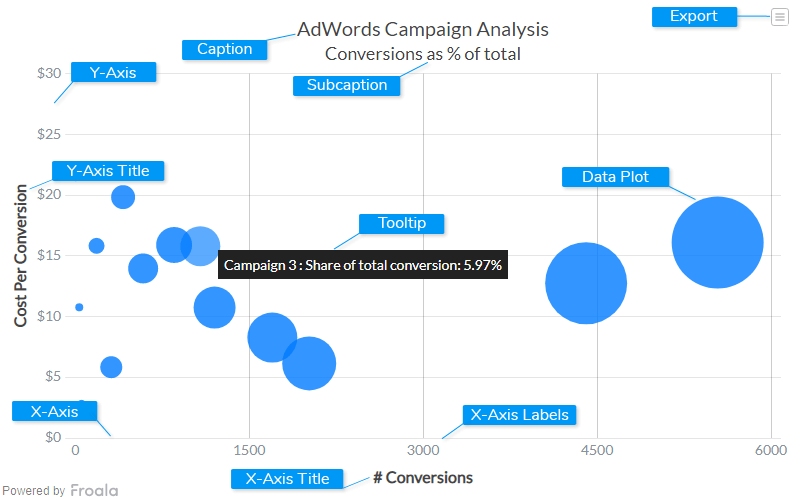
The bubble chart is used to visualize data that is defined by three numeric variables. Two variables locate the point on the x- and y-axis and the third variable is indicated by the diameter of the bubble. Typically, this chart is used to compare and depict relationships between variables by means of positioning and proportions of the size of the bubbles/circles. It is also used to analyze patterns and trends in data.

Caption
The caption (also called the chart title) is the heading of your chart. You can add custom text for the caption, as well as configure its font properties and cosmetics. Learn more about it
Subcaption
The sub-caption (also called the chart subtitle) is the sub-heading of your chart. You can add custom text for sub-caption, as well as configure its font properties.
Data Plot
Data plot refers to the pie slices in a pie chart, columns of the column chart, lines in a line chart.
Tooltip
A tooltip is displayed when the mouse cursor hovers over a particular data point. It denotes valuable information about the data plot hovered.
X-Axis
X-Axis refers to a line on a chart that runs horizontally (left-right).
Y-Axis
Y-Axis refers to line or values on a chart that runs vertically (up-down) through zero.
X-Axis Labels
X-Axis labels are the names of the data points that are displayed on the x-axis of a chart.
Y-Axis Title
The title of the y-axis
Export Menu
Export menu that appears on top-right of the chart, it offers different options to export a chart.
You can enable or disable chart export using attributeexportEnabled. Refer to Exporting Charts to learn
more.
Create a Bubble Chart
For a detailed list of attributes, refer to the Bubble Chart attributes page.{
"chart": {
"caption": "AdWords Campaign Analysis",
"subcaption": "Conversions as % of total",
"xaxisname": "# Conversions",
"yaxisname": "Cost Per Conversion",
"numberprefix": "$",
"theme": "froala",
"plottooltext": "$name : Share of total conversion: $zvalue%"
},
"categories": [
{
"verticallinealpha": "20",
"category": [
{
"label": "0",
"x": "0"
},
{
"label": "1500",
"x": "1500",
"showverticalline": "1"
},
{
"label": "3000",
"x": "3000",
"showverticalline": "1"
},
{
"label": "4500",
"x": "4500",
"showverticalline": "1"
},
{
"label": "6000",
"x": "6000",
"showverticalline": "1"
}
]
}
],
"dataset": [
{
"data": [
{
"x": "5540",
"y": "16.09",
"z": "30.63",
"name": "Campaign 1"
},
{
"x": "4406",
"y": "12.74",
"z": "24.36",
"name": "Campaign 2"
},
{
"x": "1079",
"y": "15.79",
"z": "5.97",
"name": "Campaign 3"
},
{
"x": "1700",
"y": "8.27",
"z": "9.4",
"name": "Campaign 4"
},
{
"x": "853",
"y": "15.89",
"z": "4.71",
"name": "Campaign 5"
},
{
"x": "1202",
"y": "10.74",
"z": "6.65",
"name": "Campaign 6"
},
{
"x": "2018",
"y": "6.14",
"z": "11.16",
"name": "Campaign 7"
},
{
"x": "413",
"y": "19.83",
"z": "2.28",
"name": "Campaign 8"
},
{
"x": "586",
"y": "13.96",
"z": "3.24",
"name": "Campaign 9"
},
{
"x": "184",
"y": "15.82",
"z": "1.02",
"name": "Campaign 10"
},
{
"x": "311",
"y": "5.83",
"z": "1.72",
"name": "Campaign 11"
},
{
"x": "35",
"y": "10.76",
"z": "0.19",
"name": "Campaign 12"
},
{
"x": "55",
"y": "2.73",
"z": "0.3",
"name": "Campaign 13"
},
{
"x": "6",
"y": "21.22",
"z": "0.03",
"name": "Campaign 14"
}
]
}
]
}<html>
<head>
<title>My first chart using FroalaCharts</title>
<script src=https://unpkg.com/[email protected]/froalacharts.js></script>
<script src="https://unpkg.com/[email protected]/themes/froalacharts.theme.froala.js"></script>
<script type="text/javascript">
var data = { chart: {
caption: "AdWords Campaign Analysis",
subcaption: "Conversions as % of total",
xaxisname: "# Conversions",
yaxisname: "Cost Per Conversion",
numberprefix: "$",
theme: "froala",
plottooltext: "$name : Share of total conversion: $zvalue%"
},
categories: [
{
verticallinealpha: "20",
category: [
{
label: "0",
x: "0"
},
{
label: "1500",
x: "1500",
showverticalline: "1"
},
{
label: "3000",
x: "3000",
showverticalline: "1"
},
{
label: "4500",
x: "4500",
showverticalline: "1"
},
{
label: "6000",
x: "6000",
showverticalline: "1"
}
]
}
],
dataset: [
{
data: [
{
x: "5540",
y: "16.09",
z: "30.63",
name: "Campaign 1"
},
{
x: "4406",
y: "12.74",
z: "24.36",
name: "Campaign 2"
},
{
x: "1079",
y: "15.79",
z: "5.97",
name: "Campaign 3"
},
{
x: "1700",
y: "8.27",
z: "9.4",
name: "Campaign 4"
},
{
x: "853",
y: "15.89",
z: "4.71",
name: "Campaign 5"
},
{
x: "1202",
y: "10.74",
z: "6.65",
name: "Campaign 6"
},
{
x: "2018",
y: "6.14",
z: "11.16",
name: "Campaign 7"
},
{
x: "413",
y: "19.83",
z: "2.28",
name: "Campaign 8"
},
{
x: "586",
y: "13.96",
z: "3.24",
name: "Campaign 9"
},
{
x: "184",
y: "15.82",
z: "1.02",
name: "Campaign 10"
},
{
x: "311",
y: "5.83",
z: "1.72",
name: "Campaign 11"
},
{
x: "35",
y: "10.76",
z: "0.19",
name: "Campaign 12"
},
{
x: "55",
y: "2.73",
z: "0.3",
name: "Campaign 13"
},
{
x: "6",
y: "21.22",
z: "0.03",
name: "Campaign 14"
}
]
}
]
};
FroalaCharts.ready(function () {
froalacharts = new FroalaCharts({
id: "chart_1",
type: 'bubble',
renderAt: 'ft',
width: '800',
height: '500',
dataSource: data
});
froalacharts.render();
});
</script>
</head>
<div id="msg" class="mb-20"> Chart data in the selected format will be displayed here.</div>
<body>
<div id="ft">FroalaCharts will render here</div>
</body>
</html>

