- Back to Docs
- Get Started
- Integrations
- Configuring your Charts
- List of Charts
- Single Series Charts
- Pie
- Doughnut
- Column
- Bar
- Area
- Line
- Stacked Charts
- Stacked Column
- Stacked Bar
- Stacked Area
- Combination Charts
- Combination
- XY Plot Charts
- Scatter
- Bubble
- Gauges
- Angular Gauge
- Other Charts
- Funnel
- Pyramid
- Heatmap
- Sankey
- Chord
- Radar
- Timeseries
- Chart Attributes
- API
- Options & Properties
- Methods
- Events
- Other References
- Concepts
- Browser and Technology Support
- Change Log
- License Activation
Stacked Area Chart
The Stacked Area chart shows multiple area charts, corresponding to multiple data sets, stacked on top of one another. Data values are plotted as data points that are connected using line segments. The chart puts emphasis on the magnitude of change over time and effectively highlights the total value across a trend. It can be used to compare data like the sales figures for various products.
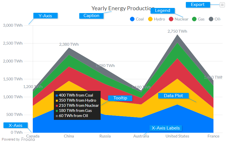
Caption
The caption (also called the chart title) is the heading of your chart. You can add custom text for the caption, as well as configure its font properties and cosmetics. Learn more about it
Data Plot
Data plot refers to the pie slices in a pie chart, columns of the column chart, lines in a line chart.
Legend
A legend is a chart element used to display the series name for each dataset, in case of multi-series or combination charts. Legends are used to correlate a data plot to its series name using its color.
Tooltip
A tooltip is displayed when the mouse cursor hovers over a particular data point. It denotes valuable information about the data plot hovered.
X-Axis
X-Axis refers to a line on a chart that runs horizontally (left-right).
Y-Axis
Y-Axis refers to line or values on a chart that runs vertically (up-down) through zero.
X-Axis Labels
X-Axis labels are the names of the data points that are displayed on the x-axis of a chart.
Export Menu
Export menu that appears on top-right of the chart, it offers different options to export a chart.
You can enable or disable chart export using attributeexportEnabled
. Refer to Exporting Charts to learn
more.
Create a Stacked Area Chart
For a detailed list of attributes, refer to the Stacked Area Chart attributes page.{
"chart": {
"caption": "Yearly Energy Production",
"numbersuffix": " TWh",
"formatnumberscale": "0",
"showvalues": "0",
"drawcrossline": "1",
"showsum": "1",
"plottooltext": "$dataValue from $seriesName",
"theme": "froala"
},
"categories": [
{
"category": [
{
"label": "Canada"
},
{
"label": "China"
},
{
"label": "Russia"
},
{
"label": "Australia"
},
{
"label": "United States"
},
{
"label": "France"
}
]
}
],
"dataset": [
{
"seriesname": "Coal",
"data": [
{
"value": "400"
},
{
"value": "830"
},
{
"value": "500"
},
{
"value": "420"
},
{
"value": "790"
},
{
"value": "380"
}
]
},
{
"seriesname": "Hydro",
"data": [
{
"value": "350"
},
{
"value": "620"
},
{
"value": "410"
},
{
"value": "370"
},
{
"value": "720"
},
{
"value": "310"
}
]
},
{
"seriesname": "Nuclear",
"data": [
{
"value": "210"
},
{
"value": "400"
},
{
"value": "450"
},
{
"value": "180"
},
{
"value": "570"
},
{
"value": "270"
}
]
},
{
"seriesname": "Gas",
"data": [
{
"value": "180"
},
{
"value": "330"
},
{
"value": "230"
},
{
"value": "160"
},
{
"value": "440"
},
{
"value": "350"
}
]
},
{
"seriesname": "Oil",
"data": [
{
"value": "60"
},
{
"value": "200"
},
{
"value": "200"
},
{
"value": "50"
},
{
"value": "230"
},
{
"value": "150"
}
]
}
]
}
<html>
<head>
<title>My first chart using FroalaCharts</title>
<script src=https://unpkg.com/[email protected]/froalacharts.js></script>
<script src="https://unpkg.com/[email protected]/themes/froalacharts.theme.froala.js"></script>
<script type="text/javascript">
var data = {
chart: {
caption: "Yearly Energy Production",
numbersuffix: " TWh",
formatnumberscale: "0",
showvalues: "0",
drawcrossline: "1",
showsum: "1",
plottooltext: "$dataValue from $seriesName",
theme: "froala"
},
categories: [
{
category: [
{
label: "Canada"
},
{
label: "China"
},
{
label: "Russia"
},
{
label: "Australia"
},
{
label: "United States"
},
{
label: "France"
}
]
}
],
dataset: [
{
seriesname: "Coal",
data: [
{
value: "400"
},
{
value: "830"
},
{
value: "500"
},
{
value: "420"
},
{
value: "790"
},
{
value: "380"
}
]
},
{
seriesname: "Hydro",
data: [
{
value: "350"
},
{
value: "620"
},
{
value: "410"
},
{
value: "370"
},
{
value: "720"
},
{
value: "310"
}
]
},
{
seriesname: "Nuclear",
data: [
{
value: "210"
},
{
value: "400"
},
{
value: "450"
},
{
value: "180"
},
{
value: "570"
},
{
value: "270"
}
]
},
{
seriesname: "Gas",
data: [
{
value: "180"
},
{
value: "330"
},
{
value: "230"
},
{
value: "160"
},
{
value: "440"
},
{
value: "350"
}
]
},
{
seriesname: "Oil",
data: [
{
value: "60"
},
{
value: "200"
},
{
value: "200"
},
{
value: "50"
},
{
value: "230"
},
{
value: "150"
}
]
}
]
};
FroalaCharts.ready(function () {
froalacharts = new FroalaCharts({
id: "chart_1",
type: 'stackedarea',
renderAt: 'ft',
width: '800',
height: '500',
dataSource: data
});
froalacharts.render();
});
</script>
</head>
<div id="msg" class="mb-20"> Chart data in the selected format will be displayed here.</div>
<body>
<div id="ft">FroalaCharts will render here</div>
</body>
</html>