Froala Charts
Interactive charts to build insightful data visualizations in your web or mobile apps
What do you get with Froala Charts?
Charts
With 20+ chart types, Froala Charts consists of the most commonly used basic charts such as column, line, and pie for your reports and dashboards.
Widgets
From Gauges and KPIs to funnel and pyramid charts, Froala Widgets makes your dashboards and monitors a lot more insightful.
Domain-Specific Charts
Advanced charting using Heat maps, treemaps, radar, statistical charts, and more for domain-specific usage.
Built by Developers for Developers.
Froala Charts allows users to configure charts to suit their unique needs. Use attributes, layers or events and APIs along with abundant charting features to create insightful dashboards.
Popular Charting Features
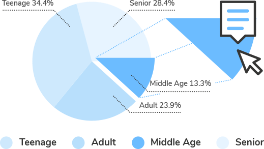
Events/API
Customize how charts behave when users perform certain actions, using events and API.
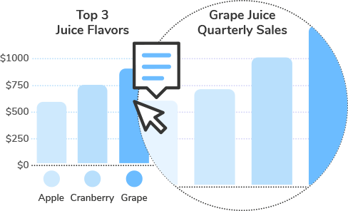
Drill Down
Drill down to endless levels to provide viewers with deep insights into data.
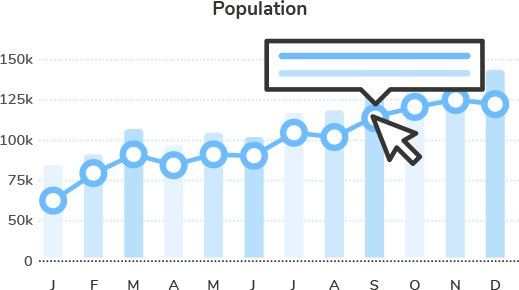
Tooltips
Make beautiful and informative tooltips to help viewers quickly see context- sensitive information about data.
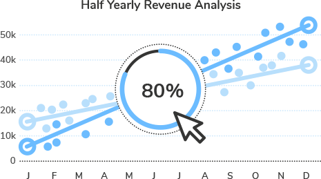
Chart Loading Config
Display messages or images, every time the chart loads. Customize the message/ source image in any way you want, and link it to the chart.
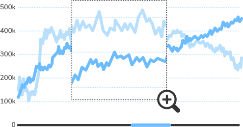
Zoom/Scroll/Pan
Zoom, scroll, and pan through Zoom Scatter charts, for better insights into individual data plots, or compare between two series of data values.
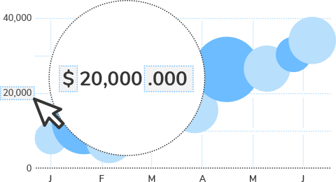
Number Formatting
Display numbers in global/European formats, and let viewers switch between them on the fly.
Why do 800,000 developers love Froala?
Easy to use with a low learning curve
Create your first chart in under 15 minutes. And with consistent API across different charts build your next dashboards in a snap.
Customizable looks and feel
Give your dashboards a modern look with multiple pre-built themes or build your own themes with ease.
Support for the choice of your frameworks
From React to Ruby on Rails and CDN to NPM, Froala Charts supports the tech stack of your choice for both frontend and backend.
Extensive documentation
Comprehensive documentation for each library or programming language, with a lot of live-examples.
A plethora of examples for inspiration
Get ready-to-use chart examples, industry-specific dashboards and even data stories, available with source code for you to quickly get started.
Charts for all your data vizualization needs
Build interactive dashboard, reports ,and powerful data visualizations using basic to advanced charts and widgets.
Intelligent configurations to save your time
Smart defaults to help you get started, but providing deep configuration for each chart element.
Support for modern and old browsers
From IE8 to Google Chrome and everything in between, it just works!
Active roadmap
Frequent updates, quick bug fixes, and customer-driven roadmap.
Priority support with live chat
Best-in-class support to help you with all your web & mobile projects.
Flexible pricing
Pricing plans customized for different team sizes, usage (internal vs SaaS), up-front vs annual.
Easy Front-end Integrations
Froala Charts is easy to integrate with any JavaScript framework or programming language of choice.
Front-end Integrations
Why should you choose Froala Charts?
There are over 800,000 developers from 28,000+ companies who prefer Froala Charts products over Open source or other paid libraries.
Here are a few reasons:
Froala Charts
VS
Open Source Charting Libraries
- 15 minutes to first chart, without any learning curve. Plus, consistent API across different charts make it simple to build complex charts or dashboards.
- Some of these libraries have a deep learning curve, requiring days of learning, before you can even build your first chart. And then configuring them to suit your requirements is another story in itself!
- Consistent look & feel. Our themes have a consistent look across products. Did we tell you that you can also build your own theme?
- Many libraries do not provide a consistent look and feel across the charts. This problem is made worse when you use multiple libraries.
- Various installation options available (direct JavaScript, CDN, NPM) and pre-integrated with all popular JavaScript libraries and back-end programming languages.
- Non availability for all frameworks - Very few libraries officially support plugins for your frameworks and back-end languages.
- Comprehensive documentation for each library or programming language, with a lot of live-examples.
- While these libraries have simple tutorials that help you get started, but beyond that you’re expected to jump straight to API docs or even source code, without enough examples.
- Ready-to-use chart examples, industry-specific dashboards and even data stories, available with source code for you to quickly get started.
- These libraries do showcase their charts and features, but most of them do not have examples of integrated dashboarding experience.
Froala Charts
VS
Open Source Charting Libraries
- Over 100+ charts and 2000+ maps. Gain access to an exhaustive list of charts, gauges & maps that allow developers to visualize any data in any form- all from one place.
- You’ll have to use more than one library to get all the visualizations of your choice. This results in the increase in bundle size and development time.
- Smart defaults, but configurable. Default chart configurations automatically figure out the best way to show your data. Developers can also configure as per their needs.
- Little to no default configurations. From typecasting to dealing with edge cases, your developers are forced to spend a significant amount of time to make the customizations.
Froala Charts
VS
Open Source Charting Libraries
- Powerful time-series charts for large data. You can plot millions of data points in your browser with no glitches, with features like time navigator for better data experience.
- While these libraries have support for time-series data, they are rendered as simple charts, without providing the UX elements to navigate through time-series data effectively.
- Export dashboards effortlessly. From generating charts on server side to exporting the dashboard as PDF, to sending reports via email, FusionExport helps you do it with ease.
- Export of Dashboards is ripe with challenges. They only offer chart export, and don’t support dashboard export. Even if they do, the results have missing data, print non-friendly layout, etc.
- Common charts are supported on older browsers as well (IE6). All charts are responsive to adapt to different screen sizes. For devices, the charts automatically adapt to touch events or even the quirks of specific devices.
- Modern browser support only. It’s a dampener when enterprise customers want product accessibility across browsers.
Froala Charts
VS
Open Source Charting Libraries
- Frequent updates & a customer-driven roadmap. We’re releasing improvements and features constantly. Bug fixes are prioritized and special requests are accommodated.
- No clarity on the roadmap. There is no commitment for fixes or feature additions, leaving your project timelines open-ended.
- Personalized support. If you need help, we are just a message away. You can reach out to us via forums, email, and live chat.
- No single point to get support. While working to meet a deadline, it’s risky to expect on-time support from online communities.
Froala Charts
VS
Open Source Charting Libraries
- Flexible licensing options. Choose flexible and customized pricing plans based on your team size and usage.
- Rigid licensing options. The paid libraries come with fixed pricing options, even if there are 50+ developers in your team.

