
How to customize Froala Image Edit Buttons in a React App

The Froala Editor lets users create and edit content with rich text formatting. One of its powerful features is the ability to work with images.
This article explains how to use Image Edit Buttons from Froala Editor in a React app project with a cheap react rich text editor.
Prerequisites
Before you get started, make sure you have the following prerequisites in place:
- Node.js and npm are installed on your computer.
- A React application set up.
- Knowledge of React and HTML.
- Setting up Froala Editor in a React App
First, we need to install the required packages. After that, we can initialize the Froala Editor.
We will make a React component called App.js. In this component, we will set up and use the Froala Editor along with the Image Edit Buttons.

1. Installation and Setup
First, install the required packages. You can do this by running the following command in your React project directory:
npm install react-froala-wysiwyg

cd react-froala-wysiwyg

npm install react-froala-wysiwyg --save
These commands install the Froala Editor and its React wrapper.
2. Importing Dependencies
In your App.js file, import the necessary dependencies.
Here’s the beginning of the file with the imports:
import { useState } from "react";

import "froala-editor/css/froala_style.min.css";

import "froala-editor/css/froala_editor.pkgd.min.css";

import "froala-editor/js/plugins.pkgd.min.js";

import FroalaEditorImg from "react-froala-wysiwyg/FroalaEditorImg";
We imported useState from React to manage the component state in the code above.
We imported the react-froala-wysiwyg package’s styles, plugins, and components.
3. Setting Up the Component
Next, create the App component and set up the basic structure.
We’ll use the FroalaEditorImg component to render the Froala Editor. Here’s the code for the App component:
export default function App() {

  const [state, setState] = useState({

    src: "https://fakeimg.pl/350x200/?text=Click to test"

  });


  const handleModelChange = (model) => {

    setState({

      content: model

    });

  };


  const config = {

    imageEditButtons: [

      "imageReplace",

      "imageAlign",

      "imageCaption",

      "imageRemove",

      "|",

      "imageLink",

      "linkOpen",

      "linkEdit",

      "linkRemove",

      "-",

      "imageDisplay",

      "imageStyle",

      "imageAlt",

      "imageSize"

    ]

  };


  return (

    <div>

      <FroalaEditorImg

        config={config}

        model={state}

        onModelChange={handleModelChange}

      />

      <br /> <br />

    </div>

  );

}
Now, let’s break down the code step by step:
We start by defining the App component as a functional component.
Inside the component, we use the useState hook to manage the state.
The state object holds the initial image source, displayed in the editor.
export default function App() {

  const [state, setState] = useState({

    src: "https://fakeimg.pl/350x200/?text=Click to test"

  });
We define the handleModelChange function, which will be called when the editor content changes. In this function, we update the state with the new content.
  const handleModelChange = (model) => {

    setState({

      content: model

    });

  };
The config object holds the Froala Editor’s configuration, including the imageEditButtons property.
This property specifies the set of image editing buttons you want to display.
  const config = {

    imageEditButtons: [

      "imageReplace",

      "imageAlign",

      "imageCaption",

      "imageRemove",

      "|",

      "imageLink",

      "linkOpen",

      "linkEdit",

      "linkRemove",

      "-",

      "imageDisplay",

      "imageStyle",

      "imageAlt",

      "imageSize"

    ]

  };
Finally, we build the FroalaEditorImg element, passing as props the config, model, and onModelChange.
This component will display the Froala Editor with the specified image edit buttons.
  return (

    <div>

      <FroalaEditorImg

        config={config}

        model={state}

        onModelChange={handleModelChange}

      />

      <br /> <br />

    </div>

  );

}
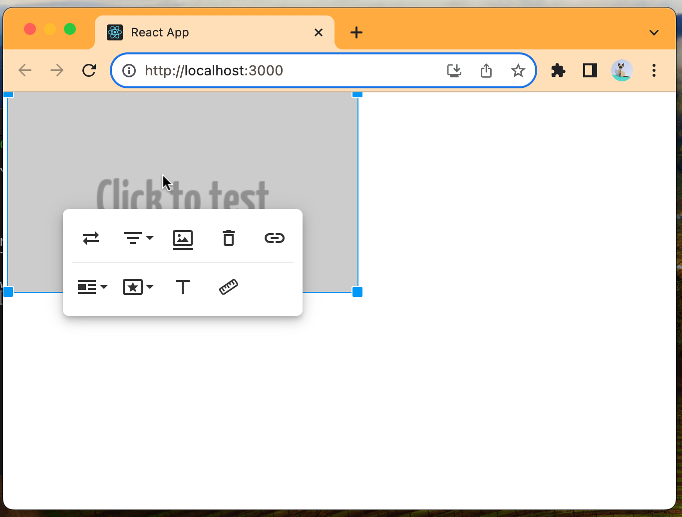
The imageEditButtons configuration is a crucial part of this implementation. It defines the set of buttons that will appear when you click on an image in the Froala Editor.
Let’s break down the buttons included in the configuration:
“imageReplace”: This button allows you to replace the selected image with a new one.
“imageAlign”: It enables you to set the alignment of the image (left, center, right, or justify).
“imageCaption”: This button adds a caption to the image.
“imageRemove”: It lets you remove the selected image.
“|”: The pipe character (|) is used to create a separator between groups of buttons.
“imageLink”: You can link the image to another URL.
“linkOpen”: This button opens the link in a new window or tab.
“linkEdit”: It allows you to edit the image’s link.
“linkRemove”: This button removes the link from the image.
“-“: The hyphen character (-) is used to create a separator between groups of buttons.
“imageDisplay”: It controls the display settings for the image, such as size and alignment.
“imageStyle”: You can apply custom styles to the image.
“imageAlt”: This button adds an alternative text (alt text) to the image, which is essential for accessibility.
“imageSize”: It allows you to adjust the dimensions of the image.
These buttons give users a variety of options for customizing and modifying photos within the Froala Editor.
Now that we’ve configured the Froala Editor with the desired image edit buttons, let’s discuss how to use the editor in your React app.
The FroalaEditorImg component is used to render the editor. Here’s how we set it up:
<FroalaEditorImg

  config={config}

  model={state}

  onModelChange={handleModelChange}

/>
We pass the config object as a prop, which contains our button configuration.
The model prop is set to state, allowing the editor to manage its content based on the state defined in the component.
The onModelChange prop is set to the handleModelChange function, which updates the state with the new editor content.
With this setup, the Froala Editor will be displayed with the specified image edit buttons, and you can interact with the image in various ways, as defined by the imageEditButtons configuration.
Testing the Implementation
To see the Image Edit Buttons in action, run your React app.
Make sure to start your development server using the following command:
npm start
This command will start your development server, and you should be able to access your React app in a web browser.
In your app, you’ll see the Froala Editor with the initial image and the configured Image Edit Buttons.
When you click on the image, the Image Edit Buttons will show up, allowing you to change the image, add a caption, align the image, and more.
As you make changes, the editor’s content will be updated, and you can observe this change in the handleModelChange function.
Conclusion
In this article, we have explained how to install Image Edit Buttons in a Froala Editor within a React app.
First, we set up the necessary dependencies.
Then, we configured the imageEditButtons property. We ended up using the FroalaEditorImg component.
It displays the editor and image editing options.
The imageEditButtons configuration has many image editing and customization features.
It is a powerful tool for working with images in your application.
By following the steps in this article, you can improve the user experience of your React app. Users will be able to edit and customize images.
You can also customize the image edit buttons to fit your needs.


No comment yet, add your voice below!