Bootstrap is one of the most popular frameworks for building responsive and modern web applications. It’s extensive, modern, and easy to learn, making it suitable for beginners and experts alike.
In this guide, you’ll learn how to use Bootstrap, from installing it through different ways to customizing it to your liking.
You’ll also explore how Bootstrap helps boost developer productivity, including its various UI components, quick setup, and compatibility with modern browsers.
Additionally, you’ll learn about React Bootstrap, a reimplementation of Bootstrap components using React. This open-source, community-maintained project is an alternate way of implementing Bootstrap in React. It’s not official Bootstrap, but it’s perfect for React apps.

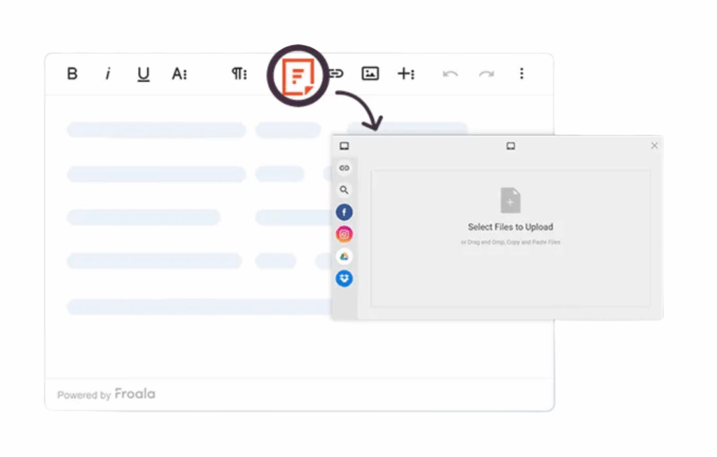
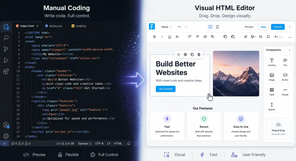
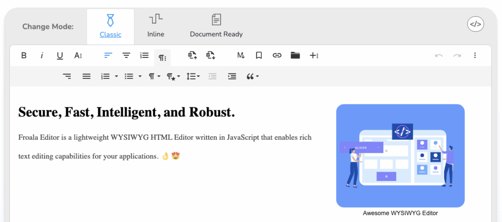
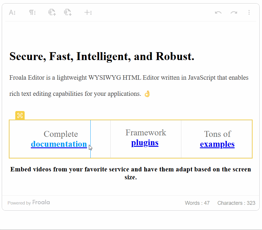
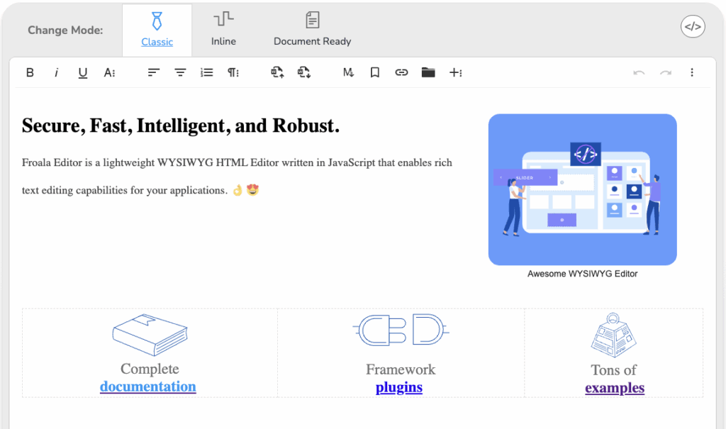
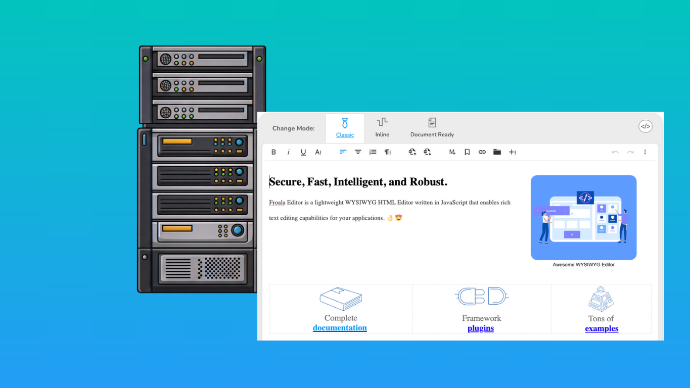
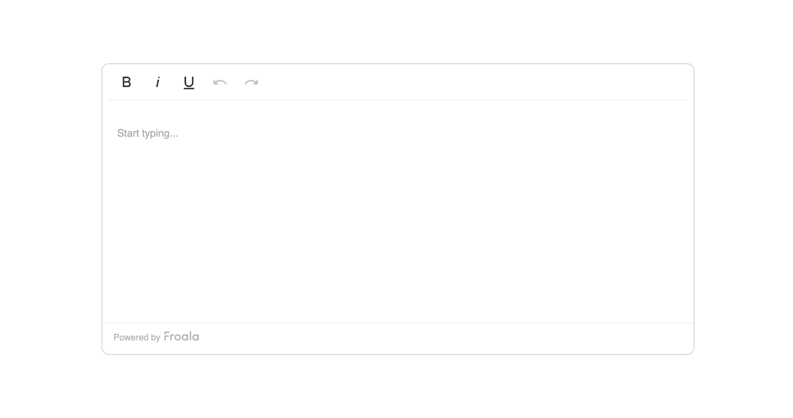
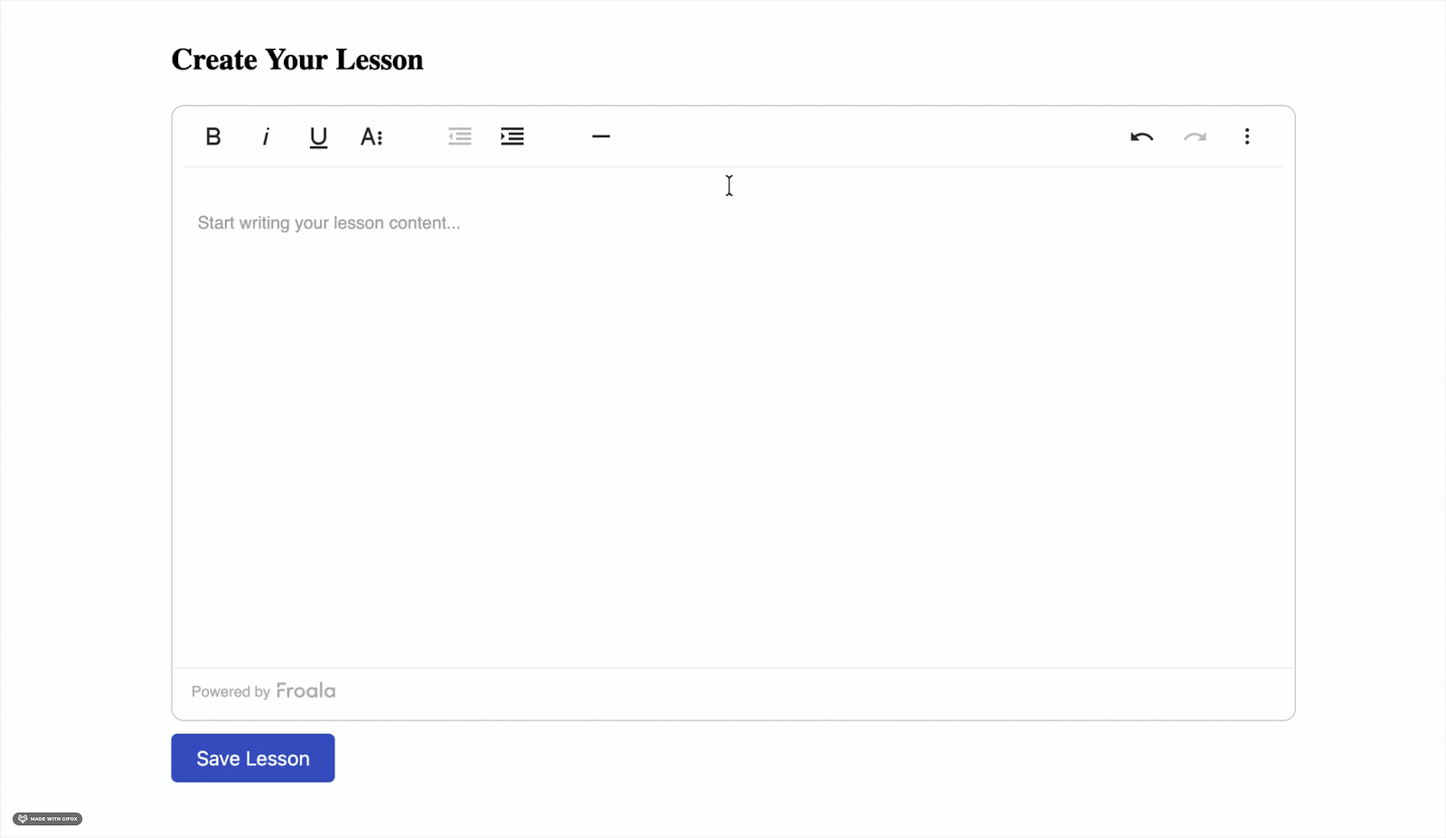
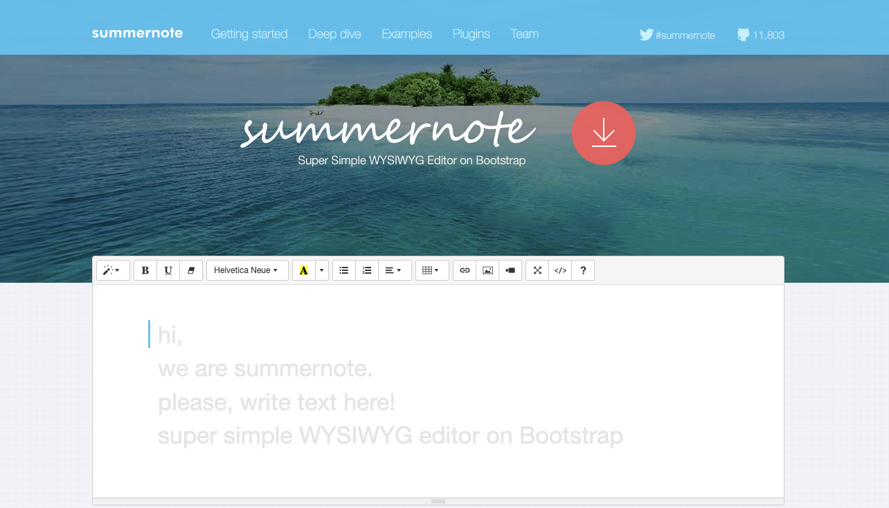
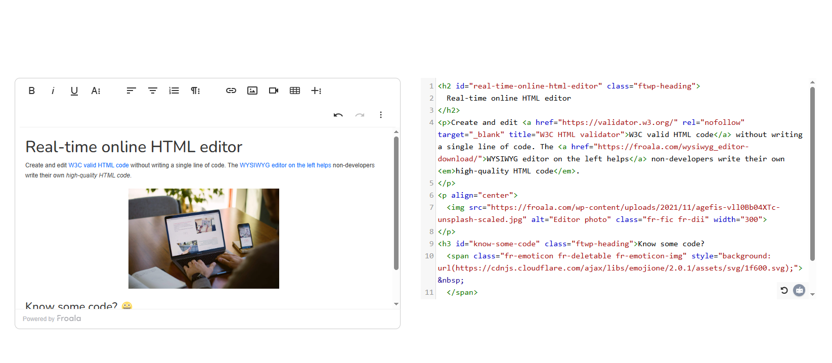
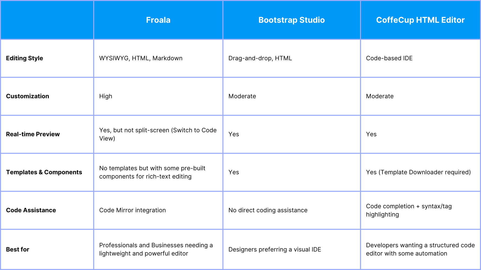
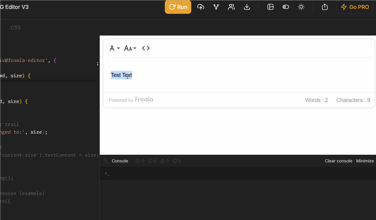
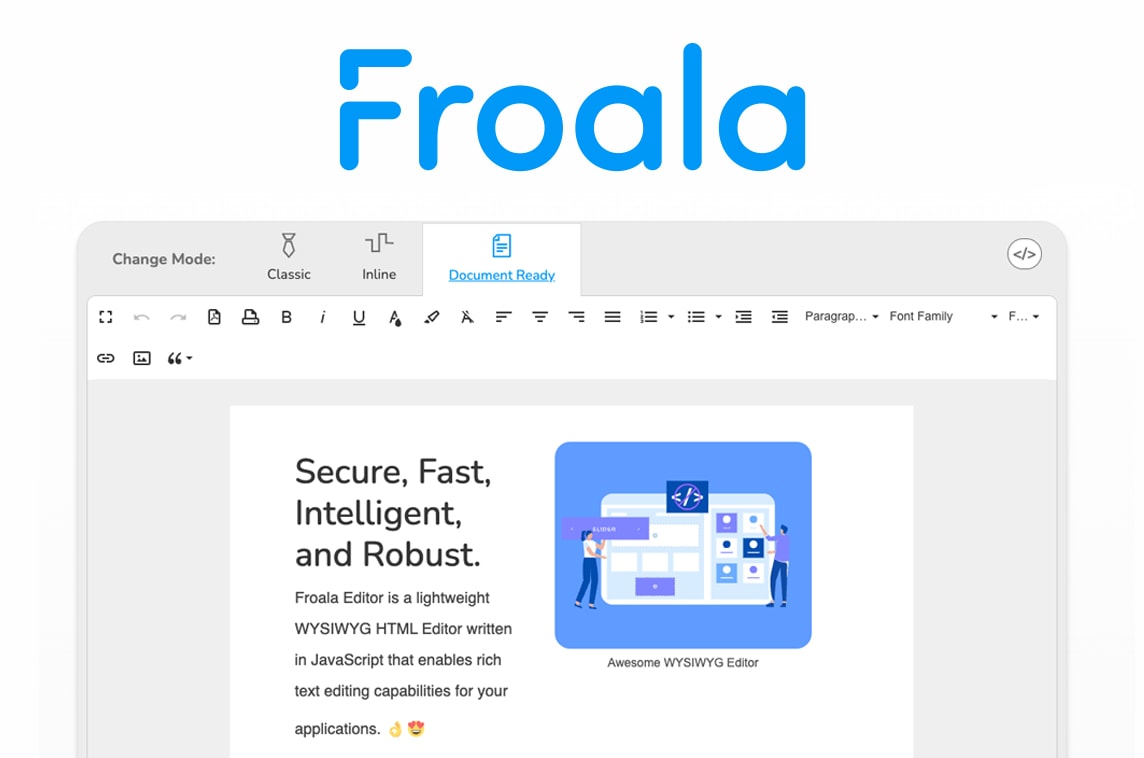
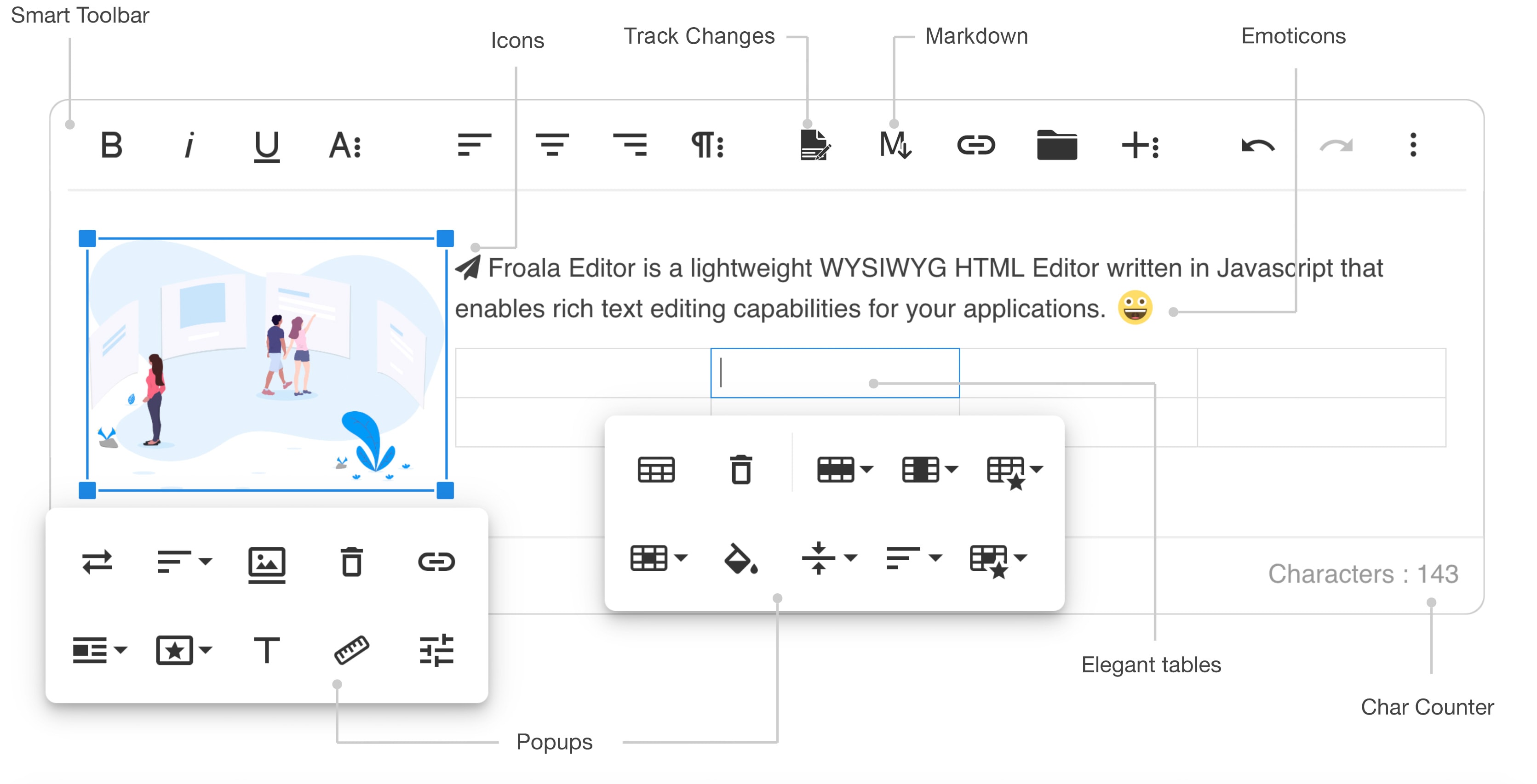
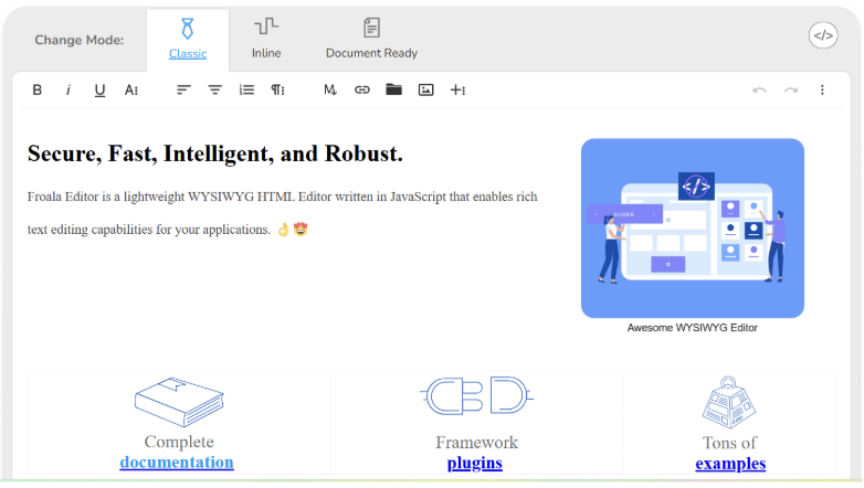
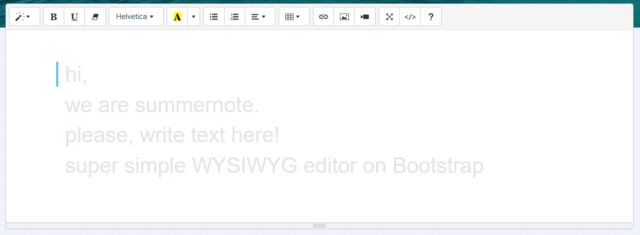
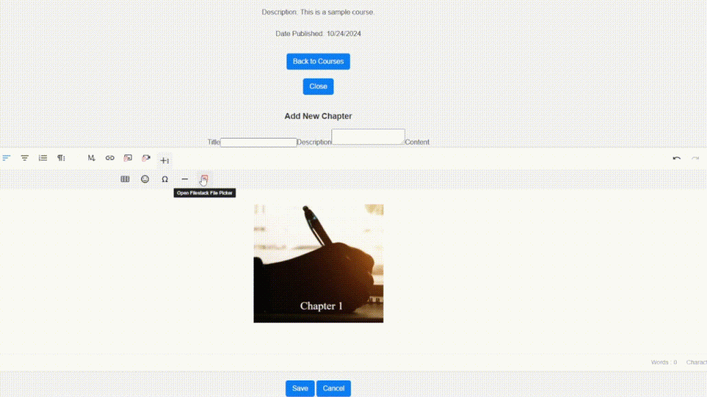
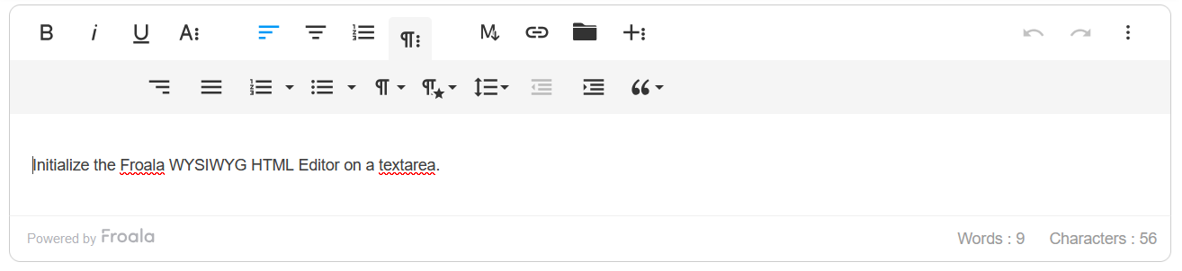
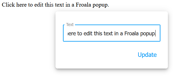
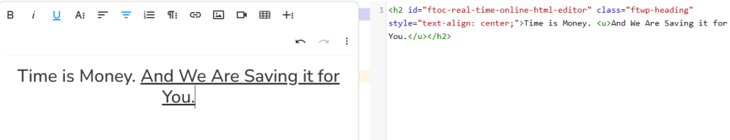
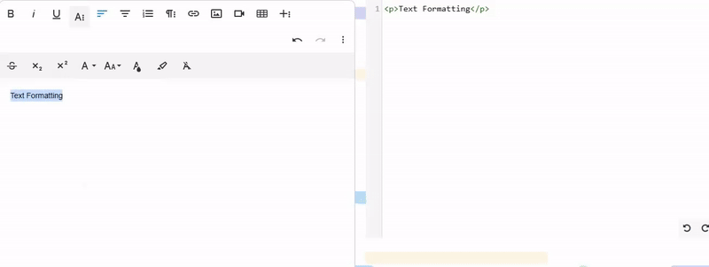
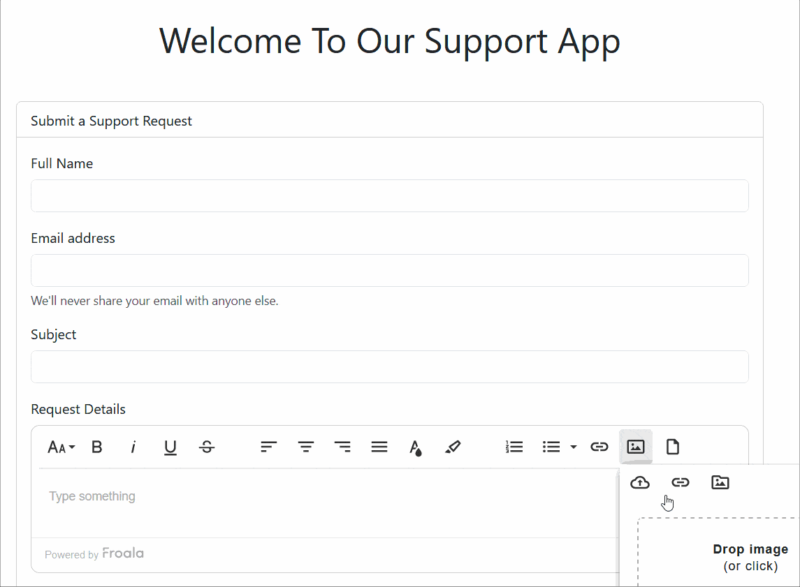
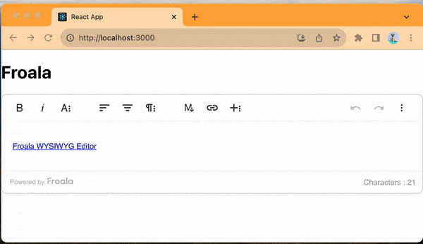
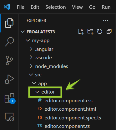
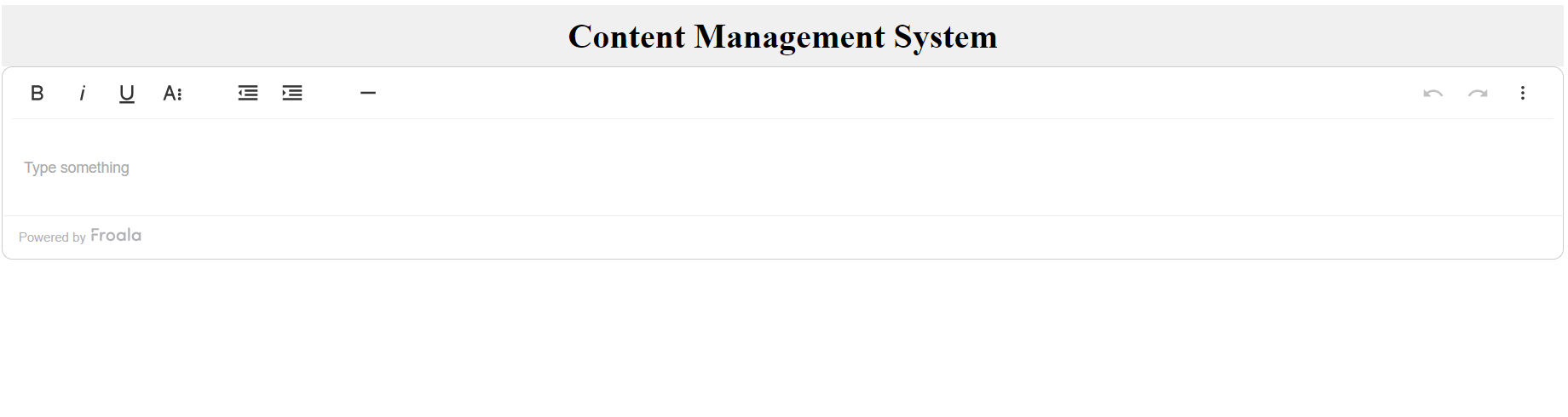
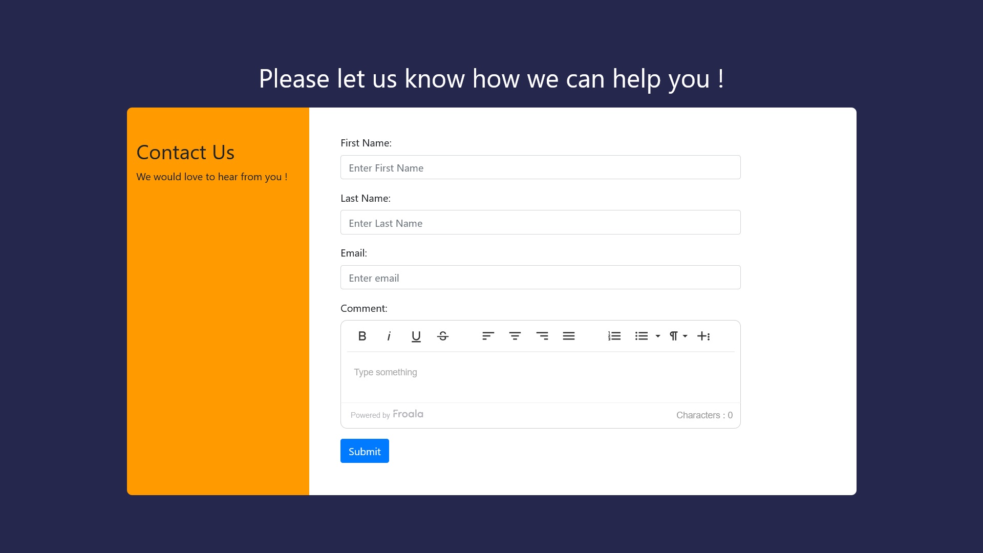
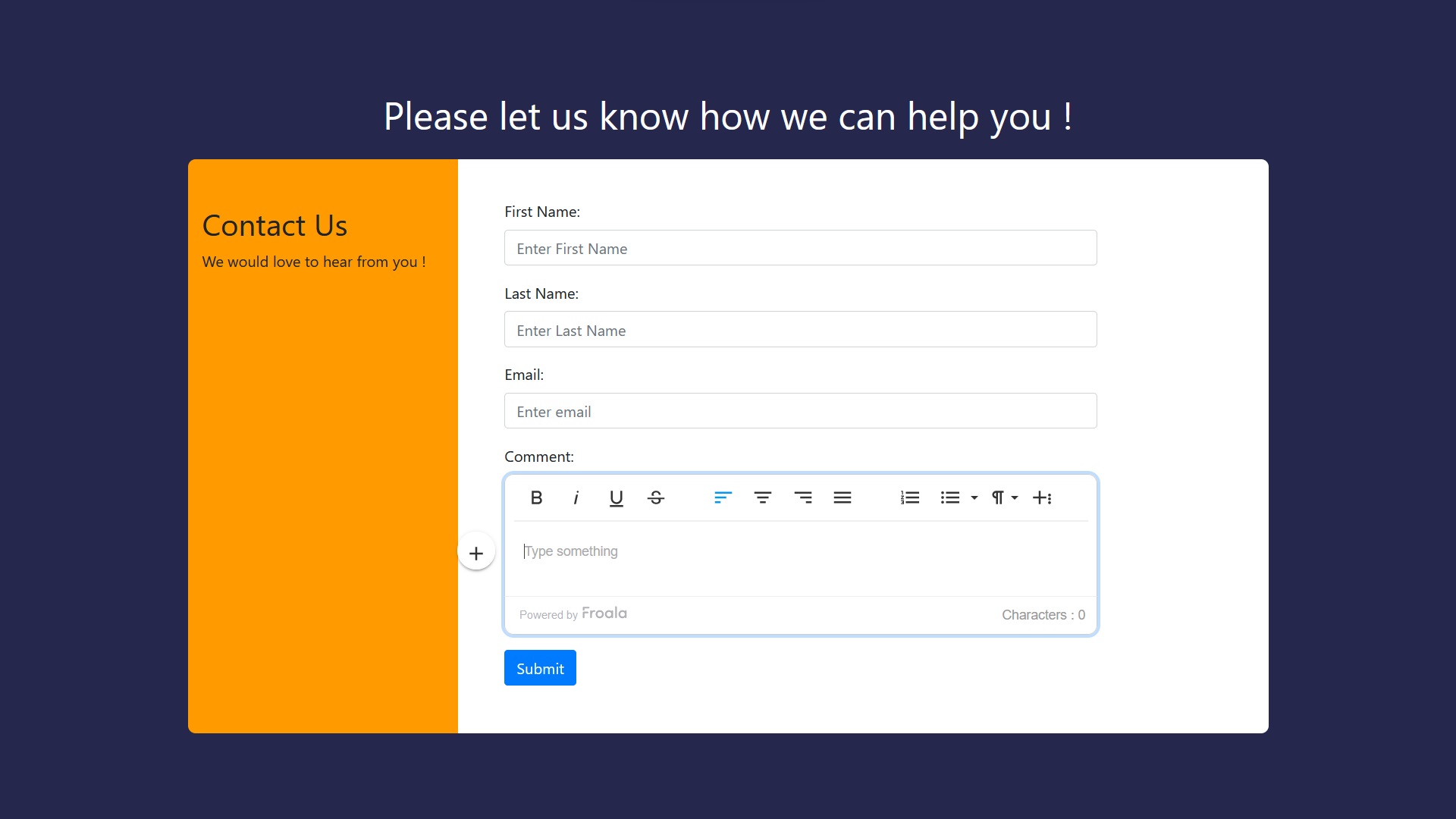
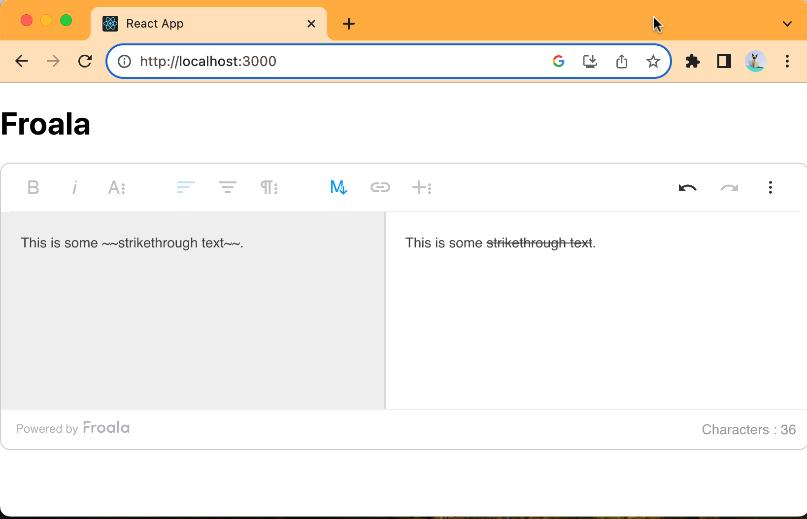
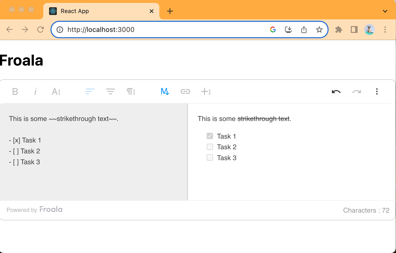
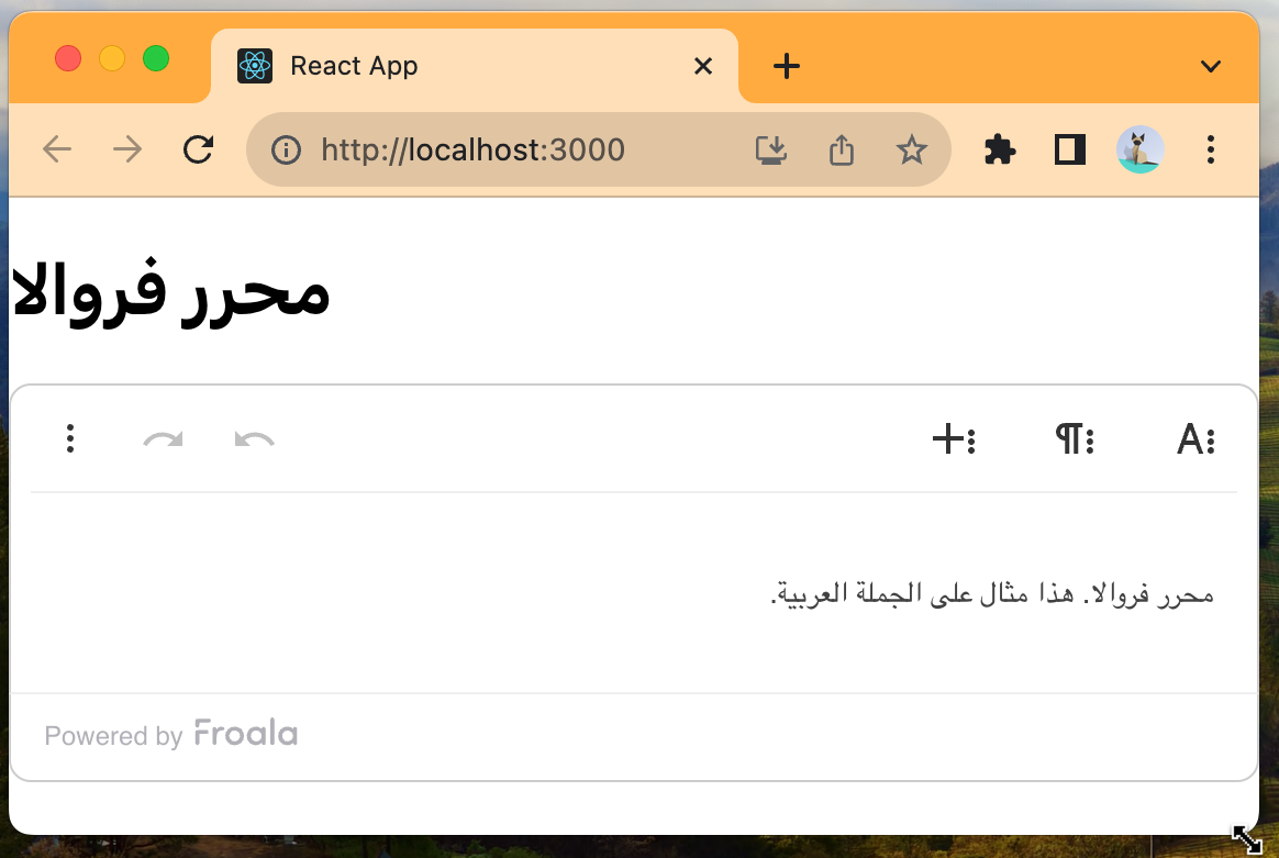
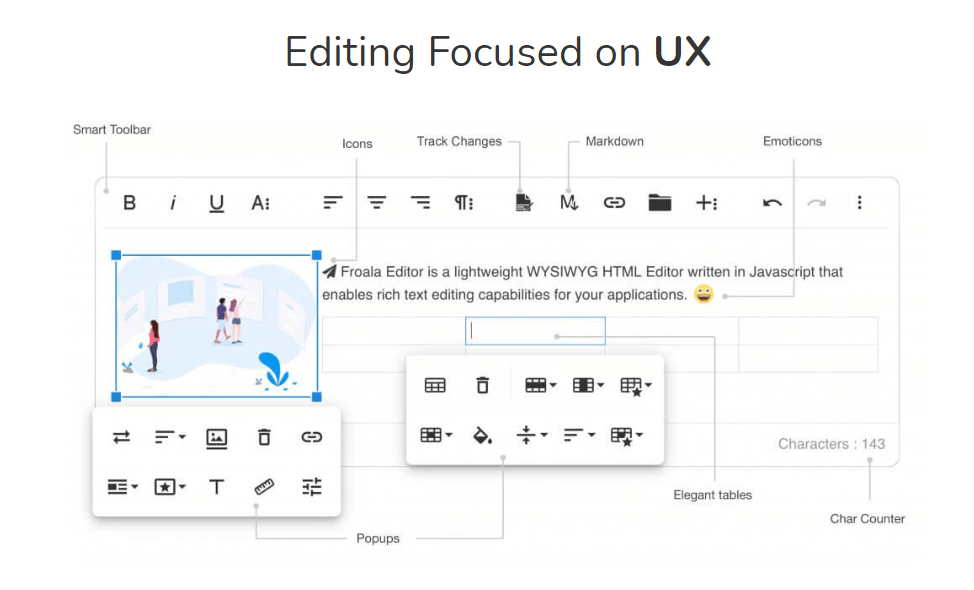
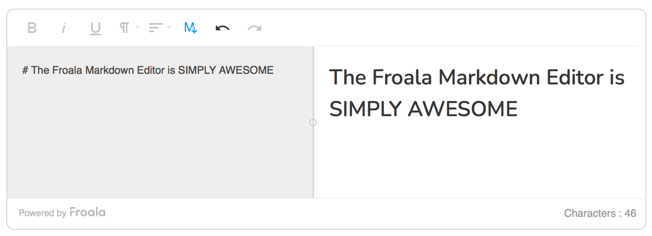
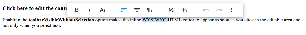
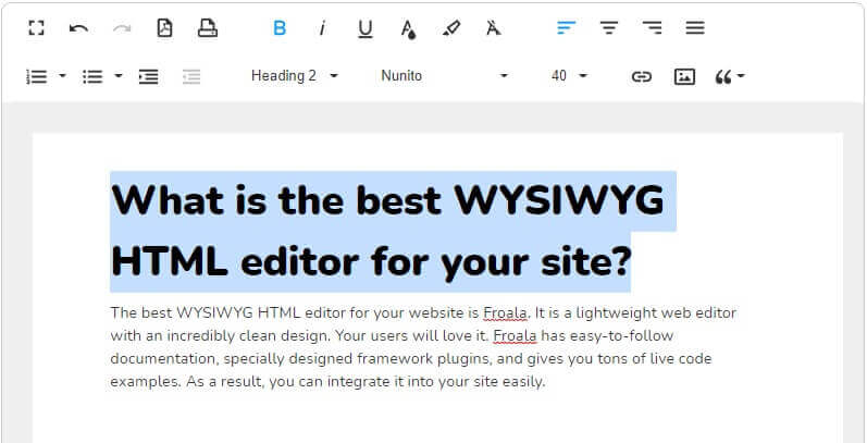
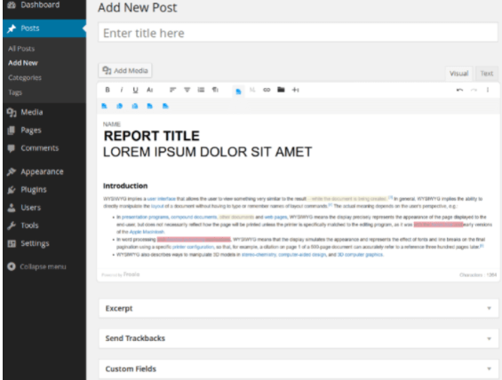
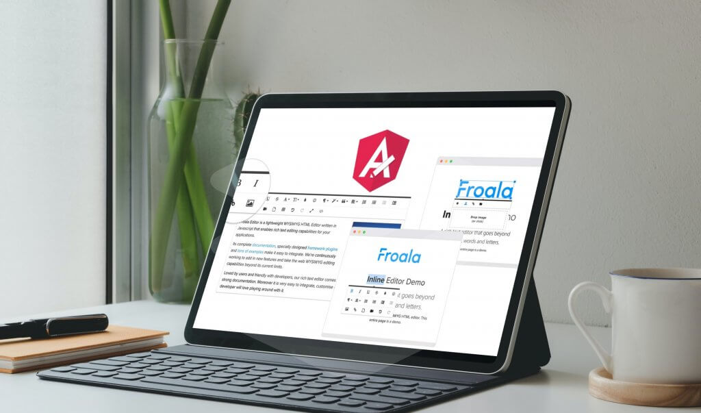
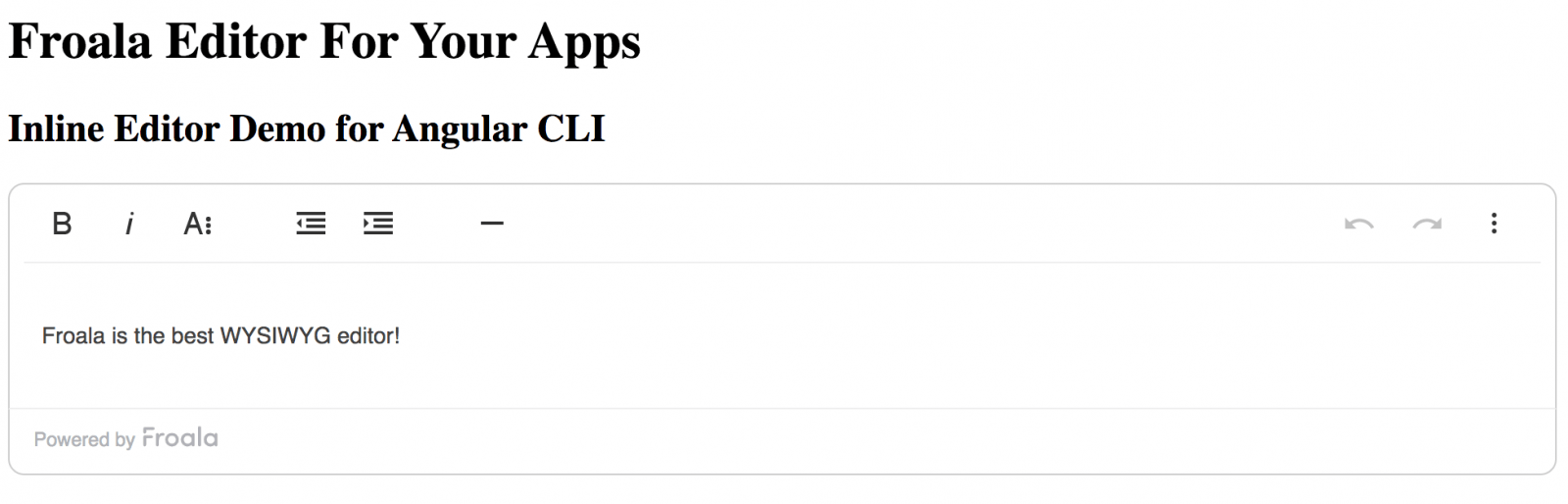
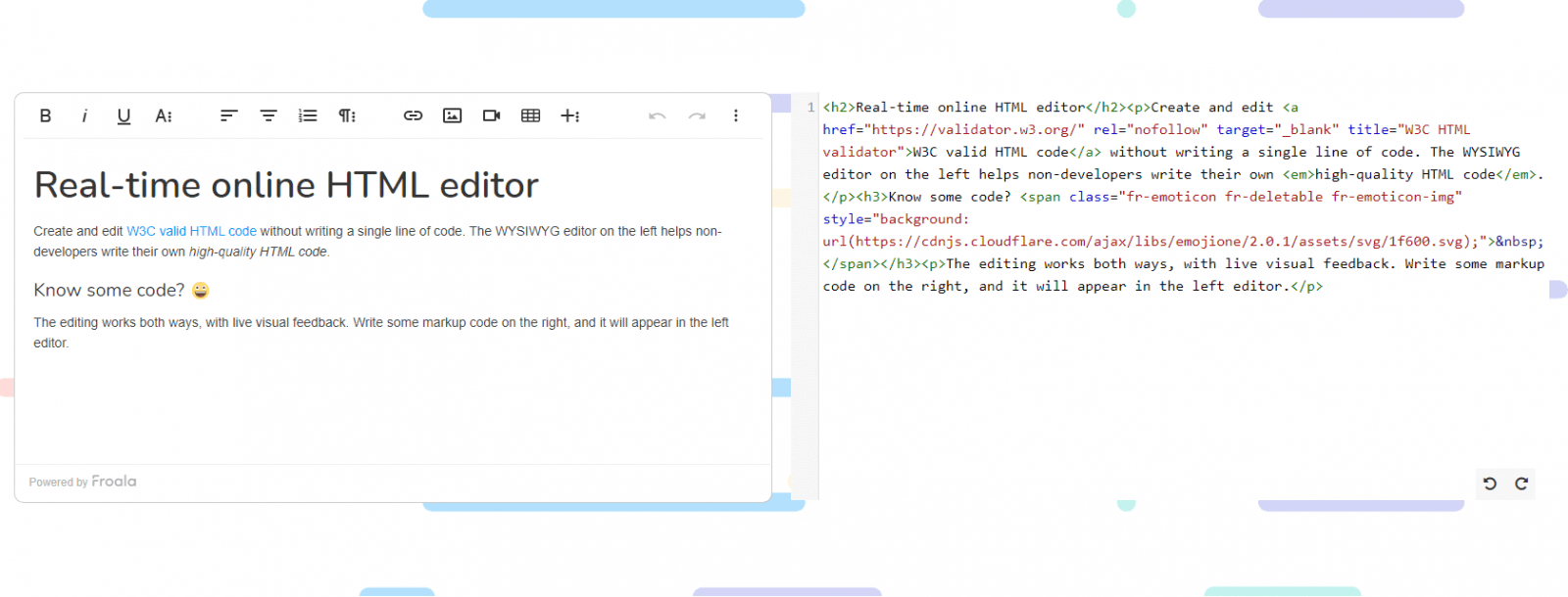
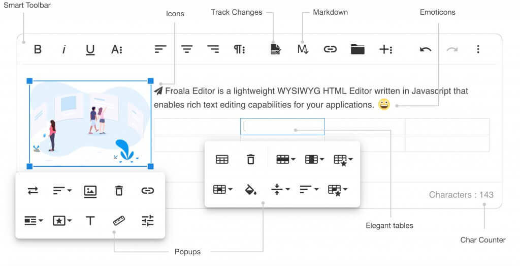
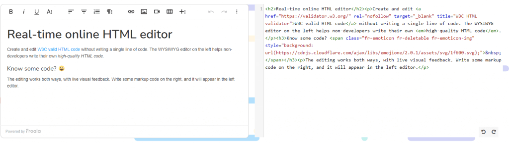
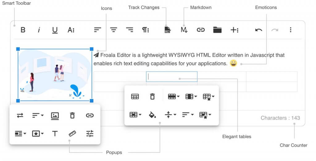
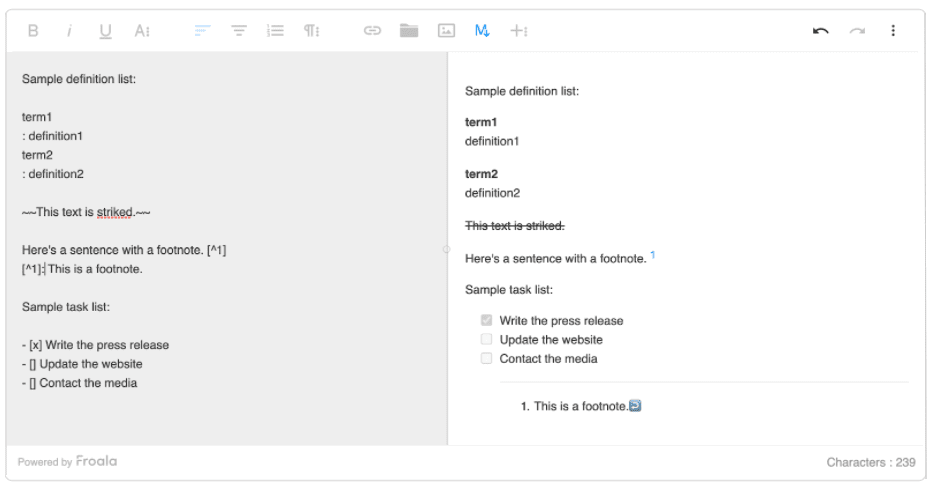
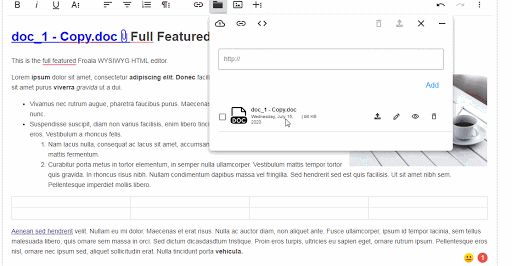
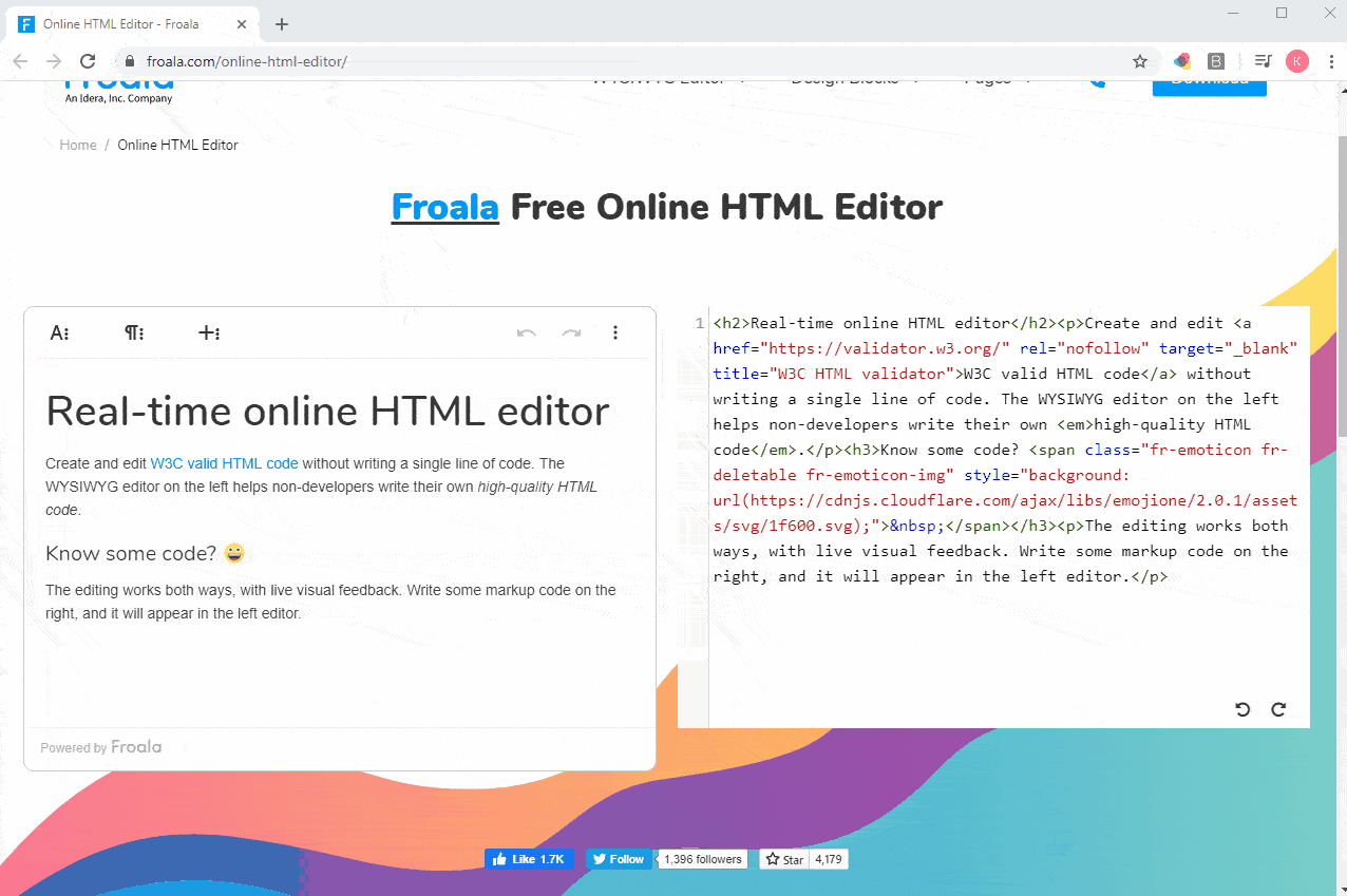
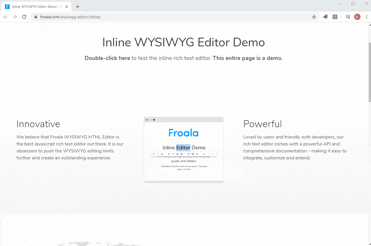
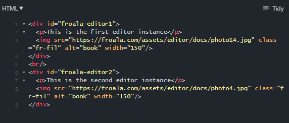
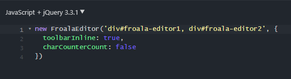
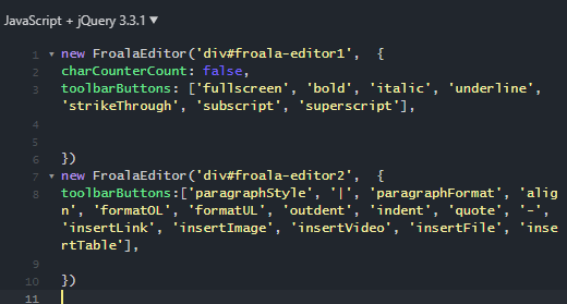
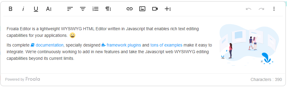
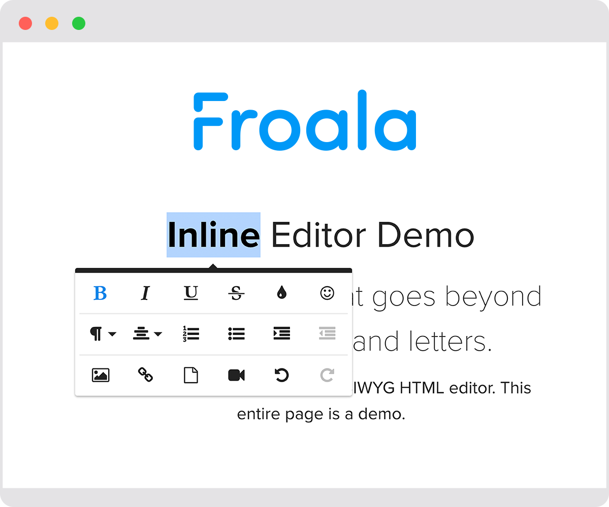
When developing modern websites and applications, you should also consider using tools that go well with one another. Froala is an HTML editor that synergizes well with Bootstrap. It consists of an intuitive, SEO-friendly, and already responsive interface in addition to powerful editing tools.
Key takeaways
- Bootstrap makes responsive design easier by offering pre-built UI components, a powerful grid system, and mobile-first styles that work across devices.
- You can install Bootstrap in multiple ways—via CDN, compiled files, or NPM—depending on your project setup and performance needs.
- Learning how to use Bootstrap effectively means understanding its components, helpers, utilities, and customization options rather than relying on default styles.
- Bootstrap is highly customizable using CSS variables, custom CSS, and Sass, allowing you to align the framework with your brand’s colors, fonts, and layout.
- For modern workflows, Bootstrap integrates well with tools like React Bootstrap and editors such as Froala, helping you build faster, cleaner, and more maintainable web applications.
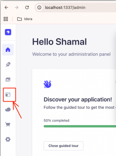
Before learning how to use Bootstrap…
You might want a refresher on its different components, as well as how to install Bootstrap. If you’re already familiar with these, skip to the next section, where you’ll explore customizing Bootstrap CSS.
Prerequisites & assumptions
Before diving into how to use Bootstrap, this guide assumes the following:
- Bootstrap version: All examples use Bootstrap 5.x (specifically 5.3+). Class names, utilities, and JavaScript behavior may differ in earlier versions.
- Project setup: Examples apply to plain HTML projects, as well as React apps using tools like Create React App (CRA), Vite, or similar bundlers.
- Node.js (optional): If you install Bootstrap via NPM or use Sass, you’ll need Node.js v16 or higher and NPM installed.
- Compiled files: “Compiled Bootstrap files” refer to the prebuilt, minified CSS and JavaScript bundles provided by Bootstrap. These are ready to use and do not require a build step.
- Basic web knowledge: You should be comfortable with basic HTML, CSS, and JavaScript to follow along smoothly.
Understanding Bootstrap’s UI components
To use Bootstrap for building responsive web apps and mobile-first styles, you make use of pre-designed, customizable UI components.
These are essentially themes or styles that you apply to plain HTML elements via the class attribute.
Once the page loads, Bootstrap will then style and design your elements according to the contents of their class attributes.
For example, you can turn a common div element into a navbar by appending the “navbar” class to it. To expand the navbar on larger screen sizes, add “navbar-expand-lg.” If you want a darker theme to it, add the “bg-dark” (as of version 5.x) class.
You can even use different styling classes for one element. Think of these components as makeup or accessories for your elements. Mix and match or use them however you like to beautify and standardize the site contents.
Ultimately, they should make your site look better and consistent across different CSS media queries or screens, including mobile devices.
Each Bootstrap CSS UI component has a specific purpose. Some are for layout, while others are for theming, form design, and individual element styling.
The Bootstrap documentation pages categorize them into the following:
Layout
These are the components that deal with organizing the DOM elements to ensure that the site contents have visual structure and responsiveness.
These usually act as styling for div elements containing elements of their own. Layout concepts include the grid system, full-width containers (which wraps site contents), and breakpoints.
Content
Content components are global styling settings for text, images, tables, and more. This means that by using content components, you can set Bootstrap’s basic styling throughout your plain JS or React projects.
For example, you can use the “img-fluid” class across your images to make them responsive without having to touch CSS properties.
Forms
As the name suggests, this type of component is responsible for styling form elements and input fields.
These UI components include text fields, floating labels, textareas, radio buttons, checkboxes, select fields, and validation classes.
Components
What the Bootstrap docs categorize as “components” refers to pre-built UI components that come with built-in styling and interactivity (e.g., hover or popover events).
Each specific component already has Bootstrap’s consistent styling and JavaScript functionality. However, you can also modify these further using utilities, helpers, and even custom CSS.
These include the bulk of Bootstrap’s components: buttons, navbars, cards, carousels, list groups, and a lot more. Bootstrap’s UI components also include JavaScript plugins such as modals, tooltips, popovers, and collapsibility.
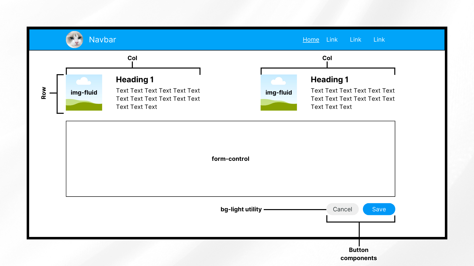
Helpers
Helpers refer to smaller classes that perform a single function. You usually use these together with other Bootstrap components.
Examples of helpers include colored links, specific component positioning (e.g., “fixed-top,” “sticky-bottom”), text truncation, visually hidden elements (for assistive technologies), and some others.
Utilities
Utilities are general-purpose styling classes for HTML elements. Unlike helpers, they have a broader, more global scope, allowing you to control styling like colors, spacing, and typography. Like helpers, they usually go together with other classes or components.
Examples of Bootstrap utilities include margins, padding, text colors, flex options, shadows, borders, sizing, and more.
Now that you’ve had a refresher, it’s time to install Bootstrap.
Installing Bootstrap
There are different methods for installing the Bootstrap CSS and JS files. Here, you’ll discover some of the most popular ones.
Via compiled Bootstrap CSS and JS
You can install Bootstrap by downloading its ready-to-use codes that include both compiled and minified Bootstrap CSS bundles and JavaScript plugins.
Note that this method does not include documentation, source files, or optional JS dependencies like Popper.
Install Bootstrap via compiled CSS and JavaScript. Include the files that you need in your JS or React app’s folder afterwards. Whether you’re using React or a non-framework setup, the steps for this method are generally the same.
Via the Bootstrap CDN
A quick alternative installation method for Bootstrap is by using the Bootstrap CDN. This method allows you to call a cached version of Bootstrap in your plain JS or React application.
This helps you get started faster and more easily. To add the framework through Bootstrap CDN, include the following code in your index.html file:
<head>
<!--other head items-->
...
<!--Bootstrap 5 CSS-->
<link href="https://cdn.jsdelivr.net/npm/bootstrap@5.3.3/dist/css/bootstrap.min.css" rel="stylesheet" integrity="sha384-QWTKZyjpPEjISv5WaRU9OFeRpok6YctnYmDr5pNlyT2bRjXh0JMhjY6hW+ALEwIH" crossorigin="anonymous">
</head>
<body>
<!--other body items-->
<!--Bootstrap 5 JavaScript-->
<script src="https://cdn.jsdelivr.net/npm/bootstrap@5.3.3/dist/js/bootstrap.bundle.min.js" integrity="sha384-YvpcrYf0tY3lHB60NNkmXc5s9fDVZLESaAA55NDzOxhy9GkcIdslK1eN7N6jIeHz" crossorigin="anonymous"></script>
</body>
This gives you the latest delivered version. You can also specify which version of Bootstrap you want in your project by replacing the version number.
If you need interactive components such as tooltips or popovers without using the bundled JavaScript file, you can install Popper explicitly.
Via package manager
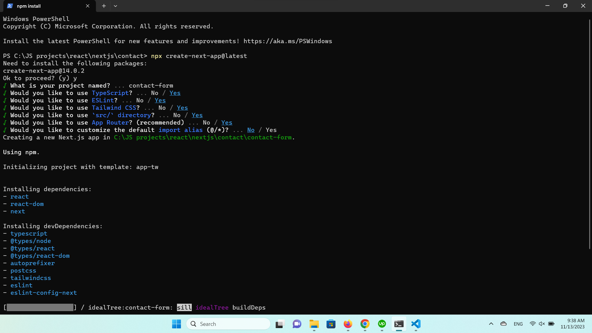
The last installation method is installing Bootstrap using NPM. To use this approach, you need Node.js (v16+) and NPM installed.
Open your CLI, navigate to your project directory, and run:
npm install bootstrap@5.3.3
This installs Bootstrap 5.3.3 into the node_modules folder, making it available for JavaScript and React-based projects.
When do you need Popper?
If you plan to use interactive components like tooltips, popovers, or dropdowns without the bundled JavaScript file, install Popper explicitly:
npm install @popperjs/core
For most projects, this extra step is not required. If you import Bootstrap’s bundled JavaScript file, Popper is already included:
import 'bootstrap/dist/css/bootstrap.min.css';
import 'bootstrap/dist/js/bootstrap.bundle.min.js';
This is the recommended setup for React, Vite, and modern JavaScript workflows.
After installation, you’ll see Bootstrap listed in your package.json dependencies.
"dependencies": {
"bootstrap": "^5.3.3",
"react": "^18.3.1",
"react-dom": "^18.3.1"
}
If you’re not using a framework, you’ll generally include the Bootstrap files in your HTML pages, similar to the code below.
<head>
<!--other head items-->
...
<!--Bootstrap 5 CSS-->
<!--If you installed Bootstrap via NPM, use the "node_modules" directory. Otherwise, replace "node_modules" with the path to your Bootstrap CSS-->
<link rel="stylesheet" href="node_modules/bootstrap/dist/css/bootstrap.min.css">
</head>
<body>
<!--other body items-->
<!--Bootstrap 5 JavaScript-->
<script src="node_modules/bootstrap/dist/js/bootstrap.bundle.min.js"></script>
</body>
With this, you should have the ability to use Bootstrap’s components throughout your HTML page (and other pages that use it).
On the other hand, for a React app, import Bootstrap by adding the following code to your “src/index.js” file:
import 'bootstrap/dist/css/bootstrap.min.css';
import "bootstrap/dist/js/bootstrap.bundle.min";
This allows you to use Bootstrap components throughout your React app. Now, let’s dive into styling and customizing your projects using Bootstrap’s grid system and other components.
Bootstrap 5 vs Bootstrap 4: Key differences to know
If you’re coming from Bootstrap 4, a few important changes in Bootstrap 5 can affect how you set up and use the framework:
- No jQuery dependency
Bootstrap 5 completely removes jQuery. All JavaScript plugins now use plain JavaScript, reducing bundle size and improving performance.
- Popper is bundled by default
In Bootstrap 5, bootstrap.bundle.min.js already includes Popper. You don’t need to install or import it separately for tooltips, popovers, or dropdowns.
- Separate JS files still exist
If you prefer more control, Bootstrap 5 also provides individual JavaScript files without Popper. This is useful when you want to manage dependencies manually or reduce bundle size.
These changes make Bootstrap 5 easier to integrate into modern JavaScript frameworks and simpler to use in plain HTML projects.
Basic customization
To understand Bootstrap’s customization capabilities, let’s look into using its grid layout system, color styling, and font styling.
How to use Bootstrap’s grid system
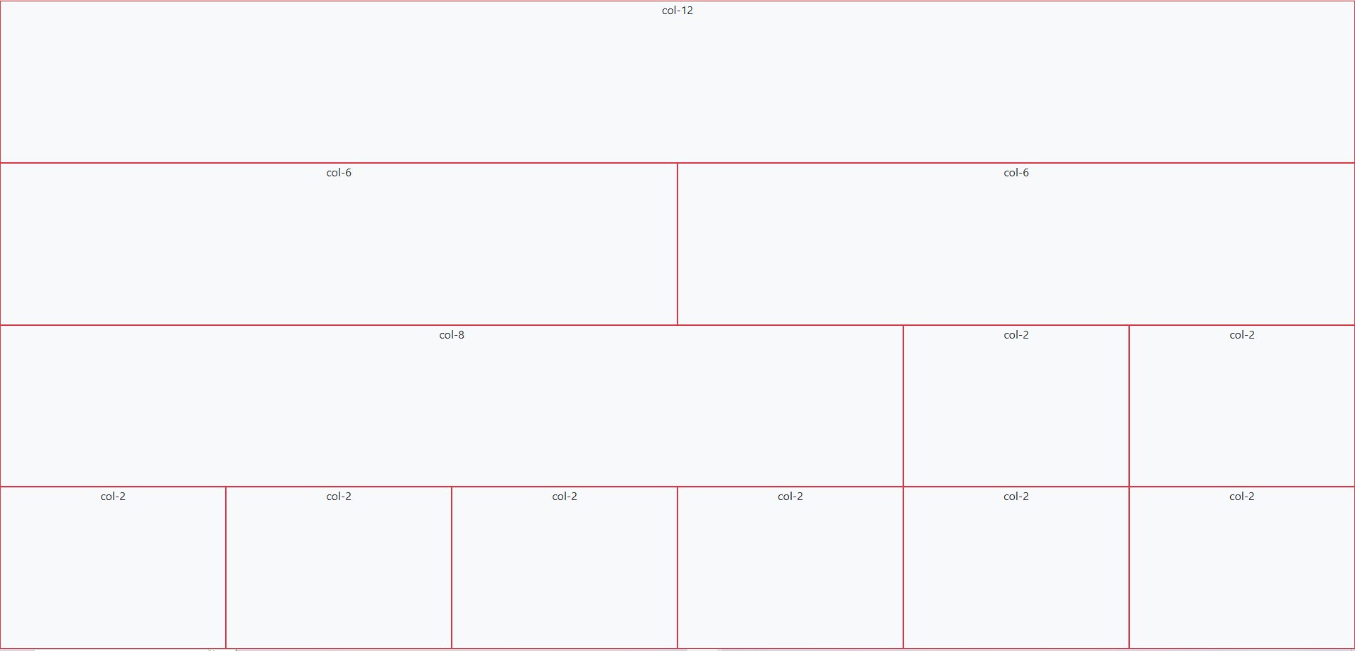
The grid system is a way of laying out HTML elements in terms of rows and columns. By doing so, you ensure that each component containing elements is properly displayed with respect to each other.
Each row takes up its parent’s entire width and has a total of 12 columns, which you can divide in any way you like. For example, if you want three equal-sized columns for a row, you have to change their size to 4 (3 columns x 4 column size = 12 total columns).
On the other hand, each column can have one or more rows. You can also nest these rows and columns together.
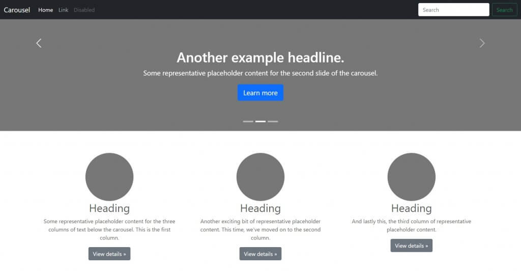
Now, let’s test it out by creating a page with a few rectangles. Try creating some rows and dividing them into columns of varying widths. To discern them from each other, add some background colors as well.
To get started, open your file (in this case, index.html) and add the following code:
<!DOCTYPE html>
<html lang="en">
<head>
<meta charset="UTF-8" />
<meta http-equiv="X-UA-Compatible" content="IE=edge" />
<meta name="viewport" content="width=device-width, initial-scale=1.0" />
<title>How to Use Bootstrap</title>
<!-- Bootstrap 5.3.3 CSS -->
<link
href="https://cdn.jsdelivr.net/npm/bootstrap@5.3.3/dist/css/bootstrap.min.css"
rel="stylesheet"
integrity="sha384-QWTKZyjpPEjISv5WaRU9OFeRpok6YctnYmDr5pNlyT2bRjXh0JMhjY6hW+ALEwIH"
crossorigin="anonymous"
/>
</head>
<body>
<div class="container-fluid bg-light vh-100">
<div class="row h-25">
<div class="col border border-danger text-center">col-12</div>
</div>
<div class="row h-25">
<div class="col-md-6 border border-danger text-center">col-6</div>
<div class="col-md-6 border border-danger text-center">col-6</div>
</div>
<div class="row h-25">
<div class="col-md-8 border border-danger text-center">col-8</div>
<div class="col-md-2 border border-danger text-center">col-2</div>
<div class="col-md-2 border border-danger text-center">col-2</div>
</div>
<div class="row h-25">
<div class="col-md-2 border border-danger text-center">col-2</div>
<div class="col-md-2 border border-danger text-center">col-2</div>
<div class="col-md-2 border border-danger text-center">col-2</div>
<div class="col-md-2 border border-danger text-center">col-2</div>
<div class="col-md-2 border border-danger text-center">col-2</div>
<div class="col-md-2 border border-danger text-center">col-2</div>
</div>
</div>
<!-- Bootstrap 5.3.3 JS bundle (includes Popper) -->
<script
src="https://cdn.jsdelivr.net/npm/bootstrap@5.3.3/dist/js/bootstrap.bundle.min.js"
integrity="sha384-YvpcrYf0tY3lHB60NNkmXc5s9fDVZLESaAA55NDzOxhy9GkcIdslK1eN7N6jIeHz"
crossorigin="anonymous"
></script>
</body>
</html>
First, add Bootstrap (in this case, through Bootstrap CDN). Next up, create a div element with the class “container-fluid,” which wraps site contents in a full-width container.
If you prefer something narrower than a full-width container, use “container” instead.
We also add the “bg-light” and “vh-100” classes to the wrapper. The former is simply for adding a touch of color, while the latter makes the container span the entire height of the screen.
Afterwards, create four rows of equal height (“h-25” allows a row to take up a fourth, or 25%, of the parent element’s height).
Finally, create as many as twelve columns for each row. How you divide it is up to you, but in the example above, you have:
- 1-column row: The first row only has one column. You can use either “col” or “col-12” to allow a column to take up the entire width of the row.
- 2-column row: The second row has two equal-length columns. Hence, each column has the “col-md-6” class.
- 3-column row (unequal lengths): The third row has three columns of varying sizes. The first one is longer (8 columns long), while the other two have an equal length of 2. How you divide the row is up to you, but the total columns per row should be 12.
- 6-column row: The fourth row has six columns of size 2.
To better discern the columns, add a border to each of them by appending the “border border-danger” classes.
The “border” (as the name suggests) class adds a border to an element, while the “border-danger” one adds Bootstrap’s red theme color to it.
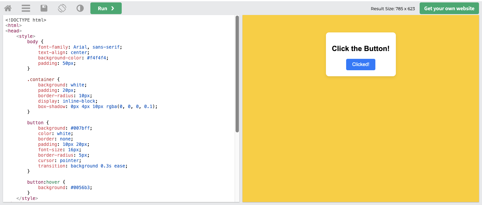
Run the application, and you should see the following screen:
Now, let’s try customizing Bootstrap’s default colors and fonts with some custom CSS.
How to customize colors and fonts
You can override Bootstrap’s default settings with custom CSS and Bootstrap 5.
Bootstrap 5 defines prebuilt CSS variables (–bs-*) for colors, typography, spacing, and more. These variables make overriding Bootstrap styles easier without modifying Bootstrap’s core files.
Overriding these CSS variables changes all elements that use Bootstrap’s default styles to follow your theme, colors, and fonts.
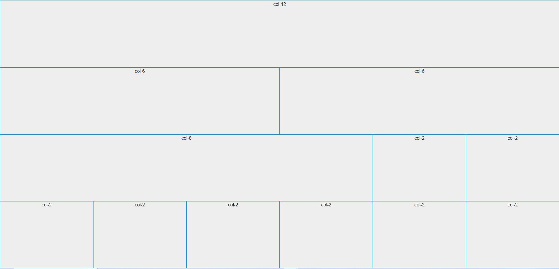
For instance, create a CSS file, include it in your HTML, and insert the following lines of code:
:root {
--bs-light: #eeeeee;
--bs-danger: #01a4f9;
--bs-body-font-family: 'Roboto', sans-serif;
}
.bg-light {
background-color: var(--bs-light) !important;
}
.border-danger {
border-color: var(--bs-danger) !important;
}
The code above defines some CSS variables (e.g., –bs-light) for changing the colors of the “light” and “danger” properties. Moreover, it also changes the default font into “Roboto.”
Note that the colors this code is using are significantly different from the default (whitish gray to slightly darker gray, red to light blue).
Afterwards, the code uses these CSS variables for the “background-color” and “border-color” properties. Now, if you run the application, you should see:
In addition to colors and fonts, you can also use CSS to customize buttons, navbars, forms, dropdown menu, and other components by using the “!important” keyword. This overrides Bootstrap’s default properties.
In summary, to integrate your color scheme and typography, define CSS variables to change the default colors and fonts to your theme’s. Afterwards, you can use these variables across your CSS file together with the “important” keyword.
Now, let’s move into the more advanced Bootstrap customization techniques.
Advanced customization techniques
If you want to go beyond basic CSS customization for Bootstrap, you should try using both Bootstrap JS plugins and Sass.
JS plugins add a bit of animation and interactivity to your components, improving the UX. Sass, on the other hand, provides a more organized way of customizing styles, making it perfect for theming.
Modifying Bootstrap components with Sass
Sass (Syntactically Awesome Stylesheets) is a CSS preprocessor that allows you to write cleaner styles more efficiently. The Bootstrap framework is built on Sass, which means that you can easily customize its components and styles to match your needs.
The best part is you don’t have to manually override styles using CSS like we did in the previous section.
Note: Sass requires that you get the entire library using NPM or local installation. Bootstrap Sass won’t work if you’re using the CDN.
Let’s start setting up Sass. First, go to your project directory and run the following line:
npm install -g sass
This command installs the Sass compiler in your directory, allowing you to use Sass commands.
Afterwards, create a new folder in your root and name it “scss” or something similar. In this new folder, create a file called “custom.scss.”
Here, you’re creating your own stylesheet that imports Bootstrap instead of modifying Bootstrap’s core files. This is because Bootstrap does not recommend modifying its core files.
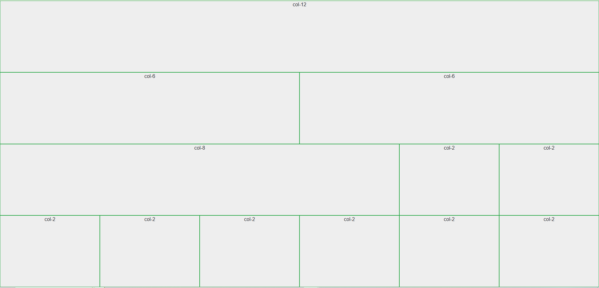
Open your “custom.scss” file and add the following lines:
$light: #eeeeee;
$danger: #28a745;
$font-family-base: 'Roboto', sans-serif !default;
@import "../node_modules/bootstrap/scss/bootstrap";
Here, you’re defining new colors for the “light,” “danger,” and “font-family-base” CSS properties. This step is similar to what you did in the previous section, albeit easier. This code also uses a different “danger” color from earlier.
Lastly, import the Bootstrap components at the end of the SCSS file. Bootstrap recommends importing only what you need, but for simplicity, the code above imports the entire library.
Afterwards, in your CLI, move up to the “scss” folder and run the following line:
sass custom.scss custom.css
This command essentially tells the Sass compiler to compile our “custom.scss” file into CSS, specifically with the filename “custom.css.” Afterwards, you should see the newly generated “custom.css” file in your “scss” folder.
For the next step, since you’re creating your own stylesheet that imports Bootstrap, you won’t need the Bootstrap CSS link in your HTML file anymore. In your index.html, replace the head contents with:
<head>
<meta charset="UTF-8" />
<meta http-equiv="X-UA-Compatible" content="IE=edge" />
<meta name="viewport" content="width=device-width, initial-scale=1.0" />
<title>Sample Bootstrap App</title>
<!--<link rel="stylesheet" href="node_modules/bootstrap/dist/css/bootstrap.min.css">-->
<!--<link href="styles.css" rel="stylesheet">-->
<link rel="stylesheet" href="scss/custom.css">
</head>
Note that the previous links (to the Bootstrap files and the custom stylesheet) are now commented so that you can use the new CSS file that you compiled from SCSS beforehand.
Run the application, and you should see the following changes:
Using Bootstrap’s JavaScript Plugins
Bootstrap provides different JavaScript plugins to add interactivity and animation to your projects. These JS plugins include:
- Modal: These are pop-up dialogs that you can use to display information, policies or terms of use, and forms. These usually include a title, body, and footer.
- Tooltips & Popovers: Plugins that show additional information on mouse hover (tooltips) or click (popovers). These can have either only text or a pair of title and text.
- Toast: Use these when you want to display stylized notifications easily. These also typically include a header and a body.
- Collapse: Plugins that create toggleable elements. These keep the application looking clean, hiding and showing elements that could clutter the display on smaller screens.
- Carousel: These are responsive image sliders. They usually come with a title, body, image, and a pair of “next” and “previous” buttons for going through the media files.
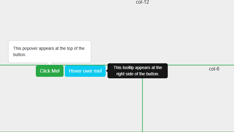
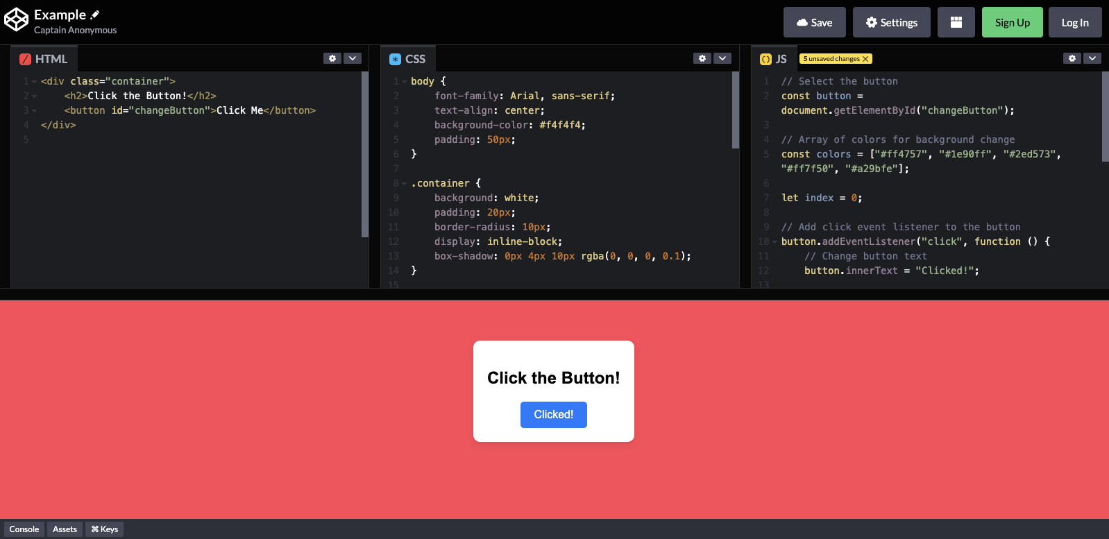
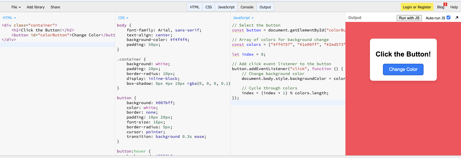
Let’s try using a tooltip and popover. In your index.html file, pick any column from any row and add the following lines of code:
<button type="button" class="btn btn-danger text-white" data-bs-container="body" data-bs-toggle="popover" data-bs-placement="top" data-bs-content="This popover appears at the top of the button.">
Click Me!
</button>
<button type="button" class="btn btn-info text-white" data-bs-toggle="tooltip" data-bs-placement="right" data-bs-title="This tooltip appears at the right side of the button.">
Hover over me!
</button>
This code adds two buttons: one for triggering the popover event and another for the tooltip event. Specify the type of data toggle using the “data-bs-toggle” property, then specify the placement of the tooltip and popover.
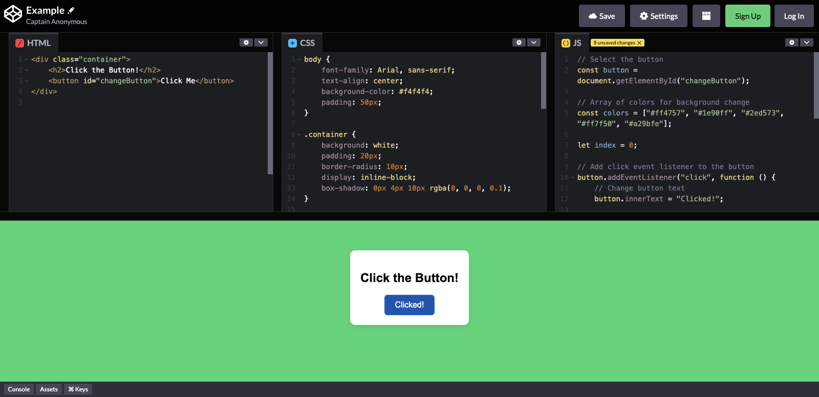
Afterwards, after the Bootstrap script near the bottom of the body, add the following lines:
<script>
const popoverTriggerList = document.querySelectorAll('[data-bs-toggle="popover"]');
const popoverList = [...popoverTriggerList].map(popoverTriggerEl => new bootstrap.Popover(popoverTriggerEl));
const tooltipTriggerList = document.querySelectorAll('[data-bs-toggle="tooltip"]');
const tooltipList = [...tooltipTriggerList].map(tooltipTriggerEl => new bootstrap.Tooltip(tooltipTriggerEl));
</script>
What this code does is initialize both the popover and tooltip trigger lists, enabling them for the page. Run the application to see the two new buttons that show a tooltip when hovered and a popover when clicked:
These components are already cool, but you can take it up a notch by customizing them further using data attributes and JavaScript.
For example, you can use data attributes to change the behavior of the popover button, shown in the code below:
<button type="button" class="btn btn-danger text-white"
data-bs-container="body"
data-bs-toggle="popover"
data-bs-placement="top"
data-bs-config='{"animation": false, "delay": {"show": 500, "hide": 100}}'
data-bs-content="This popover appears at the top of the button.">Click Me!</button>
This removes Bootstrap’s default animation for the popover. Instead, it will show the popover after 500ms without the fade-in effect. Note that to use the “data-bs-config,” you need to modify your popover and tooltip script into something like:
document.addEventListener("DOMContentLoaded", function () {
const popoverTriggerList = document.querySelectorAll('[data-bs-toggle="popover"]');
popoverTriggerList.forEach((popoverTriggerEl) => {
const config = JSON.parse(popoverTriggerEl.getAttribute("data-bs-config"));
new bootstrap.Popover(popoverTriggerEl, config);
});
const tooltipTriggerList = document.querySelectorAll('[data-bs-toggle="tooltip"]');
tooltipTriggerList.forEach((tooltipTriggerEl) => {
new bootstrap.Tooltip(tooltipTriggerEl);
});
});
On the other hand, you can use JavaScript to change the behavior of the plugins. For instance, to dynamically update the tooltip options, replace the tooltip script with:
document.addEventListener("DOMContentLoaded", function () {
const tooltipTriggerList = document.querySelectorAll('[data-bs-toggle="tooltip"]');
tooltipTriggerList.forEach((tooltipTriggerEl) => {
const tooltip = new bootstrap.Tooltip(tooltipTriggerEl);
tooltipTriggerEl.addEventListener("mouseenter", function () {
tooltip.setContent({ '.tooltip-inner': "New Tooltip Text!" });
tooltip.update();
});
});
});
This code dynamically replaces the contents of the tooltip on DOM load.
That’s all we need to discuss in this article about using Bootstrap’s most common features. But before you go, why not talk about another suitable Bootstrap implementation for React apps?
Common Bootstrap errors & how to fix them
Even when you know how to use Bootstrap, a few common setup issues can cause components to break or behave unexpectedly. Here are the most frequent problems developers run into, and how to fix them quickly.
1. Tooltips or popovers not working
Problem: Tooltips, popovers, or dropdowns don’t appear when expected.
Cause: Bootstrap’s JavaScript plugins require manual initialization.
Fix: Ensure you initialize them after the DOM loads:
document.addEventListener("DOMContentLoaded", function () {
document.querySelectorAll('[data-bs-toggle="tooltip"]').forEach(
el => new bootstrap.Tooltip(el)
);
});
Also confirm you’re using bootstrap.bundle.min.js, which includes Popper.
2. JavaScript imported twice
Problem: Modals open twice, animations behave oddly, or console warnings appear.
Cause: Bootstrap JS is loaded more than once (e.g., via CDN and NPM).
Fix: Import Bootstrap JavaScript only once—either:
- via CDN or
- via NPM/bundler (import ‘bootstrap/dist/js/bootstrap.bundle.min.js’)
Never mix both approaches in the same project.
3. Missing Popper (older Bootstrap versions)
Problem: Dropdowns or popovers fail in Bootstrap 4 or earlier.
Cause: Popper.js is required but not included.
Fix:
- For Bootstrap 5: Always use bootstrap.bundle.min.js (Popper included).
- For Bootstrap 4: Add Popper manually before Bootstrap JS.
4. Styles not applying as expected
Problem: Bootstrap classes appear correct, but styles don’t apply.
Cause: Custom CSS overrides Bootstrap unintentionally.
Fix:
- Check CSS load order (Bootstrap first, custom CSS after).
- Avoid overusing !important.
- Use Bootstrap utility classes before writing custom overrides.
5. Components not responsive
Problem: Layout breaks on mobile or tablet screens.
Cause: Missing viewport meta tag or incorrect grid usage.
Fix: Ensure this tag exists in your <head>:
<meta name="viewport" content="width=device-width, initial-scale=1">
Also, verify correct breakpoint classes (col-md-*, col-lg-*, etc.).
React Bootstrap: an alternative for React apps
Bootstrap, as it is, works well with React apps. But if you want something that works more like React, then you should consider using React Bootstrap. Let’s quickly explore what it is and what makes it different below.
What is React Bootstrap?
React Bootstrap is a popular front-end framework from an open-source community. Although not officially from the Bootstrap team, it is perfect for React apps because it doesn’t rely on direct DOM manipulation.
Instead, it’s built on React components, ensuring better compatibility with React’s virtual DOM and state management. So, instead of using syntax like “<button class=’btn btn-primary’>…,” you would use something like “<Button variant=’primary’>Primary</Button>.”
Key differences between traditional and React Bootstrap
- Component-based Approach: React Bootstrap provides pre-built React components like <Button> and <Form> instead of using HTML and class-based Bootstrap components.
- No jQuery Dependency: Bootstrap 4 required jQuery for some interactive features. Bootstrap 5 removes this dependency and uses plain JavaScript instead. On the other hand, React Bootstrap relies on React itself, reducing unnecessary dependencies.
- Better Integration with React Apps: React Bootstrap components support props, state management, and lifecycle methods, allowing more flexibility to ensure proper rendering.
Best practices for using Bootstrap
Using Bootstrap is easy, even if you are a beginner. However, beginner or not, developers should always research and consider the best practices when using Bootstrap. By doing so, you can avoid future headaches like security breaches, obsolescence, and performance issues.
Here are two important things to consider for Bootstrap:
Keep Bootstrap updated
Regularly updating Bootstrap ensures access to the latest features, performance improvements, and security patches. Outdated versions may have vulnerabilities or lack support for modern web standards.
Just be sure to check the documentation pages first before updating to the latest. Bootstrap could change some syntax on their next update, possibly breaking some existing code if not thoroughly checked. For example, “text-start” and “text-end” used to be “text-left” and “text-right” a few years ago.
Optimize Bootstrap for performance
- Minimize CSS and JS files: Use only the necessary Bootstrap components by customizing builds. You can also use other third-party tools to help remove unused styles.
- Use only necessary components: As briefly stated earlier, instead of importing the entire Bootstrap library, import individual components to reduce bundle size and improve loading times.
Conclusion
And that’s it! You now have some basic understanding of how Bootstrap works. Additionally, you’re now equipped to customize it to suit your applications.
Experimenting with different customization options will help tailor Bootstrap to specific project needs.
So, how do you find Bootstrap so far? Did you play around with the different components and customization settings? Share your experiences and tips on using Bootstrap in the comments!
FAQs
1. How do beginners start learning how to use Bootstrap?
Beginners can start learning how to use Bootstrap by adding it via the Bootstrap CDN and experimenting with the grid system, utility classes, and common components like buttons and cards.
2. Do I need JavaScript to use Bootstrap effectively?
No. You can use Bootstrap’s layout, grid, and styling features without JavaScript. JavaScript is only required for interactive components like modals, tooltips, and dropdowns.
3. What is the best way to customize Bootstrap for real projects?
For simple projects, custom CSS and CSS variables are enough. For larger projects, using Bootstrap with Sass via NPM provides better control and scalability.


 4. Set:


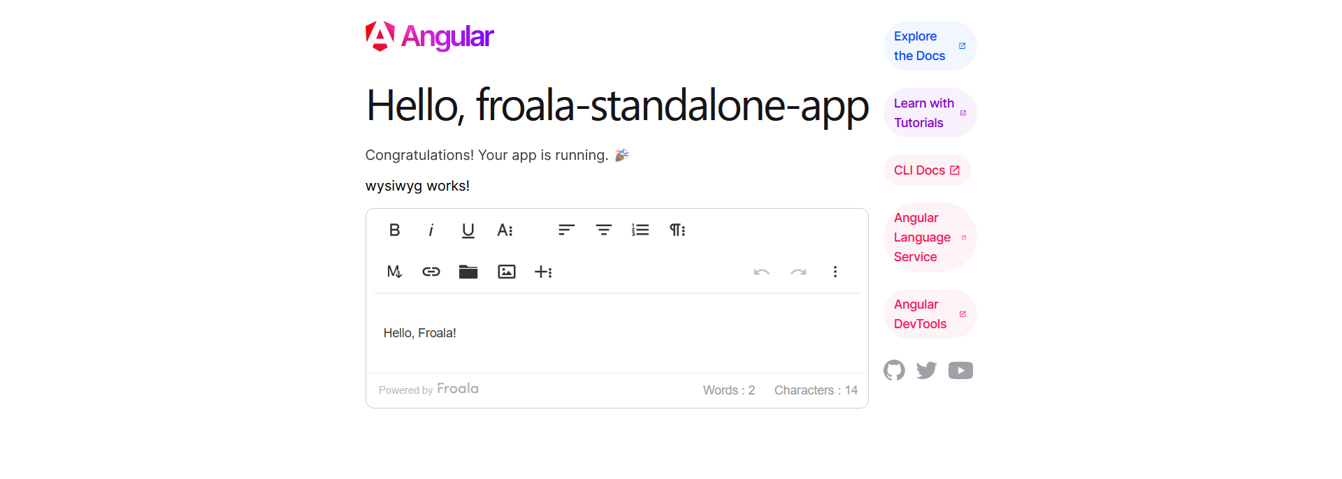
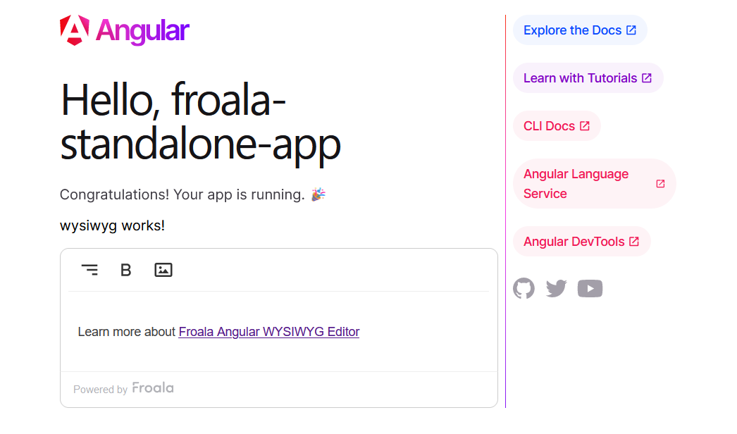
 Froala Editor 4.1 now fully supports Angular, providing seamless integration with the framework. Developers can benefit from improved compatibility and create engaging content using Froala and Angular.


 Why should you consider Froala for online document editor applications?


 Reaching the top is hard, but staying there is harder. That’s why we periodically release a new Froala Editor version every 30 – 45 days. Being


 Simditor –


