Days
Hours
Minutes
Seconds
x

New Froala Editor v4.5.1 is here – Learn More

Skip to content

Angular CMS Development: Integrate Froala WYSIWYG Editor

Angular CMS

With a Content Management System (CMS), you can easily create, modify, manage, and publish content in a user-friendly way. Starting with HTML to add text, forms, images, navigation bars, and other essential website components is straightforward. That’s why having a secure, intelligent, fast, and robust HTML code writer is crucial.

Froala, the next-generation WYSIWYG HTML code writer, has become a go-to solution for users, enabling them to shape content without diving into intricate code. This editor seamlessly integrates with any framework like React, Vue, Angular, etc., providing rich text editing capabilities for your CMS.

This article will explore how you can use the WYSIWYG HTML code writer to build a feature-rich CMS using Angular and integrate Froala’s HTML code writer for a modern design and more customizable experience.

What is a Content Management System (CMS)?

A CMS is software that helps you create, organize, and modify website content, such as text, images, and videos, without having any technical knowledge. Moreover, it provides tools for user management and collaborative workflows and offers features for version controls and scheduling content publication. Some Popular CMS systems include WordPress, Joomla, Drupal, etc.

HTML Code Writer For Seamless CMS Development

The role of a WYSIWYG HTML editor in CMS development is paramount. WYSIWYG, or What You See Is What You Get, editors are instrumental in simplifying content creation within a CMS. An intuitive WYSIWYG HTML editor is a crucial component of a CMS that allows seamless content creation, enhances user experience, and enables efficient content management without requiring coding skills.

The following section will explore building a CMS using Froala, a WYSIWYG HTML editor. We are choosing Froala for CMS development because its developer-friendly feature makes it easy to integrate with multiple frameworks, including angular, and allows developers to create and modify content with more control.

How to Build a CMS with Froala using Angular?

Make your CMS development easier, flexible, robust, and faster by integrating Froala with Angular. This powerful combination offers a sophisticated platform for building a feature-rich Content Management System, blending Froala’s intuitive design with the robust capabilities of Angular for a seamless development experience with our angular rich text editor.

Prerequisites

Before starting, you will need

  • Node.js and npm: Visit Node.js site to get the latest version of Node.js. Note that npm comes as a part of the package with node.js.
  • Angular CLI: Launch the command prompt of the terminal to set up the Angular CLI on your machine. Run the command below:
npm install -g @angular/cli
  • Visual Studio Code: A text editor for building and compiling the code.

Step 1: Setup the Angular Project

First of all, open the terminal in the Visual Studio Code and set up your AngularJS project by running the following command.

ng new my-app

Angular project

After that, navigate to your app folder.

cd my-app

Step 2: Install and Integrate the Froala Editor

Now, let’s install the Froala Editor.

npm install angular-froala-wysiwyg --save

Once it’s installed, you need to import the Froala Editor module into your Angular module. Open ‘src/app/app.module.ts’ file and add the following code.

import { FroalaEditorModule, FroalaViewModule } from 'angular-froala-wysiwyg';

@NgModule({
declarations: [
// your components here
],
imports: [
FroalaEditorModule.forRoot(),
FroalaViewModule.forRoot(),
// other modules here
],
bootstrap: [AppComponent],
})
export class AppModule {}

Step 3: Create a Content Management System (CMS)

Here we will create a content management system using AngularJS and Flora with the help of multiple components.

Create an Editor Component

In the terminal of VS Code, run the following to create an editor component. This will create a new folder named ‘editor’ with the necessary files.

ng generate component editor

Angular editor component

Open ‘src/app/editor/editor.component.html’ and add the Froala Editor.

<div [froalaEditor]></div>

Now, in your ‘src/app/app.component.html’ file, replace the existing content with:

<header>

<div class="header-content">

<h1>Content Management System</h1></div>

</header>

<app-editor></app-editor>

Add the following design code for the header in the ‘src/app/app.component.css’ file.

header {
background-color: #f0f0f0; /* Add your desired background color */
padding: 10px;
}.header-content {
text-align: center;
}h1 {
margin: 0;
}

 Create a Service for Data Management

Now, let’s add the ability to save the content entered in the Froala Editor. We’ll create a service to handle data management. First, create a new service.

ng generate service content

This will create a file named ‘content.service.ts’ in the src/app folder.

Angular service

Open ‘src/app/content.service.ts’ and add the following:

import { Injectable } from '@angular/core';
import { BehaviorSubject } from 'rxjs';

@Injectable({
  providedIn: 'root',
})
export class ContentService {
  private contentSubject = new BehaviorSubject<string>('');

  getContent() {
    return this.contentSubject.asObservable();
  }

  updateContent(content: string) {
    this.contentSubject.next(content);
  }
}

 Modify Editor Component

Now, let’s modify our ‘editor.component.ts’ to use this service.

import { Component, OnInit } from '@angular/core';
import { ContentService } from '../content.service';

@Component({
  selector: 'app-editor',
  templateUrl: './editor.component.html',
  styleUrls: ['./editor.component.css'],
})
export class EditorComponent implements OnInit {
  
  content: string = '';
  
  constructor(private contentService: ContentService) {}

  ngOnInit() {}

  onContentChanged(content: string) {
    this.contentService.updateContent(content);
  }
}

Update ‘editor.component.html’ to pass the content to the service when it changes:

<div [froalaEditor] [(froalaModel)]="content" (froalaModelChange)="onContentChanged($event)"></div>

 Create a Viewer Component

Now, let’s create a new component to display the saved content. Run:

ng generate component viewer

Angular Viewer

Open ‘src/app/viewer/viewer.component.ts’ and add the following code.

import { Component, OnInit } from '@angular/core';
import { ContentService } from '../content.service';

@Component({
  selector: 'app-viewer',
  templateUrl: './viewer.component.html',
  styleUrls: ['./viewer.component.css'],
})
export class ViewerComponent implements OnInit {
  content: string = '';

  constructor(private contentService: ContentService) {}

  ngOnInit() {
    this.contentService.getContent().subscribe((content) => {
      this.content = content;
    });
  }
}

Update ‘viewer.component.html’ to display the content.

<div [froalaView]="content"></div>

Now, update ‘app.component.html’ to include both the editor and the viewer.

<header>
  <div class="header-content">
  <h1>Content Management System</h1></div>
</header>

<app-editor></app-editor>
<app-viewer></app-viewer>

Step 4: Run the CMS Application

Start your Angular development server using the command:

ng serve

Now go to http://localhost:4200 and check your application running on the following port.

Froala runing in Angular

The CMS application has been successfully built and running.

Step 5: Test the Data Management on CMS

To test the data storage and display on the screen using the viewer component, we have to pass some text in the text field shown above in the CMS dashboard. Let’s write some text and test.

Angular WYSIWYG editor

As the data is displayed in the screen below the dashboard, the CMS has been successfully tested and displaying the correct data.

Make CMS Development Fast, Robust, and Secure with Froala WYSIWYG HTML Editor

Froala is a WYSIWYG HTML editor that, when combined with Angular, enables seamless CMS development. This collaboration, combining Froala’s user-friendly interface and rich features with Angular’s capabilities, provides developers with a toolkit for crafting efficient and customizable CMS solutions.

With Froala, you can format text, put in images, and include different things easily. Your CMS becomes more than just plain text—it can have lists, pictures, and more. You can adjust it to fit what you need for your CMS, making it simple and good for users.

Get started with Froala today for seamless CMS development!

Learn to Integrate Froala Visual HTML Editor into Your NodeJS App

Froala in NodeJS and Express

NodeJS is a popular runtime environment that allows you to run JavaScript on the server side. It offers various frameworks to build web applications, and one of the most popular
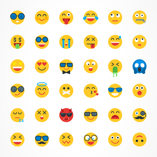
 ones is Express. In this tutorial, we will learn how to integrate Froala, a powerful visual HTML editor, into a NodeJS application built with Express. Froala provides an easy-to-use interface for users to create and edit rich text content.

Before diving in, we assume you have a working knowledge of:

  • JavaScript
  • NodeJS and npm
  • Express Framework
  • How to use the terminal/command line

Create a new NodeJS app

To create a new NodeJS app, open your terminal or command line and navigate to the desired directory where you want to create your app. Then, run the following command:

npm init

This will initialize a new NodeJS project inside the selected directory. You will be prompted with some questions for filling the `package.json` file. Accept the default values except for “main”, which we will set to “app.js”.

Install Dependencies

Next, we need to install the Express framework, Embedded JavaScript templates (EJS), and Froala WYSIWYG editor

Run the following command:

$ npm install froala-editor ejs express

This will install the required dependencies for our NodeJS application. Once the installation is complete, we can proceed to integrate Froala visual html editor into our Express application.

Set up the Express application

First, let’s create a new file named “app.js” in the root directory of our project. This file will serve as the entry point for our Express application.

Open “app.js” in your preferred text editor and add the following code:

var express = require('express');

var app = express();

// Set EJS as the view engine
app.set('view engine','ejs');

//Froala editor CSS & JS files
app.use('/froalacss',express.static(__dirname+'/node_modules/froala-editor/css/froala_editor.pkgd.min.css'));
app.use('/froalajs',express.static(__dirname+'/node_modules/froala-editor/js/froala_editor.pkgd.min.js'));

// Define routes 
app.get('/',(req,res)=>{
 res.render('editor');
});

var port = process.env.PORT || 3000;
app.listen(port,()=>console.log('server run at port '+port));

In the above file, we first import the Express framework and an instance of it using the `express()` function.

Next, we set EJS as the view engine by using the `app.set()` method.

Then, we use the `app.use()` method to serve the Froala editor CSS and JS files as static files.

After that, we define a route for the root URL (“/”) and render the “editor” view using the `res.render()` method.

Finally, we set the port for the server to listen on and start the server using the `app.listen()` method.

Create the views

Next, let’s create the views for our application. Inside the root directory of your project, create a new directory called “views”. Inside the “views” directory, create a new file called “editor.ejs”.

Open “editor.ejs” in your preferred text editor and add the following code:

<!DOCTYPE html>
<html lang="en">
<head>
    <meta charset="UTF-8">
    <meta name="viewport" content="width=device-width, initial-scale=1.0">
    <meta http-equiv="X-UA-Compatible" content="ie=edge">
    <link rel="stylesheet" href="/froalacss">
    <script src="/froalajs"></script>
    <title>Document</title>
</head>
<body>
    <h1>Froala Editor</h1>
    <textarea id="example"></textarea>
    <script>
            var editor = new FroalaEditor("#example");
     </script>
</body>
</html>

In the above file, we create a basic HTML structure with a title and a heading. We include the Froala editor CSS file and the Froala editor JS file using the `<link>` and `<script>` tags respectively. Inside the body, we create a textarea element with the id “example”. Finally, we initialize the Froala editor by creating a new instance of the FroalaEditor class and passing in the textarea element’s id as a parameter.

Test the application

To test the application, run the following command in your terminal or command line:

$ node app.js

This will start the server and your application will be accessible at `http://localhost:3000\`.

You should be able to see the Froala Editor interface with a textarea where you can create and edit rich text content. You can test the functionality of the editor by typing in the textarea and applying various formatting options provided by Froala.

Congratulations! You have successfully integrated Froala into your NodeJS application built with Express.

Customize The Froala Editor

One benefit of using Froala editor rather than other WYSIWYG editors is its extensive customization options. Froala allows you to tailor the editor to fit the specific needs of your application.

To customize the Froala editor, you can modify the initialization code in the “editor.ejs” file. The FroalaEditor class accepts an options object as a parameter, where you can specify various configuration settings.

For example, you can customize the toolbar buttons by setting the “toolbarButtons” property. You can choose which buttons to include in the toolbar and in what order they should appear.

Here’s an example of how you can customize the toolbar buttons:

            var editor = new FroalaEditor("#example", {

             toolbarButtons: ['bold', 'italic', 'underline', 'strikeThrough', 'subscript', 'superscript', 'fontFamily', 'fontSize', 'color', 'backgroundColor', 'align', 'formatOL', 'formatUL', 'indent', 'outdent', 'insertImage', 'insertLink', 'insertTable', 'insertVideo', 'undo', 'redo']

              });

In the above example, we set the “toolbarButtons” property to an array of button names. This will customize the toolbar to only include the specified buttons.

You can explore the Froala documentation to find more customization options and configure the editor according to your requirements.

froala nodejs sdk

Uploading Images, Videos, and Files

To upload images, videos, and files using Froala, we need to make some changes to our existing code. For simpification Froala provides NodeJS SDK to handle file uploads. We will cover how to use the Froala NodeJS SDK in another article.

Do I need to Secure the Froala integration?

Froala WYSIWYG HTML Editor has robust XSS attack prevention. Generally, you won’t have to worry at all about this, however, additional server-side checks are recommended.

Conclusion

We have successfully integrated the Froala editor into our NodeJS application built with Express. We have created the necessary files and views, tested the application, and explored customization options for the editor. We have also discussed the possibility of uploading images, videos, and files using the Froala NodeJS SDK. The editor also provides a strong defense against XSS attacks, ensuring the security of your application. So why wait? Start integrating Froala into your NodeJS application today and take your content editing experience to the next level.

Improve React Project Engagement: Custom Emoticons with HTML Editor Software

Froala custom emoticons

In 2023, having an engaging user interface is crucial for keeping people interested. One effective way to enhance user experience is by incorporating emoticons into your application.

Emoticons, or emojis, have evolved from being mere embellishments to essential elements in development. They play a significant role in enhancing communication across platforms.

Emoticons are important because they help us express ourselves and engage users more effectively. They personalize messages, making communication more relatable and engaging.

Additionally, emoticons serve as a universal language, boosting branding efforts by adding a visual element to text, making content more compelling.

They also contribute to storytelling by conveying emotions and context within limited space. Integrating emoticons using advanced HTML editor software can significantly elevate your application’s user interface and overall experience.

The Froala WYSIWYG editor lets you do this with its Custom Emoticons feature. In the blog post, we will explore how to integrate Froala Custom Emoticons into a React project with our versatile react rich text editor.

Froala HTML Editor Software Custom Emoticons

Take a moment to see how Froala Custom Emoticons can help your application. Froala is a tool that helps developers make advanced text editors for web apps.

Users can add their own emoticons or emojis using the Custom Emoticons feature, expanding the editor’s capabilities.

Users can use Custom Emoticons to add their own personal touch to messages, instead of using the standard emojis.

Prerequisites

Before we start, make sure you have the following prerequisites installed:

  • Node.js and npm (Node Package Manager): Ensure that you have Node.js installed on your machine.
  • Create React App: Install Create React App globally using the following command:
npm install -g create-react-app

Now that we have the prerequisites in place, let’s proceed with the integration.

Setting Up a React Project

To get started, create a new React project using the Create React App. Open your terminal and run the commands:

npx create-react-app froala-custom-emoticons-demo

cd froala-custom-emoticons-demo

This will create a new React project named froala-custom-emoticons-demo and navigate into its directory.

Installing Froala Editor

To use Froala Custom Emoticons in our React project, we need to install the Froala Editor package. In your project directory, run the command:

npm install react-froala-wysiwyg --save

This package provides a React wrapper for the Froala Editor, making it easy to integrate into our application.

Integrating Froala Editor

Now that we have the Froala Editor installed, let’s integrate it into our React project. Open the “src/App.js” file in your code editor and replace its contents with the following code:

import './App.css';

import FroalaEditorComponent from "react-froala-wysiwyg";

import "froala-editor/css/froala_style.min.css";

import "froala-editor/css/froala_editor.pkgd.min.css";

import "froala-editor/js/plugins.pkgd.min.js";

function App() {

  let model = '<p><a href="https://froala.com">Froala WYSIWYG Editor</a></p>';

  return (

    <div id="froala-editor">

      <h1>Froala</h1>

      <FroalaEditorComponent

        tag="textarea"

        model={model}

        config={{

        }}

      />

    </div>

  )

}

export default App;


  1. The import App.css statement imports the styles specific to the App component.
  2. FroalaEditorComponent is a React component provided by the “react-froala-wysiwyg” package.
  3. The next 3 lines are about importing the Froala editor styles and plugins.
  4. The App function is a functional React component.
  5. The model variable contains the initial content of the Froala editor. It’s a simple HTML string with a link.
  6. Inside the return statement, there’s a div with the id “froala-editor” and an h1 element with the text “Froala.”
  7. The FroalaEditorComponent is used to render the Froala editor. It is configured to use a textarea as its underlying element (tag=”textarea”), and the initial content is set using the model prop.
  8. The App component is exported as the default export of this module.

emoticons in React

Using Custom Emoticons in Froala Editor

Froala Editor provides flexibility in customizing the display of emoticons. The following code must be put on the config part.

In the toolbarButtons define the button emoticons.

You can control how many emoticons show up in each row of the emoticons menu by using the emoticonsStep property in the FroalaEditor component’s config prop.

The emotionsSet allows you to personalize the emotions displayed.

       toolbarButtons: ["emoticons"],

          emoticonsStep: 4,

          emoticonsSet: [{

            id: 'people',

            name: 'Smileys & People',

            code: '1f600',

            emoticons: [

             { code: '1f600', desc: 'Grinning face' },

             { code: '1f601', desc: 'Grinning face with smiling eyes' },

             { code: '1f602', desc: 'Face with tears of joy' },

             { code: '1f603', desc: 'Smiling face with open mouth' },

             { code: '1f604', desc: 'Smiling face with open mouth and smiling eyes' },

            { code: '1f605', desc: 'Smiling face with open mouth and cold sweat' },

             { code: '1f606', desc: 'Smiling face with open mouth and tightly-closed eyes' },

       { code: '1f607', desc: 'Smiling face with halo' }

            ]

            }, {

            id: 'nature',

            name: 'Animals & Nature',

            code: '1F435',

            emoticons: [

              { code: '1F412', desc: 'Monkey' },

              { code: '1F415', desc: 'Dog' },

              { code: '1F429', desc: 'Poodle' },

              { code: '1F408', desc: 'Cat' },

              { code: '1F405', desc: 'Tiger' },

              { code: '1F406', desc: 'Leopard' },

              { code: '1F40E', desc: 'Horse' },

              { code: '1F402', desc: 'Ox' },

              { code: '1F403', desc: 'Water Buffalo' },

            ]

          }]

        }}

Here’s an explanation:

  1. toolbarButtons: [“emoticons”]: This adds an “emoticons” button to the toolbar, indicating that users can interact with emoticons.
  2. emoticonsStep: 4: This is related to some intervals for emoticons.
  3. emoticonsSet: An array containing sets of emoticons. In this case, there are two sets: “Smileys & People” and “Animals & Nature”.
  4. For “Smileys & People” (id: ‘people’):
    • code: ‘1f600’: Identifier for this set.
    • emoticons: An array of objects, each representing an emoticon with a code (e.g., ‘1f600’) and a description of the emoji (‘Grinning face’, ‘Grinning face with smiling eyes’, ‘Face with tears of joy’, ‘Smiling face with open mouth’, ‘Smiling face with open mouth and smiling eyes’, ‘Smiling face with open mouth and cold sweat’, ‘Smiling face with open mouth and tightly-closed eyes’, ‘Smiling face with halo’).
  1. For “Animals & Nature” (id: ‘nature’):
    • code: ‘1F435’: Another identifier for this set.
    • emoticons: Array of objects, each representing an animal or nature-related emoticon (‘Monkey’, ‘Dog’, ‘Poodle’, ‘Cat’, ‘Tiger’, ‘Leopard’, ‘Horse’, ‘Ox’, ‘Water Buffalo’).

Running the React App

Now that we’ve set up the Froala Editor in our React project, let’s run the application and see our Custom Emoticons in action. In your terminal, run the following command:

npm start

This will start the development server, and you can view your React app by navigating to http://localhost:3000 in your web browser.

Add emoticons in React

Conclusion

This article shows how to add Froala Custom Emoticons to a React project. It makes communication more expressive and personal.

You can make a text editor with lots of features. Users can add their own emoticons, which makes the app more fun and interactive.

Froala Editor has many features for developers, like Custom Emoticons.

As you work on your React project, try using Froala Editor to improve your web app’s features and user experience.

Creating a Rich Text Form in NextJS Using an Online JavaScript Editor

NextJS rich text forms

NextJS is a powerful React framework that enables developers to build server-side rendered and static web applications with ease. An online JavaScript editor, like Froala, is a highly customizable, rich-text editor for web and mobile applications. When these two powerful tools are combined, they provide an efficient way to create dynamic, rich-text forms for your web application. In this simple tutorial, we will walk you through building a Contact Us form in NextJS, finishing with the integration of an online JavaScript editor for users to craft attractive, organized messages. Using an online JavaScript editor ensures a seamless, user-friendly experience, enhancing the overall functionality and aesthetics of your web application.

We will cover the configuration and customization of your rich-text form.

Create a new NextJS project

To create a new NextJS application, run the following NPM command:

npx create-next-app@latest

install nextJS

Answer the prompted questions like:

√ What is your project named? contact-form

√ Would you like to use TypeScript? Yes

√ Would you like to use ESLint? Yes

√ Would you like to use Tailwind CSS? Yes

√ Would you like to use src/ directory? Yes

√ Would you like to use App Router? (recommended) Yes

√ Would you like to customize the default import alias (@/*)? … No

This will scaffold a new NextJS project named “contact-form“ in your current directory. Once created, navigate into your new project by running:

cd contact-form

Creating a simple contact form

In this tutorial, we will use the react-hook-form for creating our form component. The react-hook-form is a lightweight, performant form library for React that leverages the use of hooks. It’s easy to use, requires little boilerplate code, and includes features such as form validation and error handling built right in.

To install react-hook-form, run the following NPM command:

npm install react-hook-form

After installing react-hook-form, let’s create our form component.

  • Create the `components` directory, if it doesn’t exist.
  • Create a new component file named `contact.tsx` Inside the `components` directory.
  • Open the `contact.tsx` using your preferred IDE to start editing it.
  • Since this component will run on the client side not the server side, add the following on the first line:
'use client';
  • react-hook-form provides a form builder that you can use to easily create your form and it will display the component code on the right.

form builder

Use this builder to build the form fields you like to have on your page, then copy the code in the `contact.tsx` file we created. Note that the form code doesn’t have a style for the form, so we will add some Tailwind CSS classes to make the form visually appealing. After all, this how our Contact component code looks like.

'use client';

import React from 'react';
import { useForm } from 'react-hook-form';.

export default function Contact() {

  const { register, handleSubmit, formState: { errors } } = useForm();

  const onSubmit = (data: any) => console.log(data);

  console.log(errors);

  
  return (

    <form

    className="w-full max-w-5xl"

    onSubmit={handleSubmit(onSubmit)}>

      <div className='mb-5'>

        <label

          htmlFor='name'

          className='mb-3 block text-base font-medium text-black'

        >

          Full Name

        </label>

        <input

          type='text'

          placeholder='Full Name'

          className='w-full rounded-md border border-gray-300 bg-white py-3 px-6 text-base font-medium text-gray-700 outline-none focus:border-purple-500 focus:shadow-md'

          {...register('name', { required: true })}

        />

      </div>

      <div className='mb-5'>

        <label

          htmlFor='email'

          className='mb-3 block text-base font-medium text-black'

        >

          Email Address

        </label>

        <input

          type='email'

          placeholder='[email protected]'

          className='w-full rounded-md border border-gray-300 bg-white py-3 px-6 text-base font-medium text-gray-700 outline-none focus:border-purple-500 focus:shadow-md'

          {...register('email', { required: true })}

        />

      </div>

      <div className='mb-5'>

        <label

          htmlFor='Mobile number'

          className='mb-3 block text-base font-medium text-black'

        >

          Mobile number

        </label>

      <input 

       type="tel"

       placeholder="Mobile number"

       className='w-full rounded-md border border-gray-300 bg-white py-3 px-6 text-base font-medium text-gray-700 outline-none focus:border-purple-500 focus:shadow-md'

        {...register("Mobile number", {required: true, minLength: 6, maxLength: 12})}

      />

      </div>

      <div className='mb-5'>

        <label

          htmlFor='message'

          className='mb-3 block text-base font-medium text-black'

        >

          Message

        </label>

        <textarea

          rows={5}

          placeholder='Type your message'

          className='w-full resize-none rounded-md border border-gray-300 bg-white py-3 px-6 text-base font-medium text-gray-700 outline-none focus:border-purple-500 focus:shadow-md'

          {...register('message', { required: true })}

        ></textarea>

      </div>

      <div>

        <button className='hover:shadow-form rounded-md bg-white border py-3 px-8 text-base font-semibold outline-none text-gray-700'>    

          Submit

        </button>

      </div>

    </form>

  );

}

As you can see on the above code, the Contact component will handle the form submission at the moment.

When a user submits the form, the validation starts. If there is a validation error, the errors will be logged on the console. If there are no validation errors, the input data will also be logged on the console. In a real-world application, we will need to change this behavior so the data is sent to the site administrator.

Test The Form

Display the Form in our application

To display the form on the homepage, let’s replace the code on “app/page.tsx” with the following code

import Contact from '@/components/contact';

export default function Home() {

return (

<main className="flex min-h-screen flex-col items-center justify-between p-24">

<Contact />

</main>

)

}

The above code imports the `Contact` component that we just created and renders it in the `Home` component. The Home component is the main component that is displayed when the user lands on the homepage. The `Contact` component is wrapped in the `main` tag, which is styled using Tailwind CSS to center the form on the page.

Run the NextJS app

Now, run the application using the following command:

npm run dev

This will start the Next.js development server.

Result

NextJS form

Open your web browser and navigate to `localhost:3000`. You should now see the contact form on your homepage. Open the browser console, and try submitting the form with different inputs to test the validation. If the validation fails, you will see the error messages logged in the console. If the form is submitted successfully, you will see the form data logged in the console.

The next step will be enhancing the message field to support rich text.

Enhance React Forms by Integrate Froala Rich-text

Now that our basic contact form is working as expected, we can enhance it to enable users to write rich text messages. For this, we will use the Froala WYSIWYG editor. It offers a wide range of features, including text formatting, image and video insertion, tables, and more. Moreover, it is easily integrated with NextJS since it already has a ready React rich-text editor component.

Install Froala Editor React component

First, install the Froala Editor package in your Next.js application using the following command:

npm install react-froala-wysiwyg --save

Import Froala Editor Component and stylesheets

inside “contact.tsx” file, and add

import 'froala-editor/css/froala_style.min.css';

import 'froala-editor/css/froala_editor.pkgd.min.css';

import FroalaEditorComponent from 'react-froala-wysiwyg';

Display the Froala React rich-text editor

Inside the return statement, add the Froala component after the Message field so it appears under it and before the submit button. Update the code as follows:

return (

<form

className="w-full max-w-5xl"

onSubmit={handleSubmit(onSubmit)}

>

<div className='mb-5'>

<label

htmlFor='name'

className='mb-3 block text-base font-medium text-black'

>

Full Name

</label>

<input

type='text'

placeholder='Full Name'

className='w-full rounded-md border border-gray-300 bg-white py-3 px-6 text-base font-medium text-gray-700 outline-none focus:border-purple-500 focus:shadow-md'

{...register('name', { required: true })}

/>

</div>

<div className='mb-5'>

<label

htmlFor='email'

className='mb-3 block text-base font-medium text-black'

>

Email Address

</label>

<input

type='email'

placeholder='[email protected]'

className='w-full rounded-md border border-gray-300 bg-white py-3 px-6 text-base font-medium text-gray-700 outline-none focus:border-purple-500 focus:shadow-md'

{...register('email', { required: true })}

/>

</div>

<div className='mb-5'>

<label

htmlFor='Mobile number'

className='mb-3 block text-base font-medium text-black'

>

Mobile number

</label>

<input

type="tel"

placeholder="Mobile number"

className='w-full rounded-md border border-gray-300 bg-white py-3 px-6 text-base font-medium text-gray-700 outline-none focus:border-purple-500 focus:shadow-md'

{...register("Mobile number", {required: true, minLength: 6, maxLength: 12})}

/>

</div>

<div className='mb-5'>

<label

htmlFor='message'

className='mb-3 block text-base font-medium text-black'

>

Message

</label>

<textarea

rows={5}

placeholder='Type your message'

className='w-full rounded-md border border-gray-300 bg-white py-3 px-6 text-base font-medium text-gray-700 outline-none focus:border-purple-500 focus:shadow-md'

{...register('message', { required: true })}

>

</textarea>

</div>

<div className="mb-5">

<FroalaEditorComponent

tag="textarea"

/>

</div>

<div>

<button className='hover:shadow-form rounded-md bg-white border py-3 px-8 text-base font-semibold outline-none text-gray-700'>

Submit

</button>

</div>

</form>

);

Once you open the webpage, you’ll see the Froala WYSIWYG editor is on the form. You can use it to write and make your text look nice. But, when you send the form, the editor’s content isn’t checked or sent along with it.

Submit Froala editor content along with react-hook-form submitted data in NextJS app

To validate and submit the Froala editor content along with react-hook-form submitted data, we will use the react-hook-form’s `Controller` component. This component is useful for creating a field that updates its value based on an externally controlled component, such as the Froala React rich-text editor component

First, import the `Controller` component:

import { useForm, Controller } from 'react-hook-form';

Then, Add a new variable `control` which will be used with the `Controller` component.

const { register, handleSubmit, control, formState: { errors } } = useForm();

Finally, replace the message field and Froala Editor component code with the `Controller` component :

<div className='mb-5'>

        <label htmlFor='message' className='mb-3 block text-base font-medium text-black'>

Message

</label>

<Controller

name="message"

rules={{ required: true }}

control={control}

defaultValue=""

render={({ field }) => (

<FroalaEditorComponent

tag="textarea"

model={field.value}

onModelChange={field.onChange}

/> )}

/>

</div>

In the `Controller` component:

  • We used the `name` property to identify the data when the form is submitted. The `control` property is used to control the form.
  • We used the rules property to set the validation rules.
  • The `render` method is used to render the editor and connect it with the form. inside it:
    • we used the `field` argument to get the current value and the onChange event of the form field.
    • The `model` property is used to bind the current value to the Froala Editor.
    • The `onModelChange` event is used to update the form field value when the Froala Editor content changes.

This way, the Froala Editor is fully integrated with the form, and its content is validated and submitted along with the other form fields.

Now, when you open the app and submit the form, the content of the Froala Editor will be included in the form data. The error messages, if any, will be displayed in the console.

NextJs rich text form

Customize the editor

To customize the editor toolbar, you can pass an options object to the Froala Editor component. This object should contain the desired configuration options from the Froala API options. Here’s an example:

const options = {

toolbarButtons: [ 'bold', 'italic', 'underline', 'outdent', 'indent', 'undo', 'redo', 'clearFormatting', 'selectAll'  ],

charCounterMax: 140

}

You can then pass the options object to the Froala Editor component’s config property like so:

<FroalaEditorComponent

tag="textarea"

model={field.value}

onModelChange={field.onChange}

config={options}

/>

This will customize the toolbar to only include the specified buttons and set the maximum character count to 140 characters.

Note that some editor buttons and functions require additional plugins to be loaded. You have to import the plugin file

import 'froala-editor/js/plugins/align.min.js';

import 'froala-editor/js/plugins/char_counter.min.js';

Include it in the `pluginsEnabled` option, and add the buttons to be displayed in the `toolbarButtons` option:

const options = {

toolbarButtons: [ 'bold', 'italic', 'underline', 'alignRight', 'alignCenter',  'alignLeft', 'outdent', 'indent', 'undo', 'redo', 'clearFormatting', 'selectAll'  ],

pluginsEnabled: ['align', 'charCounter'],

charCounterMax: 140

}

custom Froala rich text editor in NextJS

Full Code

Here is the complete code of “contact.tsx” component with all the changes:

'use client';

import React from 'react';
import { useForm, Controller } from 'react-hook-form';

import 'froala-editor/css/froala_style.min.css';
import 'froala-editor/css/froala_editor.pkgd.min.css';
import 'froala-editor/js/plugins/align.min.js';
import 'froala-editor/js/plugins/char_counter.min.js';

import FroalaEditorComponent from 'react-froala-wysiwyg';

export default function Contact() {
  const { register, handleSubmit, control, formState: { errors } } = useForm();
  const onSubmit = (data: any) => console.log(data);
  console.log(errors);

  const options = {
    toolbarButtons: [ 'bold', 'italic', 'underline', 'alignRight', 'alignCenter',  'alignLeft', 'outdent', 'indent', 'undo', 'redo', 'clearFormatting', 'selectAll'  ],  
    pluginsEnabled: ['align', 'charCounter'],
    charCounterMax: 140
  } 

return (
    <form
    className="w-full max-w-5xl"
    onSubmit={handleSubmit(onSubmit)}
    >
      <div className='mb-5'>
        <label
          htmlFor='name'
          className='mb-3 block text-base font-medium text-black'
        >
          Full Name
        </label>
        <input
          type='text'
          placeholder='Full Name'
          className='w-full rounded-md border border-gray-300 bg-white py-3 px-6 text-base font-medium text-gray-700 outline-none focus:border-purple-500 focus:shadow-md'
          {...register('name', { required: true })}
        />
      </div>
      <div className='mb-5'>
        <label
          htmlFor='email'
          className='mb-3 block text-base font-medium text-black'
        >
          Email Address
        </label>
        <input
          type='email'
          placeholder='[email protected]'
          className='w-full rounded-md border border-gray-300 bg-white py-3 px-6 text-base font-medium text-gray-700 outline-none focus:border-purple-500 focus:shadow-md'
          {...register('email', { required: true })}
        />
      </div>

      <div className='mb-5'>
        <label
          htmlFor='Mobile number'
          className='mb-3 block text-base font-medium text-black'
        >
          Mobile number
        </label>
      <input 
       type="tel"
       placeholder="Mobile number"
       className='w-full rounded-md border border-gray-300 bg-white py-3 px-6 text-base font-medium text-gray-700 outline-none focus:border-purple-500 focus:shadow-md'
        {...register("Mobile number", {required: true, minLength: 6, maxLength: 12})}

      />
      </div>

      <div className='mb-5'>
      <label
          htmlFor='message'
          className='mb-3 block text-base font-medium text-black'
        >
          Message
        </label>
      <Controller   name="message" rules={{ required: true }}  control={control}   defaultValue=""   render={({ field }) => ( 
            <FroalaEditorComponent 
                    tag="textarea"
                    model={field.value}
                    onModelChange={field.onChange}
                    config= {options}
             /> )}
        />
      </div>

      <div>
        <button className='hover:shadow-form rounded-md bg-white border py-3 px-8 text-base font-semibold outline-none text-gray-700'>
          Submit
        </button>
      </div>
    </form>
  );
}

Concluding Remarks

The Froala WYSIWYG editor provides a rich set of options for text manipulation, and its React component allows for easy integration with your React and NextJS applications. Using the `react-hook-form` library’s `Controller` component, we can seamlessly integrate the Froala editor into a form created using `react-hook-form`, ensuring its content is validated and submitted alongside other form data. With the configuration options provided by the Froala API, we can customize the editor to fit our application’s needs.

Whether you are building a blog, a CMS, or any other application that requires text editing, the Froala WYSIWYG editor is a powerful tool that can enhance your project’s functionality and user experience. Start your free trial now and enable your users to create and manage content in a visually appealing and intuitive way.

Froala 4.1.3 for Enhanced Security and Performance

froala-4-1-3-feature-image

We are always trying to make web writing tools better, and we stress how important it is to switch to Froala version 4.1.3. It’s important to understand that this update goes beyond normal software improvements; it’s a big step toward making your web content safer and faster overall. This version of Froala isn’t just another update in the series; it’s a highly important upgrade that was carefully made to protect your online presence from new cyber threats and make the user experience better.

If you use Froala 4.1.3, you’ll not only have access to the newest features, but you’ll also be strongly committed to keeping your web work as safe and efficient as possible.

froala-4-1-3

Understanding XSS Vulnerability: A Developer’s Perspective

What is XSS?

  • Cross-Site Scripting Explained: Cross-Site Scripting, or XSS, is a common security risk in which criminals add harmful scripts to web pages that other users view. This kind of abuse can allow people to get into user info without their permission and do other bad things.

Why is Addressing XSS Critical?

  • Protecting User Data and Trust: Froala 4.1.3 is very important for keeping your users’ info safe because it fixes XSS problems. This keeps trust and integrity in your web applications.

Key Updates in Froala 4.1.3

1. Enhanced Security Against XSS Attacks:

  • Strong defense systems: The newest version of Froala makes security stronger against XSS attacks, so these attacks can’t hurt your content or user data.

2. Extended Platform Compatibility:

  • Safari iPad Support: Froala 4.1.3 supports a wide range of devices by bringing its famous editing experience to iPad users through Safari. This fills in gaps in accessibility and usefulness.

3. Improved Table Management:

  • More advanced features for resizing tables: With the new features for resizing tables, developers have more control over making sure that tables fit the needs of the content correctly.

4. Streamlined Content Pasting:

  • Easy integration from outside sources: Enhanced algorithms for pasting content from applications like Word ensure error-free and format-consistent integration.

Why Developers Should Prioritize This Update

Balancing Technicality with User-Friendly Interfaces:

  • For Developers, By Developers: Froala 4.1.3 is designed to be both technically advanced and easy to use. This makes it a popular choice among coders who want to work quickly and safely.

A Step Towards a More Secure Web:

  • Your Role in Web Security: Developers are very important in making the internet a safer place by updating to Froala 4.1.3. This protects both content authors and end users from new web threats.

Embrace the Change, Elevate Your Experience

Therefore, after installing Froala 4.1.3, you’ll not only be able to use new features, but you’ll also be helping to make web editing safer and more efficient. We’re committed to giving developers and content makers a tool that is both powerful and safe, and this version shows that.

Don’t Delay, Update Today!

Join us in this critical step towards enhancing web security and user experience. Update to Froala 4.1.3 and be a part of a safer, more efficient, and user-friendly web development community.


Froala Blog Call To Action

Customize the Froala Font Family Plugin in React App Project

Font Family Plugin

The choice of font family plays a significant role in the communication effectiveness of the content. Different font families can convey varying tones of a message.

Some key reasons to use different fonts are readability, clarity, hierarchy, branding, consistency, compatibility, and accessibility.

Froala is a WYSIWYG HTML editor that offers a range of plugins to enhance the editing experience. One plugin is the Froala Font Family Plugin, which allows users to change fonts in their text.

Here, we will walk you through the process of including the Froala Font Family Plugin, as in this example, in a React project, step by step with Froala’s react rich text editor.

Font Family Plugin

Step 1: Setting up your React Project

If you already have a React project, you can skip this step.

Otherwise, open your terminal and run the below commands:

npx create-react-app froala-font-family-demo

cd froala-font-family-demo

This will create a new React project called “froala-font-family-demo.”

Step 2: Install Froala Editor

You need to have the Froala Editor integrated into your React project.

npm install react-froala-wysiwyg --save

Step 3: Create the component

Once you have installed Froala Editor, you need to import the editor in Froala default mode into your React component.

You can use this code on the App.js file of the React App project.

import './App.css';

import FroalaEditorComponent from "react-froala-wysiwyg";

import "froala-editor/css/froala_style.min.css";

import "froala-editor/css/froala_editor.pkgd.min.css";

import "froala-editor/js/plugins.pkgd.min.js";

function App() {

let model = '<p><a href="https://froala.com">Froala WYSIWYG Editor</a></p>';

return (

<div id="froala-editor">

<h1>Froala</h1>

<FroalaEditorComponent

tag="textarea"

model={model}

config={{

}}

/>

</div>

);

}

export default App;

Let’s break down the code:

Import Statements:

  • import ‘./App.css’; – The line imports a CSS file named App.css.
  • import FroalaEditorComponent from “react-froala-wysiwyg”; – The line imports the Froala Editor react component from “react-froala-wysiwyg” library.
  • The following lines import CSS and JavaScript files of the Froala Editor.

function App() { … } – This code defines a function component named App. In React, function components are used to create UI elements.

model Variable – let model initialize a model variable with an HTML string, that represents the initial content that will be displayed.

JSX Structure – The return statement contains a JSX structure, which defines the rendered output. JSX is a syntax extension for JavaScript often used with React.

<div id=”froala-editor”> – This div element has an id of “froala-editor.” It serves as a container for the component.

<h1>Froala</h1> – This is an <h1> heading that displays the text “Froala.”

<FroalaEditorComponent> – The code is the core component from the “react-froala-wysiwyg” library, which embeds the editor in the app.

tag=”textarea” – This prop specifies that it should be rendered as a textarea element.

model={model} – This prop provides the initial content to be displayed in the editor.

config={{}} – This prop can be used to pass additional configuration options to the editor.

export default App; – This line exports the App component as the default export of this module. This makes it available for use in other parts of the application.


Step 4: Add & Customize the Froala Font Family Plugin

Now that you have set up the Froala Editor in your React component, the Froala Font Family Plugin is added by default as we have included the “froala-editor/js/plugins.pkgd.min.js” file which imports all Froala plugins, and we have kept the pluginsEnabled API option unchanged.

Now it’s time to add more font families to the editor using the Froala Font Family Plugin.

This can be done by including the fontFamily API option in the Froala editor component config. Specify the font families that will be available in the editor.

Here we are using Roboto, Oswald, Montserrat, and Open Sans.

return (

<div id="froala-editor">

<h1>Froala</h1>

<FroalaEditorComponent

tag="textarea"

model={model}

config={{

fontFamily: {

"Roboto,sans-serif": 'Roboto',

"Oswald,sans-serif": 'Oswald',

"Montserrat,sans-serif": 'Montserrat',

"'Open Sans Condensed',sans-serif": 'Open Sans Condensed'

},

fontFamilySelection: ['true']

}}

/>

</div>

);

The code is an extension of the previous code.

fontFamily – This configuration defines a mapping between font families and their display names. It allows users to select fonts for their text content within the editor. Roboto, Oswald, Montserrat and Open Sans.

fontFamilySelection – This option is set to [‘true’], which indicates that the font family selection feature is enabled.

add fonts using Font Family Plugin

Step 5: Including the CSS code of the fonts

You need to include the fonts that will be used in your application. These are CSS-type codes.

In this project, we will use four Google fonts: Roboto, Oswald, Montserrat, and Open Sans Condensed.

In the file index.html, which is on the project file, use the following code in the <head>:

<link href='https://fonts.googleapis.com/css?family=Roboto:400,300,300italic,400italic,700,700italic&subset=latin,vietnamese,latin-ext,cyrillic,cyrillic-ext,greek-ext,greek' rel='stylesheet' type='text/css'>

<link href='https://fonts.googleapis.com/css?family=Oswald:400,300,700&subset=latin,latin-ext' rel='stylesheet' type='text/css'>

<link href='https://fonts.googleapis.com/css?family=Montserrat:400,700' rel='stylesheet' type='text/css'>

<link href='https://fonts.googleapis.com/css?family=Open+Sans+Condensed:300,300italic,700&subset=latin,greek,greek-ext,vietnamese,cyrillic-ext,cyrillic,latin-ext' rel='stylesheet' type='text/css'>

The code is a set of HTML <link> elements that are used to include fonts in a page.

These fonts are hosted on the Google Fonts service, and the code specifies which fonts and font variations to include on the web page.

Let’s break down each of the <link> elements. The <link> for the “Roboto” font:

<link href='https://fonts.googleapis.com/css?family=Roboto:400,300,300italic,400italic,700,700italic&subset=latin,vietnamese,latin-ext,cyrillic,cyrillic-ext,greek-ext,greek' rel='stylesheet' type='text/css'>

The href attribute is the URL of the font stylesheet. The rel specifies that this is a stylesheet link. The type indicates the type as ‘text/css’.

In the URL, Roboto weights and styles included are 400 regular, 300 light, 300 italic, 400 italic, 700 bold, 700 italic.

&subset=latin,vietnamese,latin-ext,cyrillic,cyrillic-ext,greek-ext,greek specifies which character subsets to include.

The next element references the Google Fonts API for the “Oswald” font family. It specifies the weights 400, 300, and 700 for the font. It includes character subsets for Latin and Latin-extended characters.

<link href='https://fonts.googleapis.com/css?family=Oswald:400,300,700&subset=latin,latin-ext' rel='stylesheet' type='text/css'>

The next <link> is for the “Montserrat” font family. It includes font weights 400 and 700.

<link href='https://fonts.googleapis.com/css?family=Montserrat:400,700' rel='stylesheet' type='text/css'>

The next element references the Google Fonts API for the “Open Sans Condensed” font family.

It specifies font weights 300, 300 italic, and 700. It includes multiple character subsets, such as Latin, Greek, Greek extended, Vietnamese, Cyrillic extended, Cyrillic, and Latin extended.

<link href='https://fonts.googleapis.com/css?family=Open+Sans+Condensed:300,300italic,700&subset=latin,greek,greek-ext,vietnamese,cyrillic-ext,cyrillic,latin-ext' rel='stylesheet' type='text/css'>

Font Family Plugin customized

Conclusion

Incorporating the Froala Font Family Plugin into your React project is a way to enhance rich text editing capabilities.

In this article, we have covered the step-by-step process of adding the Froala Font Family Plugin to your React application.

Froala Editor and its plugins offer a range of features and options, making it a versatile tool for web developers.

You can create a user-friendly text editing experience for your application’s users. In other words, you can continue to improve the functionality of a rich text editor in a React project.

User Experience with Bootstrap and Froala WYSIWYG Editor

Detailed aspects or features of Froala Editor, focusing on user experience and capabilities.

Bootstrap is a popular CSS framework that offers a variety of pre-designed components for building responsive, mobile-first web applications. Froala, on the other hand, is a powerful and flexible WYSIWYG editor that enhances the user experience by allowing them to create and edit rich text content directly on the web page.

When combined, these two tools can greatly enhance the functionality and user experience of your web forms. In this article, we will demonstrate this by creating a responsive form with Bootstrap and then integrating Froala to allow users to format their messages with different styles, fonts, and colors. This can make their queries more organized and clear, leading to better communication.

Start with a simple Bootstrap form

You can easily create a responsive HTML form using the Bootstrap form component. Moreover, there are many free ready-made Bootstrap form examples that we can copy their code. This is a good example. Let’s copy and modify it a little to make it consistent with your brand:

<!DOCTYPE html>

<html lang="en">

<head>

<meta charset="UTF-8">

<meta name="viewport" content="width=device-width, initial-scale=1.0">

<title>Bootstrap WYSIWYG Editor</title>

<link rel="stylesheet" href="https://cdn.jsdelivr.net/npm/[email protected]/dist/css/bootstrap.min.css" integrity="sha384-ggOyR0iXCbMQv3Xipma34MD+dH/1fQ784/j6cY/iJTQUOhcWr7x9JvoRxT2MZw1T" crossorigin="anonymous">

<style>


body{

background-color: #25274d;

}


.col-md-3{

background: #ff9b00;

border-top-left-radius: 0.5rem;

border-bottom-left-radius: 0.5rem;

}


.col-md-9{

background: #fff;

padding: 3%;

border-top-right-radius: 0.5rem;

border-bottom-right-radius: 0.5rem;

}


h1{

color:white;

width:100%;


}


</style>

</head>

<body>

<!------ Include the above in your HEAD tag ---------->


<div class="container py-5">

<div class="row">

<div class="col-md-12 pt-5 pb-3">

<h1 class="text-center">Please let us know how we can help you !</h1>

</div>

</div>

<div class="row">

<div class="col-md-3 pt-5">

<div>

<h2>Contact Us</h2>

<p>We would love to hear from you !</p>

</div>

</div>

<div class="col-md-9 ">

<div class="contact-form pt-2">

<div class="form-group">

<label class="control-label col-sm-2" for="fname">First Name:</label>

<div class="col-sm-10">

<input type="text" class="form-control" id="fname" placeholder="Enter First Name" name="fname">

</div>

</div>

<div class="form-group">

<label class="control-label col-sm-2" for="lname">Last Name:</label>

<div class="col-sm-10">

<input type="text" class="form-control" id="lname" placeholder="Enter Last Name" name="lname">

</div>

</div>

<div class="form-group">

<label class="control-label col-sm-2" for="email">Email:</label>

<div class="col-sm-10">

<input type="email" class="form-control" id="email" placeholder="Enter email" name="email">

</div>

</div>

<div class="form-group">

<label class="control-label col-sm-2" for="comment">Comment:</label>

<div class="col-sm-10">

<textarea class="form-control" rows="5" id="comment"></textarea>

</div>

</div>

<div class="form-group">

<div class="col-sm-offset-2 col-sm-10">

<button type="submit" class="btn btn-primary">Submit</button>

</div>

</div>

</div>

</div>

</div>

</div>


</body>

</html>

In the above code, we have included the Bootstrap stylesheet in the head section

<link rel="stylesheet" href="https://cdn.jsdelivr.net/npm/[email protected]/dist/css/bootstrap.min.css" integrity="sha384-ggOyR0iXCbMQv3Xipma34MD+dH/1fQ784/j6cY/iJTQUOhcWr7x9JvoRxT2MZw1T" crossorigin="anonymous">

We created two columns and added the form inside the right column. The form contains fields for the user’s first name, last name, email, and a comment section.

<div class="container py-5">

<div class="row">

<div class="col-md-12 pt-5 pb-3">

<h1 class="text-center">Please let us know how we can help you !</h1>

</div>

</div>

<div class="row">

<div class="col-md-3 pt-5">

<div>

<h2>Contact Us</h2>

<p>We would love to hear from you !</p>

</div>

</div>

<div class="col-md-9 ">

<div class="contact-form pt-2">

<div class="form-group">

<label class="control-label col-sm-2" for="fname">First Name:</label>

<div class="col-sm-10">

<input type="text" class="form-control" id="fname" placeholder="Enter First Name" name="fname">

</div>

</div>

<div class="form-group">

<label class="control-label col-sm-2" for="lname">Last Name:</label>

<div class="col-sm-10">

<input type="text" class="form-control" id="lname" placeholder="Enter Last Name" name="lname">

</div>

</div>

<div class="form-group">

<label class="control-label col-sm-2" for="email">Email:</label>

<div class="col-sm-10">

<input type="email" class="form-control" id="email" placeholder="Enter email" name="email">

</div>

</div>

<div class="form-group">

<label class="control-label col-sm-2" for="comment">Comment:</label>

<div class="col-sm-10">

<textarea class="form-control" rows="5" id="comment"></textarea>

</div>

</div>

<div class="form-group">

<div class="col-sm-offset-2 col-sm-10">

<button type="submit" class="btn btn-primary">Submit</button>

</div>

</div>

</div>

</div>

</div>

</div>

We used Bootstrap classes to style the form and make it responsive. The “container” class creates a container with a responsive fixed width, while the “row” and “col-md-*” classes create a flexible grid system.

For the page background and text colors, we added them using custom styles.

body{

background-color: #25274d;

}

.col-md-3{

background: #ff9b00;

border-top-left-radius: 0.5rem;

border-bottom-left-radius: 0.5rem;

}

.col-md-9{

background: #fff;

padding: 3%;

border-top-right-radius: 0.5rem;

border-bottom-right-radius: 0.5rem;

}

h1{

color:white;

width:100%;

}

Contact us Bootstrap form

Integrating Froala with the form

Now that we have a basic comment field where users can’t style their message. Let’s make it more dynamic by integrating the Froala rich text editor. This will allow users to send a rich text message which is much more engaging.

To incorporate Froala into your Bootstrap form, you first need to include the Froala stylesheets and scripts in our HTML file.

<link href='https://cdn.jsdelivr.net/npm/froala-editor@latest/css/froala_editor.pkgd.min.css' rel='stylesheet' type='text/css' />

<script type='text/javascript' src='https://cdn.jsdelivr.net/npm/froala-editor@latest/js/froala_editor.pkgd.min.js'></script>

We used CDN links to load Froala. The term froala-editor@latest in the URL ensures that we always get the latest version of Froala.

The term froala_editor.pkgd.min.js in the URL will Load the editor and all its plugins. If you want to just load the core editor replace it with froala_editor.min.js

After that, you can initialize the Froala editor on the comments field or any other field in your form.

Since the comments field defined ID is “comment“, the Froala initializing function will be called like this:

<script>

new FroalaEditor('#comment');

</script>

Now, when you reload your page, you will see a rich text editor in place of the comment field.

bootstrap form with Froala WYSIWYG editor

Because it’s just a basic contact form, you don’t need to include all the advanced editor features. Use the toolbarButtons API option to display the needed buttons only.

<script>

new FroalaEditor('#comment', {

toolbarButtons: {

'moreText': {

'buttons': ['bold', 'italic', 'underline', 'strikeThrough'],

'buttonsVisible': 4

},

'moreParagraph': {

'buttons': ['alignLeft', 'alignCenter', 'alignRight', 'alignJustify'],

'buttonsVisible': 4

},

'moreRich': {

'buttons': ['formatOLSimple', 'formatUL',  'paragraphFormat', 'undo', 'redo', 'fullscreen', 'fontSize', 'textColor', 'backgroundColor','insertLink']

},

}

});

</script>

bootstrap WYSIWYG editor

You can also set the iframe API option to true so that the editor’s style is not affected by other page styles.

Explore other Froala API options and customize them to your needs.

Add focus to the Bootstrap form


bootstrap form with Froala WYSIWYG editor

Bootstrap form input elements are known for their box shadow effect that appears when they are focused. Initializing Froala on a Bootstrap form input will make the box shadow effect not work. Let’s put it back so that form inputs look consistent when focused. Change the initializing code to the following.

new FroalaEditor('#comment', {

toolbarButtons: {

'moreText': {

'buttons': ['bold', 'italic', 'underline', 'strikeThrough'],

'buttonsVisible': 4

},

'moreParagraph': {

'buttons': ['alignLeft', 'alignCenter', 'alignRight', 'alignJustify'],

'buttonsVisible': 4

},

'moreRich': {

'buttons': ['formatOLSimple', 'formatUL',  'paragraphFormat', 'undo', 'redo', 'fullscreen', 'fontSize', 'textColor', 'backgroundColor','insertLink']

},

},

events : {

initialized(){

this.$box[0].style.transition = "border-color 0.15s ease-in-out, box-shadow 0.15s ease-in-out";

},

focus(){

this.$box[0].style.boxShadow = "0 0 0 .2rem rgba(0, 123, 255, .25)";

},

blur(){

this.$box[0].style.boxShadow = "";

}

}

});

</script>

In the above code, we used the Froala focus and blur events to handle adding a box shadow around the editor when it is focused and removing it when it is not.

The `initialized()` function is called when the editor is first created. Here we add a CSS transition property to the Froala editor box. This will give a smooth transition when the box-shadow is added or removed.

The `focus()` function is called when the editor is focused. Here we add a box-shadow around the editor box. This will be the same as the Bootstrap input focus box-shadow.

The `blur()` function is called when the editor is unfocused. Here we remove the box-shadow.

Testing the Form

After integrating Froala with your form, it’s time to test it. Refresh your web page and try typing and formatting text in the comment section. If everything is set up correctly, your text should appear in the chosen format.

Displaying the contact form content

On the page you will display the data submitted through the contact form we created don’t forget to include the froala_style.min.css stylesheet

<link href='https://cdn.jsdelivr.net/npm/froala-editor@latest/css/froala_style.min.css' rel='stylesheet' type='text/css' />

and display the comment data inside an HTML element with the fr-view class.

<div class="fr-view">

Here comes the HTML edited with the Froala rich text editor.

</div>

These steps are required to preserve the look of the edited HTML outside of the rich text editor.

Insert Images or files in the comments field

In case you want to enable your users to insert images or files into the comments field, Froala also provides an easy way to do so. Besides, you need to include the additional buttons for file and image upload in the toolbarButtons option, you will need to handle uploading the images or files into your server.

For specific instructions on how to perform each of these tasks with the Froala editor in the most popular server-side languages, check out our detailed guides.

The Froala editor also has documentation on a multitude of server-side SDKs in many languages to ease your development process.

Take Your Bootstrap Forms to the Next Level with Froala Rich Text Content Editor

The Froala Rich Text Content Editor is a powerful tool that can be seamlessly integrated into your Bootstrap forms. It provides an intuitive WYSIWYG interface, offering a plethora of features such as text formatting, image upload, and embedding options. With Froala, you can create rich, engaging form inputs that go beyond simple text fields. From bullet lists to embedded videos, the possibilities are endless. Plus, it’s highly customizable, allowing you to tailor the editor to your specific needs. Start enriching your forms today with Froala.