

How to create a rich text form using Froala’s WYSIWYG editor in NextJS
Table of contents
- Create a new NextJS project
- Creating a simple contact form
- Test The Form
- Display the Form in our application
- Run the NextJS app
- Result
- Enhance React Forms by Integrate Froala Rich-text
- Install Froala Editor React component
- Import Froala Editor Component and stylesheets
- Display the Froala React rich-text editor
- Submit Froala editor content along with react-hook-form submitted data in NextJS app
- Customize the editor

- Full Code
- Concluding Remarks

NextJS is a powerful React framework that enables developers to build server-side rendered and static web applications with ease. Froala WYSIWYG Editor, on the other hand, is a highly customizable, rich-text editor for web and mobile applications. When these two powerful tools are combined, they provide an efficient way to create dynamic, rich-text forms for your web application. In this simple tutorial, we will walk you through building a Contact Us form in NextJS, finishing with the integration of the Froala rich-text editor for users to craft attractive, organized messages.
We will cover the configuration and customization of your rich-text form.
Create a new NextJS project
To create a new NextJS application, run the following NPM command:
npx create-next-app@latest
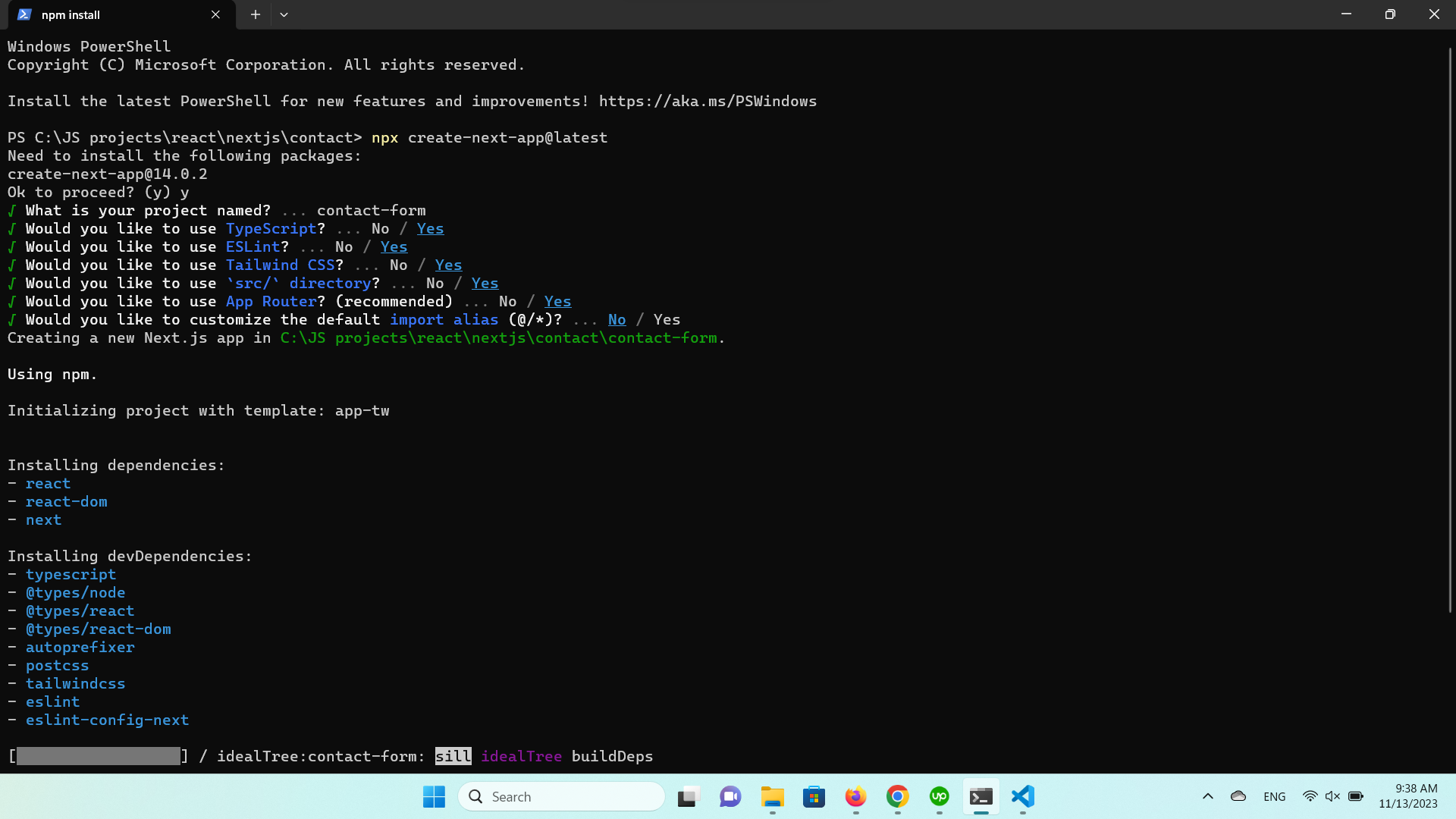
Answer the prompted questions like:
√ What is your project named? contact-form
√ Would you like to use TypeScript? Yes
√ Would you like to use ESLint? Yes
√ Would you like to use Tailwind CSS? Yes
√ Would you like to use src/ directory? Yes
√ Would you like to use App Router? (recommended) Yes
√ Would you like to customize the default import alias (@/*)? … No
This will scaffold a new NextJS project named “contact-form“ in your current directory. Once created, navigate into your new project by running:
cd contact-form
Creating a simple contact form
In this tutorial, we will use the react-hook-form for creating our form component. The react-hook-form is a lightweight, performant form library for React that leverages the use of hooks. It’s easy to use, requires little boilerplate code, and includes features such as form validation and error handling built right in.
To install react-hook-form, run the following NPM command:
npm install react-hook-form
After installing react-hook-form, let’s create our form component.
- Create the `components` directory, if it doesn’t exist.
- Create a new component file named `contact.tsx` Inside the `components` directory.
- Open the `contact.tsx` using your preferred IDE to start editing it.
- Since this component will run on the client side not the server side, add the following on the first line:
'use client';
- react-hook-form provides a form builder that you can use to easily create your form and it will display the component code on the right.
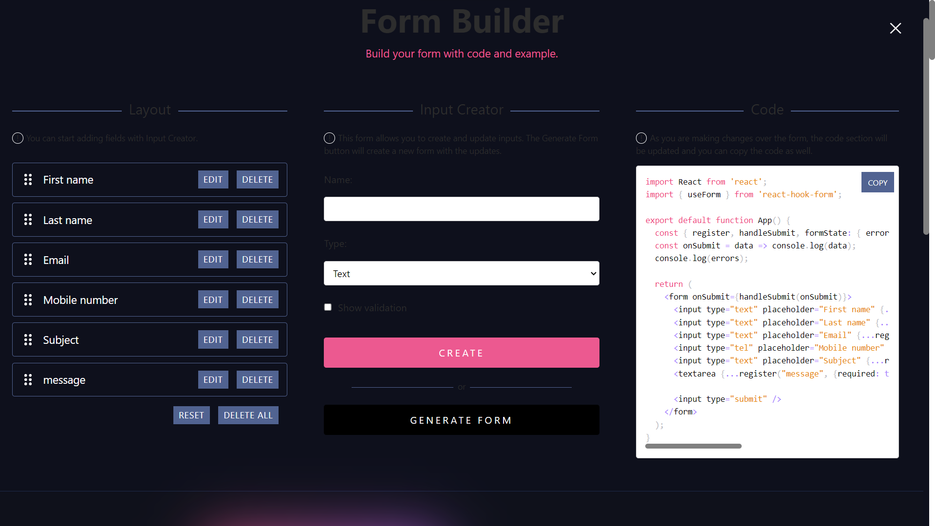
Use this builder to build the form fields you like to have on your page, then copy the code in the `contact.tsx` file we created. Note that the form code doesn’t have a style for the form, so we will add some Tailwind CSS classes to make the form visually appealing. After all, this how our Contact component code looks like.
'use client';

import React from 'react';
import { useForm } from 'react-hook-form';.

export default function Contact() {

  const { register, handleSubmit, formState: { errors } } = useForm();

  const onSubmit = (data: any) => console.log(data);

  console.log(errors);


  return (

    <form

    className="w-full max-w-5xl"

    onSubmit={handleSubmit(onSubmit)}>

      <div className='mb-5'>

        <label

          htmlFor='name'

          className='mb-3 block text-base font-medium text-black'

        >

          Full Name

        </label>

        <input

          type='text'

          placeholder='Full Name'

          className='w-full rounded-md border border-gray-300 bg-white py-3 px-6 text-base font-medium text-gray-700 outline-none focus:border-purple-500 focus:shadow-md'

          {...register('name', { required: true })}

        />

      </div>

      <div className='mb-5'>

        <label

          htmlFor='email'

          className='mb-3 block text-base font-medium text-black'

        >

          Email Address

        </label>

        <input

          type='email'

          placeholder='[email protected]'

          className='w-full rounded-md border border-gray-300 bg-white py-3 px-6 text-base font-medium text-gray-700 outline-none focus:border-purple-500 focus:shadow-md'

          {...register('email', { required: true })}

        />

      </div>

      <div className='mb-5'>

        <label

          htmlFor='Mobile number'

          className='mb-3 block text-base font-medium text-black'

        >

          Mobile number

        </label>

      <input

       type="tel"

       placeholder="Mobile number"

       className='w-full rounded-md border border-gray-300 bg-white py-3 px-6 text-base font-medium text-gray-700 outline-none focus:border-purple-500 focus:shadow-md'

        {...register("Mobile number", {required: true, minLength: 6, maxLength: 12})}

      />

      </div>

      <div className='mb-5'>

        <label

          htmlFor='message'

          className='mb-3 block text-base font-medium text-black'

        >

          Message

        </label>

        <textarea

          rows={5}

          placeholder='Type your message'

          className='w-full resize-none rounded-md border border-gray-300 bg-white py-3 px-6 text-base font-medium text-gray-700 outline-none focus:border-purple-500 focus:shadow-md'

          {...register('message', { required: true })}

        ></textarea>

      </div>

      <div>

        <button className='hover:shadow-form rounded-md bg-white border py-3 px-8 text-base font-semibold outline-none text-gray-700'>

          Submit

        </button>

      </div>

    </form>

  );

}
As you can see on the above code, the Contact component will handle the form submission at the moment.
When a user submits the form, the validation starts. If there is a validation error, the errors will be logged on the console. If there are no validation errors, the input data will also be logged on the console. In a real-world application, we will need to change this behavior so the data is sent to the site administrator.
Test The Form
Display the Form in our application
To display the form on the homepage, let’s replace the code on “app/page.tsx” with the following code
import Contact from '@/components/contact';

export default function Home() {

return (

<main className="flex min-h-screen flex-col items-center justify-between p-24">

<Contact />

</main>

)

}
The above code imports the `Contact` component that we just created and renders it in the `Home` component. The Home component is the main component that is displayed when the user lands on the homepage. The `Contact` component is wrapped in the `main` tag, which is styled using Tailwind CSS to center the form on the page.
Run the NextJS app
Now, run the application using the following command:
npm run dev
This will start the Next.js development server.
Result
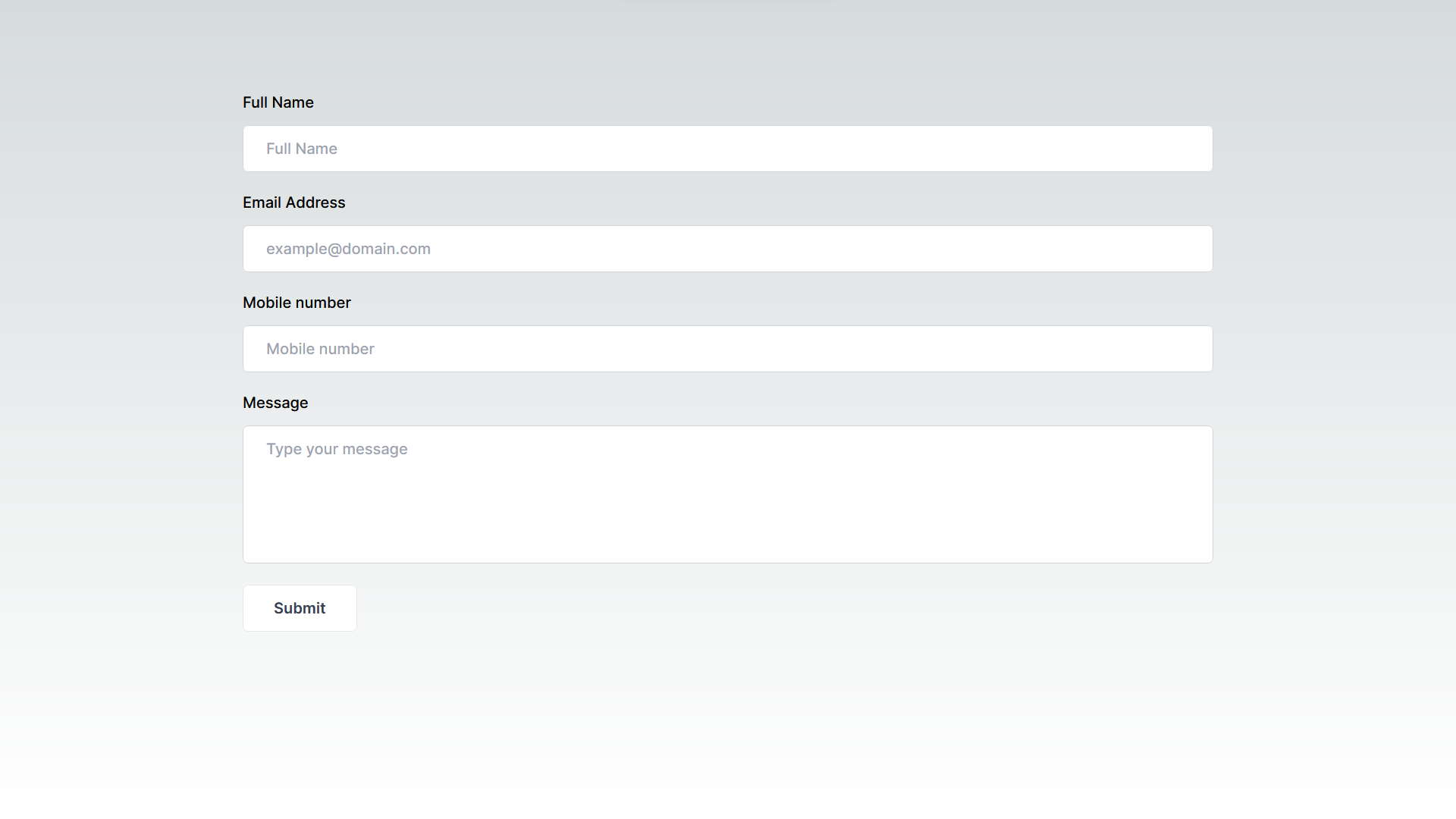
Open your web browser and navigate to `localhost:3000`. You should now see the contact form on your homepage. Open the browser console, and try submitting the form with different inputs to test the validation. If the validation fails, you will see the error messages logged in the console. If the form is submitted successfully, you will see the form data logged in the console.
The next step will be enhancing the message field to support rich text.
Enhance React Forms by Integrate Froala Rich-text
Now that our basic contact form is working as expected, we can enhance it to enable users to write rich text messages. For this, we will use the Froala WYSIWYG editor. It offers a wide range of features, including text formatting, image and video insertion, tables, and more. Moreover, it is easily integrated with NextJS since it already has a ready React rich-text editor component.
Install Froala Editor React component
First, install the Froala Editor package in your Next.js application using the following command:
npm install react-froala-wysiwyg --save
Import Froala Editor Component and stylesheets
inside “contact.tsx” file, and add
import 'froala-editor/css/froala_style.min.css';

import 'froala-editor/css/froala_editor.pkgd.min.css';

import FroalaEditorComponent from 'react-froala-wysiwyg';
Display the Froala React rich-text editor
Inside the return statement, add the Froala component after the Message field so it appears under it and before the submit button. Update the code as follows:
return (

<form

className="w-full max-w-5xl"

onSubmit={handleSubmit(onSubmit)}

>

<div className='mb-5'>

<label

htmlFor='name'

className='mb-3 block text-base font-medium text-black'

>

Full Name

</label>

<input

type='text'

placeholder='Full Name'

className='w-full rounded-md border border-gray-300 bg-white py-3 px-6 text-base font-medium text-gray-700 outline-none focus:border-purple-500 focus:shadow-md'

{...register('name', { required: true })}

/>

</div>

<div className='mb-5'>

<label

htmlFor='email'

className='mb-3 block text-base font-medium text-black'

>

Email Address

</label>

<input

type='email'

placeholder='[email protected]'

className='w-full rounded-md border border-gray-300 bg-white py-3 px-6 text-base font-medium text-gray-700 outline-none focus:border-purple-500 focus:shadow-md'

{...register('email', { required: true })}

/>

</div>

<div className='mb-5'>

<label

htmlFor='Mobile number'

className='mb-3 block text-base font-medium text-black'

>

Mobile number

</label>

<input

type="tel"

placeholder="Mobile number"

className='w-full rounded-md border border-gray-300 bg-white py-3 px-6 text-base font-medium text-gray-700 outline-none focus:border-purple-500 focus:shadow-md'

{...register("Mobile number", {required: true, minLength: 6, maxLength: 12})}

/>

</div>

<div className='mb-5'>

<label

htmlFor='message'

className='mb-3 block text-base font-medium text-black'

>

Message

</label>

<textarea

rows={5}

placeholder='Type your message'

className='w-full rounded-md border border-gray-300 bg-white py-3 px-6 text-base font-medium text-gray-700 outline-none focus:border-purple-500 focus:shadow-md'

{...register('message', { required: true })}

>

</textarea>

</div>

<div className="mb-5">

<FroalaEditorComponent

tag="textarea"

/>

</div>

<div>

<button className='hover:shadow-form rounded-md bg-white border py-3 px-8 text-base font-semibold outline-none text-gray-700'>

Submit

</button>

</div>

</form>

);
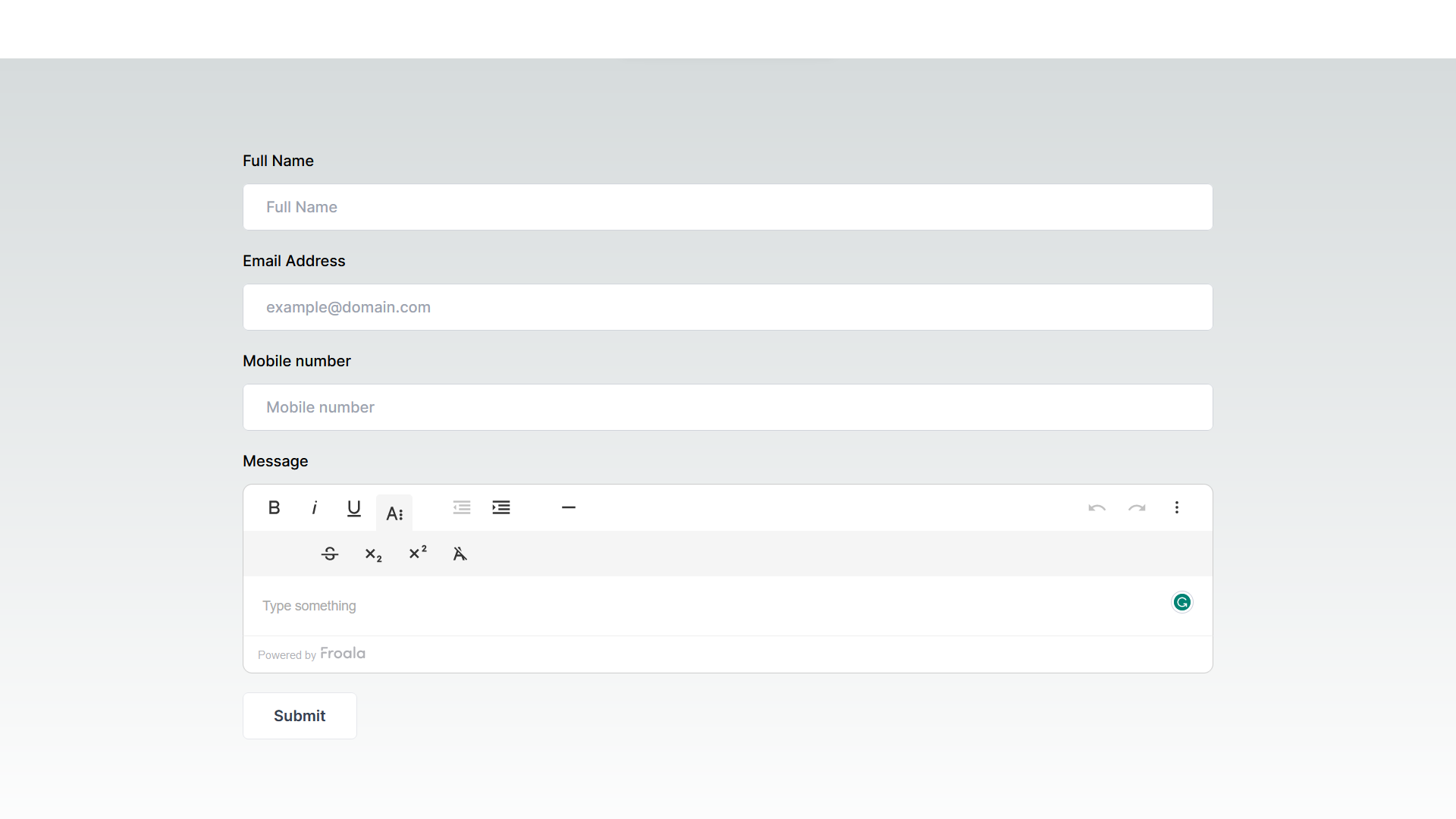
Once you open the webpage, you’ll see the Froala WYSIWYG editor is on the form. You can use it to write and make your text look nice. But, when you send the form, the editor’s content isn’t checked or sent along with it.
Submit Froala editor content along with react-hook-form submitted data in NextJS app
To validate and submit the Froala editor content along with react-hook-form submitted data, we will use the react-hook-form’s `Controller` component. This component is useful for creating a field that updates its value based on an externally controlled component, such as the Froala React rich-text editor component
First, import the `Controller` component:
import { useForm, Controller } from 'react-hook-form';
Then, Add a new variable `control` which will be used with the `Controller` component.
const { register, handleSubmit, control, formState: { errors } } = useForm();
Finally, replace the message field and Froala Editor component code with the `Controller` component :
<div className='mb-5'>

        <label htmlFor='message' className='mb-3 block text-base font-medium text-black'>

Message

</label>

<Controller

name="message"

rules={{ required: true }}

control={control}

defaultValue=""

render={({ field }) => (

<FroalaEditorComponent

tag="textarea"

model={field.value}

onModelChange={field.onChange}

/> )}

/>

</div>
In the `Controller` component:
- We used the `name` property to identify the data when the form is submitted. The `control` property is used to control the form.
- We used the rules property to set the validation rules.
- The `render` method is used to render the editor and connect it with the form. inside it:
- we used the `field` argument to get the current value and the onChange event of the form field.
- The `model` property is used to bind the current value to the Froala Editor.
- The `onModelChange` event is used to update the form field value when the Froala Editor content changes.
This way, the Froala Editor is fully integrated with the form, and its content is validated and submitted along with the other form fields.
Now, when you open the app and submit the form, the content of the Froala Editor will be included in the form data. The error messages, if any, will be displayed in the console.
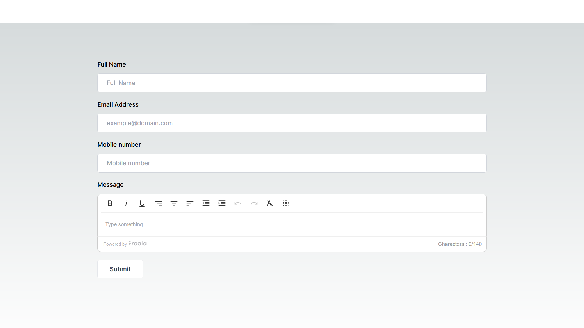
Customize the editor
To customize the editor toolbar, you can pass an options object to the Froala Editor component. This object should contain the desired configuration options from the Froala API options. Here’s an example:
const options = {

toolbarButtons: [ 'bold', 'italic', 'underline', 'outdent', 'indent', 'undo', 'redo', 'clearFormatting', 'selectAll'  ],

charCounterMax: 140

}
You can then pass the options object to the Froala Editor component’s config property like so:
<FroalaEditorComponent

tag="textarea"

model={field.value}

onModelChange={field.onChange}

config={options}

/>
This will customize the toolbar to only include the specified buttons and set the maximum character count to 140 characters.
Note that some editor buttons and functions require additional plugins to be loaded. You have to import the plugin file
import 'froala-editor/js/plugins/align.min.js';

import 'froala-editor/js/plugins/char_counter.min.js';
Include it in the `pluginsEnabled` option, and add the buttons to be displayed in the `toolbarButtons` option:
const options = {

toolbarButtons: [ 'bold', 'italic', 'underline', 'alignRight', 'alignCenter',  'alignLeft', 'outdent', 'indent', 'undo', 'redo', 'clearFormatting', 'selectAll'  ],

pluginsEnabled: ['align', 'charCounter'],

charCounterMax: 140

}
Full Code
Here is the complete code of “contact.tsx” component with all the changes:
'use client';

import React from 'react';
import { useForm, Controller } from 'react-hook-form';

import 'froala-editor/css/froala_style.min.css';
import 'froala-editor/css/froala_editor.pkgd.min.css';
import 'froala-editor/js/plugins/align.min.js';
import 'froala-editor/js/plugins/char_counter.min.js';

import FroalaEditorComponent from 'react-froala-wysiwyg';

export default function Contact() {
  const { register, handleSubmit, control, formState: { errors } } = useForm();
  const onSubmit = (data: any) => console.log(data);
  console.log(errors);

  const options = {
    toolbarButtons: [ 'bold', 'italic', 'underline', 'alignRight', 'alignCenter',  'alignLeft', 'outdent', 'indent', 'undo', 'redo', 'clearFormatting', 'selectAll'  ],
    pluginsEnabled: ['align', 'charCounter'],
    charCounterMax: 140
  }

return (
    <form
    className="w-full max-w-5xl"
    onSubmit={handleSubmit(onSubmit)}
    >
      <div className='mb-5'>
        <label
          htmlFor='name'
          className='mb-3 block text-base font-medium text-black'
        >
          Full Name
        </label>
        <input
          type='text'
          placeholder='Full Name'
          className='w-full rounded-md border border-gray-300 bg-white py-3 px-6 text-base font-medium text-gray-700 outline-none focus:border-purple-500 focus:shadow-md'
          {...register('name', { required: true })}
        />
      </div>
      <div className='mb-5'>
        <label
          htmlFor='email'
          className='mb-3 block text-base font-medium text-black'
        >
          Email Address
        </label>
        <input
          type='email'
          placeholder='[email protected]'
          className='w-full rounded-md border border-gray-300 bg-white py-3 px-6 text-base font-medium text-gray-700 outline-none focus:border-purple-500 focus:shadow-md'
          {...register('email', { required: true })}
        />
      </div>

      <div className='mb-5'>
        <label
          htmlFor='Mobile number'
          className='mb-3 block text-base font-medium text-black'
        >
          Mobile number
        </label>
      <input
       type="tel"
       placeholder="Mobile number"
       className='w-full rounded-md border border-gray-300 bg-white py-3 px-6 text-base font-medium text-gray-700 outline-none focus:border-purple-500 focus:shadow-md'
        {...register("Mobile number", {required: true, minLength: 6, maxLength: 12})}

      />
      </div>

      <div className='mb-5'>
      <label
          htmlFor='message'
          className='mb-3 block text-base font-medium text-black'
        >
          Message
        </label>
      <Controller   name="message" rules={{ required: true }}  control={control}   defaultValue=""   render={({ field }) => (
            <FroalaEditorComponent
                    tag="textarea"
                    model={field.value}
                    onModelChange={field.onChange}
                    config= {options}
             /> )}
        />
      </div>

      <div>
        <button className='hover:shadow-form rounded-md bg-white border py-3 px-8 text-base font-semibold outline-none text-gray-700'>
          Submit
        </button>
      </div>
    </form>
  );
}
Concluding Remarks
The Froala WYSIWYG editor provides a rich set of options for text manipulation, and its React component allows for easy integration with your React and NextJS applications. Using the `react-hook-form` library’s `Controller` component, we can seamlessly integrate the Froala editor into a form created using `react-hook-form`, ensuring its content is validated and submitted alongside other form data. With the configuration options provided by the Froala API, we can customize the editor to fit our application’s needs.
Whether you are building a blog, a CMS, or any other application that requires text editing, the Froala WYSIWYG editor is a powerful tool that can enhance your project’s functionality and user experience. Start your free trial now and enable your users to create and manage content in a visually appealing and intuitive way.


No comment yet, add your voice below!