Responsive Video Design for Online JavaScript Editors: A Vue WYSIWYG Guide
- Posted on
- By Mostafa Yousef
- In Editor, Tutorials

Imagine a world where videos seamlessly adapt to any screen size or device, captivating viewers with their dynamic display. In today’s digital landscape, where content consumption spans across various platforms and gadgets, the need for responsive videos has never been more crucial. Enter the “Responsive Video” feature Froala; an online javascript editor—a game-changer that ensures your videos always shine, regardless of the viewing platform.
We recently answered ten questions about the Froala video plugin customization. However, we did not cover some features, including the “Responsive Video” feature. This article will explore this important feature and demonstrate how to use it with our Vue WYSIWYG editor.
What is the Responsive Video feature in Froala?
The “Responsive Video” feature in Froala online javascript editor allows videos to adjust their size based on the screen or container they are displayed in, ensuring they look good on any device or screen size. Implementing this feature can enhance the user experience by ensuring videos are displayed responsively across various devices.
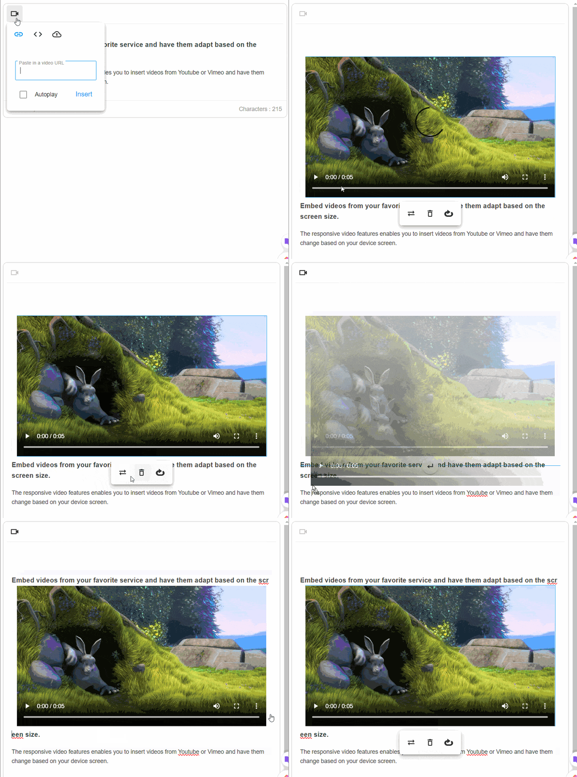
Unlike the normal mode, you cannot manually resize the added video by dragging and dropping. Additionally, users cannot modify video display or alignment properties. They also cannot change the video dimensions through the Edit video popup.
By enabling this option, the video edit pop-up menu will have three buttons only:
- Video Replace button
- Video Remove button
- Auto-play button
Responsive Videos Use Cases
Many use cases can benefit from the Responsive Videos feature. For instance, imagine a scenario where a fashion e-commerce website utilizes the “Responsive Video” feature to showcase dynamic runway videos of its latest collections. These videos seamlessly adapt to the varying screen sizes of users, whether they are browsing on a laptop, tablet, or smartphone. This not only ensures a consistent visual experience for shoppers but also reinforces the brand’s commitment to delivering high-quality content across all devices.
Moreover, consider an educational platform that leverages the responsive video functionality to deliver interactive learning materials to students. With videos adjusting intelligently to fit the screen size, learners can engage with course content effortlessly, regardless of the device they are using. This feature eliminates the need for manual adjustments, allowing educators to focus on creating impactful video lessons without worrying about compatibility issues.
In a marketing context, a travel agency could utilize the “Responsive Video” feature to showcase breathtaking destination videos on their website. By enabling automatic resizing, these videos captivate potential travelers on desktops, tablets, or smartphones, painting an immersive picture of the travel experiences they offer. This seamless display ensures that the agency’s promotional content is visually striking and accessible to a wide audience.
How to enable the “Responsive Video” feature in Froala?
To enable the “Responsive Video” feature in Froala online javascript editor, you can simply set the videoResponsive option to true within the editor configuration.
new FroalaEditor('.selector', {

  videoResponsive: true

});
By activating this feature, videos embedded using Froala will automatically adjust their dimensions to fit the screen or container they are placed in. This dynamic resizing ensures that videos appear correctly sized and formatted on any device or screen resolution.
A Demonstration of the Froala Responsive Video Feature on Vue 3
Let’s create a working example of the Froala Responsive Video Feature on Vue 3. Following a few simple steps, you can easily incorporate this feature into your Froala Vue WYSIWYG editor setup.
Start by creating a new Vue project. Simply use the command below:
vue create video-responsive-project
Once the project is created, navigate to the project directory:
cd video-responsive-project
After that, install the Froala Vue WYSIWYG editor package and its dependencies using npm:
npm install vue-froala-wysiwyg
The vue-froala-wysiwyg NPM package is a wrapper around the Froala editor that simplifies the integration between Froala and Vue.js applications, allowing users to easily create and edit content with a What You See Is What You Get interface.
After installing the vue-froala-wysiwyg package, import it into your project to set up and customize the Froala editor in your Vue.js application.
Open the main Vue component file (main.js)
- Import the Froala Vue WYSIWYG editor component:
import { createApp } from 'vue'

import App from './App.vue'

//Import Froala Editor plugins
import 'froala-editor/js/plugins.pkgd.min.js';

// Import Froala Editor css files.
import 'froala-editor/css/froala_editor.pkgd.min.css';
import 'froala-editor/css/froala_style.min.css';


// Import Froala Editor component
import VueFroala from 'vue-froala-wysiwyg';
- Register the Froala Vue WYSIWYG editor component globally:
const app = createApp(App);

app.use(VueFroala);

app.mount('#app');
Now you can use the Froala editor component anywhere in your Vue.js project.
The Froala editor component has three attributes:
:tagattribute specifies the tag on which the editor is initialized, typically set to “textarea”.:configattribute which is used to pass the editor options that allow you to customize the editor settings based on your requirements. It provides flexibility in configuring the editor’s behavior, appearance, and functionality. Using this attribute, you can tailor the Froala editor to suit your specific needs and enhance the editing experience for users interacting with your Vue.js application.v-model:valueattribute is used to display and edit content in the editor with two-way binding.
To enable the video responsive feature, we will set the videoResponsive option to true inside the :config attribute.
Open the “App.vue” file and edit it as
<template>
    <froala
    :tag="'textarea'"
    :config="config"
  ></froala>

</template>
<script>
export default {
  name: "App",
    data () {

    return {

      config: {
        videoResponsive: true,
        toolbarButtons: ['insertVideo']
        }
      }
    },
  }
</script>
Run the below NPM command to run your Vue application on your local development server.
npm run serve
Visit http://localhost:8080 to view the running example we created. Note, on the Froala editor’s toolbar, there is a button to insert Videos. When a video is inserted, it automatically spans the full width of the editor and cannot be manually resized.
Conclusion
By incorporating the “Responsive Video” feature in Froala, you can ensure that videos adjust their size according to the screen or container they are displayed in, providing a consistent viewing experience across various devices. This dynamic resizing feature enhances user interaction by optimizing video displays on different screen sizes.
Froala can act as your Vue WYSIWYG editor. Enabling the videoResponsive option in the Froala Vue WYSIWYG editor allows for seamless integration of this feature, making it easy to create and edit responsive videos within your Vue.js application.


No comment yet, add your voice below!