
Quickly Build Powerful JavaScript Dashboards With Charts

Froala Charts optimizes your charts on the dashboard, featuring over 20 different types of graphs for summarizing business insights. Create column, line, and pie charts to present your findings and compare KPIs over a specified period of time.
Receive a thorough assessment of your business performance or monitor development activities using Froala’s handy widgets and domain-specific charts. Using its JS-based API, you can collect extensive insights on heatmaps, treemaps, and even radars for those deeper dives.
To learn more, you may visit the Documentation of Froala’s Javascript HTML Editor for more complex how-to guides and examples.
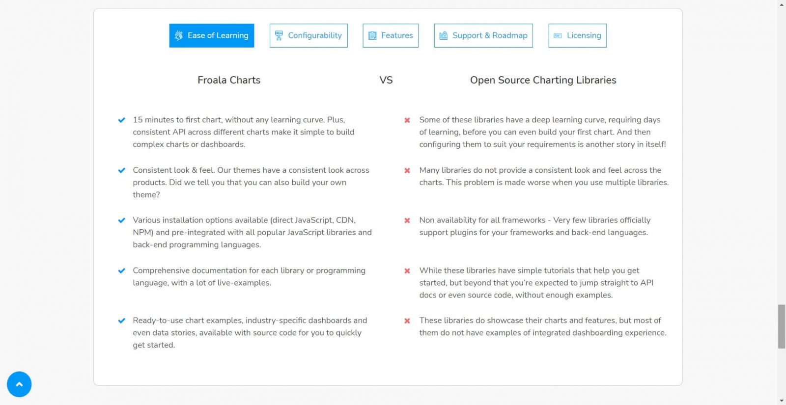
Why choose Froala Charts over other Charting APIs on JavaScript?
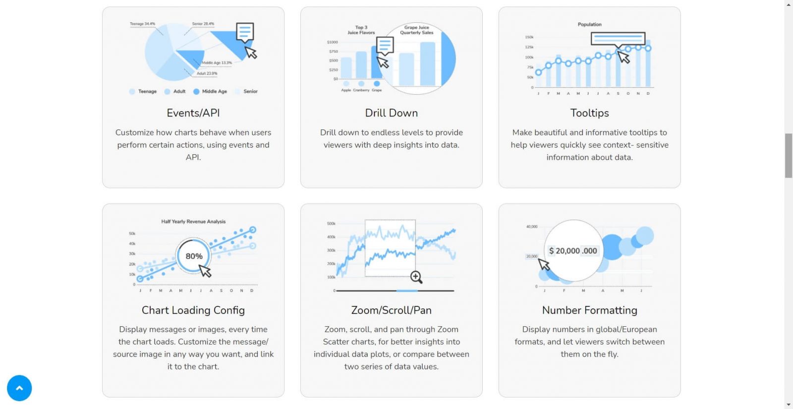
Froala equips developers with all kinds of chart configurations for unique purposes, especially options for customizing their dashboard through attributes, layers, or events. They can either create responsive charts according to user actions or organize and contextualize their data points by dragging around the tool tips.
Furthermore, it allows them to take a closer look at the data by enlarging individual plots over on Zoom Scatter charts. As a chart API, it offers robust theme changes such as on the loading screen where users get to add their own images or messages. It’s also possible to format numbers and switch between formats to better visualize a trending curve.
What are some common charts to incorporate into your dashboard?
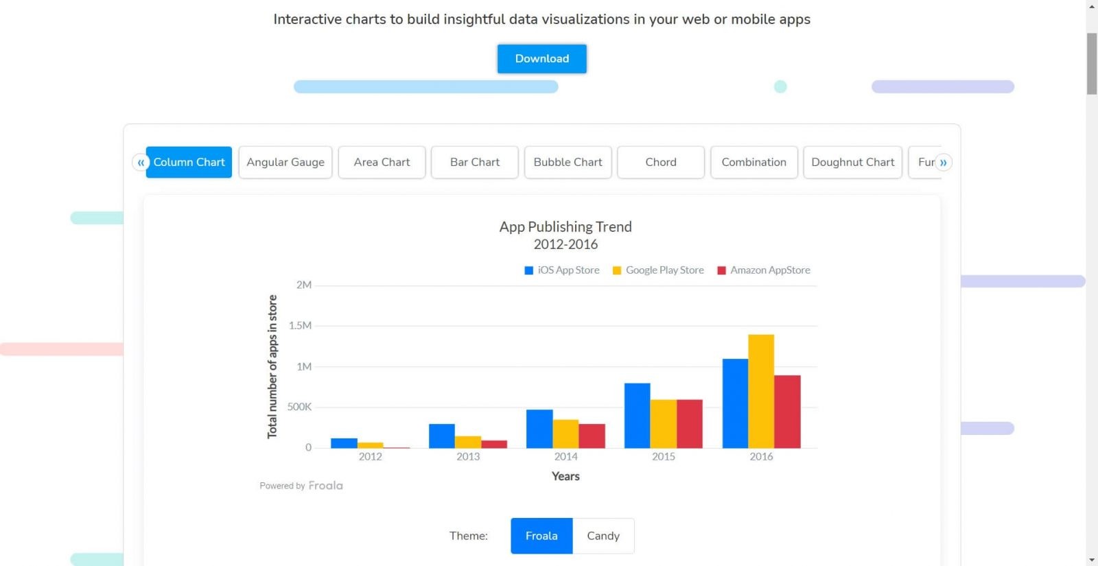
- Column Chart: This chart separates columns plotted on a bar graph to compare data side by side. Each vertical bar represents a category with both axes drawn to scale. For a proper demo, go browse the App Publishing Trends from 2012 to 2016 with the iOS, Google Play, and Amazon App Store.
- Bar Chart: This horizontal chart has rows of bars separated by category. Notice how the data values are color-coded to make them easier to read across each variable type. Click on the keys to hide bars for that particular group. As a preview, the Split of Visitors by Channels displays the annual revenue of various marketing campaigns.
- Doughnut Chart: This chart resembles a pie chart except the center is hollowed out to show the exact number allocated to each slice. The pie pieces can be dragged and rotated to reposition the labels. Users are able to determine the relative percentages as seen in Android distribution platforms example.
- Heat Map Chart: The heat map assigns several blocks to items labeled on the vertical axis. It is used to assess user activities and behaviors on a spectrum of colors which rates the measured frequency on a number line. For instance, the colors might indicate the amount of social media usage and how that affects anxiety or sleep.
- Line Chart: A linear chart that plots a series of data points connected by straight lines. In the sample, you will see two lines representing the number of tickets received as opposed to resolved over the course of a month. Hover over the markers to get their exact values.
What kind of front-end environment do you need to integrate these charts?
Before you hit the “Download” button, there are a few things you should know. Each framework has its own requirements, and as such, you must follow the setup guide in order to render your chart component in JavaScript while importing all the necessary dependencies.
Froala Charts supports the following JavaScript frameworks:
- React
- Angular
- Vue
- Svelte
- Ember
For Angular and Svelte, you must have Node.js installed to prepare for opening a chart in the terminal. But if you’re exporting a chart to react, then you have to run create-react-app. Once you’ve moved past the prerequisites, it’s time to run the Froala Charts library. Be sure to copy and paste the import code between the <script> tags to get started.
As for preparing the data, build a column chart by referring to this tutorial on how to plot the quarterly revenue in a JSON format. It will walk you through loading a set of data onto your web application. This information is stored into a list object so it stays organized as you configure the chart by editing the attributes including the type, dimensions, dataSource, and categories.
What makes Froala Charts a game-changer among JS developers?
Froala charts enables developers to build interactive charts and linear models on a JavaScript dashboard. Not only does it have a lower barrier to entry, it also has a consistent UI for hosting an array of attractive themes. You won’t have to update to the newest browser just to test out our chart elements.
The best part is, there are many live charts to preview on multiple frameworks from React to CDNs. It literally has extensive documentation of every JS library to boot. With Froala Charts, data visualization doesn’t have to be complicated, with plenty of tools to help you identify significant marketing trends and take action on them.
When you need to address key findings in your next report, Froala has you covered with interactive charts for visualizing data across all your mobile apps. To learn more about our new API releases, you can take a tour with us on our website.


No comment yet, add your voice below!