Days
Hours
Minutes
Seconds
x

New Froala Editor v4.5.2 is here – Learn More

Skip to content

A Beginners Guide To HTML Editor Online

A device screen showing the Froala Editor interface, focusing on modern web development.

The hypertext meta-language, or HTML for short, is the essential building block that powers every web application, whether it’s a small and simple webpage or a large web service.  An HTML editor online is a very handy tool for building web pages quickly and easily.

Today there are many HTML editors available online.  One, however, stands out for its ease of use, functional features, beautiful interfaces, efficiency, and more.  That editor is Froala, which is available online and free to use.  To help you get started, we have put together a beginner’s guide to an HTML editor online that will show you all the necessary features you need to build awesome and stunning web pages.

What is an HTML Editor Online?

An HTML Editor Online helps you work with HTML documents through a web browser.  You can directly input HTML in an HTML editor.  Moreover, a ‘what you see is what you get, or WYSIWYG editor helps you create HTML documents using a graphical interface where you can build and edit web pages without using any HTML.  The WYSIWYG editor generates the HTML automatically. 

What is Froala WYSIWYG HTML Editor Online?

Froala Editor interface, showcasing its extensive editing capabilities and layout.

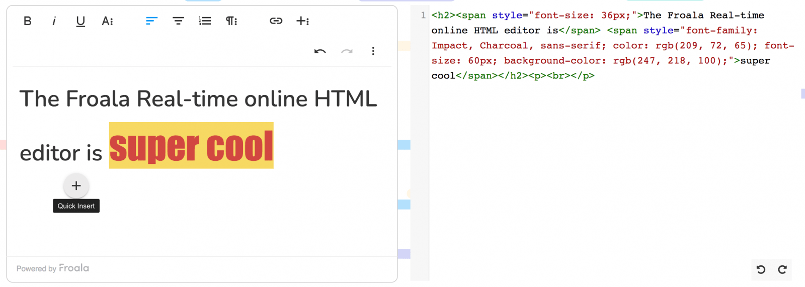
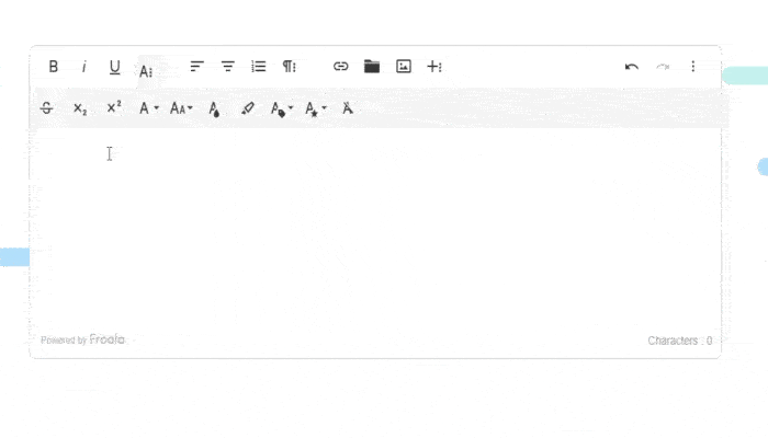
The Froala WYSIWYG HTML editor includes a free-to-use online version.  One unique feature of the online Froala editor is its two windows.  The first window shows the Froala editor and allows you to create a web page using its graphical interface. It has rich text editing capabilities accessible via a toolbar or keyboard shortcuts.  The second window is the HTML code window. This window displays the HTML for the document created in the graphical interface. If you are an HTML expert, you can directly input HTML in this window.  The two editor windows, graphical and HTML, are in synch. Making changes in one window reflects the changes in the other in real-time.

Do I Need to Know HTML to Use the Froala HTML Editor Online?

You don’t need any HTML knowledge to use the Froala HTML editor online.  Whether you are a hobbyist looking to create your web page or a novice developer, you can rely on Froala to create beautiful web pages using its easy-to-use interface. What’s more, you can learn HTML as you build your pages by looking at the contents of the HTML window. Beginner web developers can also try out various HTML tags and see how the HTML page renders in real-time.

What Rich Text Features Do I Get with Froala HTML Editor Online?

A specific aspect of the Froala Editor, focusing on its user interface and features.

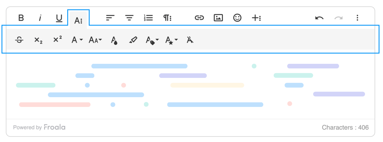
The Froala HTML editor online offers an extensive set of rich text editing features. These include:

  • Character level formatting includes changing fonts and their sizes
  • Block-level or paragraph level formatting including alignment, indentation, and more
  • Creation of bulleted lists
  • Creation of numbered lists
  • Change background and foreground text colors
  • Formatting tables with numerous options to style and format individual rows, columns, and cells

Does the Froala Online HTML Editor Support Multimedia Content?

Showing another feature or functionality of the Froala Editor, emphasizing its versatility.

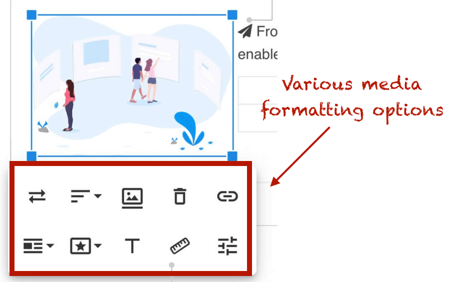
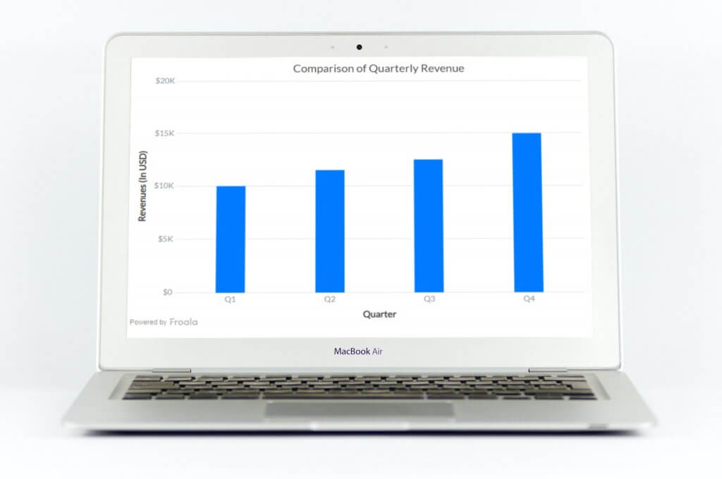
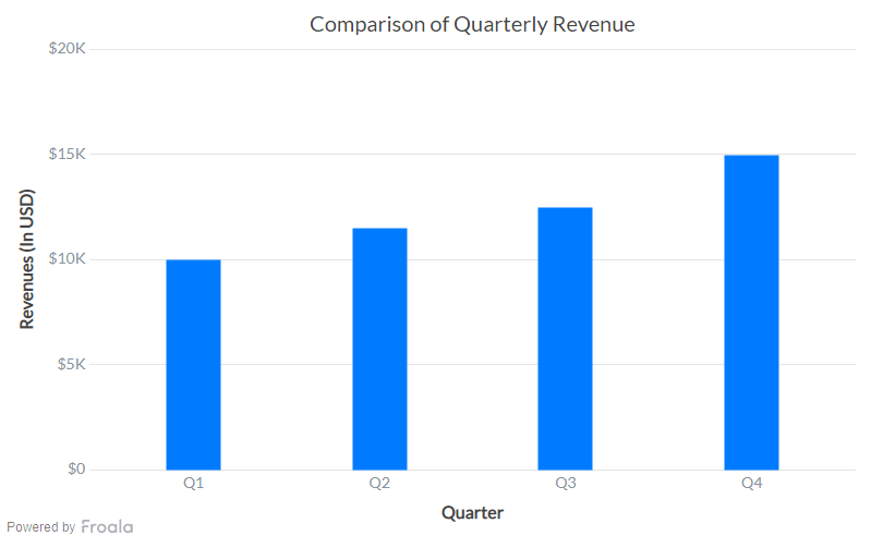
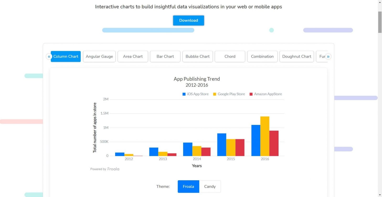
Yes, absolutely!  You can insert images as well as videos in your HTML documents using the Froala online HTML editor.  There are options to resize them along with the choice of placing them anywhere within the text.  The figure above shows various media formatting options.

Which Browser and Platform Supports Froala Online HTML editor?

One of the great things about the Froala HTML editor online is that you can use it anywhere, anytime.  Whether you are a Mac OS user or own a Windows machine, you can access Froala from your favorite browser like Safari, Chrome, Internet Explorer and more.

Which is the Best WYSIWYG HTML Editor on G2?

G2 Grid for software comparison, showing rankings and evaluations of various tools.

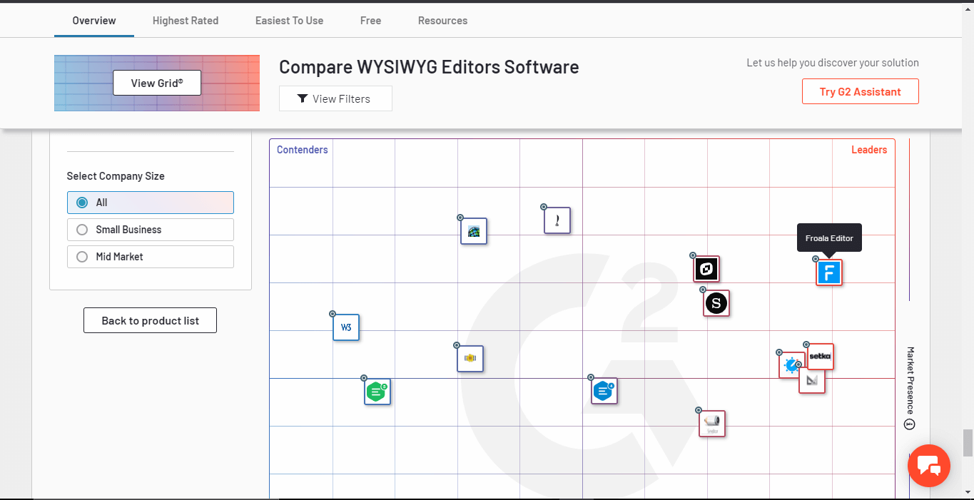
Froala is a leader on G2, a reliable platform where users give unbiased reviews and feedback on various products.  Froala is ranked the best in terms of its features, customer satisfaction, and market presence. The G2 grid above shows Froala is the best WYSIWYG HTML editor.

Are You Ready to Get Started on the World’s Best WYSIWYG HTML Editor Online?

Of course, you are! With rich text editing capabilities, blazing fast speed, multimedia support, simple interfaces, clean design, multimedia features, and a lot more, it’s no surprise that Froala is the world’s leading WYSIWYG HTML editor. Its customer base includes big multi-national companies like Samsung, Apple, IBM, Toyota, Panasonic, and more.

So wait no more! Try out the free Froala online HTML editor or sign up for a free trial.

6 Powerful Javascript Charting Features: Svelte Dashboards

Displaying six key features of Froala Editor, emphasizing its versatility and functionality.

Froala Charts is a JavaScript charting library that lets you create interactive charts, gauges, maps, and dashboards using JavaScript. We have built a simple and lightweight Svelte directive, which provides bindings for svelte-froalacharts and lets you add JavaScript charts in your Svelte application or project without any hassle.

Static charts are nice but interactive charts can take a dashboard to the next level. Froala Charts offers events and an API, drill down deep into data, tooltips for context, loading screens; zoom scroll and pan to get in close with your data, and number formatting with on-the-fly conversion.

You can use Javascript libraries to create charts and implement them in your applications using Froala’s Javascript Editor.

How can I use a Javascript chart Events/API?

Customize how charts behave when users perform certain actions, using events and APIs.

Take a deep dive into the events system of Froala Charts.

Can Javascript Charts have Drill Downs?

Drill down to endless levels to provide viewers with deep insights into data.

  • beforeDrillDown
  • drillDown
  • beforeDrillUp
  • drillUp
  • drillDownCancelled
  • drillUpCancelled

Explore the drill down events available to Svelte.

How do I implement Javascript Chart Tooltips?

Make beautiful and informative tooltips to help viewers quickly see context-sensitive information about data.

chartMouseMove is triggered when the mouse pointer is moved over a chart. The event arguments pass useful information related to pointer location, relative to the chart and the page, that can be used for positioning elements like annotations or integrating charts with custom tooltip libraries.

By default, a chart does not trigger this event until it is enabled to do so. To enable this event for a chart, set the enableChartMouseMoveEvent attribute to 1.

Can I load a Javascript Chart Loading Config?

Display messages or images, every time the chart loads. Customize the message/ source image in any way you want, and link it to the chart.

Find out more about chart configuration initialization in a Svelte app.

Do Javascript Froala Charts support Zoom/Scroll/Pan?

Zoom, scroll, and pan through Zoom Scatter charts, for better insights into individual data plots, or compare between two series of data values.

Configure zooming through setZoomMode.

Can I do Number Formatting in Javascript?

Display numbers in global/European formats, and let viewers switch between them on the fly.

Formats input numbers based on the formatting configuration passed. The function can be called globally on the Froala Chartsobject or on a specific instance of Froala Charts.

When called globally on the FroalaCharts object, the function applies the configuration settings to all numbers on the chart.

Explore the formatNumbers method for Froala Charts.

Svelte Chart integrated with various devices, highlighting responsive design.

Froala Charts is easy to install with npm.

npm install svelte-froalacharts froalacharts --save

After installing the FroalaCharts components, you can replace the code in App.svelte file with the code shown in the steps below to create your first chart. Import all the required dependencies in the <script> tag to get started.

<script>
//Step 1 : import dependecies
import FroalaCharts from "froalacharts";
import FroalaTheme from "froalacharts/themes/froalacharts.theme.froala";
import SvelteFC, { fcRoot } from "svelte-froalacharts";
// Always set FroalaCharts as the first parameter
fcRoot(FroalaCharts, FroalaTheme);

//Step 2: preparing the chart Data
const chartData = [
{
  data: [
  {
    value: "10000",
  },
  {
    value: "11500",
  },
  {
    value: "12500",
  },
  {
    value: "15000",
  }]
}];

//Step 3 : Create your configuration object
const chartConfig = {
  type: "column",
  renderAt: "ft",
  width: "800",
  height: "500",
  dataSource:
  {
    chart:
    {
      theme: "froala",
      caption: "Comparison of Quarterly Revenue",
      xAxisname: "Quarter",
      yAxisName: "Revenues (In USD)",
      numberPrefix: "$",
    },
    categories: [
    {
      category: [
      {
        label: "Q1",
      },
      {
        label: "Q2",
      },
      {
        label: "Q3",
      },
      {
        label: "Q4",
      }]
    }],
    dataset: chartData
  }
}; 
</script>

<SvelteFC {...chartConfigs}/>

Finally export the app from main.js

import App from "./App.svelte";
  var app = new App({
    target: document.body
  });
  export default app;

And run it via:
npm run dev

Here is what the final chart looks like:
A Svelte Chart visualization showcasing data representation and interactive design

Now that you’ve seen how easy it is to start building charts with Svelte and Froala Charts you can build out a whole dashboard pretty quickly.

Head over and find the full tutorial for building visual stunning dashboards with Svelte.

Quickly Build Powerful JavaScript Dashboards With Charts

Photo showcasing Froala Charts, emphasizing advanced data visualization capabilities.

Froala Charts optimizes your charts on the dashboard, featuring over 20 different types of graphs for summarizing business insights. Create column, line, and pie charts to present your findings and compare KPIs over a specified period of time. 

Receive a thorough assessment of your business performance or monitor development activities using Froala’s handy widgets and domain-specific charts. Using its JS-based API, you can collect extensive insights on heatmaps, treemaps, and even radars for those deeper dives.

To learn more, you may visit the Documentation of Froala’s Javascript HTML Editor for more complex how-to guides and examples.

Froala Charts interface, displaying interactive charting and analysis tools.

Why choose Froala Charts over other Charting APIs on JavaScript?

Froala equips developers with all kinds of chart configurations for unique purposes, especially options for customizing their dashboard through attributes, layers, or events. They can either create responsive charts according to user actions or organize and contextualize their data points by dragging around the tool tips.

Furthermore, it allows them to take a closer look at the data by enlarging individual plots over on Zoom Scatter charts. As a chart API, it offers robust theme changes such as on the loading screen where users get to add their own images or messages. It’s also possible to format numbers and switch between formats to better visualize a trending curve. 

What are some common charts to incorporate into your dashboard? 

Highlighting the features of Froala Charts, focusing on customization and usability.

  • Column Chart: This chart separates columns plotted on a bar graph to compare data side by side. Each vertical bar represents a category with both axes drawn to scale. For a proper demo, go browse the App Publishing Trends from 2012 to 2016 with the iOS, Google Play, and Amazon App Store. 
  • Bar Chart: This horizontal chart has rows of bars separated by category. Notice how the data values are color-coded to make them easier to read across each variable type. Click on the keys to hide bars for that particular group. As a preview, the Split of Visitors by Channels displays the annual revenue of various marketing campaigns. 
  • Doughnut Chart: This chart resembles a pie chart except the center is hollowed out to show the exact number allocated to each slice. The pie pieces can be dragged and rotated to reposition the labels. Users are able to determine the relative percentages as seen in Android distribution platforms example.
  • Heat Map Chart: The heat map assigns several blocks to items labeled on the vertical axis. It is used to assess user activities and behaviors on a spectrum of colors which rates the measured frequency on a number line. For instance, the colors might indicate the amount of social media usage and how that affects anxiety or sleep.  
  • Line Chart: A linear chart that plots a series of data points connected by straight lines. In the sample, you will see two lines representing the number of tickets received as opposed to resolved over the course of a month. Hover over the markers to get their exact values. 

What kind of front-end environment do you need to integrate these charts? 

Before you hit the “Download” button, there are a few things you should know. Each framework has its own requirements, and as such, you must follow the setup guide in order to render your chart component in JavaScript while importing all the necessary dependencies. 

Froala Charts supports the following JavaScript frameworks:

  • React
  • Angular
  • Vue
  • Svelte
  • Ember

For Angular and Svelte, you must have Node.js installed to prepare for opening a chart in the terminal. But if you’re exporting a chart to react, then you have to run create-react-app. Once you’ve moved past the prerequisites, it’s time to run the Froala Charts library. Be sure to copy and paste the import code between the <script> tags to get started. 

As for preparing the data, build a column chart by referring to this tutorial on how to plot the quarterly revenue in a JSON format. It will walk you through loading a set of data onto your web application. This information is stored into a list object so it stays organized as you configure the chart by editing the attributes including the type, dimensions, dataSource, and categories. 

Showcasing the benefits of using Froala Charts, emphasizing efficiency and versatility.

What makes Froala Charts a game-changer among JS developers?

Froala charts enables developers to build interactive charts and linear models on a JavaScript dashboard. Not only does it have a lower barrier to entry, it also has a consistent UI for hosting an array of attractive themes. You won’t have to update to the newest browser just to test out our chart elements.

The best part is, there are many live charts to preview on multiple frameworks from React to CDNs. It literally has extensive documentation of every JS library to boot. With Froala Charts, data visualization doesn’t have to be complicated, with plenty of tools to help you identify significant marketing trends and take action on them. 

When you need to address key findings in your next report, Froala has you covered with interactive charts for visualizing data across all your mobile apps. To learn more about our new API releases, you can take a tour with us on our website.  

Create a Chart using Next.js and Froala Charts

Next.js is an open-source React development framework for developing single-page JavaScript applications.  Next.js popularity has risen over the past couple of years given its ability to speed up page load times with Server Speed Rendering and automatic code-splitting, along with improved development time. The StateofJS 2020 Survey ranked Next.js as the top backend framework with the highest satisfaction ranking. 

Froala Charts provides interactive charts to build data visualizations for web and mobile applications. From the creators of the Best WYSIWYG HTML Editor, Froala Charts offers all varieties of charting components—basic charts, widgets, and domain-specific charts that work across frameworks.    

If you are wondering how to render a chart with Next.js, this article is for you!  This tutorial will walk you through creating a dynamic chart in React using Next.js and Froala Charts. 

Setting up the Environment

We’ll be using codesandbox for this tutorial. Before we start, we need to set up our environment by including the following dependencies in our application’s package.json:

  1. Froala Charts Latest Version (v1.0.0)
  2. React Component for Froala Charts
  3. next
  4. react
  5. React-dom

This is what our package.json should look like after adding the above dependencies:

"dependencies": {
    "froalacharts": "^1.0.0",
    "next": "latest",
    "react": "^16.13.1",
    "react-dom": "^16.13.1",
    "react-froalacharts": "^1.0.0"
}

Creating the Chart Component

Now that we are done with setting up our environment, we’ll create a component that we’ll import later to render the chart. For this tutorial, we are going to use static data, but you can also pass dynamic data using props or fetching data via API to render charts.

For this we’ll create a JS file under pages directory with the name froalacharts.js:

Step 1: Prepare Chart Data Source

const dataSource = {
  chart: {
    caption: "Global Crypto Market Cap Analysis",
    subCaption: "January 2021 | Source: coinmarketcap.com",
    theme: "froala",
    paletteColors: "#F7931A, #3c3c3d, #1A9DF6, #52AF94, #E7BF29, #3D550C",
    numberPrefix: "$",
    defaultCenterLabel: "Total Market Cap<br>$1.02T",
    centerlabel: "$label<br>$value",
    doughnutRadius: "60%"
  },
  data: [
    { label: "Bitcoin", value: "640481178825" },
    { label: "Ethereum", value: "152441577181" },
    { label: "XRP", value: "30193577746" },
    { label: "Tether", value: "26618100965" },
    { label: "WallStreetBets", value: "24846486000" },
    { label: "Others", value: "145419079283" }
  ]
};

Step 2: Create Chart Instance

const chartConfigs = {
  type: "doughnut",
  width: 600,
  height: 400,
  dataFormat: "json",
  dataSource: dataSource
};

There are multiple chart options in Froala Charts—basic charts such as column, line, pie charts, gauges, KPI, funnel, pyramid, or advanced charts, e.g. heat maps, treemaps, radar, statistical charts, and more for domain-specific usage. Check out the complete list of charts, learn how to customize the charts, or explore the chart attributes

Step 3: Export Chart Component

export default function NextFC() {
  const FroalaCharts = require("froalacharts");
  const FroalaTheme = require("froalacharts/themes/froalacharts.theme.froala.js");
  const { default: ReactFC } = require("react-froalacharts");

  ReactFC.fcRoot(FroalaCharts, FroalaTheme);

  return <ReactFC {...chartConfigs} />;
}

Render the Chart

Now that we have created the chart component i.e., froalacharts.js; we’ll now import this component into our index.js (the parent component) to render the chart.

import dynamic from "next/dynamic.js";
const FC = dynamic(() => import("./froalacharts.js"), { ssr: false });
export default function IndexPage() {
  return (
    <div>
      <FC></FC>
    </div>
  );
}

If you have followed the above steps correctly, your output should look as shown in the image below:

If you are having trouble rendering the chart, you can check the source code for this sample from this codesandbox.

Froala Charts Free Trial

Take a tour of Froala Charts and try out the charting library for free. Interested in the Froala Charts license plans? Check them out here.  

Got questions? Leave a comment or feel free to drop an email to [email protected].

Visualize the World’s Busiest Airports Using Froala Charts

A person typing on a laptop represents a modern work or study environment

Did you know — Hartsfield-Jackson Airport in Atlanta, Georgia is the busiest airport in the world with a massive 100 million annual passenger traffic?! Although most of us will avoid the busiest airports for the time being, I’m sure we all are eagerly looking forward to resuming our travel adventures once the pandemic is behind us! 😎🛪

Until then, take a look at this interesting data set on the world’s busiest airports elegantly represented with Froala Charts.  

Have you tried Froala Charts yet? 

Froala Charts is the newest addition to the Froala family and comes with a wide variety of  charts to create elegant, responsive and interactive dashboards for web and mobile applications. Draw quick insights into data using basic to advanced charts and widgets such as column, line, pie, combo, gauges, KPIs, funnels, or advanced domain-specific charts such as timeseries, radar, chord, sankey, heat maps and more! 

Learn why Froala Charts is the go-to-solution for your data viz needs.

Fan of the Froala Editor? You’ll love Froala Charts!

It’s easy to incorporate data visualization capabilities in your enterprise applications that already use the award-wining and enterprise-trusted Froala WYSIWYG Editor. We bet you’ll be a fan of Froala Charts in no time! 🥰

Get Started with Froala Charts for Free

Froala Charts — The Newest Addition to the Froala Family!

A person working on a computer, symbolizing productivity and technology use.

Our brand new data visualization product, Froala Charts, has arrived and we couldn’t be more excited to get this out to our Froala community! 😍

Froala Charts is a comprehensive library of JavaScript charts to create beautiful, responsive reports and interactive dashboards for web and mobile applications. Incorporating data visualization capabilities via interactive charts has been a growing need for enterprise app developers that are also using Froala Editor. Froala Charts bridges the gap!

Draw quick insights from your data using the wide variety of visualizations from basic charts, widgets, to domain-specific charts and more. Choose from basic column charts, line charts, pie charts, combo charts, to powerful widgets such as gauges, KPIs, funnels, or advanced domain-specific charts such as timeseries, radar, chord, sankey, heat maps and more!

Here’s why Froala Charts is the go-to-solution for your data viz needs:

Highly Customizable and Easy To Use — Just like our other Froala products, Froala Charts needs no learning curve. Easy to use APIs, numerous config options to customize charts to your specific needs, great looking themes as well as smart defaults to auto-detect the best charts for your data, you can fully control the look-and-feel of the charts.
Easy front-end integrations — Written in plain JavaScript, Froala Charts allows integration into popular JS Frameworks such as React, Angular, Vue, Svelte, and Ember.
Modern Charting Features — Drill down capabilities, customizations on specific events, several number formatting options, tooltips to convey quick info, and more!
Extensive Documentation & Examples — Detailed docs and plenty of library specific examples with source code so you can hit the ground running.
Cross-browser & platform compatibility — From everything from IE8 to Chrome and across platforms, Froala Charts works seamlessly.
Outstanding Support — We pride ourselves on the best in class support for all Froala products, and this one is no exception!
Flexible Licensing — Plans customized for different team sizes and usage. Check out the different licensing options.

Learn more about the many other charting capabilities on the Froala Charts product page.

See Froala Charts in Action

Check out these interactive examples with source code!

Can I try Froala Charts?

Absolutely! The fully-featured FREE 7 day trial provides access to the full suite of interactive charts, documentation, demo examples, and technical support.

Get Started with Froala Charts for Free

What resources do I have?

Check out the documentation center to learn how to Get Started, API options, Guides to configure your charts, Framework integrations, and lots more!

Froala Charts snippet, showcasing data visualization capabilities.

Dive Right in!

Take a product tour and let us know how we can help answer any questions.
We hope you absolutely enjoy using Froala Charts! 😊 📊📈

LET’S GET CHARTED!