


A pie chart is a circular chart divided into sectors where the arc length of each sector,
its central angle, and its area is proportional to the quantity it represents.
You can learn more
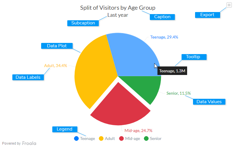
Caption
The caption (also called the chart title) is the heading of your chart. You can add custom text for the caption, as well as configure its font properties and cosmetics. Learn more about it
Subcaption
The sub-caption (also called the chart subtitle) is the sub-heading of your chart. You can add custom text for sub-caption, as well as configure its font properties.
Data Plot
Data plot refers to the pie slices in a pie chart, columns of the column chart, lines in a line chart.
Data Labels
Data labels refers to the labels associated with each pie slice
Data Values
Data values refers to values associated with each pie slice.
Legend
A legend is a chart element used to display the series name for each dataset, in case of multi-series or combination charts. Legends are used to correlate a data plot to its series name using its color.
Tooltip
A tooltip is displayed when the mouse cursor hovers over a particular data point. It denotes valuable information about the data plot hovered.
Export Menu
Export menu is hamburger menu that appears on top-right of the chart, it offers different options to export a chart.
You can enable or disable chart export using attributeexportEnabled. Refer to Exporting Charts to learn
more.
Create a Pie Chart
Let's create our first pie chart which will showcase the split of visitors for one year.
To create a pie chart follow the steps given below:- In the JSON data, set the attributes and their corresponding values in
"<attributeName>": "<value>
                        "
format. - Specify the chart type using the
typeattribute. To render a pie chart, setpie. - Set the container object using
renderAtattribute. - Specify the dimension of the chart using
widthandheightattributes. - Set the type of data (JSON/XML) you want to pass to the chart object using
dataFormatattribute.
For a detailed list of attributes, refer to the pie charts attribute page.
The pie chart for the above code looks like: