- Back to Docs
- Get Started
- Integrations
- Configuring your Charts
- List of Charts
- Single Series Charts
- Pie
- Doughnut
- Column
- Bar
- Area
- Line
- Stacked Charts
- Stacked Column
- Stacked Bar
- Stacked Area
- Combination Charts
- Combination
- XY Plot Charts
- Scatter
- Bubble
- Gauges
- Angular Gauge
- Other Charts
- Funnel
- Pyramid
- Heatmap
- Sankey
- Chord
- Radar
- Timeseries
- Chart Attributes
- API
- Options & Properties
- Methods
- Events
- Other References
- Concepts
- Browser and Technology Support
- Change Log
- License Activation
Radar Chart
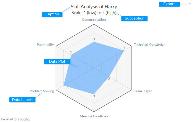
A radar chart (also known as a spider chart) is a visual interpretation of data bearing multiple dimensions. With the radial grid like structure, the chart displays the values of different categories on its axis. Radar charts are primarily used as a data comparison tool to visually correlate and contrast entities over its diverse aspects such as growth against benchmarks, progress over several criteria, etc.

Caption
The caption (also called the chart title) is the heading of your chart. You can add custom text for the caption, as well as configure its font properties and cosmetics.
Data Plot
Data plot refers to the columns of the chord chart.
Subcaption
The sub-caption (also called the chart subtitle) is the sub-heading of your chart. You can add custom text for sub-caption, as well as configure its font properties.
Data Labels
Data labels refers to the labels associated with data
Export Menu
Export menu that appears on top-right of the chart, it offers different options to export a chart.
You can enable or disable chart export using attributeexportEnabled. Refer to Exporting Charts to learn
more.
Create a Radar Chart
For a detailed list of attributes, refer to the Radar Chart attributes page.{
"chart": {
"caption": "AdWords Campaign Analysis",
"subcaption": "Conversions as % of total",
"xaxisname": "# Conversions",
"yaxisname": "Cost Per Conversion",
"numberprefix": "$",
"theme": "froala",
"plottooltext": "$name : Share of total conversion: $zvalue%"
},
"categories": [
{
"verticallinealpha": "20",
"category": [
{
"label": "0",
"x": "0"
},
{
"label": "1500",
"x": "1500",
"showverticalline": "1"
},
{
"label": "3000",
"x": "3000",
"showverticalline": "1"
},
{
"label": "4500",
"x": "4500",
"showverticalline": "1"
},
{
"label": "6000",
"x": "6000",
"showverticalline": "1"
}
]
}
],
"dataset": [
{
"data": [
{
"x": "5540",
"y": "16.09",
"z": "30.63",
"name": "Campaign 1"
},
{
"x": "4406",
"y": "12.74",
"z": "24.36",
"name": "Campaign 2"
},
{
"x": "1079",
"y": "15.79",
"z": "5.97",
"name": "Campaign 3"
},
{
"x": "1700",
"y": "8.27",
"z": "9.4",
"name": "Campaign 4"
},
{
"x": "853",
"y": "15.89",
"z": "4.71",
"name": "Campaign 5"
},
{
"x": "1202",
"y": "10.74",
"z": "6.65",
"name": "Campaign 6"
},
{
"x": "2018",
"y": "6.14",
"z": "11.16",
"name": "Campaign 7"
},
{
"x": "413",
"y": "19.83",
"z": "2.28",
"name": "Campaign 8"
},
{
"x": "586",
"y": "13.96",
"z": "3.24",
"name": "Campaign 9"
},
{
"x": "184",
"y": "15.82",
"z": "1.02",
"name": "Campaign 10"
},
{
"x": "311",
"y": "5.83",
"z": "1.72",
"name": "Campaign 11"
},
{
"x": "35",
"y": "10.76",
"z": "0.19",
"name": "Campaign 12"
},
{
"x": "55",
"y": "2.73",
"z": "0.3",
"name": "Campaign 13"
},
{
"x": "6",
"y": "21.22",
"z": "0.03",
"name": "Campaign 14"
}
]
}
]
}<html>
<head>
<title>My first chart using FroalaCharts</title>
<script src=https://unpkg.com/[email protected]/froalacharts.js></script>
<script src="https://unpkg.com/[email protected]/themes/froalacharts.theme.froala.js"></script>
<script type="text/javascript">
var data = {
chart: {
caption: "Skill Analysis of Harry",
subcaption: "Scale: 1 (low) to 5 (high)",
theme: "froala",
showlegend: "0",
showdivlinevalues: "0",
showlimits: "0",
showvalues: "1",
plotfillalpha: "40",
plottooltext: "Harry's $label skill is rated as $value"
},
categories: [
{
category: [
{
label: "Communication"
},
{
label: "Punctuality"
},
{
label: "Problem Solving"
},
{
label: "Meeting Deadlines"
},
{
label: "Team Player"
},
{
label: "Technical Knowledge"
}
]
}
],
dataset: [
{
seriesname: "User Ratings",
data: [
{
value: "3"
},
{
value: "3"
},
{
value: "4"
},
{
value: "3"
},
{
value: "2"
},
{
value: "4"
}
]
}
]
};
FroalaCharts.ready(function () {
froalacharts = new FroalaCharts({
id: "chart_1",
type: 'radar',
renderAt: 'ft',
width: '800',
height: '500',
dataSource: data
});
froalacharts.render();
});
</script>
</head>
<div id="msg" class="mb-20"> Chart data in the selected format will be displayed here.</div>
<body>
<div id="ft">FroalaCharts will render here</div>
</body>
</html>

