Days
Hours
Minutes
Seconds
x

New Froala Editor v5.0.0 is here โ€“ Learn More

Skip to content

Comparing the Page Break Feature in Froala and TinyMCE Editors

Page Break feature

Are you looking for the best rich text editor with a page break feature? Froala and TinyMCE, two leading rich text editors, handle this critical feature a bit differently. In this comparison, we’ll examine how each editor implements page breaks, evaluate their strengths and limitations, and help you determine which solution best fits your project requirements.

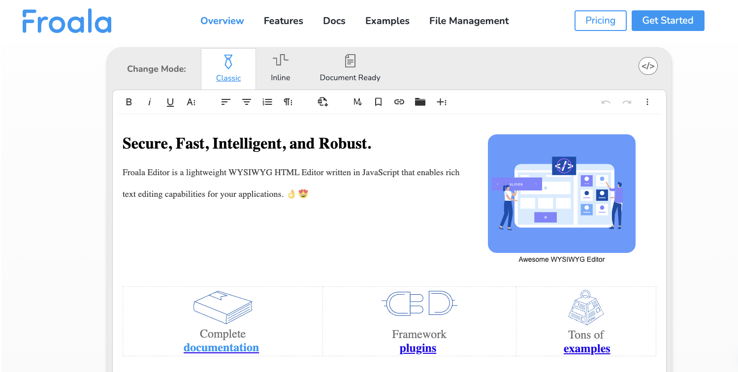
What Are Page Breaks and Why They Matter

Page breaks are essential formatting elements that allow users to divide documents into separate pages, improving readability and professional presentation for print output.

Definition and Use Cases

A page break is a formatting element that forces content to continue on a new page in a document. This is essential for applications that generate printable or exportable documents where layout control matters. Page breaks are commonly used in:

  • Invoice and report generation systems
  • Academic papers and research documents
  • Legal documents and contracts
  • Multi-page forms
  • Content management systems with print functionality

Importance in Document-Heavy Applications

For applications dealing with structured, professional documents, page breaks aren’t optionalโ€”they’re fundamental. Without proper page break support, users lose control over document layout, leading to unprofessional output and poor user experience. This is why evaluating page break implementations is crucial when selecting a rich text editor.

How Page Breaks Work in Froala & TinyMCE

Froala and TinyMCE implement the page break feature through a dedicated plugin.

The plugin is enabled and included in the toolbar configuration by default.

How Page Breaks Work in Froala

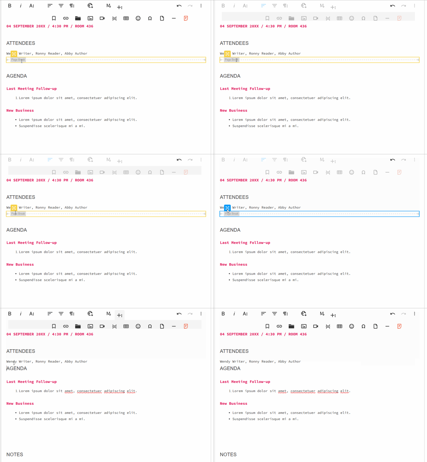
When Froalaโ€™s Page Break plugin is active, users see a page break button that inserts a <div class="fr-page-break"></div> element into the document. This approach uses CSS styling to render the visual representation of page breaks in the editor.

How Page Breaks Work in TinyMCE

When the TinyMCE “pagebreak” plugin is active, users see a page break button that inserts a <!-- pagebreak --> HTML comment into the document. Using HTML comments keeps the markup clean, but it has some drawbacks:

  • Less visual prominence in the editor compared to Froala
  • Styling options are more limited out-of-the-box
  • Requires custom CSS to render page breaks visually during print
  • HTML comment approach may be stripped by some content filters

Features and Capabilities

Froala V4.7.1 TinyMCE V8.2.3
HTML Representation <div class="fr-page-break"></div> <!-- pagebreak -->
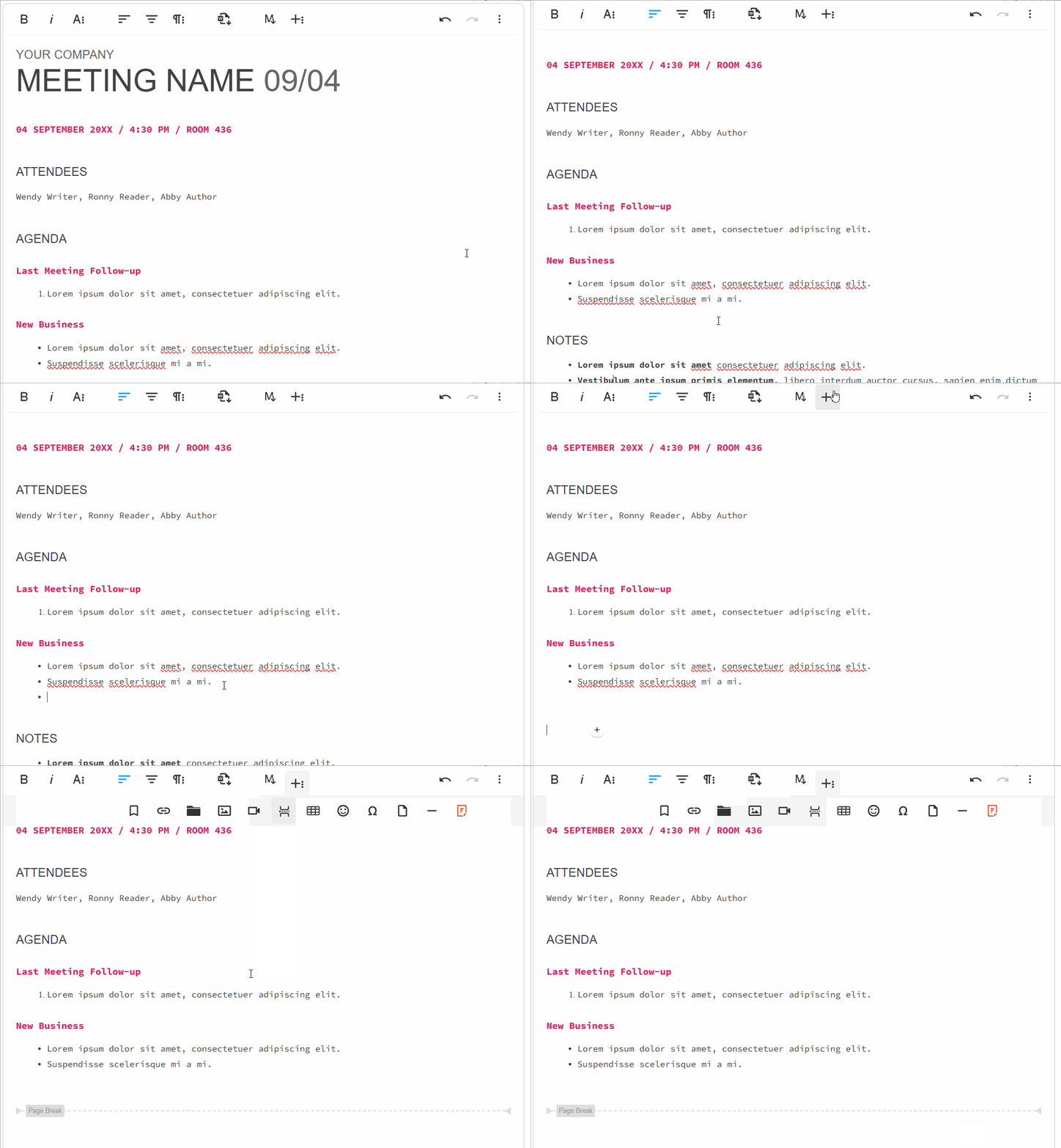
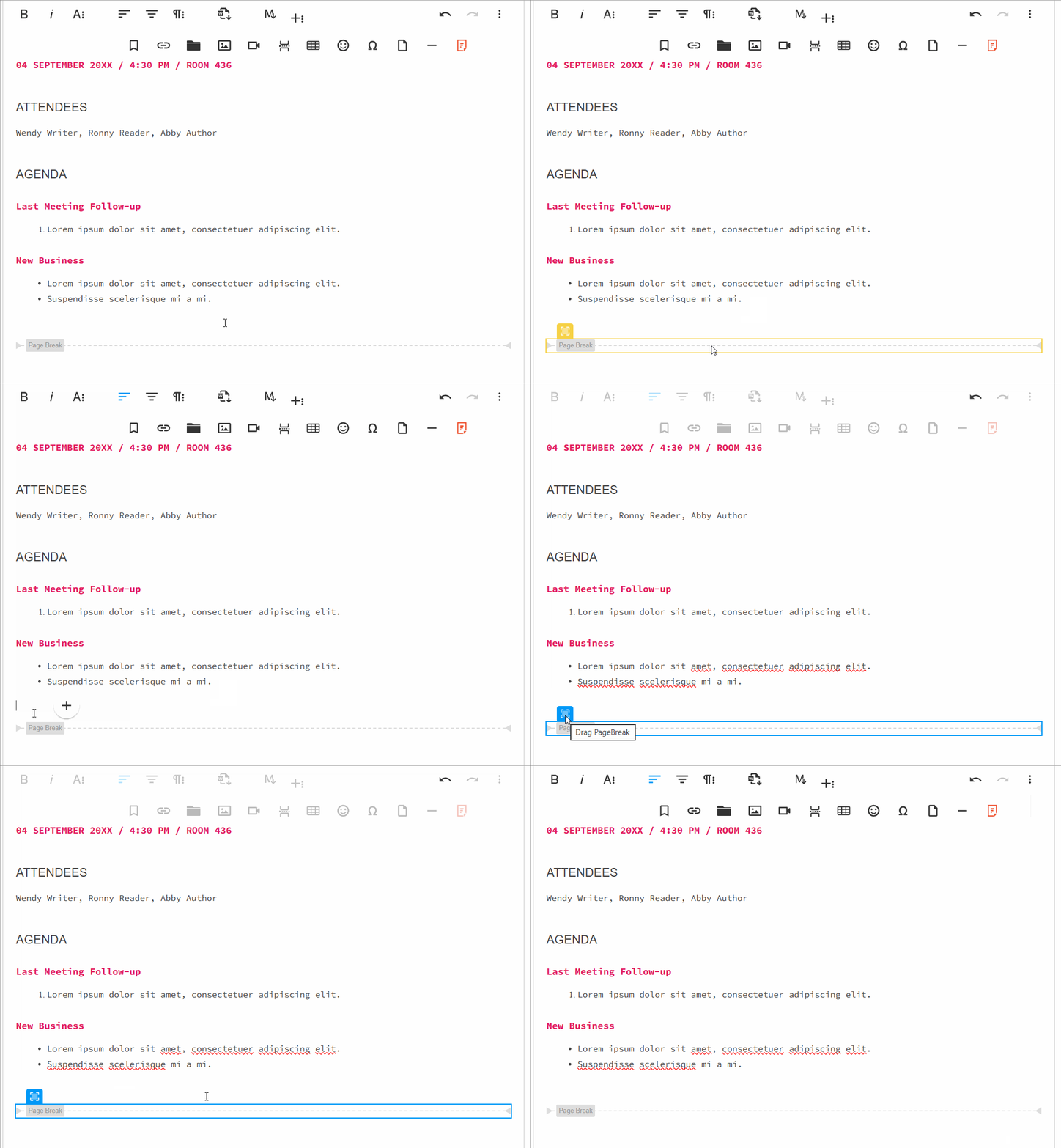
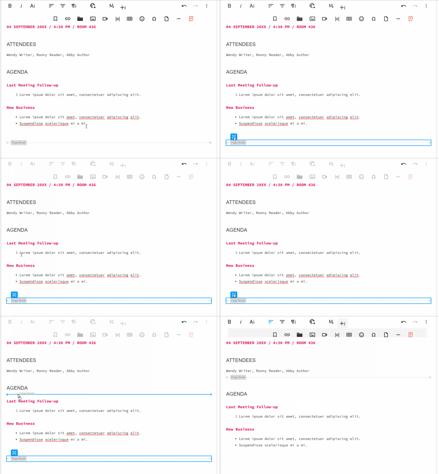
Visual Representation pageBreak in Froala page Break in tinymce
Drag and Drop Reposition Yes Yes
Insert inside Tables No Yes
Toolbar Integration Simple one-click insertion via the toolbar button
Undo/Redo Support Full support for undoing and redoing page break insertions

Which Plugin is More Developer Friendly?

Selecting a rich text editor involves more than just featuresโ€”developer experience matters significantly. Let’s conduct a detailed technical comparison of Froala and TinyMCE’s page break implementations to help you assess which aligns better with your development workflow.

Basic Setup and Configuration

Both editors require initialization, but their approaches differ in clarity and complexity.

Froala’s Initialization:

new FroalaEditor('textarea', {

ย ย pluginsEnabled: ['pageBreak'],

ย ย toolbarButtons: ['pageBreak']

})

Froala uses a direct constructor pattern. You instantiate a new FroalaEditor object, passing your target element selector as the first parameter and a configuration object as the second. The configuration explicitly declares which plugins to enable (pluginsEnabled) and which buttons to display in the toolbar (toolbarButtons). This approach is straightforward and self-documentingโ€”developers immediately understand that the page break plugin is active and visible.

TinyMCE’s Initialization:

tinymce.init({

ย ย selector: 'textarea',ย  // change this value according to your html

ย ย plugins: 'pagebreak',

ย ย toolbar: 'pagebreak'

});

TinyMCE uses a static initialization method. The tinymce.init() function accepts a single configuration object where you specify the target selector, plugins to load, and toolbar items. While equally straightforward, TinyMCE’s method is slightly less object-oriented, treating the editor as a singleton service rather than an instantiated object.

Developer Perspective: Froala’s object-oriented approach is more intuitive for developers working with multiple editor instances, while TinyMCE’s method works well for simpler implementations. However, both are easy to understand and implement.

Configuration Options

Configuration options reveal how each editor allows developers to customize behavior. The differences here are notable.

Froala’s Options:

exportPageBreak: Boolean (Default: true)

Froala provides a single, focused configuration option: exportPageBreak. When set to false, page breaks are excluded from exported content across all formats (PDF, Word, Print). This is a clean, intention-driven approach. If you need to control page break export behavior, this option does exactly that without additional complexity.

TinyMCE’s Options:

TinyMCE offers two configuration options, providing finer-grained control:

pagebreak_separator: String (Default: ‘<!– pagebreak –>’)

This option allows you to customize the HTML comment marker used to represent page breaks. By default, TinyMCE uses <!– pagebreak –>, but developers can modify this to any custom string. This is useful when integrating with systems that expect different delimiters.

pagebreak_split_block: Boolean (Default: undefined)

When enabled, this option improves the user experience by making it easier to split block-level elements (like paragraphs or lists) with a page break insertion. This prevents awkward formatting where a page break might conflict with element boundaries.

Developer Perspective: TinyMCE offers more granular configuration options, giving developers greater flexibility for specialized use cases. However, Froala’s simpler option set may be preferable for projects that don’t require extensive customization. The choice depends on your project’s specific requirements.

Event Handling and Hooks

Event systems allow developers to execute custom logic when specific actions occur. This is where the implementations diverge significantly.

Froala’s Event System:

pageBreak.beforeInsert()

Froala provides a dedicated event: pageBreak.beforeInsert(). This event fires immediately before a page break is inserted into the editor. Developers can attach listeners to this event to run validation, logging, or modification logic.

Example implementation:

editor.on('pageBreak.beforeInsert', function(e) {

ย ย console.log('A page break is about to be inserted');

ย ย // Perform validation or custom logic here

});

This is direct and purpose-built for page break operations, making the developer’s intent clear.

TinyMCE’s Event System:

TinyMCE doesn’t provide page break-specific events. Instead, developers must use the broader command event system to intercept page break operations:

tinymce.init({

ย ย selector: 'textarea',

ย ย setup: function(editor) {

ย ย ย ย // Before any command executes

ย ย ย ย editor.on('BeforeExecCommand', function(e) {

ย ย ย ย ย ย if (e.command === 'mcePageBreak') {

ย ย ย ย ย ย ย ย // Logic before page break command execution

ย ย ย ย ย ย ย ย console.log('Page break command about to execute');

ย ย ย ย ย ย }

ย ย ย ย });

ย ย ย ย 

ย ย ย ย // After any command executes

ย ย ย ย editor.on('ExecCommand', function(e) {

ย ย ย ย ย ย if (e.command === 'mcePageBreak') {

ย ย ย ย ย ย ย ย // Logic after page break command execution

ย ย ย ย ย ย ย ย console.log('Page break command executed');

ย ย ย ย ย ย }

ย ย ย ย });

ย ย }

});

TinyMCE’s approach requires developers to:

  1. Use the setup function during initialization
  2. Listen for generic BeforeExecCommand and ExecCommand events
  3. Check the e.command property to identify if the event relates to a page break (‘mcePageBreak’)

This works reliably but requires more boilerplate code and conditional logic compared to Froala’s dedicated event.

Developer Perspective: Froala provides a cleaner, more intuitive event model with dedicated hooks. TinyMCE’s generic command system is powerful and flexible but requires more code to achieve the same result. For developers who need to frequently intercept page break operations, Froala has a clear advantage here.

Methods and Command Execution

Programmatically inserting page breaks is a common requirement. The two editors provide different mechanisms.

Froala’s Method:

editor.pageBreak.insert();

Froala exposes a direct method on the editor instance. Calling editor.pageBreak.insert() immediately inserts a page break at the cursor position. This is intuitiveโ€”the method name clearly indicates the action being performed.

TinyMCE’s Command:

tinymce.activeEditor.execCommand('mcePageBreak');

TinyMCE uses a command execution pattern. The execCommand() method is a generic function that accepts a command string (‘mcePageBreak’). TinyMCE maintains a registry of available commands, and mcePageBreak is the registered command identifier for page break insertion.

Detailed explanation of the TinyMCE approach:

  • tinymce.activeEditor refers to the currently active editor instance in the DOM
  • execCommand('mcePageBreak') queues the page break command for execution
  • The command is processed through TinyMCE’s command pipeline, potentially triggering event listeners

Developer Perspective: Froala’s approach is more explicit and self-documenting. A developer reading editor.pageBreak.insert() immediately understands the action. TinyMCE’s command string approach (‘mcePageBreak’) requires familiarity with the command registry or documentation lookup. For new developers, Froala’s method is more discoverable and easier to understand.

Summary: Developer Friendliness Comparison

Aspect Froala TinyMCE
Setup Complexity Object-oriented, multi-instance friendly Static method, singleton-oriented
Configuration Options Minimal, focused on export behavior More granular control available
Event System Dedicated page break events Generic command events requiring filtering
Programmatic Insertion Direct method calls Command string pattern
Learning Curve Shorterโ€”intent-driven naming Moderateโ€”requires understanding command patterns
Code Verbosity Less boilerplate required More boilerplate for event handling

Recommendation: If developer experience is a priority, particularly for teams working with page breaks frequently, Froala provides a more intuitive and straightforward API. Its dedicated methods and events reduce the need for conditional logic and command registry lookups. TinyMCE, however, remains a solid choice for developers who value flexibility and are comfortable with command-based architectures. Your choice should align with your team’s familiarity with these patterns and your project’s complexity requirements.

Scenarios Favoring Froala Over TinyMCE

Choose Froala if your project exhibits these characteristics:

  • Print-Heavy Applications: If your users frequently generate printed documents or PDFs with precise page layouts, Froala’s <div class="fr-page-break"></div> approach provides superior CSS styling control and visual prominence in the editor. Users see exactly how page breaks will appear in the final output.
  • Complex Document Workflows: Applications requiring intricate document structuresโ€”such as legal document generators, report builders, or academic paper editorsโ€”benefit from Froala’s robust page break implementation. The ability to drag-and-drop reposition page breaks streamlines the editing experience.
  • Branded Document Output: When documents must match corporate branding or specific visual styling, Froala’s CSS-based approach allows you to customize page break appearance (colors, icons, borders) more intuitively than HTML comments.
  • Object-Oriented Development Teams: Developers familiar with object-oriented patterns will find Froala’s instantiation model (new FroalaEditor()) more natural. This is especially valuable for teams building applications with multiple editor instances or complex state management.
  • Frequent Programmatic Manipulation: If your application needs to regularly insert, validate, or track page breaks through code, Froala’s dedicated methods (editor.pageBreak.insert()) and events (pageBreak.beforeInsert()) reduce boilerplate and improve code maintainability.
  • Export Control Requirements: Projects requiring granular control over whether page breaks appear in exported content benefit from Froala’s exportPageBreak configuration option, which cleanly handles this common requirement.

In summary: Froala excels in professionally managed document workflows where visual control and developer ergonomics matter most. Let’s try Froala Now.


State Management Patterns for Editor Components in React-Based LMS Platforms

state react pattern

If you’re building a Learning Management System (LMS) in React, youโ€™ve probably faced this annoying issue: you add a WYSIWYG editor, and suddenly it turns slow. You type, and suddenly the cursor jumps around or the editor re-renders for no reason.

And honestly, the issue isnโ€™t the editor itself; itโ€™s usually the way we handle its state.

WYSIWYG editors like Froala, TinyMCE, and Draft.js are great for creating content, but they come with their own internal state. When we try to sync that state with React (using Redux, Context, or even normal component state), things can get messy really fast.

This post covers simple, beginner-friendly patterns to integrate WYSIWYG editors into a React-based LMS without performance issues.

Key Takeaways

  • Initialise the editor only when needed so it doesnโ€™t re-render too much.
  • Use refs instead of controlled components to keep typing smooth.
  • Debounce state updates to prevent performance degradation during typing.
  • Load the editor after a user action (like clicking a button) instead of loading it immediately.
  • Keep the editorโ€™s content separate from other fast-changing app state to avoid slowdowns.

Understanding the Problem

Before we jump into solutions, letโ€™s first understandย whyย WYSIWYG editors can be tricky in React.

React works best withย controlled components, where it manages the state and updates it on every change. But WYSIWYG editors donโ€™t really work that way. They manage a lot of internal stuff on their own: cursor position, text selection, formatting, undo history, and more.

So when we try to make them fully controlled in React, every single keystroke triggers a React state update. That update causes a re-render, which then interferes with the editorโ€™s internal state.

And the result? Laggy typing, the cursor jumping around, and a very frustrated user experience.

Now that we know what causes the lag, letโ€™s look at how to set up a WYSIWYG editor properly before applying the patterns.

Getting Started with a WYSIWYG Editor in React

Before implementing the patterns below, you’ll need to install and set up the editor in your React project.

Installation

First, install the editor package in your React project:


npm install react-froala-wysiwyg --save


Basic Setup

Now add the following code toย src/components/SimpleEditor.jsxย to set up a simple editor in your React project:


// Import Editor styles and scripts
import "froala-editor/css/froala_style.min.css";
import "froala-editor/css/froala_editor.pkgd.min.css";
import FroalaEditorComponent from "react-froala-wysiwyg";

const SimpleEditor = () => {
  return (
    <FroalaEditorComponent
      tag="textarea"
      config={{
        placeholderText: "Start typing...",
        toolbarButtons: ["bold", "italic", "underline", "undo", "redo"],
        height: 300,
        width: 800,
        events: {
          contentChanged: function () {
            console.log("Content updated!");
          },
          initialized: function () {
            console.log("Editor is ready!");
          },
        },
      }}
    />
  );
};

export default SimpleEditor;


What these options mean:

  • tag: The HTML element the editor is built on (textareaย orย div).
  • placeholderText: What shows when the editor is empty.
  • toolbarButtons: Choose which toolbar buttons to show.
  • height: Sets the editorโ€™s height.
  • width: Sets the editorโ€™s width.
  • events: Lets you listen to things likeย contentChangedย orย initializedย so you can react to editor actions.

Now, import and use it in yourย App.jsxย file:


importย SimpleEditorย fromย './components/SimpleEditor';

functionย App() {
returnย <SimpleEditorย />;
}


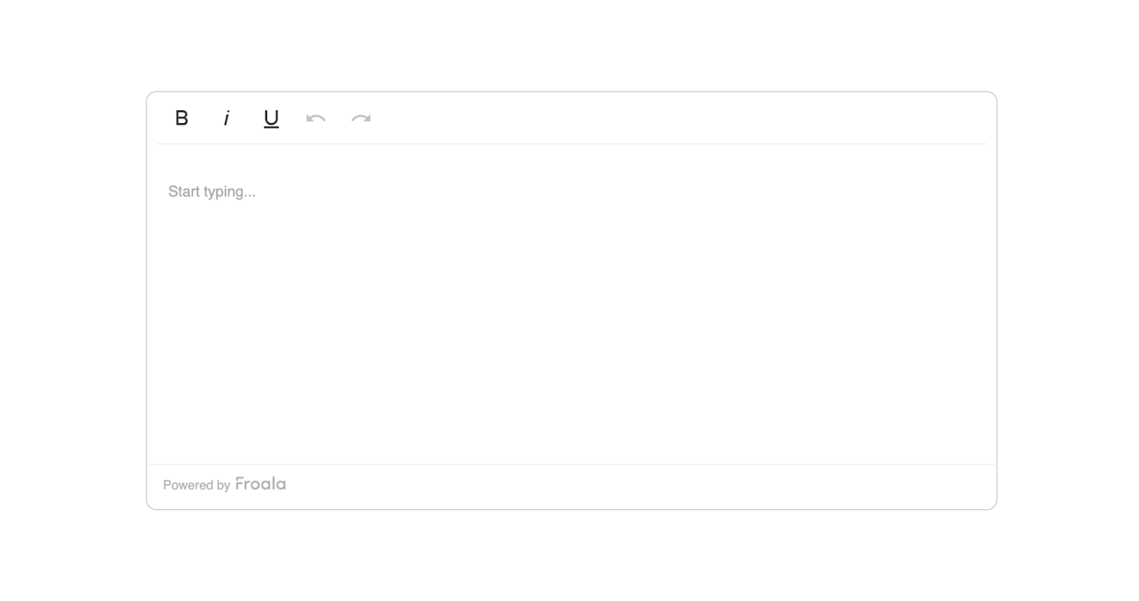
Hereโ€™s what it will look like:

froala editor

Now that you have the editor set up, letโ€™s look at different patterns to manage its state without hurting performance.

Pattern 1: Using Refs with Uncontrolled Editors (Simplest Approach)

The easiest way to work with a WYSIWYG editor in React is to treat it as an uncontrolled component.

Instead of syncing every keystroke with React, you just use a ref to access the content whenever you need it.

Create a new fileย src/components/LessonEditor.jsxย and add the following code inside it:


import React, { useRef, useState } from "react";
import FroalaEditorComponent from "react-froala-wysiwyg";

function LessonEditor() {
  const editorRef = useRef(null);
  const [isSaving, setIsSaving] = useState(false);

  const handleSave = async () => {
    // Get content only when needed
    const content = editorRef.current?.editor?.html?.get();
    setIsSaving(true);
    try {
      await saveToDatabase(content);
      alert("Lesson saved successfully!");
    } catch (error) {
      alert("Error saving lesson");
    }
    setIsSaving(false);
  };

  return (
    <div>
      <h2>Create Your Lesson</h2>
      <FroalaEditorComponent
        ref={editorRef}
        tag="textarea"
        config={{
          placeholderText: "Start writing your lesson content...",
          height: 400,
          width: 900,
        }}
      />
      <button
        onClick={handleSave}
        disabled={isSaving}
        style={{
          marginTop: "10px",
          padding: "10px 20px",
          fontSize: "16px",
          cursor: "pointer",
          backgroundColor: "#3c55c4ff",
          color: "white",
          border: "none",
          borderRadius: "5px",
        }}
      >
        {isSaving ? "Saving..." : "Save Lesson"}
      </button>
    </div>
  );
}

export default LessonEditor;


What this code does:

  • useRefย creates a reference to the editor so you can read its content whenever you want.
  • Reactย does notย try to manage the editorโ€™s internal state; the editor handles everything itself.
  • When the user clicksย Save, we grab the content using the ref and send it to the database.
  • While saving, the button showsย Savingโ€ฆย so the user knows something is happening.
  • This approach keeps typing smooth and removes the lag caused by constant re-renders.

Now import it wherever you want to show the editor:


import LessonEditor from './components/LessonEditor';

function App() {
  return <LessonEditor />;
}


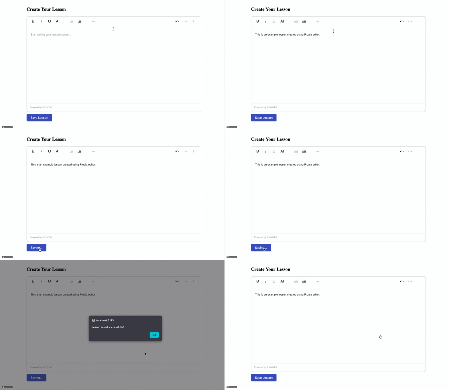
froala editor create lesson demo

Why this works:ย The editor keeps its own internal state, including cursor position, formatting, and undo history. Since React isnโ€™t watching every keystroke, nothing slows down. You only read the content when needed (like saving), which keeps your LMS fast and smooth.

This pattern works perfectly when you have a single editor. But what if your LMS page has multiple editors, like quizzes or modules? Thatโ€™s where Pattern 2 comes in.

Pattern 2: Lazy Initialisation with onClick

When you’re building LMS features, you might have multiple editors on the same page, like quiz questions, explanations, hints, etc.

Loading all editors at once can slow everything down.

A simple fix is to initialise the editor only when the user clicks on it.

This keeps your page fast and avoids unnecessary memory usage.

Create a new fileย src/components/QuizQuestionEditor.jsxย and add the following code inside it:


import React, { useState, useRef } from "react";
import FroalaEditor from "react-froala-wysiwyg";

function QuizQuestionEditor() {
  const [editorActive, setEditorActive] = useState(false);
  const editorRef = useRef(null);
  const [initialContent] = useState("");

  const activateEditor = () => {
    setEditorActive(true);
  };

  const handleSubmit = () => {
    if (editorRef.current) {
      const content = editorRef.current.editor.html.get();
      console.log("Question content:", content);
      // Submit to your backend
    }
  };

  return (
    <div>
      <h2>Quiz Question</h2>
      {!editorActive ? (
        <div
          onClick={activateEditor}
          style={{
            border: "1px solid #ccc",
            padding: "20px",
            borderRadius: "4px",
            cursor: "pointer",
            backgroundColor: "#f9f9f9",
          }}
        >
          Click to start writing your question...
        </div>
      ) : (
        <FroalaEditor
          ref={editorRef}
          tag="textarea"
          model={initialContent}
          config={{
            placeholderText: "Enter your quiz question here...",
            height: 400,
            width: 900,
          }}
        />
      )}
      <button
        onClick={handleSubmit}
        style={{
          marginTop: "10px",
          padding: "10px 20px",
          fontSize: "16px",
          cursor: "pointer",
          backgroundColor: "#3c55c4ff",
          color: "white",
          border: "none",
          borderRadius: "5px",
        }}
      >
        Submit Question
      </button>
    </div>
  );
}

export default QuizQuestionEditor;


What this code does:

  • The editor doesn’t load immediately. Instead, you show a placeholder box:ย โ€œClick to start writing your questionโ€ฆโ€
  • When the user clicks,ย editorActiveย becomesย true, and the editor finally loads.
  • The editorโ€™s content is accessed using a ref whenever you submit the question.
  • This avoids loading multiple heavy editors at once and is great for quiz creation pages.

Now import it wherever you want to show the editor:


importย QuizQuestionEditorย fromย './components/QuizQuestionEditor';

functionย App() {
returnย <QuizQuestionEditorย />;
}


Lazy loading of a Froala editor when the user clicks an input area

Benefits of this approach:

  • Faster initial page load.
  • Reduced memory usage (because editors load only when needed).
  • Better user experience when working with forms that contain multiple editors.

Lazy loading helps when you have many editors, but what if you also need autosave? Thatโ€™s where Pattern 3 comes in.

Pattern 3: Debounced Updates with Context API

Sometimes youย doย need the editorโ€™s content inside your app state, like when you want autosave.

But updating the state onย every keystrokeย will slow things down immediately.

A simple fix is to useย debouncing: wait a short time after the user stops typing before updating the state.

Create a new fileย src/components/AutoSaveEditor.jsxย and add the following code inside it:


import React, { useState, useRef } from "react";
import FroalaEditor from "react-froala-wysiwyg";

function QuizQuestionEditor() {
  const [editorActive, setEditorActive] = useState(false);
  const editorRef = useRef(null);
  const [initialContent] = useState("");

  const activateEditor = () => {
    setEditorActive(true);
  };

  const handleSubmit = () => {
    if (editorRef.current) {
      const content = editorRef.current.editor.html.get();
      console.log("Question content:", content);
      // Submit to your backend
    }
  };

  return (
    <div>
      <h2>Quiz Question</h2>
      {!editorActive ? (
        <div
          onClick={activateEditor}
          style={{
            border: "1px solid #ccc",
            padding: "20px",
            borderRadius: "4px",
            cursor: "pointer",
            backgroundColor: "#f9f9f9",
          }}
        >
          Click to start writing your question...
        </div>
      ) : (
        <FroalaEditor
          ref={editorRef}
          tag="textarea"
          model={initialContent}
          config={{
            placeholderText: "Enter your quiz question here...",
            height: 400,
            width: 900,
          }}
        />
      )}
      <button
        onClick={handleSubmit}
        style={{
          marginTop: "10px",
          padding: "10px 20px",
          fontSize: "16px",
          cursor: "pointer",
          backgroundColor: "#3c55c4ff",
          color: "white",
          border: "none",
          borderRadius: "5px",
        }}
      >
        Submit Question
      </button>
    </div>
  );
}

export default QuizQuestionEditor;


What this code does:

  • The editor fires aย contentChangedย event every time the user types.
  • But instead of updating the state instantly, we debounce it usingย setTimeout.
  • If the user keeps typing, the timer resets.
  • When they stop typing for 2 seconds, then:
  • The content is saved into global state (LessonContext)
  • The autosave request is sent to the backend
  • A small message shows when the lesson was last saved.

Now, wrap your app in theย LessonProvider:


import { LessonProvider, AutoSaveEditor } from './components/AutoSaveEditor';

function App() {
  return (
    <LessonProvider>
      <AutoSaveEditor />
    </LessonProvider>
  );
}


Froala editor with an autosave message showing the last saved time

Key points:

  • We debounce editor changes to avoid constant state updates.
  • Autosave feels fast but never slows down typing.
  • Using Context lets other components read the lesson content too.
  • Perfect for LMS dashboards with autosave, drafts, and live editing.

No matter which pattern you use, a few best practices can save you from unexpected performance issues.

Best Practices

Here are a few simple guidelines to keep your WYSIWYG editors fast, clean, and easy to manage in React, especially when you’re building LMS features.

  1. Initialise on demand: Donโ€™t load the editor until the user actually needs it. This really helps when you have multiple editors on a single page.
  2. Use refs for content access: Instead of making the editor fully controlled, use refs to access the content only when you need it.
  3. Add debouncing for state updates:ย If youโ€™re syncing editor content with state (like autosave), debounce it by 1โ€“2 seconds so youโ€™re not updating constantly.
  4. Keep editor state separate: Avoid mixing editor HTML with other UI state. Keep it separate from things like loading flags, filters, or user preferences.
  5. Clean up when the component unmounts: Always clear timers, intervals, or event listeners to avoid memory leaks.

And of course, there are a few easy mistakes that can undo all this good work. So now look at what to avoid.

Common Pitfalls

These are the mistakes that usually cause WYSIWYG editors to lag, re-render too much, or behave unpredictably in React. Avoiding them will make your editor setup much smoother.

  1. Making the editor fully controlled: Avoid using aย valueย prop that updates on every change. This forces React to re-render constantly, causing cursor jumps and laggy typing.
  2. Storing HTML in a frequently updated state: Donโ€™t mix editor content with state that updates often (like loading flags, validation, or UI filters). It leads to unnecessary re-renders.
  3. Not debouncing autosave: Saving to the backend on every character typed will crush your server and slow down the editor.
  4. Initialising too early: Loading all editors as soon as the page mounts wastes memory. Use lazy initialisation so the editor loads only when needed.
  5. Forgetting to clean up: Forgetting to clear timeouts, intervals, or listeners can cause memory leaks, especially in single-page applications like React apps.

Conclusion

Managing WYSIWYG editors in React doesnโ€™t have to be difficult. The main thing to remember is that these editors already handle a lot of their own internal state. When we try to control every update through React, things slow down, and typing becomes laggy.

By keeping the editor uncontrolled, using refs to read content, debouncing updates, and loading the editor only when needed, you can build fast, smooth LMS features without the usual headaches.

Start with the simplest pattern that fits your use case. You can always add more advanced logic later as your app grows. Just keep in mind: you donโ€™t need to over-optimise too early, but planning for performance from the beginning simply helps you avoid issues later.

Resources for Further Reading

What Makes a WYSIWYG Editor Developer-Friendly?

Developer-friendly WYSIWYG editor illustration showing clean HTML output, customization, and extensible editor components

A WYSIWYG editor lets users create content visually instead of writing raw HTML. What you see is what you get. On the surface, most editors look the same. A toolbar. A text area. Some formatting buttons.

But once you start integrating one into a real product, the differences show up fast. Some editors fight your codebase. Others generate messy HTML, slow down your app, or limit how much control you have. Thatโ€™s when โ€œeasy to useโ€ stops mattering, and โ€œeasy to work withโ€ becomes the real priority.

So what actually makes a WYSIWYG editor developer-friendly?

Itโ€™s not about flashy features or long toolbars. Itโ€™s about clean output, predictable behavior, performance, and flexibility. Itโ€™s about whether the editor fits into your stack without friction.

In this article, youโ€™ll break down the key traits that matter most to developers, and how to evaluate a WYSIWYG editor with long-term maintainability in mind.

Key takeaways

  • A developer-friendly WYSIWYG editor is easy to integrate and doesnโ€™t disrupt your existing stack.
  • Clean, predictable HTML output reduces long-term maintenance and styling issues.
  • Customization should be possible without forking or rewriting core editor code.
  • Lightweight performance matters for both user experience and Core Web Vitals.
  • Strong APIs, security controls, and good documentation make an editor easier to maintain as your product grows.

What does โ€œdeveloper-friendlyโ€ really mean?

A developer-friendly WYSIWYG editor doesnโ€™t slow you down. It fits into your existing stack without forcing workarounds or hacks. Setup feels straightforward, not fragile.

You get predictable behavior. The editor does what it promises and produces consistent results. You donโ€™t have to guess how it will behave in different browsers or environments.

Flexibility matters just as much. You can customize features, control output, and adapt the editor to your productโ€™s needs. It works with you, not against you.

Most importantly, it stays out of your way. A truly developer-friendly WYSIWYG editor lets you focus on building your product instead of fighting the editor itself.

Clean & predictable HTML output

HTML output is where many WYSIWYG editors fail developers. What looks fine in the editor can turn into bloated, inconsistent markup behind the scenes. That mess shows up later as styling bugs, broken layouts, or painful cleanup work.

A developer-friendly WYSIWYG editor produces clean, semantic HTML. Tags are predictable. Structure stays consistent. You donโ€™t have to inspect every block just to understand what was generated.

This matters long term. Clean HTML is easier to style, safer to store, and simpler to maintain. It also reduces security risks and improves performance across your app.

When an HTML WYSIWYG editor gives you control over output, your codebase stays healthy. You spend less time fixing content issues and more time shipping features that actually matter.

Customization without forking the editor

Every product has different content needs. A developer-friendly WYSIWYG editor lets you adapt those needs without rewriting the editor itself. You should be able to customize behavior, not fight defaults.

Toolbar configuration is a good starting point. You decide which buttons exist and which features stay hidden. Users see only what they need, and nothing more.

Extensibility matters even more. A solid plugin system lets you add custom buttons, commands, and workflows. You can enable or disable rich text editor features without touching core code.

When customization is built in, you avoid forks. Updates stay simple. Your editor evolves with your product instead of becoming technical debt.

Lightweight performance & fast load times

Performance matters more than it looks. A heavy editor can slow down page loads and hurt Core Web Vitals before users even start typing. Thatโ€™s a problem, especially in content-heavy apps.

A lightweight WYSIWYG editor keeps bundle size under control. You load only what you need, not an entire feature set by default. This makes a big difference for web-based WYSIWYG editors running in modern frontend stacks.

Fast load times also improve the developer experience. You spend less time optimizing around the editor and more time building features. Lazy loading and modular builds help keep things efficient.

When an editor respects performance, it fits naturally into your app. It feels fast, responsive, and invisible, in the best way.

Strong API & extensibility

A polished UI is nice, but APIs are what developers rely on. A developer-friendly WYSIWYG editor gives you a clear, well-documented API to control behavior programmatically. You shouldnโ€™t be limited to default actions.

Events, hooks, and callbacks make the editor predictable and flexible. You can listen for changes, intercept actions, or trigger custom logic when content updates. This is where real integration happens.

Extensibility also matters when your editor connects to other systems. File uploads, media libraries, CMS platforms, and workflows should plug in cleanly. A strong WYSIWYG editor API keeps everything connected without fragile hacks.

When extensibility is built into the core, the editor grows with your product. You stay in control as requirements evolve.

Framework & ecosystem compatibility

Modern apps donโ€™t live in isolation. Youโ€™re likely working with React, Vue, Angular, or a mix of frameworks. A developer-friendly WYSIWYG editor fits into these environments without friction.

Framework-agnostic support matters. You should be able to use the same editor across projects, even as your tech stack evolves. Tight coupling to a single framework creates long-term limits.

Integration should feel natural. Clear examples, predictable lifecycle handling, and clean state management make the editor easier to work with. This is especially important for frontend WYSIWYG editors embedded deep in complex apps.

When an editor respects your ecosystem, it becomes a reliable building block, not a special case you have to manage forever.

Security & content control

Rich text content can be risky if you donโ€™t control it. A WYSIWYG editor that allows unsafe markup can open the door to XSS attacks and data exposure. That risk grows as more users create content.

A developer-friendly WYSIWYG editor helps you stay in control. You can define allowed tags, sanitize output, and restrict what users are permitted to do. Security should be configurable, not bolted on later.

Content control matters too. Different users need different permissions. Editors should respect roles, limits, and workflows without custom patches.

When security is built into the editor, you protect both your users and your application. You also avoid last-minute fixes that slow development and create technical debt.

Documentation & developer experience (DX)

Good documentation saves hours of guesswork. A developer-friendly WYSIWYG editor explains how things work, not just what buttons exist. Setup steps should be clear from the first read.

Real examples make a big difference. You want to see how the editor behaves in real projects, not just isolated snippets. Clear API references help you move faster and avoid mistakes.

Developer experience also depends on maintenance. Regular updates, clear changelogs, and active support build trust over time. You know the editor wonโ€™t become a liability later.

When documentation is solid, the editor feels reliable. You spend less time searching for answers and more time building with confidence.

Choosing the right WYSIWYG editor for your project

There is no single WYSIWYG editor that fits every product. The right choice depends on how your app works and what your users actually need. Features alone shouldnโ€™t drive the decision.

Start with your use case. Consider content complexity, performance expectations, and how much control you need over output. Think about integrations, security requirements, and long-term maintenance.

Popularity can be misleading. An editor that looks powerful may create friction once you start customizing it. A developer-friendly WYSIWYG editor supports your workflow instead of dictating it.

When you evaluate editors through a developer lens, the right option becomes clearer. You choose a tool that grows with your product, not one you have to replace later.

Conclusion

A developer-friendly WYSIWYG editor is not defined by how many features it offers. Itโ€™s defined by how well it fits into your workflow. Clean output, strong APIs, performance, and control matter more than flashy tools.

When an editor respects your stack, security needs, and long-term goals, it becomes an asset instead of a burden. You spend less time fixing issues and more time building your product.

As you evaluate your options, focus on maintainability and flexibility. The right editor should support your growth todayโ€”and still make sense months or years down the line.

FAQs

What makes a WYSIWYG editor developer-friendly?

A developer-friendly WYSIWYG editor is easy to integrate, produces clean HTML, and offers strong customization options. It gives you control over output, performance, and security without forcing workarounds or forks.

Why does HTML output matter in a WYSIWYG editor?

Messy or inconsistent HTML creates long-term problems. Clean, predictable output makes styling easier, improves performance, and reduces security risks in content-driven applications.

Should developers prioritize features or flexibility when choosing a WYSIWYG editor?

Flexibility should come first. A rich feature set means little if the editor is hard to customize or maintain. Developers benefit more from extensibility, strong APIs, and predictable behavior than from extra buttons.

10 Best WYSIWYG Editors for Web Developers in 2026

Illustration showing modern WYSIWYG editors and code interfaces used by web developers to create and edit rich content

Modern web applications rely on rich content experiences. From dashboards to CMS platforms, you need tools to make content creation fast and reliable. Thatโ€™s where the best WYSIWYG editors continue to play a key role in 2026.

WYSIWYG editors have transformed the way you create and edit content by showing you what you will get while working. They still produce clean HTML behind the scenes. For developers like you, this means fewer formatting issues, faster workflows, and better user experiences. For teams, it reduces friction between content creators and code.

In this guide, youโ€™ll find a practical WYSIWYG editor comparison covering the tools web developers use most today. You can explore how they differ, what theyโ€™re best suited for, and how to choose the right one for your project.

Key takeaways

  • The best WYSIWYG editors help you build rich content experiences faster without writing raw HTML. They reduce formatting errors and improve consistency across applications.
  • Not all WYSIWYG editors work the same way. Some focus on simplicity, while others offer deep customization, structured content models, or headless architectures.
  • Modern WYSIWYG editors integrate smoothly with frameworks like React, Vue, and Angular. This makes them suitable for component-driven and scalable web apps.
  • Open-source and commercial editors both have strengths. Your choice depends on support needs, maintenance effort, and long-term project goals.
  • The right editor is the one that fits your use case. Always evaluate based on your stack, users, and how much control you need over content.

What is a WYSIWYG editor?

A WYSIWYG editor, short for What You See Is What You Get, allows you to create content in a visual interface. It automatically generates the underlying HTML. Instead of writing raw markup, you can format text, add images, and structure content the same way it will appear on the page.

This is different from plain text or code editors where you need to change HTML and CSS manually. A WYSIWYG text editor removes that complexity and reduces formatting errors.

Today, WYSIWYG editors are widely used in content management systems, web apps, form builders, and any interface where non-technical users need to create structured content.

Why web developers still use WYSIWYG editors in 2026

Web developers still rely on WYSIWYG editors because they speed up content creation without sacrificing control. Your teams can build rich content experiences quickly while avoiding repetitive HTML work. This is especially valuable in content-heavy applications.

You can integrate modern WYSIWYG smoothly with frameworks like React, Vue, and Angular. They support modular architectures and custom configurations. This makes them suitable for todayโ€™s component-driven development.

Accessibility and collaboration also matter more than ever. A visual editor allows designers, marketers, and developers to work together efficiently while maintaining consistent, structured output.

How we evaluated the best WYSIWYG editors

To create a fair WYSIWYG editor comparison, each tool was evaluated using the same criteria. We looked at core editing features such as formatting options, media handling, and plugin support. These basics determine how flexible an editor is in real projects.

Framework compatibility was also important. Editors that integrate well with React, Vue, Angular, or plain JavaScript scored higher for modern workflows. We also considered customization options, bundle size, and performance.

Finally, we reviewed documentation quality, community support, and licensing models. This helps developers understand long-term maintenance and adoption costs.

10 best WYSIWYG editors for web developers in 2026

Here is my list of 10 best WYSIWYG editors for web developers in 2026. You can explore their key features, use cases, support for integration with different frameworks and pros & cons below:

1. Froala Editor

Froala HTML WYSIWYG editor screenshot

Froala is a modern and versatile HTML WYSIWYG editor designed with developers in mind. It focuses on clean output, performance, and flexibility rather than overwhelming users with unnecessary features. The editor produces well-structured HTML that works reliably across applications.

Key features include rich text formatting, media handling, extensible plugins, and strong security controls. It is lightweight, which helps keep bundle sizes small and load times fast.

  • Best for: content-heavy web apps and SaaS platforms.
  • Framework support: React, Vue, Angular, and plain JavaScript.
  • Pros: fast, clean output, highly customizable.
  • Cons: commercial licensing required.

2. TinyMCE

TinyMCE WYSIWYG editor

TinyMCE is one of the most widely used WYSIWYG editors on the web. It offers a familiar editing experience and a large ecosystem of plugins. Many developers recognize it from CMS platforms and enterprise applications.

Key features include extensive formatting tools, media embedding, and advanced plugin support. The editor is highly configurable, but heavier setups may require careful optimization.

  • Best for: enterprise content platforms and CMS-driven sites.
  • Framework support: React, Vue, Angular, and vanilla JavaScript.
  • Pros: mature ecosystem, strong documentation.
  • Cons: larger bundle size and premium features behind paid plans.

3. CKEditor

CKEditor - rich text editor

CKEditor is a powerful WYSIWYG editor known for its structured content model. It is often used in large-scale applications where consistency and control matter. The editor emphasizes clean markup and predictable behavior.

Key features include modular plugins, collaborative editing options, and strong content filtering. CKEditor is highly extensible, but setup can be more complex compared to lightweight editors.

  • Best for: enterprise apps and collaborative editing workflows.
  • Framework support: React, Vue, Angular, and plain JavaScript.
  • Pros: structured output, advanced collaboration features.
  • Cons: steeper learning curve and licensing considerations.

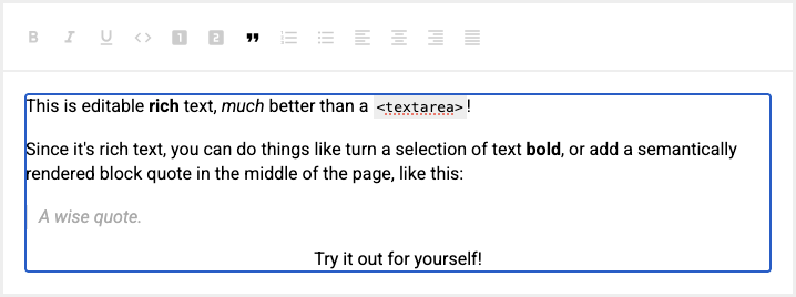
4. Quill

Quill - a lightweight, open-source WYSIWYG editor

Quill is a lightweight, open-source WYSIWYG editor built with a modern API. It focuses on simplicity and gives developers fine-grained control over content behavior. The editor uses a structured document model rather than raw HTML.

Key features include a clean core, customizable modules, and a powerful delta-based data format. Quill does not try to handle every use case out of the box, which keeps it flexible and fast.

  • Best for: custom editors and developer-driven interfaces.
  • Framework support: JavaScript, React, Vue, and Angular wrappers.
  • Pros: lightweight, open source, flexible API.
  • Cons: limited built-in UI features without customization.

5. Summernote

Summernote - open-source WYSIWYG editor

Summernote is a simple, open-source WYSIWYG editor designed for quick integration. It offers a clean interface that feels familiar to users who need basic rich text editing. The setup is straightforward and works well for smaller projects.

Key features include standard formatting tools, image uploads, and drag-and-drop support. Summernote is built on jQuery, which makes it easy to add to legacy systems but less ideal for modern frameworks.

  • Best for: small websites and legacy applications.
  • Framework support: jQuery-based environments.
  • Pros: easy setup, lightweight, open source.
  • Cons: limited modern framework support and extensibility.

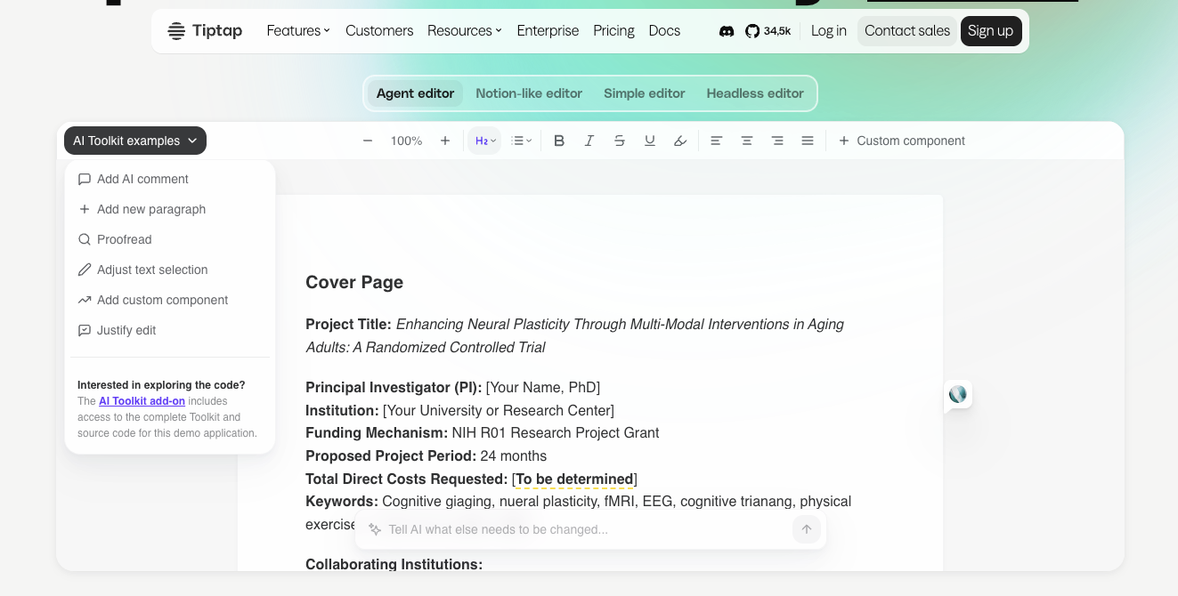
6. TipTap

TipTap - a headless WYSIWYG editor

TipTap is a headless WYSIWYG editor built on top of ProseMirror. It gives developers full control over the UI while handling complex editing logic under the hood. This makes it a strong fit for highly customized interfaces.

Key features include a flexible extension system, collaborative editing support, and a schema-driven content model. Because it is headless, most of the visual layer must be built manually.

  • Best for: custom-rich editors and design-heavy applications.
  • Framework support: React, Vue, and vanilla JavaScript.
  • Pros: extremely flexible, modern architecture.
  • Cons: requires more development effort to implement.

7. Slate

Slate - highly customizable WYSIWYG editor framework

Slate is a highly customizable WYSIWYG editor framework built specifically for React. It gives developers full control over how content is structured, rendered, and edited. Slate acts more like a toolkit than a ready-made editor.

Key features include a flexible document model, React-first architecture, and complete control over editor behavior. This makes it possible to build unique editing experiences that go far beyond standard text formatting.

  • Best for: advanced, React-based custom editors.
  • Framework support: React only.
  • Pros: extremely flexible, full control over content logic.
  • Cons: requires significant setup and implementation effort.

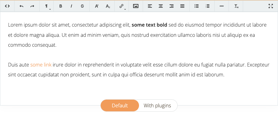
8. Trumbowyg

Trumbowyg - open-source WYSIWYG editor

Trumbowyg is a minimal, open-source WYSIWYG editor focused on speed and simplicity. It avoids complex features in favor of a clean editing experience. This keeps the editor lightweight and easy to understand.

Key features include basic formatting tools, plugin extensions, and fast initialization. Trumbowyg is jQuery-based, which makes it suitable for older projects but less aligned with modern frameworks.

  • Best for: simple editing needs and lightweight projects.
  • Framework support: jQuery-based environments.
  • Pros: very lightweight, easy to integrate.
  • Cons: limited advanced features and modern framework support.

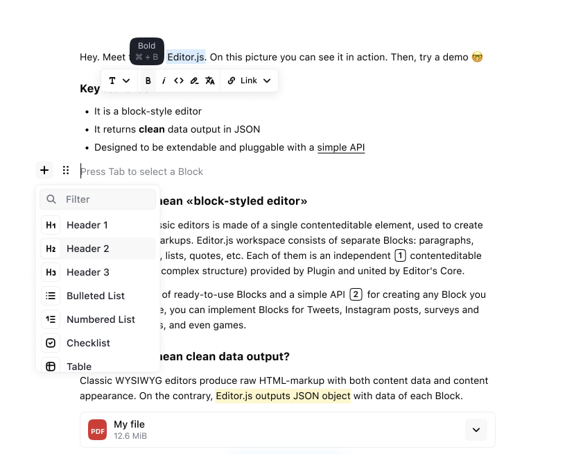
9. Editor.js

Editor.js free and open-source block-based WYSIWYG editor

Editor.js is a free and open-source block-based WYSIWYG editor. It takes a different approach to content creation. Instead of editing free-flowing text, users build content using structured blocks like paragraphs, images, lists, and embeds. This makes content more predictable and reusable.

Key features include JSON-based output, modular block plugins, and clean separation between content and presentation. Editor.js focuses on data structure rather than visual styling.

  • Best for: content-driven apps and headless CMS setups.
  • Framework support: JavaScript with wrappers for React and Vue.
  • Pros: structured output, modern block-based editing.
  • Cons: limited traditional rich text formatting.

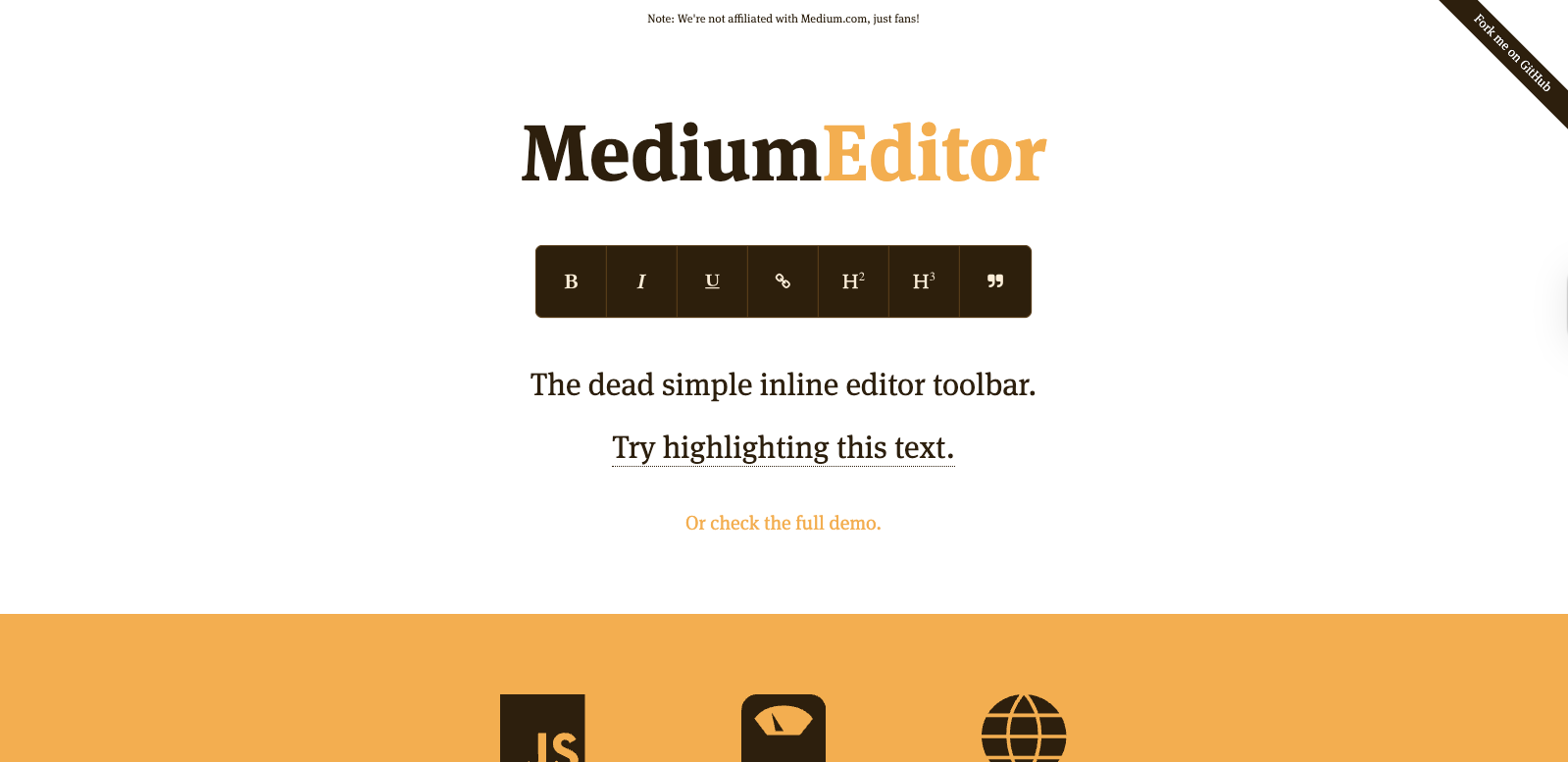
10. MediumEditor

MediumEditor inline WYSIWYG editor

MediumEditor is a lightweight, inline WYSIWYG editor inspired by the editing experience on Medium. It focuses on simplicity and keeps the interface almost invisible while users write. The goal is to make content creation feel natural and distraction-free.

Key features include inline editing, basic formatting options, and minimal configuration. MediumEditor does not try to handle complex layouts or advanced content structures.

  • Best for: simple text editing and inline content experiences.
  • Framework support: plain JavaScript with community wrappers.
  • Pros: clean UX, very lightweight.
  • Cons: limited features and not ideal for complex editing needs.

Quick comparison table

The table below offers a high-level WYSIWYG editor comparison to help you spot key differences at a glance. It highlights licensing models, framework support, customization levels, and common use cases. Use this overview as a starting point before exploring each editor in detail and testing them within your own development environment.

Editor Open-source / Commercial Framework support Customization level Ideal use case
Froala Editor Commercial React, Vue, Angular, JS High Content-heavy web apps
TinyMCE Hybrid React, Vue, Angular, JS High CMS and enterprise platforms
CKEditor Hybrid React, Vue, Angular, JS High Structured enterprise content
Quill Open source JS, React, Vue Medium Custom lightweight editors
Summernote Open source jQuery Lowโ€“Medium Small or legacy projects
TipTap Open core React, Vue, JS Very high Custom editor experiences
Slate Open source React Very high Advanced React-based editors
Trumbowyg Open source jQuery Low Simple editing needs
Editor.js Open source JS, React, Vue Medium Block-based content systems
MediumEditor Open source JavaScript Low Inline text editing

Conclusion

There is no single editor that fits every project or team. Each option in this list serves a different purpose, depending on how much control, structure, and flexibility you need. The best choice depends on your application, your users, and your long-term maintenance goals.

Before committing, itโ€™s worth testing a few editors in real scenarios. Look at how they integrate with your stack, how they handle content, and how easy they are to extend. A thoughtful evaluation will help you choose a WYSIWYG editor that supports both your current needs and future growth.

FAQs

What is the best WYSIWYG editor for web developers?

There is no universal best option. The right WYSIWYG editor depends on your project requirements, framework, and level of customization needed. Some editors focus on simplicity, while others are built for complex, structured content.

Are open-source WYSIWYG editors good enough for production use?

Yes, many open-source WYSIWYG editors are production-ready. However, they may require more customization and maintenance compared to commercial tools. Support, updates, and long-term stability should be considered.

Can WYSIWYG editors be used with modern JavaScript frameworks?

Most modern WYSIWYG editors support frameworks like React, Vue, and Angular. Some are framework-specific, while others offer wrappers or SDKs. Always check integration options before choosing an editor.

Froala V5.0.0 Release: Code Snippets, Word Imports, and More

Froala V5.0.0

Froala V5.0.0 introduces two major features: code snippet insertion with syntax highlighting, and direct Word document import with formatting preserved. This release also includes table handling improvements and updated styling defaults.

Code Snippet Feature Overview

The Code Snippet plugin adds syntax-highlighted code blocks to your editor. Supports JavaScript, Python, HTML, CSS, TypeScript, Java, C++, SQL, and JSON. Works across Chrome, Firefox, Edge, and Safari.

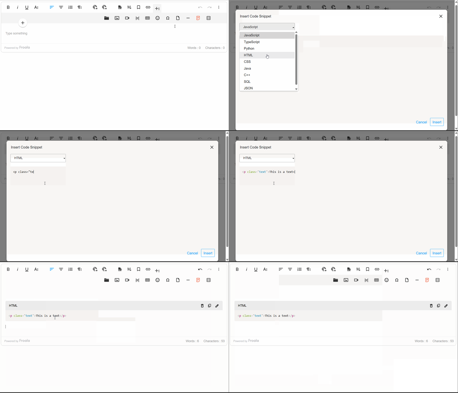
code snippet insertion

Inserting Code Snippets

Click the “Insert Code Snippet” button in the toolbar to open the code entry modal. Select a programming language from the dropdown and paste or write your code. Syntax highlighting applies automatically.

Code Block Rendering

Code snippets are rendered in a monospace font within styled <pre> and <code> blocks, ensuring precision and consistency. The plugin intelligently preserves indentation and line breaks, maintaining the exact formatting developers intended. By default, code blocks are read-only, protecting formatting integrity while allowing users to view and reference code effortlessly.

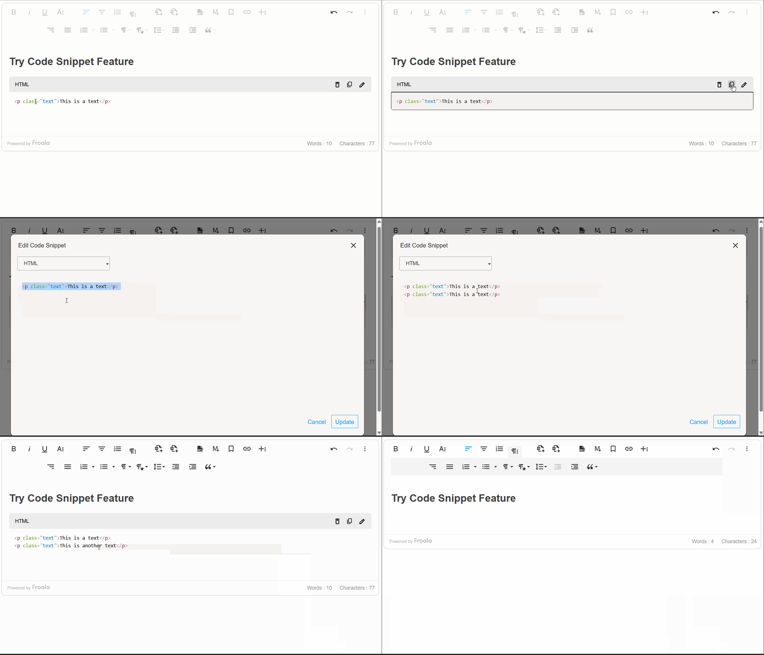
Edit, Remove, and Copy with Ease

Use the Code Snippet toolbar to edit, remove, or copy code blocks. The “Copy to Clipboard” button copies the code with formatting intact.

code snippet edit

Developer Control and Customization

Froala V5.0.0 provides a comprehensive set of options, methods, and events that give developers programmatic control over the code snippet feature.

The plugin configuration options allow developers to customize the code snippet feature according to their needs. Whether you want to limit available programming languages, set a default language preference, or tailor the feature to your specific workflow, these settings give you complete control over the code snippet behavior.

Additionally, there are methods for code snippet insertion, updating, and display. These methods enable you to integrate code snippet functionality seamlessly into your custom workflows and automate code block management.

Moreover, the Code Snippet plugin exposes powerful events that allow you to hook into the code insertion lifecycle. These events enable you to implement custom validation, analytics tracking, and dynamic code processingโ€”giving you fine-grained control over how code snippets are handled within your editor. By leveraging these events, you can build sophisticated workflows that align with your application’s specific requirements and user needs.

new FroalaEditor('.selector', {
  codeSnippetLanguage: {
    'JavaScript': 'javascript',
    'Python': 'python',
    'Ruby': 'ruby',
    'Go': 'go',
    'Rust': 'rust'
  },
  codeSnippetDefaultLanguage: 'Python',
  events: {
    'codeSnippet.beforeInsert': function (code) {
  
      // Add a comment to all code snippets
      return '// Auto-generated comment\n' + code;
    },
    'codeSnippet.afterInsert': function (code) { 
   
      console.log('Code snippet inserted:', code);

    }

}, function () {
  // Call the method inside the initialized event.
  this.codeSnippet.insert('console.log("Hello World");', 'JavaScript');

});

Import from MS Word Feature Overview

Another powerful addition to Froala V5.0.0 is the ability to seamlessly import content from Microsoft Word documents into the editor while preserving formatting, styles, and structure. This feature simplifies the transition for users who draft content in Word, ensuring compatibility and reducing the need for manual adjustments, enhancing productivity and usability across platforms.

Import from word

Why This Enhancement Matters

Content creators often work in Microsoft Word due to its familiarity and advanced formatting capabilities. However, moving that polished content into a web editor typically requires tedious manual adjustmentsโ€”reformatting text, recreating tables, repositioning images, and reapplying styles. The Import from MS Word feature solves this problem entirely, allowing users to upload Word documents and have all their work instantly available in the editor, exactly as intended.

How It Works

Importing Word documents is remarkably simple. Users click the “Import from Word” button on the toolbar, select their .doc or .docx file, and the editor handles the rest. The plugin even supports drag-and-drop importing, allowing users to simply drag Word files directly into the editor for instant importโ€”making the process as intuitive as possible.

Comprehensive Content Preservation

The Import from MS Word feature preserves virtually every element of your Word document:

Text & Formatting: All text formatting is maintained exactly as authored. Headings and paragraphs retain their structure and hierarchy, ensuring your document’s visual organization remains intact.

Lists: The plugin imports lists with complete accuracy, preserving indentation and hierarchy.

Images & Media: Embedded images imported directly into the editor.

Styling & Links: Inline styles such as font color, background color, and text highlights are preserved. Hyperlinks remain functional, allowing your content to maintain its interconnectedness.

Enterprise-Grade Performance

The plugin is engineered to handle real-world document sizes efficiently. It processes large, complex documents, importing smoothly and quickly without freezing the editor or degrading performance.

Robust Error Handling

The feature includes intelligent error management. For example, if a Word file size is larger than what specified, users receive a clear, helpful error message explaining the issue.ย 

word Import error

Developer Control & Customization

Froala V5.0.0 provides developers with comprehensive control over the Import from MS Word feature through powerful configuration options, methods, and events:

Configuration Options

importFromWordMaxFileSize โ€“ Control the maximum allowed file size (default: 3 MB). Adjust this setting based on your infrastructure and user needs.

importFromWordFileTypesAllowed โ€“ Specify which Word file formats are accepted (default: [‘.docx’]). Enable support for legacy .doc files if required.

importFromWordUrlToUpload โ€“ Provide your own server endpoint for processing Word file uploads, giving you complete control over file handling and storage.

importFromWordEnableImportOnDrop โ€“ Enable or disable drag-and-drop import functionality (default: true). Disable this if you want to restrict imports to the toolbar button only.

Methods

editor.importFromWord.import() โ€“ Programmatically trigger a file selection dialog, or pass a file object directly to import without user interaction. This enables integration with custom file pickers and automation workflows.

Events

word.beforeImport โ€“ Hook into the import lifecycle before processing begins. Use this event to validate files, track analytics, or perform custom preprocessing.

word.afterImport โ€“ Trigger custom logic after import completes successfully. Implement post-import workflows, update UI elements, or notify other systems that new content has been added.

Import from MS Word Overall

The Import from MS Word feature transforms how teams collaborate and manage content. By eliminating manual reformatting, preserving document fidelity, and providing developers with extensive customization options, this enhancement makes Froala V5.0.0 an even more powerful choice for organizations relying on Microsoft Word in their content workflows. Whether you’re a content creator seeking convenience or a developer building sophisticated workflows, this feature delivers tangible value and productivity gains.

Table Enhancements

Froala V5.0.0 brings meaningful improvements to table editing and management, making it easier for content creators to work with tables while giving developers finer control over table behavior and styling.

Smarter Line Break Handling in Table Cells

Tables are essential for organizing data and content, but managing text wrapping within cells can be tricky. Froala V5.0.0 introduces the retainLineBreaksInCellsOnWrap option, which gives you control over how line breaks are handled when cell content wraps to multiple lines.

What This Means for You

By default, Froala now retains line breaks within table cells when content wraps (retainLineBreaksInCellsOnWrap: true). This is particularly useful for content creators who intentionally format their cell content with line breaks for readability and structureโ€”think of lists, multi-line labels, or formatted addresses within a table. Your carefully structured formatting is now preserved exactly as you intended.

If you prefer the behavior where line breaks are removed during wrapping, you can simply disable this feature by setting retainLineBreaksInCellsOnWrap to false. This flexibility ensures Froala adapts to your specific workflow and content requirements.

Real-World Example

Imagine you’re creating a product comparison table with detailed descriptions in each cell. You might want product features listed on separate lines within a cell for clarityโ€”without line breaks being automatically stripped, your formatting stays intact, resulting in a cleaner, more professional-looking table.

Cleaner Table Styling Defaults

Froala V5.0.0 refines how table styling defaults are applied, giving you more control and preventing unnecessary styling overhead.

What Changed

Two table styling configurations have been updated with improved defaults:

  • tableDefaultBorderWidth โ€“ Now defaults to an empty string () instead of a predefined value
  • tableDefaultBorderStyle โ€“ Now defaults to an empty string () instead of a predefined value

Why This Matters

Previously, Froala suggested default border widths and styles for new tables. While this provided a starting point, it sometimes resulted in unwanted styling being automatically appliedโ€”particularly when you wanted complete design flexibility or preferred to apply your own CSS styling.

By changing these defaults to empty strings, Froala now takes a “blank slate” approach: new tables created without enforcing any specific border styling. This means:

โœ“ More Design Freedom โ€“ You have complete control over table appearance from the start

โœ“ Cleaner HTML โ€“ Less unnecessary inline styling clutters your code

โœ“ Better CSS Integration โ€“ Tables integrate seamlessly with your site’s stylesheet without style conflicts

โœ“ Consistent Branding โ€“ Apply your own design system directly through CSS rather than fighting against defaults

For Content Creators

You’ll notice that newly created tables now appear with minimal or no visible borders by default. Don’t worryโ€”borders are easy to add! Using the table toolbar, you can quickly apply border styles that match your content needs. This approach empowers you to design tables intentionally rather than inheriting styling you didn’t ask for.

For Developers

These changes simplify table integration into custom applications. With no default border styling applied, you have complete freedom to:

  • Apply your own border styling via CSS frameworks (Bootstrap, Tailwind, etc.)
  • Maintain consistent table appearance across your application.
  • Avoid CSS specificity conflicts with default styles

If you need the old behavior where borders are suggested by default, you can easily restore it by explicitly setting these configuration options in your Froala initialization.

Result: Tables That Work the Way You Do

These table enhancements reflect Froala’s commitment to balancing powerful functionality with user control. Whether you’re preserving intentional formatting within cells or designing tables with complete styling freedom, Froala V5.0.0 adapts to your workflow rather than imposing rigid defaults. Your tables, your way.

Much Moreโ€ฆ

This release includes additional improvements and bug fixes. See the complete changelog for details.

How Can I Update?

Update to Froala WYSIWYG Editor 5.0.0 today and experience enhanced editing features and improvements.

Check our getting-started guide to know how to download the latest Froala Editor release and how to include it in your project based on your preferred method.

Try The Latest Froala Editor

Explore a variety of examples that demonstrate the functionality of the Froala HTML Editor.

Support and Feedback

We are dedicated to always offering the best possible experience for all our users. We believe this release, meant to enhance TypeScript support, is a stepping stone towards that commitment. We encourage you to try this improved TypeScript support and give us your valuable feedback. Your input is crucial for delivering continuous enhancement and meeting your evolving needs. Thank you for being a valuable part of our vibrant and growing community.We would like to hear what you think of the latest release! Join us on our GitHub Community to chat with our product manager, developers, and other members of the Froala team.

Change Log

Please visit the release notes for a complete list of changes.

Technical Questions

If you have a technical question, you can check whether we have already answered it in our help center. If not, contact our Support team.

Elevate Your Delphi Web Application with Seamless Rich Text Editing: Mastering Froala TMS Web Core Integration

logo, icon

As a Delphi developer, you know the importance of building modern, responsive web applications with a great user experience. The TMS WEB Core framework is a powerful tool for creating such apps, but what if you need a robust WYSIWYG (What-You-See-Is-What-You-Get) editor for your content management features?

No worries, the TMS WEB Core framework has a WEB Component for integrating Froala, a powerful WYSIWYG Editor, allowing Delphi web applications to seamlessly incorporate rich text editing capabilities and enhance user experience.

In this step-by-step guide, we’ll walk you through the simple process of integrating the Froala editor into your TMS WEB Core Delphi applications. By leveraging the power of Froala and the flexibility of TMS WEB Core, you can deliver a high-quality content management solution within your Delphi web projects.

Key Takeaways

  • TMS WEB Core makes modern Delphi web apps possible, and integrating a WYSIWYG editor like Froala significantly improves content editing and user experience.
  • Froala integrates seamlessly with TMS WEB Core through the TMSwebFroalaEditor component, minimizing setup time and reducing custom JavaScript work.
  • The integration supports both classic and inline editing modes, giving developers flexibility to tailor the editor experience to different use cases.
  • Froala is lightweight yet feature-rich, offering advanced formatting, media handling, and extensibility without compromising performance.
  • This guide provides a practical, step-by-step integration path, including setup, demo usage, and source code insights to help you implement Froala confidently in real projects.

Why Use the TMS WEB Core Framework?

The TMS WEB Core framework is the foundation of an exciting new and modern way for creating web client applications from Delphi using a component-based framework. Some key benefits of using TMS WEB Core include:

  • Cross-platform compatibility: TMS WEB Core allows you to create web applications that can run on a variety of platforms, including Windows, macOS, and Linux.
  • Rapid development: The framework provides a wealth of pre-built components and tools, enabling you to quickly build and deploy feature-rich web applications.
  • Seamless integration: TMS WEB Core integrates seamlessly with other Delphi technologies, such as the Froala WYSIWYG Editor, allowing you to create a cohesive and efficient development ecosystem.
  • Modern web standards: The framework is built on the latest web technologies, ensuring your applications are up-to-date and provide an optimal user experience.
  • The TMS WEB Core web client application is open to work with different server technologies. This includes but is not limited to Embarcadero RAD Server, Node.js, ASP.NET Core microservices.

Why Integrate Froala Editor with TMS WEB Core?

The Froala WYSIWYG HTML Editor is a lightweight WYSIWYG HTML editor. However, it is a feature-rich, customizable editor that allows users to easily format text, insert images, and more, all without needing to write HTML code.

Some key benefits of this integration include:

  • Intuitive WYSIWYG editing experience for your users
  • Extensive customization options to match your app’s branding and design
  • Robust feature set including table manipulation, responsive video embedding, and more
  • Seamless integration with the TMS WEB Core framework for a cohesive user experience

Froala TMS Web Core Integration Guide

The TMS WEB Core offers the TMSwebFroalaEditor WEB Component that simplifies the Froala Editor integration with TMS WEB Core framework. The integration process is straightforward, allowing you to quickly set up the Froala editor, saving a lot of development time and effort.

Integrate the Froala WYSIWYG Editor into your TMS WEB Core Delphi application using the TMSwebFroalaEditor component by following these steps:

Step 1: Install the RAD Studio IDE

As a Delphi developer, you may already be using RAD Studio. If not, we recommend installing it. RAD Studio is an advanced IDE for rapidly and visually building high-performance platform-native apps for Windows, Linux, iOS, macOS and Android from a single codebase.

Step 2: Install the TMS WEB Core Framework

The TMS WEB Core is a framework for creating modern web applications in Delphi. You can download and install the latest version of the framework from the official TMS Software website. Download the version compatible with your RAD Studio. The integration requires TMS WEB Core version 1.2.3.0 or newer.

Step 3: Install the TMSwebFroalaEditor Component

    1. Download and install the TMSwebFroalaEditor component from the TMS Software website.Froala Editor TMS WEB Core component
  1. Extract the downloaded ZIP file: it contains the following folders:
    • The “Component Library Source” folder,
    • The “Core Source” folder.
    • The “Demo” folder.
  2. Add the Library path: Add the “Core Source” folder path to the TMS WEB library path (RAD Studio: Tools > Options > TMS WEB > Library Path). Restart RAD Studio afterwards to ensure changes are applied.
  3. Install the package file “TMSWEBFroalaEditor”:
    1. Open the "Component Library Source/TMSWEBFroalaEditor.dpk" package file in the Rad Studio.
    2. This package requires the TMSWEBCorePkgLibDXE11.dcp library. Update this line if you are using a different TMS WEB Core version.
    3. Compile the package: Right-clicking on the package in the Project Manager and selecting “Compile”.
    4. Install the package: Right-clicking on the package in the Project Manager and selecting “Install”. Now you are ready to use the component in your project.

Step 4: Play with the Demo

The demo illustrates displaying the Froala Editor within your TMS WEB Core Delphi application. To run it, you need to do the following steps:

    1. Open the Demo Project: Locate the "Demo/FroalaEditor.dpk" package file in the downloaded ZIP folder and open it in your RAD Studio IDE.
    2. Include Froala Editor: Open โ€œIndex.htmlโ€œ file. Note, the code assumes you will download the Froala Editor files and host them on your server. However, you can replace the local Froala stylesheet and JavaScript links with CDN links so we donโ€™t need to download it.ย 
      <link href='https://cdn.jsdelivr.net/npm/froala-editor@latest/css/froala_editor.pkgd.min.css' rel='stylesheet' type='text/css' />
      
      <script type='text/javascript' src='https://cdn.jsdelivr.net/npm/froala-editor@latest/js/froala_editor.pkgd.min.js'></script>

      ย 

    1. Understand the Demo Structure: The demo project likely consists of several files, including:
      • FroalaEditor.dpr: The main project file.
      • FroalaEditorForm.pas: The main form file, which contains the Froala Editor component and other UI elements.
    2. Run the Demo: To run the demo application, simply click the “Run” button in your RAD Studio IDE. This will compile and launch the demo, allowing you to interact with the Froala Editor integrated into the TMS WEB Core application.
    3. Inspect the Code: Once the demo is running, you can inspect the code to understand how the TMSWEBFroalaEditor component is being used. This can provide valuable insights and help you integrate the Froala Editor into your own TMS WEB Core projects.

Understanding the Source Code

By exploring the demo, you’ll get a better understanding of how to use the TMSWEBFroalaEditor component and integrate the Froala Editor into your own TMS WEB Core Delphi applications. The demo serves as a helpful starting point and reference for your own implementation.

For instance, to setup your own Froala Editor, do the following

  • Declare an external function so we can use Object Pascal to create the Editor Object.
  • Create an object that links the Froala Editor events with the WEB Core event handlers.
  • Initialize the Froala Editor
var  
  FEvents: TJSObject;  
  FFroalaEditor: TJSObject;  
  function froalaEditor(s: string; jsObject: TJSObject): TJSObject; overload; external name 'new FroalaEditor';  
  
begin  
    FEvents := new([  
     'contentChanged', @HandleChanged,  
     'initialized', @HandleLoaded,  
     'focus', @HandleStartEdit,  
     'blur', @HandleEndEdit  
     ]);  
  
    FFroalaEditor := froalaEditor('div#' + ElementID,   new([  
      'toolbarInline', false,  
      'events', FEvents  
      ]));  
end;

Froala WYSIWYG HTML Editor Modes

Note the demo offers two ways to use the Froala Editor:

Classic: This is the default behavior.

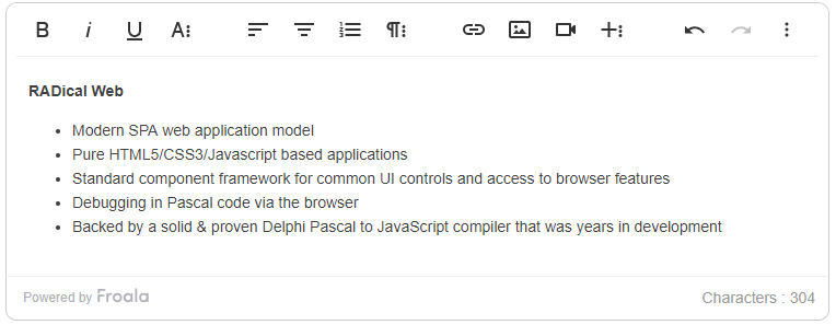
Froala classic editor

Inline: Show the Editor toolbar upon content selection.

Connect any TWebLabel to the TWebFroalaEditor component to instantly make it editable in the browser.

WebLabel1.EventStopPropagation := [];  
WebFroalaEditor1.Visible := False;  
WebFroalaEditor1.InlineEditing := True;  
WebFroalaEditor1.Editor := WebLabel1;

Froala inline editor

By now, you have learned how to easily add a powerful, customizable WYSIWYG editing experience to your TMS WEB Core Delphi applications, providing your users with an intuitive and efficient way to manage content.

Live Demo

A live demo of the Froala editor integration is available at https://download.tmssoftware.com/tmsweb/demos/froalaeditor/. Explore the editorโ€™s rich text editing capabilities and view the corresponding HTML code and triggered web core event handlers below the editor.

Conclusion

In this guide, we’ve walked through the seamless process of integrating the Froala Editor into your TMS WEB Core Delphi applications. By leveraging the powerful TMSwebFroalaEditor component, you can quickly add rich text editing capabilities to your web applications.

Integrating Froala WYSIWYG HTML Editor with TMS WEB Core allows Delphi developers to create modern, responsive web apps with an intuitive WYSIWYG interface for managing content. With features like inline editing, table manipulation, and responsive video embedding, the Froala Editor provides a top-notch user experience that will delight your end-users.

With the steps outlined in this guide, you now have the knowledge and tools to integrate the Froala Editor into your own TMS WEB Core Delphi projects. By incorporating this powerful integration, you can deliver exceptional content management capabilities and take your Delphi web applications to new heights.

Get started today and elevate your Delphi web development with the TMS WEB Core Froala Editor integration!ย 

FAQs

What is TMS web Core?

TMS WEB Core is a Delphi-based framework for building modern, responsive web applications. It allows developers to create cross-platform web apps using Object Pascal while leveraging standard web technologies like HTML, CSS, and JavaScript, without needing to learn a new programming language.

Does Froala work natively with TMS WEB Core?

Yes. Froala integrates smoothly with TMS WEB Core using the TMSwebFroalaEditor component, allowing Delphi developers to add rich text editing without manually wiring complex JavaScript logic.

Can I use Froala in both classic and inline editing modes with TMS WEB Core?

Yes. The Froala Editor supports both classic and inline modes when used with TMS WEB Core, giving you flexibility to choose how and where content becomes editable in your Delphi web application.

Do I need to host Froala files locally when using TMS WEB Core?

No. While you can host Froala assets locally, you may also use the Froala CDN to load the editorโ€™s CSS and JavaScript files, which simplifies setup and speeds up development.

How to Use Bootstrap: Set Up and Customize in Your Project

Responsive web design layout showing how to use Bootstrap to build modern, mobile-friendly websites across desktop, tablet, and smartphone screens.

Bootstrap is one of the most popular frameworks for building responsive and modern web applications. It’s extensive, modern, and easy to learn, making it suitable for beginners and experts alike.

In this guide, you’ll learn how to use Bootstrap, from installing it through different ways to customizing it to your liking.

You’ll also explore how Bootstrap helps boost developer productivity, including its various UI components, quick setup, and compatibility with modern browsers.

Additionally, you’ll learn about React Bootstrap, a reimplementation of Bootstrap components using React. This open-source, community-maintained project is an alternate way of implementing Bootstrap in React. It’s not official Bootstrap, but it’s perfect for React apps.

Illustration showing how to use Bootstrap to build responsive web layouts across desktop, tablet, and mobile devices.

When developing modern websites and applications, you should also consider using tools that go well with one another. Froala is an HTML editor that synergizes well with Bootstrap. It consists of an intuitive, SEO-friendly, and already responsive interface in addition to powerful editing tools.

Key takeaways

  • Bootstrap makes responsive design easier by offering pre-built UI components, a powerful grid system, and mobile-first styles that work across devices.ย 
  • You can install Bootstrap in multiple waysโ€”via CDN, compiled files, or NPMโ€”depending on your project setup and performance needs.ย 
  • Learning how to use Bootstrap effectively means understanding its components, helpers, utilities, and customization options rather than relying on default styles.ย 
  • Bootstrap is highly customizable using CSS variables, custom CSS, and Sass, allowing you to align the framework with your brandโ€™s colors, fonts, and layout.ย 
  • For modern workflows, Bootstrap integrates well with tools like React Bootstrap and editors such as Froala, helping you build faster, cleaner, and more maintainable web applications.

Before learning how to use Bootstrapโ€ฆ

You might want a refresher on its different components, as well as how to install Bootstrap. If you’re already familiar with these, skip to the next section, where you’ll explore customizing Bootstrap CSS.

Prerequisites & assumptions

Before diving into how to use Bootstrap, this guide assumes the following:

  • Bootstrap version: All examples use Bootstrap 5.x (specifically 5.3+). Class names, utilities, and JavaScript behavior may differ in earlier versions.
  • Project setup: Examples apply to plain HTML projects, as well as React apps using tools like Create React App (CRA), Vite, or similar bundlers.
  • Node.js (optional): If you install Bootstrap via NPM or use Sass, youโ€™ll need Node.js v16 or higher and NPM installed.
  • Compiled files: โ€œCompiled Bootstrap filesโ€ refer to the prebuilt, minified CSS and JavaScript bundles provided by Bootstrap. These are ready to use and do not require a build step.
  • Basic web knowledge: You should be comfortable with basic HTML, CSS, and JavaScript to follow along smoothly.

Understanding Bootstrapโ€™s UI components

To use Bootstrap for building responsive web apps and mobile-first styles, you make use of pre-designed, customizable UI components.

These are essentially themes or styles that you apply to plain HTML elements via the class attribute.

Once the page loads, Bootstrap will then style and design your elements according to the contents of their class attributes.

For example, you can turn a common div element into a navbar by appending the “navbar” class to it. To expand the navbar on larger screen sizes, add “navbar-expand-lg.” If you want a darker theme to it, add the “bg-dark” (as of version 5.x) class.

You can even use different styling classes for one element. Think of these components as makeup or accessories for your elements. Mix and match or use them however you like to beautify and standardize the site contents.

Ultimately, they should make your site look better and consistent across different CSS media queries or screens, including mobile devices.

Each Bootstrap CSS UI component has a specific purpose. Some are for layout, while others are for theming, form design, and individual element styling.

The Bootstrap documentation pages categorize them into the following:

Layout

These are the components that deal with organizing the DOM elements to ensure that the site contents have visual structure and responsiveness.

These usually act as styling for div elements containing elements of their own. Layout concepts include the grid system, full-width containers (which wraps site contents), and breakpoints.

Content

Content components are global styling settings for text, images, tables, and more. This means that by using content components, you can set Bootstrap’s basic styling throughout your plain JS or React projects.

For example, you can use the “img-fluid” class across your images to make them responsive without having to touch CSS properties.

Forms

As the name suggests, this type of component is responsible for styling form elements and input fields.

These UI components include text fields, floating labels, textareas, radio buttons, checkboxes, select fields, and validation classes.

Components

What the Bootstrap docs categorize as “components” refers to pre-built UI components that come with built-in styling and interactivity (e.g., hover or popover events).

Each specific component already has Bootstrap’s consistent styling and JavaScript functionality. However, you can also modify these further using utilities, helpers, and even custom CSS.

These include the bulk of Bootstrap’s components: buttons, navbars, cards, carousels, list groups, and a lot more. Bootstrap’s UI components also include JavaScript plugins such as modals, tooltips, popovers, and collapsibility.
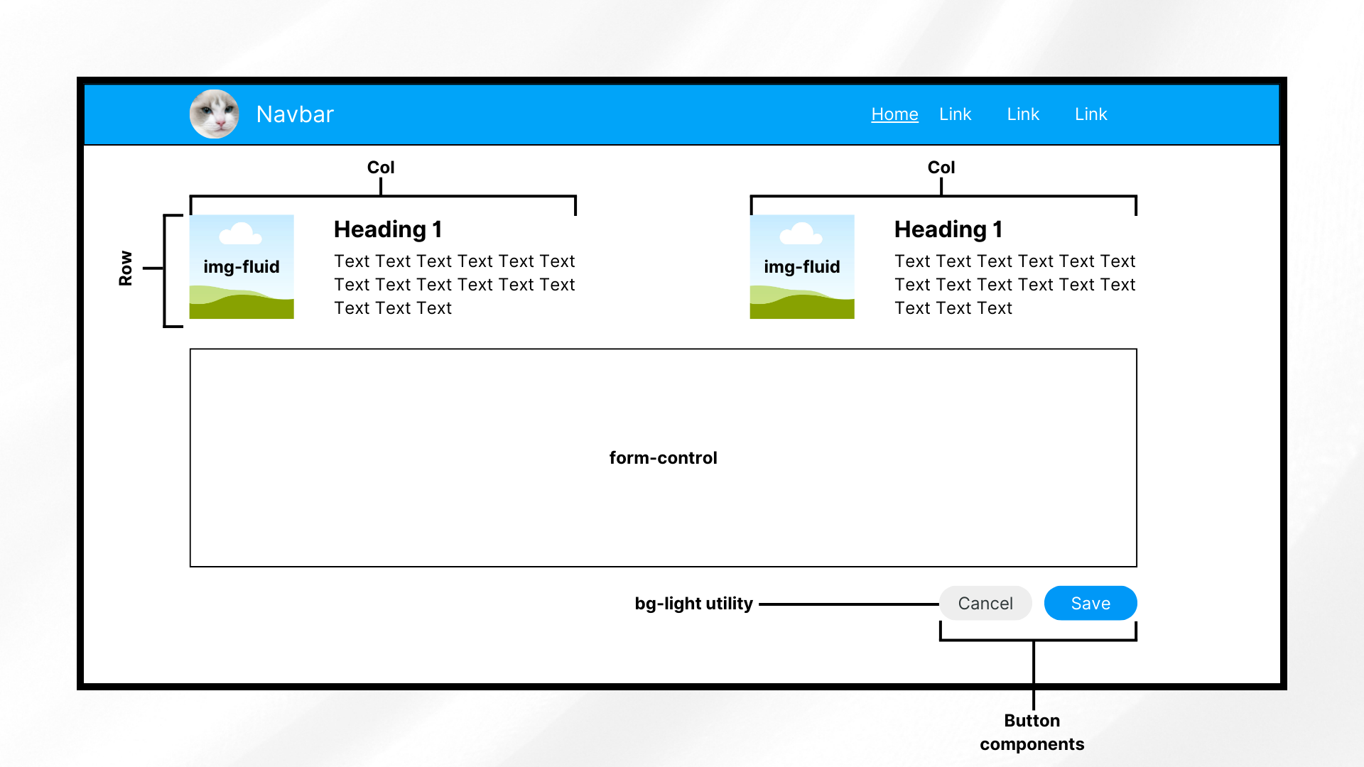
When learning how to use Bootstrap, it's vital to understand how its components work and interact with one another. This image presents a few of these components used together to create a responsive and presentable design.

Helpers

Helpers refer to smaller classes that perform a single function. You usually use these together with other Bootstrap components.

Examples of helpers include colored links, specific component positioning (e.g., “fixed-top,” “sticky-bottom”), text truncation, visually hidden elements (for assistive technologies), and some others.

Utilities

Utilities are general-purpose styling classes for HTML elements. Unlike helpers, they have a broader, more global scope, allowing you to control styling like colors, spacing, and typography. Like helpers, they usually go together with other classes or components.

Examples of Bootstrap utilities include margins, padding, text colors, flex options, shadows, borders, sizing, and more.

Now that you’ve had a refresher, it’s time to install Bootstrap.

Installing Bootstrap

There are different methods for installing the Bootstrap CSS and JS files. Here, you’ll discover some of the most popular ones.

Via compiled Bootstrap CSS and JS

You can install Bootstrap by downloading its ready-to-use codes that include both compiled and minified Bootstrap CSS bundles and JavaScript plugins.

Note that this method does not include documentation, source files, or optional JS dependencies like Popper.

Install Bootstrap via compiled CSS and JavaScript. Include the files that you need in your JS or React app’s folder afterwards. Whether you’re using React or a non-framework setup, the steps for this method are generally the same.

Via the Bootstrap CDN

A quick alternative installation method for Bootstrap is by using the Bootstrap CDN. This method allows you to call a cached version of Bootstrap in your plain JS or React application.

This helps you get started faster and more easily. To add the framework through Bootstrap CDN, include the following code in your index.html file:

<head>
<!--other head items-->
...
<!--Bootstrap 5 CSS-->
<link 	href="https://cdn.jsdelivr.net/npm/bootstrap@5.3.3/dist/css/bootstrap.min.css" rel="stylesheet" integrity="sha384-QWTKZyjpPEjISv5WaRU9OFeRpok6YctnYmDr5pNlyT2bRjXh0JMhjY6hW+ALEwIH" crossorigin="anonymous">
</head>

<body>
<!--other body items-->
<!--Bootstrap 5 JavaScript-->
<script src="https://cdn.jsdelivr.net/npm/bootstrap@5.3.3/dist/js/bootstrap.bundle.min.js" integrity="sha384-YvpcrYf0tY3lHB60NNkmXc5s9fDVZLESaAA55NDzOxhy9GkcIdslK1eN7N6jIeHz" crossorigin="anonymous"></script>
</body>

This gives you the latest delivered version. You can also specify which version of Bootstrap you want in your project by replacing the version number.

If you need interactive components such as tooltips or popovers without using the bundled JavaScript file, you can install Popper explicitly.

Via package manager

The last installation method is installing Bootstrap using NPM. To use this approach, you need Node.js (v16+) and NPM installed.

Open your CLI, navigate to your project directory, and run:

npm install bootstrap@5.3.3

This installs Bootstrap 5.3.3 into the node_modules folder, making it available for JavaScript and React-based projects.

When do you need Popper?

If you plan to use interactive components like tooltips, popovers, or dropdowns without the bundled JavaScript file, install Popper explicitly:

npm install @popperjs/core

For most projects, this extra step is not required. If you import Bootstrapโ€™s bundled JavaScript file, Popper is already included:

import 'bootstrap/dist/css/bootstrap.min.css';
import 'bootstrap/dist/js/bootstrap.bundle.min.js';

This is the recommended setup for React, Vite, and modern JavaScript workflows.

After installation, youโ€™ll see Bootstrap listed in your package.json dependencies.

"dependencies": {
  "bootstrap": "^5.3.3",
  "react": "^18.3.1",
  "react-dom": "^18.3.1"
}


If you’re not using a framework, you’ll generally include the Bootstrap files in your HTML pages, similar to the code below.

<head>
<!--other head items-->
...
<!--Bootstrap 5 CSS-->

<!--If you installed Bootstrap via NPM, use the "node_modules" directory. Otherwise, replace "node_modules" with the path to your Bootstrap CSS-->
<link rel="stylesheet" href="node_modules/bootstrap/dist/css/bootstrap.min.css">

</head>

<body>
<!--other body items-->
<!--Bootstrap 5 JavaScript-->
<script src="node_modules/bootstrap/dist/js/bootstrap.bundle.min.js"></script>
</body>

With this, you should have the ability to use Bootstrap’s components throughout your HTML page (and other pages that use it).

On the other hand, for a React app, import Bootstrap by adding the following code to your “src/index.js” file:

import 'bootstrap/dist/css/bootstrap.min.css';

import "bootstrap/dist/js/bootstrap.bundle.min";

This allows you to use Bootstrap components throughout your React app. Now, let’s dive into styling and customizing your projects using Bootstrap’s grid system and other components.

Bootstrap 5 vs Bootstrap 4: Key differences to know

If youโ€™re coming from Bootstrap 4, a few important changes in Bootstrap 5 can affect how you set up and use the framework:

  • No jQuery dependency
    Bootstrap 5 completely removes jQuery. All JavaScript plugins now use plain JavaScript, reducing bundle size and improving performance.
  • Popper is bundled by default
    In Bootstrap 5, bootstrap.bundle.min.js already includes Popper. You donโ€™t need to install or import it separately for tooltips, popovers, or dropdowns.
  • Separate JS files still exist
    If you prefer more control, Bootstrap 5 also provides individual JavaScript files without Popper. This is useful when you want to manage dependencies manually or reduce bundle size.

These changes make Bootstrap 5 easier to integrate into modern JavaScript frameworks and simpler to use in plain HTML projects.

Basic customization

To understand Bootstrap’s customization capabilities, let’s look into using its grid layout system, color styling, and font styling.

How to use Bootstrapโ€™s grid system

The grid system is a way of laying out HTML elements in terms of rows and columns. By doing so, you ensure that each component containing elements is properly displayed with respect to each other.

Each row takes up its parent’s entire width and has a total of 12 columns, which you can divide in any way you like. For example, if you want three equal-sized columns for a row, you have to change their size to 4 (3 columns x 4 column size = 12 total columns).

On the other hand, each column can have one or more rows. You can also nest these rows and columns together.

Now, let’s test it out by creating a page with a few rectangles. Try creating some rows and dividing them into columns of varying widths. To discern them from each other, add some background colors as well.

To get started, open your file (in this case, index.html) and add the following code:

<!DOCTYPE html>
<html lang="en">

<head>
  <meta charset="UTF-8" />
  <meta http-equiv="X-UA-Compatible" content="IE=edge" />
  <meta name="viewport" content="width=device-width, initial-scale=1.0" />

  <title>How to Use Bootstrap</title>

  <!-- Bootstrap 5.3.3 CSS -->
  <link
    href="https://cdn.jsdelivr.net/npm/bootstrap@5.3.3/dist/css/bootstrap.min.css"
    rel="stylesheet"
    integrity="sha384-QWTKZyjpPEjISv5WaRU9OFeRpok6YctnYmDr5pNlyT2bRjXh0JMhjY6hW+ALEwIH"
    crossorigin="anonymous"
  />
</head>

<body>
  <div class="container-fluid bg-light vh-100">
    <div class="row h-25">
      <div class="col border border-danger text-center">col-12</div>
    </div>

    <div class="row h-25">
      <div class="col-md-6 border border-danger text-center">col-6</div>
      <div class="col-md-6 border border-danger text-center">col-6</div>
    </div>

    <div class="row h-25">
      <div class="col-md-8 border border-danger text-center">col-8</div>
      <div class="col-md-2 border border-danger text-center">col-2</div>
      <div class="col-md-2 border border-danger text-center">col-2</div>
    </div>

    <div class="row h-25">
      <div class="col-md-2 border border-danger text-center">col-2</div>
      <div class="col-md-2 border border-danger text-center">col-2</div>
      <div class="col-md-2 border border-danger text-center">col-2</div>
      <div class="col-md-2 border border-danger text-center">col-2</div>
      <div class="col-md-2 border border-danger text-center">col-2</div>
      <div class="col-md-2 border border-danger text-center">col-2</div>
    </div>
  </div>

  <!-- Bootstrap 5.3.3 JS bundle (includes Popper) -->
  <script
    src="https://cdn.jsdelivr.net/npm/bootstrap@5.3.3/dist/js/bootstrap.bundle.min.js"
    integrity="sha384-YvpcrYf0tY3lHB60NNkmXc5s9fDVZLESaAA55NDzOxhy9GkcIdslK1eN7N6jIeHz"
    crossorigin="anonymous"
  ></script>
</body>
</html>

First, add Bootstrap (in this case, through Bootstrap CDN). Next up, create a div element with the class “container-fluid,” which wraps site contents in a full-width container.

If you prefer something narrower than a full-width container, use “container” instead.

We also add the “bg-light” and “vh-100” classes to the wrapper. The former is simply for adding a touch of color, while the latter makes the container span the entire height of the screen.

Afterwards, create four rows of equal height (“h-25” allows a row to take up a fourth, or 25%, of the parent element’s height).

Finally, create as many as twelve columns for each row. How you divide it is up to you, but in the example above, you have:

  • 1-column row: The first row only has one column. You can use either “col” or “col-12” to allow a column to take up the entire width of the row.
  • 2-column row: The second row has two equal-length columns. Hence, each column has the “col-md-6” class.
  • 3-column row (unequal lengths): The third row has three columns of varying sizes. The first one is longer (8 columns long), while the other two have an equal length of 2. How you divide the row is up to you, but the total columns per row should be 12.
  • 6-column row: The fourth row has six columns of size 2.

To better discern the columns, add a border to each of them by appending the “border border-danger” classes.

The “border” (as the name suggests) class adds a border to an element, while the “border-danger” one adds Bootstrap’s red theme color to it.

Run the application, and you should see the following screen:
A sample application powered by Bootstrap. This screen contains 4 rows with different columns each. All columns have a reddish border color from Bootstrap's border-danger class.

Now, let’s try customizing Bootstrap’s default colors and fonts with some custom CSS.

How to customize colors and fonts

You can override Bootstrap’s default settings with custom CSS and Bootstrap 5.

Bootstrap 5 defines prebuilt CSS variables (–bs-*) for colors, typography, spacing, and more. These variables make overriding Bootstrap styles easier without modifying Bootstrap’s core files.

Overriding these CSS variables changes all elements that use Bootstrap’s default styles to follow your theme, colors, and fonts.

For instance, create a CSS file, include it in your HTML, and insert the following lines of code:

:root {
    --bs-light: #eeeeee;
    --bs-danger: #01a4f9;
    --bs-body-font-family: 'Roboto', sans-serif;
}

.bg-light {
    background-color: var(--bs-light) !important;
}

.border-danger {
    border-color: var(--bs-danger) !important;
}

The code above defines some CSS variables (e.g., –bs-light) for changing the colors of the “light” and “danger” properties. Moreover, it also changes the default font into “Roboto.”

Note that the colors this code is using are significantly different from the default (whitish gray to slightly darker gray, red to light blue).

Afterwards, the code uses these CSS variables for the “background-color” and “border-color” properties. Now, if you run the application, you should see:
In our grid example, the border color has changed into a lighter shade of blue. Additionally, the background color is now a darker gray, and the font family is different.

In addition to colors and fonts, you can also use CSS to customize buttons, navbars, forms, dropdown menu, and other components by using the “!important” keyword. This overrides Bootstrap’s default properties.

In summary, to integrate your color scheme and typography, define CSS variables to change the default colors and fonts to your theme’s. Afterwards, you can use these variables across your CSS file together with the “important” keyword.

Now, let’s move into the more advanced Bootstrap customization techniques.

Advanced customization techniques

If you want to go beyond basic CSS customization for Bootstrap, you should try using both Bootstrap JS plugins and Sass.

JS plugins add a bit of animation and interactivity to your components, improving the UX. Sass, on the other hand, provides a more organized way of customizing styles, making it perfect for theming.

Modifying Bootstrap components with Sass

Sass (Syntactically Awesome Stylesheets) is a CSS preprocessor that allows you to write cleaner styles more efficiently. The Bootstrap framework is built on Sass, which means that you can easily customize its components and styles to match your needs.

The best part is you don’t have to manually override styles using CSS like we did in the previous section.

Note: Sass requires that you get the entire library using NPM or local installation. Bootstrap Sass won’t work if you’re using the CDN.

Let’s start setting up Sass. First, go to your project directory and run the following line:

npm install -g sass

This command installs the Sass compiler in your directory, allowing you to use Sass commands.

Afterwards, create a new folder in your root and name it “scss” or something similar. In this new folder, create a file called “custom.scss.”

Here, you’re creating your own stylesheet that imports Bootstrap instead of modifying Bootstrap’s core files. This is because Bootstrap does not recommend modifying its core files.

Open your “custom.scss” file and add the following lines:

$light: #eeeeee;
$danger: #28a745;

$font-family-base: 'Roboto', sans-serif !default;

@import "../node_modules/bootstrap/scss/bootstrap";

Here, you’re defining new colors for the “light,” “danger,” and “font-family-base” CSS properties. This step is similar to what you did in the previous section, albeit easier. This code also uses a different “danger” color from earlier.

Lastly, import the Bootstrap components at the end of the SCSS file. Bootstrap recommends importing only what you need, but for simplicity, the code above imports the entire library.

Afterwards, in your CLI, move up to the “scss” folder and run the following line:

sass custom.scss custom.css

This command essentially tells the Sass compiler to compile our “custom.scss” file into CSS, specifically with the filename “custom.css.” Afterwards, you should see the newly generated “custom.css” file in your “scss” folder.

For the next step, since you’re creating your own stylesheet that imports Bootstrap, you won’t need the Bootstrap CSS link in your HTML file anymore. In your index.html, replace the head contents with:

<head>
    <meta charset="UTF-8" />
    <meta http-equiv="X-UA-Compatible" content="IE=edge" />
    <meta name="viewport" content="width=device-width, initial-scale=1.0" />

    <title>Sample Bootstrap App</title>
    <!--<link rel="stylesheet" href="node_modules/bootstrap/dist/css/bootstrap.min.css">-->
    <!--<link href="styles.css" rel="stylesheet">-->
    <link rel="stylesheet" href="scss/custom.css">
</head>

Note that the previous links (to the Bootstrap files and the custom stylesheet) are now commented so that you can use the new CSS file that you compiled from SCSS beforehand.

Run the application, and you should see the following changes:
After creating an SCSS file, compiling it into CSS, and using it, we are able to achieve the same effect of customizing Bootstrap, but in an easier manner.

Using Bootstrapโ€™s JavaScript Plugins

Bootstrap provides different JavaScript plugins to add interactivity and animation to your projects. These JS plugins include:

  • Modal: These are pop-up dialogs that you can use to display information, policies or terms of use, and forms. These usually include a title, body, and footer.
  • Tooltips & Popovers: Plugins that show additional information on mouse hover (tooltips) or click (popovers). These can have either only text or a pair of title and text.
  • Toast: Use these when you want to display stylized notifications easily. These also typically include a header and a body.
  • Collapse: Plugins that create toggleable elements. These keep the application looking clean, hiding and showing elements that could clutter the display on smaller screens.
  • Carousel: These are responsive image sliders. They usually come with a title, body, image, and a pair of “next” and “previous” buttons for going through the media files.

Let’s try using a tooltip and popover. In your index.html file, pick any column from any row and add the following lines of code:

<button type="button" class="btn btn-danger text-white" data-bs-container="body" data-bs-toggle="popover" data-bs-placement="top" data-bs-content="This popover appears at the top of the button.">
     Click Me!
</button>

<button type="button" class="btn btn-info text-white" data-bs-toggle="tooltip" data-bs-placement="right" data-bs-title="This tooltip appears at the right side of the button.">
     Hover over me!
</button>

This code adds two buttons: one for triggering the popover event and another for the tooltip event. Specify the type of data toggle using the “data-bs-toggle” property, then specify the placement of the tooltip and popover.

Afterwards, after the Bootstrap script near the bottom of the body, add the following lines:

<script>
        const popoverTriggerList = document.querySelectorAll('[data-bs-toggle="popover"]');
        const popoverList = [...popoverTriggerList].map(popoverTriggerEl => new bootstrap.Popover(popoverTriggerEl));

        const tooltipTriggerList = document.querySelectorAll('[data-bs-toggle="tooltip"]');
        const tooltipList = [...tooltipTriggerList].map(tooltipTriggerEl => new bootstrap.Tooltip(tooltipTriggerEl));
</script>

What this code does is initialize both the popover and tooltip trigger lists, enabling them for the page. Run the application to see the two new buttons that show a tooltip when hovered and a popover when clicked:
This image demonstrates Bootstrap's popover and tooltip components. It shows two buttons: one for displaying a popover on click and another for displaying a tooltip on hover.

These components are already cool, but you can take it up a notch by customizing them further using data attributes and JavaScript.

For example, you can use data attributes to change the behavior of the popover button, shown in the code below:

<button type="button" class="btn btn-danger text-white"
     data-bs-container="body"
     data-bs-toggle="popover"
     data-bs-placement="top"
     data-bs-config='{"animation": false, "delay": {"show": 500, "hide": 100}}'
     data-bs-content="This popover appears at the top of the button.">Click Me!</button>

This removes Bootstrap’s default animation for the popover. Instead, it will show the popover after 500ms without the fade-in effect. Note that to use the “data-bs-config,” you need to modify your popover and tooltip script into something like:

document.addEventListener("DOMContentLoaded", function () {
    const popoverTriggerList = document.querySelectorAll('[data-bs-toggle="popover"]');

    popoverTriggerList.forEach((popoverTriggerEl) => {
        const config = JSON.parse(popoverTriggerEl.getAttribute("data-bs-config"));
        new bootstrap.Popover(popoverTriggerEl, config);
    });

    const tooltipTriggerList = document.querySelectorAll('[data-bs-toggle="tooltip"]');
    tooltipTriggerList.forEach((tooltipTriggerEl) => {
        new bootstrap.Tooltip(tooltipTriggerEl);
    });
});

On the other hand, you can use JavaScript to change the behavior of the plugins. For instance, to dynamically update the tooltip options, replace the tooltip script with:

document.addEventListener("DOMContentLoaded", function () {
            const tooltipTriggerList = document.querySelectorAll('[data-bs-toggle="tooltip"]');

            tooltipTriggerList.forEach((tooltipTriggerEl) => {
                const tooltip = new bootstrap.Tooltip(tooltipTriggerEl);

                tooltipTriggerEl.addEventListener("mouseenter", function () {
                    tooltip.setContent({ '.tooltip-inner': "New Tooltip Text!" });
                    tooltip.update();
                });
            });
});

This code dynamically replaces the contents of the tooltip on DOM load.

That’s all we need to discuss in this article about using Bootstrap’s most common features. But before you go, why not talk about another suitable Bootstrap implementation for React apps?

Common Bootstrap errors & how to fix them

Even when you know how to use Bootstrap, a few common setup issues can cause components to break or behave unexpectedly. Here are the most frequent problems developers run into, and how to fix them quickly.

1. Tooltips or popovers not working

Problem: Tooltips, popovers, or dropdowns donโ€™t appear when expected.
Cause: Bootstrapโ€™s JavaScript plugins require manual initialization.
Fix: Ensure you initialize them after the DOM loads:

document.addEventListener("DOMContentLoaded", function () {

ย ย document.querySelectorAll('[data-bs-toggle="tooltip"]').forEach(

ย ย ย ย el => new bootstrap.Tooltip(el)

ย ย );

});

Also confirm youโ€™re using bootstrap.bundle.min.js, which includes Popper.

2. JavaScript imported twice

Problem: Modals open twice, animations behave oddly, or console warnings appear.
Cause: Bootstrap JS is loaded more than once (e.g., via CDN and NPM).ย 

Fix: Import Bootstrap JavaScript only onceโ€”either:

  • via CDN or
  • via NPM/bundler (import ‘bootstrap/dist/js/bootstrap.bundle.min.js’)

Never mix both approaches in the same project.

3. Missing Popper (older Bootstrap versions)

Problem: Dropdowns or popovers fail in Bootstrap 4 or earlier.
Cause: Popper.js is required but not included.
Fix:

  • For Bootstrap 5: Always use bootstrap.bundle.min.js (Popper included).
  • For Bootstrap 4: Add Popper manually before Bootstrap JS.

4. Styles not applying as expected

Problem: Bootstrap classes appear correct, but styles donโ€™t apply.
Cause: Custom CSS overrides Bootstrap unintentionally.
Fix:

  • Check CSS load order (Bootstrap first, custom CSS after).
  • Avoid overusing !important.
  • Use Bootstrap utility classes before writing custom overrides.

5. Components not responsive

Problem: Layout breaks on mobile or tablet screens.
Cause: Missing viewport meta tag or incorrect grid usage.
Fix: Ensure this tag exists in your <head>:

<meta name="viewport" content="width=device-width, initial-scale=1">

Also, verify correct breakpoint classes (col-md-*, col-lg-*, etc.).

React Bootstrap: an alternative for React apps

Bootstrap, as it is, works well with React apps. But if you want something that works more like React, then you should consider using React Bootstrap. Let’s quickly explore what it is and what makes it different below.

What is React Bootstrap?

React Bootstrap is a popular front-end framework from an open-source community. Although not officially from the Bootstrap team, it is perfect for React apps because it doesn’t rely on direct DOM manipulation.

Instead, it’s built on React components, ensuring better compatibility with React’s virtual DOM and state management. So, instead of using syntax like “<button class=’btn btn-primary’>…,” you would use something like “<Button variant=’primary’>Primary</Button>.”

Key differences between traditional and React Bootstrap

  • Component-based Approach: React Bootstrap provides pre-built React components like <Button> and <Form> instead of using HTML and class-based Bootstrap components.
  • No jQuery Dependency: Bootstrap 4 required jQuery for some interactive features. Bootstrap 5 removes this dependency and uses plain JavaScript instead. On the other hand, React Bootstrap relies on React itself, reducing unnecessary dependencies.
  • Better Integration with React Apps: React Bootstrap components support props, state management, and lifecycle methods, allowing more flexibility to ensure proper rendering.

Best practices for using Bootstrap

Using Bootstrap is easy, even if you are a beginner. However, beginner or not, developers should always research and consider the best practices when using Bootstrap. By doing so, you can avoid future headaches like security breaches, obsolescence, and performance issues.

Here are two important things to consider for Bootstrap:

Keep Bootstrap updated

Regularly updating Bootstrap ensures access to the latest features, performance improvements, and security patches. Outdated versions may have vulnerabilities or lack support for modern web standards.

Just be sure to check the documentation pages first before updating to the latest. Bootstrap could change some syntax on their next update, possibly breaking some existing code if not thoroughly checked. For example, “text-start” and “text-end” used to be “text-left” and “text-right” a few years ago.

Optimize Bootstrap for performance

  • Minimize CSS and JS files: Use only the necessary Bootstrap components by customizing builds. You can also use other third-party tools to help remove unused styles.
  • Use only necessary components: As briefly stated earlier, instead of importing the entire Bootstrap library, import individual components to reduce bundle size and improve loading times.

Conclusion

And that’s it! You now have some basic understanding of how Bootstrap works. Additionally, youโ€™re now equipped to customize it to suit your applications.

Experimenting with different customization options will help tailor Bootstrap to specific project needs.

So, how do you find Bootstrap so far? Did you play around with the different components and customization settings? Share your experiences and tips on using Bootstrap in the comments!

FAQs

1. How do beginners start learning how to use Bootstrap?

Beginners can start learning how to use Bootstrap by adding it via the Bootstrap CDN and experimenting with the grid system, utility classes, and common components like buttons and cards.

2. Do I need JavaScript to use Bootstrap effectively?

No. You can use Bootstrapโ€™s layout, grid, and styling features without JavaScript. JavaScript is only required for interactive components like modals, tooltips, and dropdowns.

3. What is the best way to customize Bootstrap for real projects?

For simple projects, custom CSS and CSS variables are enough. For larger projects, using Bootstrap with Sass via NPM provides better control and scalability.

Discover the Best HTML Code Generator for Web Development

HTML code generator illustration showing a code editor icon with brackets and settings gear, representing automated HTML generation for web development

HTML code generators have helped web developers speed up their development cycles since their emergence. By providing a user-friendly interface to generate HTML code, they are able to significantly lessen manual coding. Many of these tools function as a WYSIWYG editor, allowing users to create and edit web pages visually without needing to write extensive code.

A visual representation of an HTML code generator.

Thus, businesses, developers, and even non-technical hobbyists have chosen to rely on these HTML generators or integrate them into their workflow.

If you’re planning to find the best HTML code generator that suits your needs, then read on below. In this guide, you’ll see some key features to look for in these generators, as well as a list featuring the best of them. Additionally, you’ll explore how you can quickly integrate one in your projects.

Key Takeaways

  • HTML code generators speed up development by reducing repetitive manual coding and enabling visual or assisted HTML creation.
  • Not all generators are the sameโ€”some focus on WYSIWYG editing, while others behave more like IDEs or desktop site builders.
  • The best HTML code generator depends on your workflow, project size, and whether you prioritize visual editing, clean output, or deep customization.
  • Features like syntax highlighting, templates, and cross-browser compatibility are essential for producing reliable, maintainable code.
  • Generated HTML should always be reviewed to ensure semantic structure, accessibility, security, and long-term maintainability.
  • Modern generators integrate easily into existing workflows, whether through online tools, CDN-based editors, package managers, or standalone applications.

What is an HTML Code Generator?

Whenever we build webpages, we write HTML code using text editors and view the result through a browser. Let’s call this “traditional coding.”

HTML code generators, on the other hand, allow developers to use a visual or text-based interface to generate code.

For example, a user can type on the generator’s text editor, select the text, and click some buttons (e.g., bold and italics). Afterwards, the generator will convert the editor’s contents (e.g., <strong><em>Some text</em></strong>) into HTML code. The way generators display the HTML code might differ, but the end result should be the same.

With these features, HTML generators help developers reduce or skip some basic coding, allowing them to focus on other important parts like optimization, security, and analysis.

Key Features to Look for in an HTML Code Generator

Nowadays, code generators come with plenty of features. Most of these are standard and essential, while others have more niche or specific uses. Here are four important features that the best HTML code generators should contain:

User-friendly Interface

This might appear obvious or simple at first glance, but the truth is that some generators prioritize other things over a polished user interface. Without proper layouts, organization, accessibility, customization, and a clean, modern look, a feature-rich code generator would turn into a difficult, counterintuitive tool.

So, for efficiency (and for not straining your eyes), choose a generator that looks and feels intuitive and seamless.

Auto-completion and Syntax Highlighting

Auto-completion and syntax highlighting are integral parts of every development process because of how they reduce issues, ensure clean code, and provide convenience.

The former automatically suggests code when you type in the editor, possibly reducing human errors (such as typos). Additionally, it helps cut time when writing repetitive code. On the other hand, syntax highlighting helps you identify syntax errors or inconsistencies in the editor.

Code Snippets and Templates

The code snippets feature contributes greatly to the rapid development of web pages. It allows developers to use pre-written codes and insert or paste them directly into projects.

Templates provide developers with a fixed yet customizable web page design and features. They serve as a good foundation for a project, especially for those who want a quick start.

In case youโ€™re looking for ways to visualize code snippets or animate them in various ways, you can look at tools like Snappify.

Cross-browser Compatibility

Browsers may display HTML code differently. That’s why you usually test the look and feel of your web pages across different browsers before deploying them.

The same goes for HTML generators. When looking for the right one for your use case, you should pick that which already has cross-browser compatibility.

Top HTML Code Generators Available Today

There are many HTML generators available, each with its own strengths and weaknesses. Here’s a list of some of the best options you can consider:

1. Froala Editor

Froala, a WYSIWYG editor that also functions as an HTML code generator. The image shows two screens, one with the user interface and the other with the generated HTML code from the editor's code view feature.

Froala is a WYSIWYG editor (think drag-and-drop, rich-text editing, and image handling) that also contains code generation features. With over 100 features, it’s a tool that you can use for code generation, blog sites, web content creation, and more.

Features

  • Rich text and formatting features (e.g., Markdown, basic styling, tables, etc.)
  • Code Mirror integration for converting visual elements into code
  • Integration with Codox.io for collaboration and real-time editing features
  • Advanced file uploading and transformations
  • Lightweight (50 KB gzip core) and fast (about 40 ms initialization)

Pros

  • High degree of customization
  • A responsive, accessible, cross-browser, and cross-platform WYSIWYG editor that also supports SEO optimization
  • Easy integration with different front-end frameworks like React and server-side tools like PHP
  • Free trial with full features

Cons

  • No code templates exist at the moment.

Suitable for: Professionals and businesses that need a powerful, customizable, and light HTML editor and generator

2. Bootstrap Studio

An sample image that shows Bootstrap Studio's HTML code generator and IDE.

This is a desktop application that leverages the Bootstrap framework to create responsive web pages. It primarily offers several drag-and-drop components to assemble these web pages. Compared to other generators, this feels like more of a full-fledged IDE for web design.

Features

  • Bootstrap framework support (several versions are available)
  • Drag-and-drop editing for rapid development
  • Real-time preview of web page designs across different devices and screen widths (like a hot reload for page design)
  • Pre-made templates and components
  • Fonts and icons are available

Pros

  • Great for responsive web design
  • A good degree of customization
  • Easy to learn
  • Intuitive and clean IDE UI

Cons

  • Might seem too heavy for simpler or specific HTML code generation requirements

Suitable for: Web page designers or developers who feel more comfortable with drag-and-drop IDEs

3. CoffeeCup HTML Editor

This image shows the UI of CoffeeCup's HTML editor, particularly the tag highlighting feature.

CoffeeCup’s HTML editor offers dozens of useful tools for building web pages, prioritizing development speed and convenience.

Features

  • Code completion for convenience and reducing typographical errors
  • Tag highlighting for knowing where each tags (e.g., div) start and end
  • Template downloader
  • Components library
  • Free trial is available

Pros

  • Good syntax highlighting and auto-completion features
  • Lets you get started easily
  • Good file structure organization
  • Great for developers and designers who are already familiar with non-visual IDEs

Cons

  • The IDE’s UI looks clean but might seem less modern compared to others
  • There’s a free trial, but there’s no online HTML code generator demo available

Suitable for: Developers who are more comfortable with manual coding but want a little automation features and convenience

A table of comparison that summarizes the information above.

How to Choose the Right HTML Code Generator for Your Needs

With many available options to generate HTML code, you should consider the following factors:

Project Requirements

Are you building a full website, or are you looking to quickly generate HTML code? Do you need many features or just specific ones? Are compliance, security, clean layouts, SEO, and performance important for you? How about scalability?

Team Size

If you’re working solo, you can opt for a simple, easy-to-use, and possibly free tool to generate HTML code. On the other hand, small and larger teams might benefit from more robust tools, especially those with collaboration features.

Budget

Some HTML code generators are free or have a perpetual plan option. Others require a subscription. Better ones offer all of the aforementioned. Choose a tool that aligns with your budget constraints.

Remember that before you fully commit, you should test out the tools with either a free trial or a live demo. You can then gauge whether the features align with your needs and workflow.

Integrating an HTML Code Generator into Your Workflow

You can use HTML code generators in several ways. Here are some examples that demonstrate how you can integrate them into your workflow:

Online HTML code generators

If you just need a quick and accessible start to your projects, you can use online HTML generators. These include online HTML editor demos and even AI-powered LLMs like ChatGPT. To get started, visit the site of your preferred online editor.

Web app integration

You can also integrate these generators into applications (e.g., internal apps or apps for your users). For example, you can install Froala Editor by either downloading its files as a ZIP, using the CDN, or using package managers like NPM.

After you have the editor’s files (or if you’re using CDN), you can then import them into your project directly like the following lines:

<!--Import via CDN-->
<link href='https://cdn.jsdelivr.net/npm/froala-editor@latest/css/froala_editor.pkgd.min.css' rel='stylesheet' type='text/css' /><script type='text/javascript' src='https://cdn.jsdelivr.net/npm/froala-editor@latest/js/froala_editor.pkgd.min.js'></script>

Once you have them, you’re ready to initialize the editor and enable your application’s users to generate HTML.

As separate desktop applications

Lastly, you can download or purchase full IDEs with code generation features. This method would probably require the most effort and resources but might also come with the most features. Hence, you must ensure that you can maximize the use of these features should you get such a code generator.

Conclusion

In web development, you can supplement your current tech stack with a tool that can generate HTML code. This speeds up the layout design and development process while possibly reducing errors.

Before you start implementing, it is worth noting that neither traditional coding nor HTML generators is better than the other. Furthermore, you should always review generated code to be safe.

To find the best one for you, check each of the best HTML code generators out (demos, free trials, etc.). In the end, the answer will depend on your project needs, development style, pacing, and budget.

FAQs

How to generate code for HTML?

You can generate HTML code by writing it manually in a text editor, using an HTML code generator or WYSIWYG editor, or through AI tools. HTML generators allow you to design visually or use templates, then automatically convert your input into structured HTML code.

Can ChatGPT create HTML?

Yes, ChatGPT can generate HTML code based on prompts you provide. Itโ€™s useful for creating layouts, components, forms, and sample markup. However, the generated code should always be reviewed and tested before use in production.

Can AI write HTML code?

Yes, AI tools can write HTML code efficiently, especially for common layouts and components. While AI speeds up development, developers should still validate the output for correctness, accessibility, performance, and security.

Are HTML code generators good for SEO?

Yes, HTML code generators can be good for SEO if they produce clean, semantic HTML. To get the best results, developers should review generated code to ensure proper heading structure, accessible markup, optimized images, and minimal unnecessary elements.

Do HTML code generators replace manual coding?

No, HTML code generators do not fully replace manual coding. They are best used to speed up layout creation and repetitive tasks, while developers still refine, optimize, and secure the generated code for production use.

Adding Rich Text Editor Support For Contact Form 7 WordPress Plugin

rich-text editor for contact form 7

Would you like to allow users to submit formatted content through your Contact Form 7 forms instead of plain text? This guide explains step-by-step how you can integrate a rich-text editor for Contact Form 7 using the Froala WordPress content editor.

What Is Contact Form 7?

Contact Form 7 is one of the most popular form-building plugins used by millions of WordPress websites worldwide. It’s incredibly reliable and powerful for creating simple to advanced forms.

Contact form 7

But there’s one limitationโ€”its default text area fields only allow plain text submissions. This means users can’t include HTML tags like bold text, italics, headings, or any other visually appealing formatting.

That’s where adding a rich text editor like Froala can greatly improve the user experience and allow your forms to accept visually engaging, formatted submissions.

Why Add a WordPress Content Editor to Contact Form 7?

By adding a rich text editor field, you’ll significantly enhance your user’s experience. Contributors to your forms will now be able to easily provide complex content using the wordpress editor. Instead of receiving boring plain text submissions, you’ll get nicely formatted messages including headings, bold text, italicized text, and lists.

This improvement can make submissions easier to read, more organized, and visually appealing, potentially boosting your engagement and conversion rates. Your WordPress site and your email communications will both look more professional and polished.

Creating a Rich Text Editor Field for Contact Form

Let’s get started! Follow these easy steps to add the feature to your form:

Step 1: Setting Up Your Contact Form

  • In your WordPress dashboard, navigate to Contact Form 7 under the plugins menu.
  • Either create a new form or select an existing contact form to edit.
  • You might already have something like this in your form template:
<label> Your name
    [text* your-name autocomplete:name] </label>

<label> Your email
    [email* your-email autocomplete:email] </label>

<label> Subject
    [text* your-subject] </label>


[submit "Submit"]

Step 2: Adding a Rich Text Editor Field for Contact Form

Now let’s add the new Froala-powered rich text editor field:

  • Click on the “textarea” button to insert a new field.

rich text wordpress content editor

  • In the “Field name” input, provide a unique identifier such as “message“.
  • In the “Class attribute” input, add a class name you’ll use later to reference the field in the Froala initialization code. A simple example is “editor“.
  • Your inserted tag will look like this:
[textarea message class:editor]

Insert text area field

  • Click “Insert Tag“, and your form template will now include this new field for complex content submission.
  • Save your updated contact form.

Initializing Froala Rich Text Editor on Your Form

You’re almost there! Next, you’ll need to set up your form emails to handle HTML content properly.

Step 3: Configuring Email Submission with HTML Tags

  • In your Contact Form 7 settings, click the “Mail” tab.
  • Ensure you’ve checked “Use HTML content type“. This setting allows your submissions to include HTML tags and maintain their formatting.
  • Also, ensure the “message” field is referenced in your “Message body“.
contact form email setup
  • Click “Save” and copy the generated shortcode provided by Contact Form 7.

Step 4: Embedding Your Contact Form into a WordPress Page

To display your new rich text-enabled form, embed the shortcode into one of your WordPress pages:

  • Open the page editor for your desired page.
  • Paste your shortcode where you want the form to appear:

Error: Contact form not found.

Insert contact form shortcode
  • Click “Publish” or “Update” to make the page live on your WordPress site.

Step 5: Adding the Froala WordPress Content Editor to the Form Page

Now, you’ll add the Froala rich text editor resources directly to your page. Simply include the Froala CDN link and initialization script:

Add these CDN references to your page or site’s HTML head:

<link href='https://cdn.jsdelivr.net/npm/froala-editor@latest/css/froala_editor.min.css' rel='stylesheet' />
<script src='https://cdn.jsdelivr.net/npm/froala-editor@latest/js/froala_editor.min.js'></script>

Then initialize the Froala editor on your textarea field using the class name “editor“:

<script> document.addEventListener('DOMContentLoaded', function() { new FroalaEditor('.editor'); }); </script>
rich text editor for contact form 7

After adding this code snippet, save and publish your page.

Safety & Validation: Handling Rich Text Submissions Securely

While adding a rich text editor for Contact Form 7 improves usability, itโ€™s important to handle formatted content safely. Allowing HTML input introduces new considerations around validation, sanitization, and storage.

Here are a few best practices to follow:

Limit Allowed HTML Tags

Not all HTML tags should be accepted from user submissions. Limit input to safe formatting elements such as <strong>, <em>, <ul>, <ol>, <li>, and <p>. Avoid allowing scripts, inline styles, or embedded media unless absolutely necessary.

WordPress provides built-in functions for sanitizing user input. To learn more about best practices, refer to the official WordPress sanitization documentation

Sanitize Output Before Displaying or Sending

Always sanitize rich text content before displaying it on your site or including it in emails. This helps prevent XSS attacks and malformed HTML from breaking layouts.

If youโ€™re using the submission content in email notifications, ensure that HTML output is properly escaped or filtered to maintain consistent formatting across email clients.

Decide How HTML Should Be Stored or Emailed

Before going live, decide whether rich text submissions should be:

  • Stored as raw HTML
  • Sanitized HTML
  • Converted to plain text for email delivery

For many use cases, sanitizing and sending HTML emails works well. For others, such as support forms or internal tools, converting submissions to clean, readable text may be safer and more reliable.

Taking a few extra steps to validate and sanitize user input ensures your rich text forms remain both powerful and secure.

Testing Your New Rich Text Contact Form

Now it’s time to test your implementation:

  • Open your published page in a browser.
  • You should now see your contact form with the Froala rich text editor field instead of the plain textarea.

rich-text editor for contact form 7

  • Enter test values and experiment by formatting your message with headings, bold, italics, and more.
  • Submit your form and verify the formatted HTML content appears correctly in your email inbox.

rich-text editor for contact form 7 submitted

Improving Your WordPress Submissions with Complex Content

With Froala integrated, your website visitors can now submit visually rich and complex content directly through your forms. This simple upgrade drastically improves the readability and organization of form responses. It also enhances your overall communications, making them look professional and polished.

No more monotonous plain text submissionsโ€”each submission now comes beautifully formatted and ready for immediate use, perfect for your next post.

Conclusion

By following this straightforward, step-by-step guide, you’ve successfully added a powerful rich text editor to your Contact Form 7 forms. With Froala powering your form submissions, your website’s user experience is significantly enhanced, allowing for detailed, structured, and engaging responses.

This simple yet impactful integration transforms the way your website visitors interact with your forms, providing a much-improved WordPress experience. Now go ahead and enjoy the benefits of beautifully formatted submissions!

FAQs

Can Contact Form 7 support a rich text editor?

Yes. While Contact Form 7 only supports plain text fields by default, you can add a rich text editor for Contact Form 7 by integrating a third-party editor like Froala. This allows users to submit formatted content such as bold text, headings, lists, and more.

Is it safe to use a rich text editor in Contact Form 7?

Yes, as long as you follow proper security practices. When using a rich text editor for Contact Form 7, itโ€™s important to limit allowed HTML tags, sanitize user input, and validate output before displaying or emailing submissions. WordPress provides built-in sanitization functions to help handle formatted content safely.

Will rich text formatting appear correctly in Contact Form 7 emails?

It can. To ensure formatting is preserved, you must enable the HTML content type in Contact Form 7โ€™s Mail settings. Once enabled, formatted submissions created using a rich text editor will appear correctly in email notifications, provided the HTML is properly sanitized.

How to Control Font Size in Froala Editor: Complete Guide to Pixel-Precise Typography

Font Size Plugin

Precise typography is fundamental to professional document design. Froala’s font sizing controls give you pixel-level accuracy and flexible unit options, ensuring your typography remains consistent and intentional across every page. From responsive layouts that adapt seamlessly to different screens, to accessible contrast ratios that meet accessibility standards, to maintaining visual harmony across devicesโ€”Froala delivers the typographic control you need for polished, professional results.

In this article, we’ll explore the Froala editor’s powerful font sizing capabilitiesโ€”including options, methods, and events that developers can leverage to give end-users precise typographic control.

Whether you’re building a content management system, a blogging platform, or a collaborative writing tool, mastering these features enables you to deliver a seamless, professional editing experience.

Font Size Plugin

Key Takeaways

  • Use fontSize to define a custom set of sizes aligned with your brand guidelines and design system.
  • Control units with fontSizeUnit to ensure responsive, accessible typography across devices.
  • Display selected text sizes on the toolbar with fontSizeSelection for real-time user feedback.
  • Leverage command.before and command.after events to implement custom logic around font size changes.
  • Ensure the Font Size plugin is enabled and properly configured in your editor setup.

Froala Font Size Options

The Froala editor provides multiple font size options that cater to different design needs and user preferences.

Set Font Sizes

The fontSize option allows developers to define a custom set of font sizes available to end-users in the editor. This gives you precise control over the typographic choices permitted within your application.

By specifying exact pixel values or relative units, you ensure typographic consistency while preventing users from applying arbitrary sizes that could break your design system.

PRO tip: Consider using predefined ranges that align with your brand guidelinesโ€”perhaps 12px for body text, 16px for leads, and 24px for headings.

new FroalaEditor('div#froala-editor', { 
    fontSize: [12, 18, 32],
 });

Set Font Size Units

The fontSizeUnit option allows you to control the default font size unit used in your editor, whether that’s pixels, points, ems, rems, or percentages for maximum flexibility and responsive design compatibility.

With `fontSizeUnit: ‘rem’`, your typography scales responsively across all devices while maintaining accessible, scalable text sizing throughout your application.

This approach ensures that users can adjust text sizes based on their preferences without compromising the overall design integrity or visual hierarchy of your content documents and layouts.

new FroalaEditor('div#froala-editor', {
    fontSize: [12, 18, 32],
    fontSizeUnit: 'pt',
});

Display Selected Text Font Size On The Editor Toolbar

The fontSizeSelection option enhances usability by displaying the current font size of selected text directly on the editor toolbar. When set to true, users can instantly see what size is applied to their text without hunting through the code view option.

This real-time feedback improves editing efficiency and helps users maintain consistent typography throughout their document.

new FroalaEditor('div#froala-editor', {
    fontSizeSelection: true,
    fontSize: [12, 18, 32],
    fontSizeUnit: 'pt',
});

Set The Default Font Size Of The Editor

Another important option is fontSizeDefaultSelection. This option sets the default font size applied when users begin typing new content or add unstyled text to the editor.

By establishing a sensible baseline font size, developers ensure that new content maintains visual consistency without requiring constant user intervention or manual formatting corrections.

It is important to note that when a user presses Enter to create a new line, the editor automatically inherits the formatting of the previous line. This behavior ensures consistent typography throughout the document without requiring manual formatting adjustments.

new FroalaEditor('div#froala-editor', {
    fontSizeDefaultSelection: "12pt",
    fontSizeSelection: true,
    fontSize: [12, 18, 32],
    fontSizeUnit: 'pt',
});

PRO TIP: Keep Font Size Format When Text Deleted

Froala’s keepFormatOnDelete option preserves text formatting when content is deleted. When enabled, the editor maintains the formatting of deleted text and applies it to any new content you type immediately afterward.

Example: If you format text to 32px, then delete it and begin typing again, the new text automatically inherits the 32px sizeโ€”even if your default font size is set to a different value.

This feature streamlines editing workflows by eliminating the need to reapply formatting after deletions, ensuring consistent typography throughout your document without manual intervention.

new FroalaEditor('div#froala-editor', {
    fontSizeDefaultSelection: "12pt",
    fontSizeSelection: true,
    fontSize: [12, 18, 32],
    fontSizeUnit: 'px',
    keepFormatOnDelete: true
});

Froala Font Size Methods

Apply Font Size to Text

The `fontSize.apply` method programmatically applies a specific font size value to the selected text withinthe Froala editor instance.ย This is useful when you need to apply consistent formatting programmatically based on user actions or document requirements within your application. For example, you might automatically set all headings to 28px or ensure body paragraphs maintain a readable 16px baseline throughout.

Froala Font Size Related Events

You can use the command.before and command.after events to execute custom logic before or after font size changes occur. By validating that the triggered command is fontSize, you can intercept these events and implement application-specific behavior.

Before font size changes, use command.before to:

  • Validate the current text selection
  • Check document constraints or business rules
  • Prompt users for confirmation before applying modifications.

After font size changes, use command.after to:

  • Update the UI to reflect the new font size.
  • Log formatting changes for audit trails
  • Trigger validation routines
  • Synchronize modifications across collaborative editing sessions
const editor = new FroalaEditor('div#froala-editor', {
  toolbarButtons: ['fontFamily', 'fontSize', 'html'],
  fontSize: [12, 16, 24, 32],
  fontSizeUnit: 'px',
  events: {
    'commands.before': function (cmd, size) {
      // Do something here
      if (cmd === 'fontSize') {
        // this is the editor instance.
        const selectedText = this.selection.text();

        // Enforce business rule: prevent sizes over 24px
        if ( parseInt(size, 10) > 24) {
          alert('Font size cannot exceed 24px per brand guidelines');
          return false;
        }
      }
    },
    'commands.after': function (cmd, size) {

      if (cmd === 'fontSize') {
        // Log the change for audit trail
        console.log('Font size changed to:', size);

        // Update custom UI element
       // document.getElementById('current-size').textContent = size;

        // Trigger validation
        validateDocumentFormatting();

        // Sync to collaborative session (example)
        syncChangesToCollaborators({
          action: 'fontSize',
          value: e.args[0],
          timestamp: new Date(),
        });
      }
    },
  },
});

font size events

These events give developers the hooks needed to implement custom logic, maintain data integrity, and create a polished editing experience for end-users.

Froala Font Size Plugin

The font sizing options, methods, and events described above are only available when the Font Size plugin is enabled in your Froala editor instance.

Including the Font Size Plugin

If you’re using a custom Froala build (not the pre-packaged .pkgd version), you’ll need to explicitly include the Font Size plugin script:

https://cdn.jsdelivr.net/npm/froala-editor@latest/js/plugins/font_size.min.js

Once included, the plugin activates automatically.

Verifying Your Configuration

If you’re customizing your editor setup, confirm these settings are properly configured:

  • pluginsEnabled โ€” Ensure fontSize is included in this array
  • pluginsDisabled โ€” Verify fontSize is not listed here
  • toolbarButtons โ€” Confirm fontSize appears in your toolbar configuration

FAQ

Can I set custom font sizes for different user roles?

Yes. Define your fontSize array with specific values, then conditionally render the editor with different configurations based on user permissions.

What happens if a user’s browser doesn’t support a font size unit I specify?

Modern browsers support px, pt, em, rem, and %. Stick to these standard units and test across your target browsers to ensure compatibility.

Can I prevent users from making text too large or too small?

Yes. Control available sizes by defining your fontSize array with only the sizes you want to permit in your application.

Why isn’t the font size toolbar button appearing?

Verify the Font Size plugin is included, fontSize is in your pluginsEnabled array, and fontSize is listed in your toolbarButtons configuration.

How do I undo a font size change?

Users can press Ctrl+Z (Windows) or Cmd+Z (Mac) to undo formatting changes, just like any other edit.

Conclusion

Mastering Froala’s font sizing capabilities empowers you to deliver professional, accessible typography throughout your application. Whether you’re defining brand-aligned sizes, ensuring responsive scaling, or maintaining consistent formatting across collaborative editing sessions, these tools give you the precision and flexibility needed for polished document design.

Ready to experience seamless typographic control? Try Froala’s editor free today and see how pixel-perfect font sizing transforms your editing experience.

Froala Anchor Plugin: A Practical Guide for Implementing In-Editor Navigation

Anchor text

In the world of web development, creating intuitive navigation experiences is crucial for user engagement and content accessibility. Froala’s Anchor Plugin emerges as a powerful solution for developers seeking to implement anchor-based navigation within their rich text editor. This comprehensive guide will walk you through everything you need to know about the Anchor Plugin, from basic setup to advanced integration with Froala’s Export to Word feature.

Whether you’re building a documentation site, creating long-form content, or developing a knowledge base, understanding how to effectively use anchor links can significantly improve your user experience. This guide is designed for developers, content creators, and web developers who want to master Froala’s Anchor Plugin and leverage its full potential in their projects.

Anchor Plugin Guide

What Are Anchor Links?

Anchor links are specific points within a web page that you can link to directly, allowing users to navigate to specific sections without scrolling through the entire content. In HTML, anchors are implemented using the <a> tag with a name attribute or the id attribute on any HTML element.

<!-- Anchor point -->
<h2 name="section1" id="section1">Section 1</h2>

<!-- Link to anchor -->
<a href="#section1">Go to Section 1</a>

Common use cases include:

  • Table of contents navigation
  • FAQ sections with quick jump links
  • Long articles with numbered sections
  • Documentation sites with hierarchical content
  • E-commerce product specifications
  • Educational content with multiple chapters

The primary benefits of anchor links include improved user experience, better content organization, and enhanced accessibility for users with disabilities. They provide immediate access to relevant information, reducing cognitive load and improving content discoverability.

Getting Started with Froala’s Anchor Plugin

Before diving into the implementation, ensure you have the following prerequisites:

Installation and Setup

To get started with the Anchor Plugin, follow these steps:

    1. Install the Anchor Plugin:
      Include via CDN or using other alternative installing methods.

      <link href="path/to/froala_editor.min.css" rel="stylesheet" type="text/css" />
      <link href="path/to/css/plugins/link_to_anchor.min.css" rel="stylesheet" type="text/css" />
      
      
      <script type="text/javascript" src="path/to/js/froala_editor.min.js"></script>
      <script type="text/javascript" src="path/to/js/plugins/link_to_anchor.min.js"></script>
      <script type="text/javascript" src="path/to/js/plugins/export_to_word.min.js"></script> <!-- Optional: for Word export -->
    2. Include the plugin in your initialization:
      The Anchor plugin is enabled by default. If you are customizing enabled plugins:

      • Ensure โ€œlinkToAnchorโ€ย is listed in pluginsEnabled.
      • Ensure โ€œlinkToAnchorโ€ is NOT listed in pluginsDisabled.
    3. Include the Anchor button in the toolbar buttons:
      To display the Anchor button on the toolbar, ensure the insertAnchor is included in the toolbar button configurations for all sizes:

        • toolbarButtons
        • toolbarButtonsMD
        • toolbarButtonsSM
        • toolbarButtonsXS
$(document).ready(function() {

ย ย new froalaEditor('#edit', {

ย ย ย ย ย pluginsEnabled: ['linkToAnchor', 'exportToWord'],

ย ย pluginsDisabled: ['track_changes', 'fontSize'],

ย ย toolbarButtons: ['insertAnchor', 'export_to_word', 'undo', 'redo', '|', 'bold', 'italic']

ย ย });

});

Inserting Anchors in the Editor

Using the Anchor Insertion Button

Once the plugin is activated, Froala adds an anchor button to the toolbar. Here’s how to use it:

  1. Place your cursor where you want to insert an anchor.
  2. Click the anchor button in the toolbar.
  3. Enter the anchor name in the dialog that appears.
  4. Click “Insert” to create the anchor.

You’ll see a small anchor icon appear in the editor. This visual indicator helps you locate anchors within your content.

anchors

Best Practices for Anchor Management

When working with anchors, consider these best practices:

  • Use descriptive, meaningful names.
  • Follow a consistent naming convention (e.g., section1, faq-item-2)
  • Avoid spaces and special characters in anchor names.
  • Keep anchor names short but descriptive.
  • Test anchor links regularly to ensure they work correctly.

Creating Links to Scroll to Anchors

Link Creation Workflow

Creating links to anchors in Froala is straightforward:

  1. Select the text you want to turn into a link.
  2. Click the link button in the toolbar.
  3. In the link dialog, choose the anchor reference (e.g., #section1) from the dropdown list.
  4. Click “Insert” to create the link.

Clicking the link smoothly scrolls to the anchor text.

Plugin Options and Events

The Anchor Plugin provides one option and two events for programmatic control:

Anchor Plugin Configuration

This configuration allows developers to customize the edit anchor popup buttons. This popup appears when clicking an existing anchor in the editor.

new FroalaEditor('#editor', {

  anchorEditButtons: ['anchorEdit', 'anchorRemove']

});

Event Handlers

Listen to anchor-related events to create custom workflows:

Before inserting the anchor text

Use anchor.beforeInsert event to execute pre-insert validation, modify anchor data, trigger custom animations, and synchronize with other plugins or content blocks in the editor.

For example, configure validation to ensure anchor names meet your requirements:

new FroalaEditor('#editor', {

  anchorEditButtons: ['anchorEdit', 'anchorRemove']

});
Event Handlers
Listen to anchor-related events to create custom workflows:
Before inserting the anchor text
Use anchor.beforeInsert event to execute pre-insert validation, modify anchor data, trigger custom animations, and synchronize with other plugins or content blocks in the editor.
For example, configure validation to ensure anchor names meet your requirements:
new FroalaEditor('#editor', {

  events: {

    'anchor.beforeInsert': function (link, anchorName) {

      
      if (anchorName.length < 3) return false; // Prevent insertion
      
      if (!/^[a-zA-Z0-9_-]+$/.test(anchorName)) return false; // Prevent insertion
      
      return true; // Allow insertion
 

      }

  }

});

This enables robust pre-insert checks, preventing invalid anchors and ensuring consistent naming across the document and navigation within your workflow.

Before removing the anchor text

Another available event is anchor.beforeRemove, which allows you to ensure proper cleanup, update internal references, and trigger downstream updates across the editor’s content structure consistently.

Integration with Export to Word Feature

One of the powerful aspects of Froala’s Anchor Plugin is its seamless integration with the Export to Word feature. This ensures that your anchor-based navigation structure is preserved when exporting content to Word documents.

How Anchor Plugin Works with Export to Word

When you export content containing anchors to Word, Froala automatically:

  1. Preserves anchor points: All anchor markers are converted to Word bookmarks
  2. Maintains link structure: Anchor links are converted to Word hyperlinks
  3. Keeps navigation intact: Users can still jump to specific sections in the exported document.

Conclusion

Froala’s Anchor Plugin provides developers with a powerful and flexible solution for implementing anchor-based navigation within rich text editing environments. Throughout this comprehensive guide, we’ve explored the plugin’s capabilities from basic setup to advanced integration with other features like Export to Word.

Key takeaways include:

  1. Versatile Implementation: The Anchor Plugin seamlessly integrates with Froala’s editor, offering control over anchor creation and management.
  2. Enhanced User Experience: Anchor links significantly improve content navigation, making large documents more accessible and user-friendly.
  3. Cross-Feature Compatibility: The plugin works harmoniously with Froala’s Export to Word feature, ensuring that navigation structures are preserved across different formats.
  4. Extensive Customization: With configuration options and events, developers can tailor anchor functionality to meet specific project requirements.

By following the best practices and implementation strategies outlined in this guide, developers can create sophisticated navigation experiences that enhance both user engagement and content accessibility. The Anchor Plugin exemplifies Froala’s commitment to providing comprehensive, developer-friendly solutions for modern web development challenges.

Additional Resources

To further enhance your understanding and implementation of Froala’s Anchor Plugin, consider exploring these additional resources:

Official Froala Documentation Links

By leveraging these resources and following the comprehensive guide provided, you’ll be well-equipped to implement Froala’s Anchor Plugin effectively and create exceptional navigation experiences for your users.

Plain Text to HTML without Losing Formatting

A broken pipe, which represents the plain text format to HTML pipeline where some formatting is lost.

Developers work with the plain text format almost everywhere, from API responses to logs and user input fields. Storing and processing plain text is simple; however, this format doesnโ€™t carry much layout or structure. This introduces a problem when plain text needs to appear in an HTML page.

Users expect line breaks to stay in place and spacing to remain readable, but browsers treat raw text very differently. For example, a user copies some paragraphs and log data from a text editor like Notepad into a browser-based editor. The paragraphs could merge together, since HTML doesnโ€™t treat line breaks as structure, and log data might collapse into one long line.

These issues are everywhere, as you might have experienced firsthand before. They commonly appear in content-rich platforms, like documentation tools and project management systems. Hence, itโ€™s crucial that your text editor preserves plain text even after your users paste it.

This article explores why formatting breaks during conversion, how HTML interprets plain text, and which techniques you can use to protect structure.

Key Takeaways

  • Plain text format is simple and universal, but it lacks structure, making HTML conversion challenging.
  • Browsers collapse whitespace by default, causing plain text spacing and alignment to break.
  • HTML requires structural elements like <p>, <br>, and <pre> to preserve readable formatting.
  • Manual parsing gives full control over how plain text becomes HTML but requires more development effort.
  • WYSIWYG editors automate most basic conversion tasks by detecting structure during paste, reducing manual work.

Understanding the Plain Text Format

Plain text offers a simple and transparent way to store content. This is because it contains only characters and doesnโ€™t include metadata about fonts, styling, or layout. This simplicity helps developers and end users process it with many tools, but it also creates challenges during HTML conversion.

What Plain Text Format Can (and Canโ€™t) Represent

The plain text format stores letters, numbers, symbols, spaces, tabs, and line breaks. These characters appear exactly as written because plain text doesnโ€™t support styling or layout. As there are no rules for headings or alignment, a plain text file contains only the characters the author typed.

Plain text may use either ASCII or Unicode. ASCII covers basic English characters, while Unicode supports many writing systems, emojis, and symbols. Unicode matters during conversion because browsers must interpret each code point correctly.

When it comes to spacing, plain text is literal. For instance, if the file shows four spaces, it contains four space characters. HTML will not preserve those characters unless developers enforce whitespace rules.

A sample table of ASCII characters from the ASCII website.

Note: ASCII, or the American Standard Code for Information Interchange, is a character encoding standard that assigns unique numbers (0-127) to English letters, digits, punctuation, and control codes (tab, new line). In short, itโ€™s responsible for converting text into numbers that computers can understand (e.g., โ€˜Aโ€™ is 65 and โ€˜aโ€™ is 97).

Note: On the other hand, Unicode is a character encoding standard that builds upon what the ASCII already provides. Like ASCII, it assigns a unique number to every character; however, it can accommodate emojis and other languages and scripts. This is because Unicode has a potential code space of over a million character identifiers (code points). Unicode uses different encoding forms, including the popular UTF-8.

Why Formatting Breaks during HTML Conversion

Preserving plain text format isnโ€™t part of HTMLโ€™s responsibilities (it does have some remedies for this, as youโ€™ll see later). Its rendering rules come from early web standards that prioritized semantic structure over visual fidelity. Because of this, browsers must interpret whitespace, line breaks, and special characters according to HTMLโ€™s layout model.

As a result,

  • Browsers collapse whitespace by default. Several spaces shrink into one visible space, and tabs collapse or convert into a small number of spaces. This behavior breaks alignment for logs or structured text.
  • Line breaks that use characters like โ€œ\nโ€ fail to create new paragraphs. Instead, you must convert these into <br>tags or wrap sections in block elements.
  • You need to escape characters like โ€œ<โ€ and โ€œ&โ€ to avoid broken markup or injection vulnerability issues. This is because they have special meaning in HTML.

What HTML Expects

HTML expects content inside elements that define structure. For example, paragraphs need a <p> tag, line breaks need <br>tags, and code belongs in <pre> or <code> blocks. Browsers donโ€™t infer these elements from plain text alone.

Since HTMLโ€™s rendering engine collapses whitespace by design (as stated earlier), whitespace needs explicit rules. You can use <pre> tags or CSS rules like โ€œwhite-space: preโ€ to override this behavior and preserve the literal spacing. You must decide which parts of the input should keep exact alignment because preserving everything can cause unintended spacing, hidden characters, or inconsistent indentation.

How HTML Interprets the Plain Text Format

HTML follows rendering rules that control spacing, flow, and structure. It ignores consecutive spaces unless the text appears inside special elements or styles. This behavior works for narrative text but may break content that relies on alignment.

HTML relies on structure, and block-level elements shape how text appears. For example, a paragraph tag enforces vertical spacing, while a <div> creates a container with its own rules. Without these structures, the browser treats the plain text format input as one continuous block.

The HTML symbol

Furthermore, line breaks appear only when you use tags like <br> or when you preserve it using <pre> tags. Tabs may also behave inconsistently between browsers, with some treating them as a single space and some as consecutive spaces. Because of these inconsistencies, alignments and spacing could break.

Common Developer Techniques for Converting Plain Text to HTML

Thankfully, there are many ways to reliably convert plain text format to HTML. No single method works for every scenario, so choose based on your content type and project needs. You can even combine them together for a more layered approach.

Manual Conversion Using Custom Logic

Custom logic starts with treating the plain text as a stream of characters rather than a block of content. With this, youโ€™ll typically read the text line by line and then decide how each line maps to HTML. For example, blank lines can turn into paragraph breaks, while lines that start with a hyphen turn into list items.

These rules follow a structured logic: detecting patterns, assigning meaning, and wrapping with the correct HTML. Custom logic is also versatile, as it works for your specific use case. If your end users write documentation, for example, you can interpret โ€œ-โ€ as a list.

When converting to plain text format, escaping should happen first so the parser never confuses user text with actual HTML. This includes replacing โ€œ<โ€ or โ€œ>โ€ and โ€œ&โ€ elements with HTML entities before applying any structural rules. Once the text is safe, the script can assign the appropriate HTML tags to build the final converted content.

This approach works when you need full control over how usersโ€™ text becomes HTML. It also helps generate predictable output that matches the exact needs of your project. The tradeoff is that you must define the entire structure and conversion logic in code.

Using Built-in or Language-Level Utilities

Many languages include small helper functions that solve the most basic parts of conversion. For example, PHPโ€™s nl2br() turns newline characters (โ€œ\nโ€ or โ€œ\r\nโ€) into HTML line break tags (<br>).

Similarly, htmlspecialchars() escapes characters that can alter markup (e.g., <, >, &, โ€œ, โ€˜). This function is also crucial since it helps prevent cross-site scripting (XSS), which involves injecting scripts that can execute in client browsers.

For example, with htmlspecialchars(), you can turn scripts like <script>alert(โ€˜XSSโ€™)</script> into harmless text (โ€œ&lt;script&gt;alert(โ€˜XSSโ€™)&lt;/script&gt;โ€). This is necessary for when youโ€™re displaying any user-provided or external data, especially within form fields.

A visualization of utilities like htmlspecialchars that clean plain text content and protects against XSS.

While incredibly useful and essential, these utilities canโ€™t handle more advanced formatting. For example, multi-space indentation can collapse unless you add custom logic. Tabs also need normalization to avoid alignment issues.

Using <pre> and CSS-Based Preservation

Some content needs exact alignment rather than semantic structure, and logs, stack traces, and configuration files fall into this category. Wrapping them in <pre> tags instructs the browser to respect every space, tab, and newline. CSS rules such as โ€œwhite-space: pre-wrapโ€ preserve this behavior and allow lines to wrap inside narrow layouts.

While this approach keeps the visual pattern of the source, it doesnโ€™t express relationships in HTML form. For instance, a block of text inside <pre> has no paragraphs, lists, or headings. Thus, it works best when readability depends on fixed spacing rather than document structure.

Plain Text Format-Markdown-HTML Conversion

Interestingly, some plain text already resembles Markdown. When you list down items in text editors, the natural way is to use dashes, right? This is the same in Markdown, and many users naturally format plain text following Markdown conventions without realizing it.

Instead of writing custom logic to detect ordered lists or other formatting, you can map common patterns to Markdown tokens. Afterwards, you can pass the result through a Markdown parser to generate HTML cleanly. These parsers can also handle mixed input, as they simply interpret what they can and ignore what they canโ€™t.

This method does come with some weaknesses. First, input that doesnโ€™t resemble Markdown at all wonโ€™t benefit from this approach (e.g., a log file). Some users may also type symbols that resemble Markdown unintentionally, which can lead to unexpected formatting.

Using External Libraries

Most ecosystems provide libraries that convert plain text into structured HTML. These tools often include configurable rules for paragraphs, indentations, lists, and block detection. Some allow developers to attach preprocessors so that you can handle unusual patterns without modifying the core library.

These libraries could also cover edge cases that appear in real-world text, like inconsistent spacing or mixed encodings.

Using WYSIWYG Editors

A WYSIWYG HTML editor provides another easy way to handle converting plain text format to HTML. Modern editors may apply conversion rules when users paste text, preserving line breaks and clear structural cues. They may also come with paste handlers, which detect list markers, indentation, or repeated whitespace.

What makes this method simpler is that youโ€™ll get plain text to HTML support from the start. The editor handles the heavy lifting by analyzing pasted content and transforming it into structured elements like paragraphs, line breaks, non-breaking spaces, etc.

An example of how WYSIWYG editors can immediately convert plain text format to HTML.

Itโ€™s important to note that, like the other methods, WYSIWYG editors donโ€™t present an absolute solution to everything. You might still have to rely on other means for automatically detecting Markdown, code, and other advanced formatting. Still, with these tools, you skip most of the work, like creating a custom plain text format to HTML converter.

Note: Click here to see how you can get started with a WYSIWYG editor implementation of plain text to HTML conversion.

Conclusion

Converting plain text format into HTML requires careful handling of whitespace, encoding, structure, and escaping. Each technique supports different goals, and itโ€™s up to you to choose whatโ€™s best for your use case. Manual parsing offers full control, CSS rules preserve visual alignment, and libraries and WYSIWYG editors reduce complexity.

Browsers and editors follow rules that shape how plain text appears. So, understanding these rules can help you build stable and predictable conversion workflows. In the end, the best approach depends on your content (logs, documentation, etc.), its structure, and your usersโ€™ needs.

Building a Complete Document Generator with Froala 4.7 Plugins

automating document workflows

Froala 4.7 introduced a powerful trio of plugins that streamlines document workflows. Link to Anchor handles internal navigation, Page Break controls print layout, and Export to Word allows for generating downloadable files. While these tools are effective individually, they become a complete document generation system when combined.

This guide details how to integrate these plugins into a cohesive workflow. We will build a custom toolbar button that scans document headings and generates a semantic Table of Contents (TOC) directly inside the editor. This solves a common user friction point where manual linking becomes tedious for long reports in a WYSIWYG editor.

The Objective

The end goal is a seamless user experience. A user clicks a single button, the editor scans their content for structure, and a linked TOC appears at the top of the document. Users can then insert page breaks between sections and export the final result to Microsoft Word with the layout preserved.

Key Takeaways

  • Integrate Core Plugins Combine Link to Anchor, Page Break, and Export to Word for seamless workflows.
  • Automate Navigation Build a custom button that auto-generates a Table of Contents from headings.
  • Sanitize Data Implement logic to create URL-safe anchors and handle duplicate headings.
  • Export Fidelity Ensure page breaks and navigation links remain functional in Word downloads.
  • Validate Input Add safeguards to ensure manual anchor names adhere to strict naming conventions.

What We Are Building

The custom button performs four specific logic operations.

  1. Scans the DOM It identifies all H2 and H3 headings within the editor instance.
  2. Sanitizes Anchors It automatically creates URL-safe anchor tags for navigation.
  3. Generates Navigation It builds a nested, linked list at the top of the content.
  4. Manages Duplicates It intelligently handles identical heading names by appending unique counters.

This automation removes the need for manual anchor placement and ensures every exported document has a functional navigation structure.

Plugin Setup

To begin, you must load all three plugins along with their required dependencies. Note that the Export to Word plugin relies on FileSaver and html-docx-js. These libraries must be loaded before the Froala script to ensure the export functionality initializes correctly.


<!DOCTYPE html>
<html lang="en">
<head>
    <meta charset="UTF-8">
    <title>Froala Editor Basic Setup</title>
    
    <link href="https://cdn.jsdelivr.net/npm/froala-editor@4.7.0/css/froala_editor.pkgd.min.css" rel="stylesheet">
    <link href="https://cdn.jsdelivr.net/npm/froala-editor@4.7.0/css/plugins/link_to_anchor.min.css" rel="stylesheet">
    <link href="https://cdn.jsdelivr.net/npm/froala-editor@4.7.0/css/plugins/page_break.min.css" rel="stylesheet">
    
    <style>
        html { 
            /* Enables smooth scrolling when jumping to anchors */
            scroll-behavior: smooth; 
        }
    </style>
</head>
<body>
    
    <div id="editor"></div>
    
    <script src="https://cdn.jsdelivr.net/npm/file-saver-es@2.0.5/dist/FileSaver.min.js"></script>
    <script src="https://cdn.jsdelivr.net/npm/html-docx-js@0.3.1/dist/html-docx.min.js"></script>
        
    <script src="https://cdn.jsdelivr.net/npm/froala-editor@4.7.0/js/froala_editor.pkgd.min.js"></script>
    
    <script src="https://cdn.jsdelivr.net/npm/froala-editor@4.7.0/js/plugins/link_to_anchor.min.js"></script>
    <script src="https://cdn.jsdelivr.net/npm/froala-editor@4.7.0/js/plugins/page_break.min.js"></script>
    <script src="https://cdn.jsdelivr.net/npm/froala-editor@4.7.0/js/plugins/export_to_word.min.js"></script>
    
    <script>
        document.addEventListener('DOMContentLoaded', function () {
            // Initialize the editor on the div with id="editor"
            new FroalaEditor('#editor', {
                heightMin: 400, // Set a minimum height
                // Add any desired toolbar buttons and configurations here
                toolbarButtons: ['bold', 'italic', 'formatOL', 'formatUL', '|', 'pageBreak', 'export_to_word']
            });
        });
    </script>
</body>
</html>


Creating the Generate TOC Button

Custom toolbar buttons in Froala require a two-step definition process. First, we define the visual icon. Second, we register the command logic.

The implementation below uses DOMParser rather than regex for HTML manipulation. This is the industry standard for security and reliability, as it avoids the common pitfalls of parsing HTML strings manually.


// Define the button icon for the toolbar
FroalaEditor.DefineIcon('generateTOC', {
    NAME: 'list-ol', 
    SVG_KEY: 'orderedList' // Uses the icon key for an ordered list
});

// Register the custom command 'generateTOC'
FroalaEditor.RegisterCommand('generateTOC', {
    title: 'Generate Table of Contents',
    focus: true, // Focus on the editor after execution
    undo: true, // Allow the action to be undone
    refreshAfterCallback: true, // Refresh the toolbar state
    
    // The main function executed when the button is clicked
    callback: function() {
        var content = this.html.get();
        var parser = new DOMParser();
        // Parse the current editor content into a manipulable DOM document
        var doc = parser.parseFromString(content, 'text/html');
        // Find all H2 and H3 headings in the content
        var headings = doc.querySelectorAll('h2, h3');
        
        // Exit if no headings are found
        if (headings.length === 0) {
            alert('No headings found. Add H2 or H3 headings first.');
            return;
        }
        
        // Remove existing TOC if regenerating to avoid duplication
        var existingTOC = doc.querySelector('.generated-toc');
        if (existingTOC) {
            existingTOC.remove();
        }
        
        // Variables to track anchor names and TOC items
        var usedAnchors = {};
        var tocItems = [];
        
        // Process each heading found
        headings.forEach(function(heading) {
            // Convert heading text to an anchor-safe slug
            var baseAnchor = heading.textContent
                .toLowerCase()
                .replace(/[^a-z0-9_\s-]/g, '') // Remove invalid characters
                .replace(/\s+/g, '-')          // Replace spaces with hyphens
                .substring(0, 50);             // Limit length
                
            // Initialize anchor name
            var anchor = baseAnchor;
            
            // Handle duplicate headings by appending an index (e.g., section-2)
            if (usedAnchors[baseAnchor]) {
                usedAnchors[baseAnchor]++;
                anchor = baseAnchor + '-' + usedAnchors[baseAnchor];
            } else {
                usedAnchors[baseAnchor] = 1;
            }
            
            // Add the unique ID (anchor) to the heading element itself
            heading.id = anchor;
            
            // Store the data needed to build the list
            tocItems.push({
                text: heading.textContent,
                anchor: anchor,
                level: heading.tagName // 'H2' or 'H3'
            });
        });
        
        // Start building the Table of Contents HTML structure
        var tocHTML = '<div class="generated-toc"><h4>Table of Contents</h4><ul>';
        
        // Iterate over the prepared items to build the list links
        tocItems.forEach(function(item) {
            // Determine if the item needs indentation (for H3 headings)
            var indent = item.level === 'H3' ? ' class="indent"' : '';
            // Create the list item with a link to the corresponding anchor
            tocHTML += '<li' + indent + '><a href="#' + item.anchor + '">' + item.text + '</a></li>';
        });
        
        tocHTML += '</ul></div>';
        
        // Prepend the generated TOC HTML to the rest of the document content
        this.html.set(tocHTML + doc.body.innerHTML);
    }
});

The callback function parses the editor content to locate all H2 and H3 elements. It generates URL-safe anchor names from the heading text and handles duplicate headings (such as two sections named “Overview”) by appending an incremental number. Finally, it injects the ID attributes and prepends the linked list.

Styling the Generated TOC

Visual hierarchy is essential for a usable table of contents. The following CSS ensures the TOC is distinct from the main body content, using a left border and specific background color to denote it as a navigation element.


/* Styling for the main Table of Contents container */
.generated-toc {
    background: #f8f9fa; /* Light grey background for contrast */
    padding: 20px 24px; /* Internal spacing */
    margin-bottom: 24px; /* Space below the TOC box */
    border-radius: 6px; /* Slightly rounded corners */
    /* Highlight the TOC with a prominent blue left border */
    border-left: 4px solid #0066cc; 
}

/* Styling for the TOC header (e.g., "Table of Contents") */
.generated-toc h4 {
    margin: 0 0 12px 0; /* Space below the header */
    font-size: 14px;
    text-transform: uppercase; /* All caps text */
    letter-spacing: 0.5px; /* Slight letter spacing */
    color: #666; /* Grey text color */
}

/* Styling for the unordered list element */
.generated-toc ul {
    margin: 0;
    padding: 0;
    list-style: none; /* Remove default bullet points */
}

/* Styling for each list item */
.generated-toc li {
    margin: 8px 0; /* Vertical spacing between items */
}

/* Styling for the anchor links within the list */
.generated-toc li a {
    color: #0066cc; /* Blue link color */
    text-decoration: none; /* Remove default underline */
}

/* Hover effect for the links */
.generated-toc li a:hover {
    text-decoration: underline; /* Add underline on hover */
}

/* Indentation specifically for H3 items */
.generated-toc .indent {
    margin-left: 20px; /* Push H3 items to the right */
}

Adding Anchor Validation

In professional environments, maintaining clean data is as important as the feature itself. If users need to create anchors manually using the native insertAnchor button, you should validate their input to prevent broken links or invalid HTML IDs.

The specific regex used here enforces lowercase compatibility and prevents special characters that might break URL hashes.


events: {
    /**
     * Anchor beforeInsert Event Handler
     * * This function validates anchor names before they are inserted into the editor.
     * It ensures the anchor name meets minimum length and character requirements.
     * * @param {string} link - The link object (usually not used here but part of Froala signature)
     * @param {string} text - The proposed anchor name entered by the user
     * @returns {boolean} True to proceed with insertion, false to stop it
     */
    'anchor.beforeInsert': function(link, text) {
        // 1. Minimum Length Check
        if (text && text.length < 3) {
            alert('Anchor names must be at least 3 characters.');
            return false;
        }
        
        // 2. Character Validation Check
        // The pattern only allows lowercase letters (a-z), numbers (0-9), hyphens (-), and underscores (_).
        var validPattern = /^[a-z0-9_-]+$/;
        if (text && !validPattern.test(text)) {
            alert('Use lowercase letters, numbers, hyphens, and underscores only.');
            return false;
        }
        
        // If all checks pass, allow the anchor to be inserted
        return true;
    }
}


This validation logic rejects ambiguous names like “A” or “Section 1” while accepting standard formats like “requirements”, “phase-1”, or “section_intro”.

Complete Working Example

Below is the complete implementation code. You can copy this into a single HTML file to test the full workflow from heading generation to Word export.


<!DOCTYPE html>
<html lang="en">
<head>
    <meta charset="UTF-8">
    <title>Froala Editor with Dynamic TOC Generation</title>
    <link href="https://cdn.jsdelivr.net/npm/froala-editor@4.7.0/css/froala_editor.pkgd.min.css" rel="stylesheet">
    <link href="https://cdn.jsdelivr.net/npm/froala-editor@4.7.0/css/plugins/link_to_anchor.min.css" rel="stylesheet">
    <link href="https://cdn.jsdelivr.net/npm/froala-editor@4.7.0/css/plugins/page_break.min.css" rel="stylesheet">
    
    <style>
        /* Smooth scrolling for anchor links */
        html { 
            scroll-behavior: smooth; 
        }
        
        .generated-toc {
            background: #f8f9fa;
            padding: 20px 24px;
            margin-bottom: 24px;
            border-radius: 6px;
            border-left: 4px solid #0066cc;
        }
        
        .generated-toc h4 {
            margin: 0 0 12px 0;
            font-size: 14px;
            text-transform: uppercase;
            letter-spacing: 0.5px;
            color: #666;
        }
        
        .generated-toc ul {
            margin: 0;
            padding: 0;
            list-style: none;
        }
        
        .generated-toc li {
            margin: 8px 0;
        }
        
        .generated-toc li a {
            color: #0066cc;
            text-decoration: none;
        }
        
        .generated-toc li a:hover {
            text-decoration: underline;
        }
        
        /* Indentation for H3 items */
        .generated-toc .indent {
            margin-left: 20px;
        }
    </style>
</head>
<body>
    <div id="editor">
        <h2>Project Overview</h2>
        <p>This document outlines the technical specifications for the dashboard redesign. All stakeholders should review before the kickoff meeting scheduled for next week.</p>
        
        <h2>Requirements</h2>
        <p>The new dashboard must support real-time data updates, mobile responsiveness, and accessibility compliance. Performance targets require sub-second load times.</p>
        
        <h3>Functional Requirements</h3>
        <p>Users need to filter data by date range, export reports to CSV, and customize widget layouts. Role-based permissions control section access.</p>
        
        <h3>Technical Requirements</h3>
        <p>The frontend uses React 18 with TypeScript. Backend APIs follow REST conventions with JSON responses. All endpoints require JWT authentication.</p>
        
        <h2>Timeline</h2>
        <p>Development spans 12 weeks divided into three phases covering infrastructure, features, and testing.</p>
        
        <h3>Phase 1 Foundation</h3>
        <p>Weeks 1 through 4 establish the component library, API layer, and auth system. Deliverables include a working prototype.</p>
        
        <h3>Phase 2 Features</h3>
        <p>Weeks 5 through 8 build dashboard widgets, reporting tools, and user settings. Each feature requires design review first.</p>
        
        <h3>Phase 3 Testing</h3>
        <p>Weeks 9 through 12 cover performance optimization, accessibility audits, and user acceptance testing.</p>
        
        <h2>Team</h2>
        <p>Two frontend developers, one backend developer, one designer, and one QA engineer. The PM coordinates with stakeholders weekly.</p>
    </div>

    <script src="https://cdn.jsdelivr.net/npm/file-saver-es@2.0.5/dist/FileSaver.min.js"></script>
    <script src="https://cdn.jsdelivr.net/npm/html-docx-js@0.3.1/dist/html-docx.min.js"></script>
    
    <script src="https://cdn.jsdelivr.net/npm/froala-editor@4.7.0/js/froala_editor.pkgd.min.js"></script>
    <script src="https://cdn.jsdelivr.net/npm/froala-editor@4.7.0/js/plugins/link_to_anchor.min.js"></script>
    <script src="https://cdn.jsdelivr.net/npm/froala-editor@4.7.0/js/plugins/page_break.min.js"></script>
    <script src="https://cdn.jsdelivr.net/npm/froala-editor@4.7.0/js/plugins/export_to_word.min.js"></script>
    
    <script>
        "use strict";

        /*
         * 1. Define and Register the Custom 'Generate TOC' Command
         */

        // Define the Generate TOC button icon
        FroalaEditor.DefineIcon('generateTOC', {
            NAME: 'list-ol', 
            SVG_KEY: 'orderedList'
        });
        
        // Register the custom command
        FroalaEditor.RegisterCommand('generateTOC', {
            title: 'Generate Table of Contents',
            focus: true,
            undo: true,
            refreshAfterCallback: true,
            callback: function() {
                var content = this.html.get();
                var parser = new DOMParser();
                // Parse the editor content as an HTML document
                var doc = parser.parseFromString(content, 'text/html');
                var headings = doc.querySelectorAll('h2, h3');
                
                if (headings.length === 0) {
                    alert('No headings found. Add H2 or H3 headings first.');
                    return;
                }
                
                // Remove existing TOC if regenerating
                var existingTOC = doc.querySelector('.generated-toc');
                if (existingTOC) {
                    existingTOC.remove();
                }
                
                // Track anchor names to handle duplicates (e.g., 'title' 'title-2')
                var usedAnchors = {};
                var tocItems = [];
                
                headings.forEach(function(heading) {
                    // Create a clean base anchor from the heading text
                    var baseAnchor = heading.textContent
                        .toLowerCase()
                        .replace(/[^a-z0-9_\s-]/g, '') // Remove non-alphanumeric/spaces/hyphens
                        .replace(/\s+/g, '-')          // Replace spaces with hyphens
                        .substring(0, 50);             // Truncate
                        
                    var anchor = baseAnchor;
                    
                    // Handle duplicates by appending a number
                    if (usedAnchors[baseAnchor]) {
                        usedAnchors[baseAnchor]++;
                        anchor = baseAnchor + '-' + usedAnchors[baseAnchor];
                    } else {
                        usedAnchors[baseAnchor] = 1;
                    }
                    
                    // Set the ID attribute on the actual heading element
                    heading.id = anchor;
                    
                    // Prepare data for the TOC list
                    tocItems.push({
                        text: heading.textContent,
                        anchor: anchor,
                        level: heading.tagName // H2 or H3
                    });
                });
                
                // Construct the TOC HTML structure
                var tocHTML = '<div class="generated-toc"><h4>Table of Contents</h4><ul>';
                
                tocItems.forEach(function(item) {
                    var indent = item.level === 'H3' ? ' class="indent"' : '';
                    tocHTML += '<li' + indent + '><a href="#' + item.anchor + '">' + item.text + '</a></li>';
                });
                
                tocHTML += '</ul></div>';
                
                // Insert the new TOC at the beginning of the editor content
                this.html.set(tocHTML + doc.body.innerHTML);
            }
        });

        /*
         * 2. Initialize the Editor
         */

        new FroalaEditor('#editor', {
            // Define the toolbar buttons to be displayed
            toolbarButtons: [
                'bold', 'italic', 'paragraphFormat',
                '|',
                'generateTOC', // Custom TOC button
                'insertAnchor', // Froala native anchor button
                'insertLink',
                '|',
                'pageBreak',
                '|',
                'export_to_word'
            ],
            // Enable necessary plugins
            pluginsEnabled: [
                'link',
                'linkToAnchor',
                'pageBreak',
                'exportToWord',
                'paragraphFormat'
            ],
            // Export to Word configuration
            wordExportFileName: 'document-with-toc',
            exportPageBreak: true,
            heightMin: 500,
            
            // Custom event handling for anchor insertion (manual creation)
            events: {
                'anchor.beforeInsert': function(link, text) {
                    // Validation for manual anchor names
                    if (text && text.length < 3) {
                        alert('Anchor names must be at least 3 characters.');
                        return false; // Prevent insertion
                    }
                    
                    var validPattern = /^[a-z0-9_-]+$/;
                    if (text && !validPattern.test(text)) {
                        alert('Use lowercase letters, numbers, hyphens, and underscores only.');
                        return false; // Prevent insertion
                    }
                    
                    return true; // Allow insertion
                }
            }
        });
    </script>
</body>
</html>


Testing the Workflow

  1. Click the “Generate Table of Contents” button (the list icon). A linked TOC appears at the top.
  2. Click any link in the TOC to verify it scrolls to the correct section.
  3. Add page breaks before major sections to control print layout.
  4. Click the export button to download the file as a Microsoft Word document.

How the Pieces Fit Together

The Generate TOC button creates anchor IDs on headings programmatically. The Link to Anchor plugin’s insertAnchor button lets users add additional anchors manually anywhere in the document. The insertLink dropdown recognizes all anchors (both auto-generated and manual) which facilitates creating cross-references within the text.

Critically, Page Breaks inserted between sections carry through to the Word export. This ensures that when the file is downloaded, each major section starts on a new page, maintaining the document’s professional appearance.

Quick Reference

Custom Button Registration

  • FroalaEditor.DefineIcon() sets the toolbar icon.
  • FroalaEditor.RegisterCommand() defines the button behavior.
  • undo: true enables undo/redo history for the TOC generation.

Anchor Name Pattern

  • Allowed a-z, 0-9, -, _
  • Validation Regex /^[a-z0-9_-]+$/
  • Minimum Length 3 characters recommended.

Export to Word

  • Requires FileSaver and html-docx-js loaded first.
  • exportPageBreak: true includes page breaks in the output.
  • wordExportFileName sets the default download filename.

Next Steps

All three plugins require Froala 4.7 or later and are included in every license tier. For the complete API reference, consult the official plugin documentation.

graphical user interface, text

Add In-Document Navigation to Your Editor with the Link to Anchor Plugin

link anchor

Long-form content needs structure. Whether your users are writing technical documentation, course materials, or detailed reports, they need a way to help readers navigate to specific sections without scrolling through pages of text in a WYSIWYG editor.

The Link to Anchor plugin, introduced in Froala 4.7, adds this capability directly to the editor. Users can insert named anchors at key points in their document, then create links that jump to those anchors. When readers click the link, the page scrolls smoothly to the target section.

What the Plugin Does

The plugin adds two related features to the editor toolbar.

First, users can insert named anchors at any cursor position. These anchors appear as small bookmark icons in the editor, marking locations that can be linked to.

Second, when users create a link using the standard Link plugin, a dropdown now appears listing all available anchors in the document. Selecting an anchor creates an internal link that smoothly scrolls to that position when clicked.

Both the Link plugin and Link to Anchor plugin need to be enabled for the full functionality.

Setting Up the Editor

Here’s a complete implementation using CDN resources. This approach requires no build tools and gives you a working editor in minutes:

ย 
<!DOCTYPE html>
<html lang="en">
<head>
  <meta charset="UTF-8">
  <meta name="viewport" content="width=device-width, initial-scale=1.0">
  <title>Froala Link to Anchor Demo</title>
  
  <link href="https://cdn.jsdelivr.net/npm/froala-editor@4.7.1/css/froala_editor.pkgd.min.css" 
        rel="stylesheet" type="text/css" />
  
  <link href="https://cdn.jsdelivr.net/npm/froala-editor@4.7.1/css/plugins/link_to_anchor.min.css" 
        rel="stylesheet" type="text/css" />
  
  <style>
    body {
      font-family: -apple-system, BlinkMacSystemFont, 'Segoe UI', Roboto, sans-serif;
      max-width: 900px;
      margin: 40px auto;
      padding: 0 20px;
    }
    
    /* Enable smooth scrolling for anchor navigation */
    html {
      scroll-behavior: smooth;
    }
  </style>
</head>
<body>
  <h1>Document Editor with Anchor Links</h1>
  
  <div id="editor">
    <h2>Getting Started</h2>
    <p>This is the introduction. Add an anchor here so readers can jump back from anywhere.</p>
    
    <h2>Main Content</h2>
    <p>Your primary content goes here. Consider adding anchors at each major heading.</p>
    
    <h2>Conclusion</h2>
    <p>Wrap up your document here.</p>
  </div>

  <script src="https://cdn.jsdelivr.net/npm/froala-editor@4.7.1/js/froala_editor.pkgd.min.js"></script>
  
  <script src="https://cdn.jsdelivr.net/npm/froala-editor@4.7.1/js/plugins/link_to_anchor.min.js"></script>
  
  <script>
    var editor = new FroalaEditor('#editor', {
      key: 'YOUR_LICENSE_KEY',
      
      toolbarButtons: {
        moreText: {
          buttons: ['bold', 'italic', 'underline', 'fontSize'],
          buttonsVisible: 3
        },
        moreParagraph: {
          buttons: ['alignLeft', 'alignCenter', 'formatOL', 'formatUL', 'paragraphFormat'],
          buttonsVisible: 3
        },
        moreRich: {
          buttons: ['insertLink', 'insertAnchor', 'insertImage', 'insertTable'],
          buttonsVisible: 3
        },
        moreMisc: {
          buttons: ['undo', 'redo', 'fullscreen', 'html'],
          align: 'right',
          buttonsVisible: 2
        }
      },
      
      pluginsEnabled: [
        'align', 'fontSize', 'fullscreen', 'image', 'link', 
        'linkToAnchor', 'lists', 'paragraphFormat', 'table', 'codeView'
      ],
      
      heightMin: 300,
      heightMax: 600
    });
  </script>
</body>
</html>

Understanding the Configuration

The toolbarButtons configuration places insertAnchor alongside insertLink in the “moreRich” group. This keeps related functions together in the toolbar.

The pluginsEnabled array explicitly includes both link and linkToAnchor. While the packaged Froala build includes most plugins by default, being explicit helps when optimizing load times.

The CSS scroll-behavior: smooth property ensures that anchor link clicks animate the scroll rather than jumping instantly.

Handling Anchor Events

For more control over anchor behavior, you can listen to the plugin’s events:

var editor = new FroalaEditor('#editor', {
  key: 'YOUR_LICENSE_KEY',
  
  // Explicitly enabled plugins
  pluginsEnabled: ['link', 'linkToAnchor', 'align', 'lists'],
  
  // Customized toolbar layout
  toolbarButtons: [
    ['bold', 'italic', 'underline'],
    ['insertLink', 'insertAnchor'], // Buttons for linking and inserting/managing anchors
    ['undo', 'redo']
  ],
  
  // Custom event handlers for the Anchor plugin
  events: {
    'anchor.beforeInsert': function(link, text) {
      if (text && text.length < 3) {
        // Validation check
        alert('Anchor names should be at least 3 characters');
        return false; // Prevents the anchor from being inserted
      }
      console.log('Inserting anchor:', text);
      return true; // Allows the anchor to be inserted
    },
    
    'anchor.beforeRemove': function(link) {
      console.log('Removing anchor:', link);
      // You could add a confirmation here (e.g., return confirm('Are you sure?'))
      return true; // Allows the anchor to be removed
    }
  }
});

The anchor.beforeInsert event fires before an anchor is added. Returning false cancels the insertion, which is useful for enforcing naming conventions or limiting anchors per document.

Link Anchor in Action


Practical Use Cases

The Link to Anchor plugin fits naturally into several content types.

Documentation and help articles often run to dozens of pages. Adding anchors at each major section with a table of contents at the top lets readers jump directly to the information they need.

Course materials benefit from structured navigation within lessons. Anchors allow students to bookmark progress conceptually and return to specific concepts during review.

Long-form reports like annual reports and research papers also benefit. Stakeholders can jump to sections most relevant to their interests.

Getting Started

The Link to Anchor plugin requires Froala 4.7 or later. Add the plugin by including its JavaScript and CSS files as shown in the examples above.

For the complete API reference, see the Link to Anchor plugin documentation. The Froala 4.7 release notes cover additional features like page breaks and Word export.

If you’re new to Froala, the CDN installation guide walks through the basics, and the plugins overview explains how the modular architecture lets you include only the features you need.

For smooth scrolling behavior, the MDN documentation on scroll-behavior covers the CSS approach. If you need more control over the animation, CSS-Tricks has a detailed guide covering both CSS and JavaScript options.

WYSIWYG vs Markdown for Developer Docs

A visual representation of WYSIWYG (represented by a paintbrush) and Markdown (represented by a pen) editing.

Both WYSIWYG (what you see is what you get) and Markdown editors play a crucial role in creating and maintaining developer documentation. They help writers format content quickly, either through intuitive typing commands in Markdown or visual formatting in WYSIWYG editing. Because of the popularity of both tools, the WYSIWYG-Markdown debate began: which is better for documentation?

Teams often struggle to answer this because they could overlook how these tools affect consistency and collaboration. WYSIWYG tools preview the final output as users edit, while Markdown relies on plain text and intuitive typing. This difference could create workflow mismatches when technical and non-technical documenters edit the same content.

The choice of editor can affect how smoothly teams work together. For instance, developers may prefer Git-friendly plain text, while QA teams need clear, structured test steps. Similarly, product and support staff benefit from readable, visually formatted content.

If an editor is too rigid or limited, some team members might struggle to express information in their ideal way. Thus, it is vital to learn about the strengths and weaknesses of both WYSIWYG and Markdown editors.

This article compares both approaches in detail. Youโ€™ll also learn how you can implement a WYSIWYG-Markdown editor inside a developer docs workflow.

Key Takeaways

  • Editor choice shapes writing speed and clarity across all roles involved in documentation.
  • WYSIWYG tools help visual contributors but might seem like overkill for simpler workflows.
  • Markdown speeds up technical collaboration and automation but introduces a learning curve.
  • Complex content may require WYSIWYG features, while technical notes benefit from Markdown.
  • Many teams succeed with hybrid setups that store Markdown but allow visual editing when needed.

Important Things to Know before Exploring the WYSIWYG-Markdown Debate

Before choosing a side, teams need to understand what each editing method offers. This is because this decision ultimately affects the future of your developer docs. For instance, version control, automation, long-term maintainability, and how different roles contribute to the docs all benefit from choosing correctly.

What Is WYSIWYG Editing?

A WYSIWYG editor lets end users create and format web content visually. This means that users can click buttons for links, headings, and more, and the editor generates the underlying HTML automatically. As a result, users can see how their final output will look as theyโ€™re creating it.

This approach helps speed up content editing in the sense that writers donโ€™t have to memorize formatting rules (HTML, Markdown). Thus, by making contributors focus more on content than syntax, this significantly shortens training time and helps reduce mistakes.

Furthermore, WYSIWYG editors often come with plenty of other features. These may include image uploads and handling, code view, real-time collaboration, and sometimes, even Markdown itself.

However, WYSIWYG editors also have limitations. These typically include a heavier bundle as well as too many features, especially if without plugins or a modular architecture.

Across the web, organizations rely on WYSIWYG editors for internal wikis, user guides, extensive documentation pages, and other content-heavy apps. Many CMS (content management system) platforms also include these editors, since designers and product teams tend to rely on visual layouts.

Note: WYSIWYG editors tend to differ from each other. These differences may span performance, bundle size, robustness (in terms of features), and framework compatibility, among others.

What Is Markdown?

A graphical representation of the different types of formatting that Markdown offers.

Markdown is a lightweight markup language that uses plain text with simple symbols to structure content. If youโ€™ve used popular platforms like Discord, Slack, and GitHub, youโ€™ve most likely used Markdown. For example, hash symbols create headings, while wrapping a word in a pair of single asterisks denotes bold font.

Developers tend to prefer Markdown because it gives them speed and control. With it, they can format content quickly without lifting their hands from the keyboard. Markdown also integrates well with Git version control because it produces predictable output, making tracking changes and reverting mistakes easy.

Markdown excels at structure and consistency, but it does have its drawbacks as well. For instance, complex layouts and formatting may require extra tools that Markdown canโ€™t handle on its own. It also demands some knowledge of syntax, which may slow down less technical contributors.

Across organizations, Markdown works with many static site generators like Next.js MDX, Hugo, and Jekyll. These tools convert Markdown into fully rendered documentation sites. This gives developers control over automation, CI/CD pipelines, and integration with larger development workflows.

Tip: Markdown works best when teams agree on a style guide and enforce it with linters (style, consistency, and syntax checkers) to maintain consistent output.

Evaluating WYSIWYG and Markdown Editors for Developer Docs

The WYSIWYG-Markdown editor choice goes beyond the question of formatting preference. The choice determines how teams collaborate, how they store documentation, and how they scale their workflows over time.

Developer Workflow Support

A visualization of Git branches

Markdown supports developer workflows because it fits naturally into Git repositories. With it, developers can review documentation using the same tools they use for code reviews. Clean diffs (differences between files, commits, or branches) also highlight changes clearly. making it easier to discuss edits or catch inaccuracies.

On the other hand, WYSIWYG editors help teams that mix technical and non-technical roles by providing visual formatting tools and previews. Modern ones can handle code blocks with syntax highlighting, automatic correction, and even AI-assisted editing. This can significantly help developers, since they often canโ€™t afford to write extensive or descriptive documentation.

However, WYSIWYG editors must generate clean HTML so the Git diffs stay manageable. If the output changes unpredictably, reviews become harder.

Editorial policies also influence this choice. Markdown supports strict style guides because syntax rules enforce consistent structure. WYSIWYG editors suit teams that prefer flexible and visually guided writing.

Both WYSIWYG and Markdown editors are viable options to make developer documentation better. Of course, Markdown appears to be the quicker and simpler option. However, a WYSIWYG editor that produces clean HTML and has robust modern features turns into an equally solid choice.

Content Complexity

WYSIWYG HTML editors work well for most types of documents. For example, tutorials with screenshots often require spacing adjustments, captions, or visual grouping, along with image and video management. Some professional or educational documentation platforms even require content safety checking, which the best WYSIWYG editors provide.

Moreover, WYSIWYG editors let writers adjust the layout quickly. User-facing documentation benefits from precise styling because readers rely on visuals to follow steps. Additionally, help articles also gain clarity from visual cues like callouts or highlighted sections.

Grammar, syntax, and spelling checking is also another excellent WYSIWYG editor feature for developer docs. This allows contributors to detect and immediately correct any issues in both human language and code.

Meanwhile, Markdown works for simpler content and formatting. If your users or organization needs documentation that can handle code blocks, basic text formatting, and links, then Markdown offers a quick solution. It also gives release notes and changelogs the predictable formatting they need for quick content scanning.

If your docs contain user-facing or complex (mixed media, localization, scripts and codes, etc.) content, WYSIWYG is the better option.

Performance, Portability, and Environment Support

Markdown is lightweight and portable. It opens instantly and works in many environments, including text editors, operating systems, and browsers, with predictable behavior. Offline editing requires no dependencies, making it ideal for flexible, cross-platform workflows.

WYSIWYG editors typically rely on system libraries or browser APIs. Modern browser-based editors are portable and cross-compatible across operating systems and browsers. Desktop editors may require installation or updates, however.

For WYSIWYG editors, performance and portability depend on the specific implementation and which editor you use. Thankfully, many modern WYSIWYG editors are bridging these gaps, offering offline editing, cross-platform support, and integration with version control. The best WYSIWYG HTML editors also come with small bundle sizes despite having many features.

A laptop, tablet, and phone with a floating cube above. This signifies cross-compatibility and portability.

So, when it comes to performance and support, there doesnโ€™t seem to be a clear winner between Markdown and modern WYSIWYG editors. It is clear, however, that desktop-based WYSIWYG editors often come with more compatibility issues or complications. Still, note that none of these are bad, and all are viable depending on your use case.

Should You Choose WYSIWYG, Markdown, or Both?

As stated just one sentence ago, both WYSIWYG and Markdown editors work. And when implemented correctly, these work really well. Then again, before you get there, youโ€™d have to make your choice:

Choose Mostly WYSIWYG ifโ€ฆ

  • Your team values fast onboarding and visual editing.
  • You have contributors who prefer visual formatting instead of typing syntax (although some WYSIWYG editors support code and even Markdown).
  • Your content requires rich formatting, branding, or full-blown, thoroughly designed visual layouts that benefit from real-time previews.
  • Your team consists of product specialists, support staff, and mixed-skill documentation groups.

Choose Mostly Markdown ifโ€ฆ

  • Your documentation follows a docs-as-code workflow.
  • Your files live in Git repositories that developers maintain.
  • You rely on automation tools like link checkers, linters, or CI pipelines.
  • You have little to no need for visually heavy or complex documentation.

The Hybrid WYSIWYG-Markdown Approach

Notice how the above subheadings say โ€œMostlyโ€ instead of just โ€œMarkdownโ€ or โ€œWYSIWYG? โ€Chances are, you might end up making the most of both to really improve your documentation workflow. Thankfully, some WYSIWYG HTML editors also support Markdown editing, leading to a โ€œhybridโ€ approach.

In a hybrid workflow, the WYSIWYG editor acts as the primary interface for visual editing. This lets mixed-skill documenters design content, adjust layouts, embed media, and write documentation. When technical contributors prefer Markdown, the same editor switches to a Markdown mode, allowing them to write in plain text .

Through a Markdown-capable WYSIWYG editor, a documentation platform can convert visual edits into Markdown-compatible structures whenever possible. It can also store any additional embedded content (images or video files) separately in a repository or content storage. This helps preserve the benefits of WYSIWYG editing while giving developers the clean Markdown, Git-ready workflow they often rely on.

This approach makes documentation more flexible for organizations and teams. Both technical and non-technical contributors enjoy an intuitive editing experience without compromising consistency or maintainability.

That said, itโ€™s probably wise to start with one or the other before fully adopting a hybrid approach. The good thing about WYSIWYG editors, though, is that they offer both types of editing right away. This way, itโ€™s easier to switch between or combine different document editing workflows.

How to Create a Simple Developer Docs Tool Using a WYSIWYG-Markdown Editor

Now, itโ€™s time to try building a simple documentation platform using a Markdown-capable WYSIWYG HTML editor. The image below shows how it should look.

A sample documentation tool that uses a WYSIWYG editor with Markdown capabilities

The image shows the WYSIWYG editor in Markdown mode. Notice that through such an editor, users can instantly view how the Markdown will look as they type.

Note: To keep this guide simple and concise, it will show only the logic of the project and not the full code. To view the full code and start implementing this project yourself, visit this GitHub repository.

Project Requirements

Here are some of our goals in this quick project:

  • Add pages by clicking the โ€œAdd Pageโ€ button, entering a page title, adding some web content, and clicking the โ€œSaveโ€ button.
  • Display each created page in the sidebar. When a user clicks each sidebar element, they should see the page contents.
  • Allow users to update each page by clicking an โ€œEditโ€ button below the page title.

Furthermore, hereโ€™s what weโ€™ll need:

  • A database table called โ€œdocPageโ€
  • A simple HTML file (CSS and style framework optional) that calls the WYSIWYG editorโ€™s CSS and JS files
  • JavaScript (or your preferred framework)
  • PHP scripts (or your backend language of choice) that handle the loading and saving of pages

Setting up the Database Table

In your SQL client of choice (in this case, SQL Server/SSMS), create the table using the following script:

CREATE TABLE docPage (
    pageID INT IDENTITY(1,1) PRIMARY KEY,
    pageTitle NVARCHAR(255) NOT NULL,
    content NVARCHAR(MAX) NOT NULL,
    createdAt DATETIME2 DEFAULT GETDATE(),
    updatedAt DATETIME2 DEFAULT GETDATE()
);

In the table, the pageID column serves as an auto-increment ID that starts from 1. The pageTitle column stores the title of the page (unsurprisingly), while the content field gets the editorโ€™s HTML content. Lastly, there are also two date-time fields just for tracking.

In a real-world docs platform, youโ€™ll want to have more columns than this (e.g., createdBy, lastUpdatedBy, pageSortOrder, etc.). For simplicity, weโ€™ll stick with this.

Building the Application

Start off by creating an index.html file, a styles.css stylesheet, and an app.js script. Make sure to handle the following in your HTML:

  • Load Bootstrap, Froala Editor CSS, and the custom stylesheet
  • Load the necessary scripts, including Bootstrapโ€™s, Froalaโ€™s, and the app.js file
  • Divide a container into two areas: the left side for the sidebar and the right for the content and editing space
  • Create the platform title, page list container, and the โ€œAdd Pageโ€ button in the sidebar
  • Create an โ€œempty stateโ€ display for when the user has no pages yet
  • Build two initially hidden modes: a display mode for viewing (with an edit button) and an editing mode for adding or updating a page (with save and cancel buttons)
  • Declare the element in which the WYSIWYG editor will initialize (in this case, the โ€œeditorโ€ div)

A GIF that demonstrates updating content in a WYSIWYG editor with Markdown features.

A sample of how the โ€œEdit Pageโ€ feature works

Afterwards, in your app.js, do the following:

  • On DOM content loaded, load the sidebar elements (if any) and bind the button functions to the buttons.
  • Create a โ€œstartNewPageโ€ function (bound to the โ€œAdd Pageโ€ sidebar button) that enables the editing space and initializes Froala Editor.
  • Make a โ€œresetEditorโ€ function (bound to the โ€œCancelโ€ button in the editing area). If the user triggers the cancel while creating a page, clear the input field and the editorโ€™s contents. If the user triggers it while updating a page, return the user to the display view.
  • Make a โ€œsavePageโ€ function (bound to the โ€œSaveโ€ button in the editing area). This will gather the inputs and send them to the back end for storing. On success, add the page title to the sidebar and show the newly created page contents.
  • Create a โ€œstartEditModeโ€ function (bound to โ€œEditโ€ while in page view mode). This handles toggling the display between editing and viewing modes.

After this, you should see something similar to the image from earlier.

In terms of saving to and loading from the database, hereโ€™s what youโ€™ll need:

  • A script for loading all pages (and displaying their titles on the sidebar)
  • A script for loading a specific page
  • And another one for saving the contents of a page

Running the WYSIWYG-Markdown Application

Once youโ€™ve set everything up, run the application on your browser. Start off by creating a new page:

A GIF that shows docs page creation using a WYSIWYG Markdown editor.

Creating a new page by interacting with the editor and clicking โ€œSaveโ€

After creating a page, you should be able to see the contents in your database table:

The contents of the page are stored in the database table.

In the table, youโ€™ll notice how the โ€œcontentโ€ field stores the editor elements as HTML. In more complex setups, youโ€™ll probably want to separate the HTML content from media files and Markdown.

Lastly, test out the navigation feature and watch the contents change by clicking on the page titles at the sidebar.

A GIF that demonstrates navigating between the created developer docs pages.

Conclusion

After all this, it seems that the WYSIWYG-Markdown debate remains inconclusive. Teams should test both workflows before choosing a long-term solution. In the end, itโ€™s not a competition about which tool is better.

The best option supports the people who write the content, the processes they follow, and the future maintenance strategy of the documentation. So, take your time in testing out and evaluating each approach. Or, if you want flexibility, you can even choose an editor that can handle both WYSIWYG and Markdown editing.

A Comprehensive Guide to Froalaโ€™s Page Break Plugin

Page Break plugin

The Page Break Plugin, one of the three major features introduced in the 4.7 release, addresses a long-standing gap in document creation workflows. For years, users have requested the ability to insert page breaks similar to what they experience in Microsoft Word or Google Docs. This plugin delivers exactly that functionality, providing seamless integration with Froala’s powerful export capabilities.

What is the Page Break Plugin and Its Use Cases

The Page Break Plugin is a specialized component that allows users to insert explicit page breaks within the editor content. Unlike traditional line breaks or paragraph separators, page breaks are structural elements that signal where a new page should begin when the document is exported to formats like Word (.docx) or PDF, or when printed.

Key use cases for the Page Break Plugin include:

  • Marketing Reports: Create professional multi-chapter reports with chapters starting on separate pages
  • Technical Documentation: Structure complex documentation with clear section divisions
  • Legal Documents: Format contracts and agreements with precise page control
  • Academic Papers: Organize thesis chapters, research papers, and technical manuals
  • Email Templates: Design multi-section email campaigns with deliberate page breaks
  • Annual Reports: Build comprehensive corporate reports with executive summaries on dedicated pages
  • Training Materials: Create structured training documents with logical page divisions

When to Use Page Breaks

Page breaks are particularly valuable when your use case involves:

  • Long-form content that requires logical separation
  • Documents destined for print or PDF export
  • Professional formatting where content organization matters
  • Multi-page documents where specific sections need dedicated pages
  • Compliance or regulatory documents requiring structured layouts

Understanding Page Breaks in Froala

A page break is a structural marker in a document that instructs rendering enginesโ€”whether browsers, PDF generators, or word processorsโ€”to start a new page at that point. In Froala, page breaks are represented using a special HTML custom structure that’s intelligible to various export formats.

Installation and Setup

Prerequisites and Requirements

Before implementing the Page Break Plugin, ensure you have:

  1. Froala Editor Version 4.7.0 or later – The page break plugin is a new feature introduced in this version.
  2. Valid Froala License.

Enabling the Page Break Plugin

Step 1: Including Required JavaScript Files

For vanilla JavaScript implementations, include the necessary Froala libraries in your HTML:

<!-- Include Froala CSS -->

<link href="path/to/froala_editor.pkgd.min.css" rel="stylesheet" type="text/css" />

<!-- Include Froala JavaScript (packaged version includes all plugins) -->

<script type="text/javascript" src="path/to/froala_editor.pkgd.min.js"></script>

If using the basic version of Froala without plugins bundled, you must include the page break plugin separately

<link href="path/to/froala_editor.min.css" rel="stylesheet" type="text/css" />
<link href="path/to/css/plugins/page_break.min.css" rel="stylesheet" type="text/css" />


<script type="text/javascript" src="path/to/js/froala_editor.min.js"></script>
<script type="text/javascript" src="path/to/js/plugins/page_break.min.js"></script>
<script type="text/javascript" src="path/to/js/plugins/export_to_word.min.js"></script> <!-- Optional: for Word export -->

If using a module system like Webpack or ES6 imports, enable the page break plugin in your configuration:

import FroalaEditor from 'froala-editor';

Step 2: Initializing the Editor with Page Breaks Enabled

To enable the Page Break feature when customizing plugins:

  • Ensure โ€œpageBreakโ€ is listed in pluginsEnabled.
  • Ensure โ€œpageBreakโ€ is NOT listed in pluginsDisabled.

Additionally, to make the Page Break button available on the toolbar, ensure the pageBreakย is included in the toolbar button configurations for all sizes:

  • toolbarButtons
  • toolbarButtonsMD
  • toolbarButtonsSM
  • toolbarButtonsXS
new FroalaEditor('#editor', {
  pluginsEnabled: ['pageBreak', 'exportToWord'],
  pluginsDisabled: ['track_changes', 'fontSize'],
  toolbarButtons: ['pageBreak', 'export_to_word', 'undo', 'redo', '|', 'bold', 'italic']
});

Step 3: Set Page Break Plugin Configuration Propertiesย 

The exportPageBreak Option

This critical option controls whether page breaks are preserved during export operations:

new FroalaEditor('#editor', {

  exportPageBreak: true,  // Enable page break export

});

When exportPageBreak is set to true, page breaks are converted to appropriate format-specific equivalents during Word export.

Customizing Page Break Behavior for Your Use Case

The plugin offers the pageBreak.beforeInsert event, which fires before a page break is inserted, allowing you to validate or prevent the action.

You can use this event to limit the number of page breaks inserted per document.

new FroalaEditor('#editor', {

  events: {

    'pageBreak.beforeInsert': function () {

      console.log('Page break insertion triggered');     

      // Example: Allow only 5 page breaks per document

      const breakCount = this.$el.find('.fr-page-break').length;

      if (breakCount >= 5) {

        alert('Maximum 5 page breaks allowed');

        return false; // Prevent insertion

      }

      return true; // Allow insertion

    }

  }

});

Using the Page Break Plugin: User Perspective

Inserting Page Breaks via Toolbar

Once the Page Break Plugin is enabled and the toolbar button is visible:

  1. Position your cursor where you want the page break to occur.
  2. Click the page break button (By default, it is on the โ€œMore Richโ€œ toolbar buttons group and represented by an icon showing pages stacked together)
  3. A visual indicator appears in the editor showing the page break location.
  4. Continue editing as normal.

The page break creates a visual guide in the editorโ€”a dotted line with a subtle visual markerโ€”without disrupting the editing experience.

Page Break Insertion

Visual Representation in the Editor

Page breaks are represented with a gray dotted horizontal line where the page break exists with a “Page Break” label on the left.

Hovering over the page break marker displays a yellow border and a selection handle, which allows users to select, move, or delete the page break.

These visual cues help users understand document structure without making the editor appear cluttered.

Page Break Hover

Moving Page Breaks

To modify page break placement:

  1. Click directly on the page break selection handle.
  2. Drag the page break to a new position.

Page Break

Removing Page Breaks

To remove an accidentally inserted page break:

  1. Click directly on the page break selection handle.
  2. Press the Delete key or Backspace
  3. The page break is removed, and content flows together.

Removing Page Break

Conclusion

The Froala Page Break Plugin represents a significant advancement in web-based document editing. By providing explicit pagination control combined with seamless export capabilities, it enables developers to build professional document creation applications.

The Froala Page Break Plugin is ready for implementation in your projects. Whether you’re building marketing automation platforms, documentation tools, or custom reporting systems, page breaks provide the professional document structure your users expect.

Next Steps:

  1. Evaluate Froala for your use case
  2. Download the free trial
  3. Experiment with page break functionality
  4. Integrate into your development roadmap.
  5. Share your implementation with the community

The future of web-based document editing is hereโ€”make page breaks part of your solution.

Frequently Asked Questions (FAQ)

Is a page break the same as a regular line or paragraph break?

No. A page break is a structural marker that signals where a new page should start in PDF or Word exports and in print workflows. It does not simply insert extra space or a cosmetic divider; it defines content flow across pages.

Will page breaks always render on-screen exactly as they will export?

The editor shows a visual indicator for page breaks, but rendering can differ across export targets (Word vs PDF) due to format-specific layout rules. Expect similar but not guaranteed pixel-perfect alignment across formats.

Are there performance or memory considerations for documents with many page breaks?

Page breaks add structural markers to the document model. In very large documents, excessive breaks can impact editing responsiveness slightly; balance the number of breaks with your editing needs and test in your target environment.

How do I verify that page breaks export correctly?

Create a sample doc with known page-break placements, export to Word and PDF, and compare the page boundaries. Use the beforeInsert hook to enforce constraints during drafting to reduce export surprises.

Resources for Further Learning

Official Documentation:


Linux-Compatible HTML Editors That Work

A penguin sitting on a WYSIWYG editor, symbolizing a WYSIWYG editor that's compatible with Linux installation environments.

Developers sometimes move between different operating systems as they switch devices or environments. Many workflows start on macOS or Windows, but teams also use Linux installation setups for server work, container testing, or long-running tasks.

This mix creates a simple problem: not every HTML editor behaves the same across platforms. Some tools offer stable Windows builds but weak Linux support. Others run on Linux but require workarounds during installation or setup.

HTML editors (including WYSIWYG tools) play a key role in frontend work. For instance, they allow end users to create web content visually while also allowing developers to write code. If an editor fails on Linux (e.g., formatting, encoding, or rendering issues), developers lose consistency across environments.

This article looks at HTML editors that work well on Linux installations. It also discusses factors that affect a smooth Linux installation and explains how browser-based editors bypass platform issues. Lastly, it highlights what you should check before selecting an editor for cross-platform workflows.

Key Takeaways

  • Linux-compatible HTML editors reduce friction when switching between or using different devices.
  • Some WYSIWYG HTML editors run natively on Linux, while browser-based editors run consistently across different operating systems.
  • Linux installation varies across distros, but package managers simplify most setups.
  • Plugin ecosystems help teams maintain consistent features across mixed platforms.
  • Browser-based editors remain the easiest option for cross-OS collaboration, while desktop or standalone editors prove useful in more advanced environments.

Why Platform Compatibility Matters for Developers

Developers tend to rely on consistent tools (and for good reason). When an HTML editor behaves differently across different systems, workflows could slow down. Platform compatibility keeps the environment predictable, so design and code changes remain stable regardless of where they are made.

Switching Machines without Losing Workflow

Many developers use more than one machine (possibly with different operating systems). Some teams also use cloud workspaces for CI, testing, or staging work. If an editor performs or behaves differently on Linux than on other OS, switching machines could prove disruptive.

Many compatibility issues come from how providers package their software or the system functions it relies on. For instance, some providers build HTML editors using frameworks like Electron, which bundle their own set of modules (small building blocks of code). These modules sometimes work differently on Linux compared to other OSs because Linux uses different system libraries under the hood.

Missing dependencies also cause issues, like when an editor expects certain tools or libraries to already exist on the system. Linux distros (distributions) vary widely, so those components may not exist by default. When an editor canโ€™t find something it needs to run, it may fail to launch, or certain features wonโ€™t work.

Two ice caps with a broken bridge in between. There's a Linux penguin on one side and a code editor on another.

These gaps are frustrating because they fall more under system environment issues instead of your regular coding errors. Itโ€™s a case of โ€œeverything works fine on one OS but suddenly breaks on another.โ€ When youโ€™re trying to meet a deadline, spending hours troubleshooting missing binaries disrupts your workflow and makes Linux feel unpredictable.

Maintaining Project Consistency across Environments

When an editor changes how content renders, it affects HTML output. Minor differences in default fonts, spacing, or encoding can create layout issues that only appear on one platform. A Linux installation-ready HTML editor helps prevent these differences by addressing cross-platform compatibility right from the start.

This consistency matters for teams building responsive layouts or CMS (content management system) templates, since they depend on uniform output. When everyone uses the same editor and formatting behaviors, you help avoid issues like mismatched spacing or inconsistent HTML tags. These differences add up to broken layouts or inconsistent components once the code is pushed to staging.

Avoiding Workarounds and Unstable Builds

Some editors run on Linux only through unofficial ports, emulated layers, or compatibility layers like Wine. These workarounds often cause slow load times or missing UI elements. Emulated builds sometimes also struggle with file dialogs, clipboard access, and plugin systems.

Choosing an editor with official Linux support or compatibility helps prevent these stability issues. The editor can behave as intended, updates follow a predictable schedule, and features work without extra configuration.

What Makes an HTML Editor โ€œLinux Installation-Compatible? โ€

Compatibility means more than just having the ability to open or use the software. A Linux installation-ready HTML editor should install cleanly (if applicable), integrate with the system, and align with common Linux workflows.

The availability of native packages is a strong indicator of compatibility. Tools that offer DEB files for Debian-based distros or RPM files for Fedora reduce the chances of missing libraries. Editors that ship AppImage builds also simplify installation, because AppImages bundle most dependencies.

Browser-based HTML editors help solve compatibility problems in a different way. These tools run from within the browser, so Linux installation becomes a non-issue. As long as the browser meets the editorโ€™s requirements, the experience stays the same across macOS, Windows, and Linux.

A compatible HTML editor should also support UTF-8 encoding, standard HTML linting (validation) tools, plugin systems, and stable updates across distros. These factors help ensure that the editor behaves predictably in a Linux environment.

Linux Installation Considerations

A visualization of a Linux package manager.

Integrating a Linux installation-compatible HTML editor may differ across distributions. Understanding how these packages work could minimize errors and failed setups.

Package Availability across Distros

Linux distros use different package formats. Debian-based systems like Ubuntu and Mint use DEB files. Fedora, RHEL, and CentOS use RPM files. If an editor only ships DEB packages, Fedora users must rely on conversion tools or unofficial builds.

Some editors avoid this problem by offering AppImage builds. AppImages run on many distros without installation, which helps teams working with mixed Linux environments. This is because they are self-contained files that bundle the application (and its dependencies) into a single executable.

Dependency Handling

Many desktop editors rely on libraries like GTK, QT, or libappindicator. These libraries handle windows, menus, and UI rendering in Linux. If they are missing, the desktop editor might fail to install or launch.

Package managers usually install dependencies automatically. Problems appear more often when users download a .deb or .AppImage file manually. Manual installs skip dependency checks, so Linux might not know which packages the editor needs.

Error messages on Linux often mention the exact library that is missing. This helps users understand what the installer needs before the editor can run. A missing library usually appears as a short code-like name, such as libappindicator1 or libxcb.

Reading the editorโ€™s installation guide usually reveals which libraries are required. Most guides list common dependencies for Ubuntu, Fedora, or Arch. Installing those packages first prevents repeated failures and saves time during setup.

Security and Repository Trust

Linux users often install software from PPAs (personal package archives), GitHub pages, or community repositories. However, these sources are sometimes possibly outdated or unmaintained. Installing from official repositories or distribution sources helps reduce the risk of security issues and ensure access to stable versions.

HTML Editors That Work on Linux Installations

Developers can choose between browser-based editors, desktop code editors, and standalone WYSIWYG tools. These are all feasible options, but the right choice depends on your team and projectโ€™s requirements.

Browser-Based WYSIWYG Editors

Browser-based editors like Froala, TinyMCE, and CKEditor work on Linux with no extra setup. They run inside standard browsers such as Chrome, Firefox, and Edge. This makes platform compatibility a non-issue, since these editors load the same way on every operating system.

An example of a browser-based editor, which is compatible across different operating systems like in Linux installations.

These editors rely on JavaScript APIs and plugin systems to extend functionality. The plugins work regardless of the OS because the browser handles the runtime. Thus, this is often the easiest option for mixed teams because this doesnโ€™t require installation.

Desktop Code Editors with HTML Support

Several code editors provide strong Linux support. For instance, VS Code offers official Linux builds and a marketplace filled with extensions. Similarly, Sublime Text provides fast performance, native builds, and strong HTML support.

When you install these desktop-based code editors through official packages or repos, they behave consistently across Linux distributions.

Standalone Linux WYSIWYG Editors

Some standalone WYSIWYG HTML editors still include Linux builds. For example, BlueGriffon offers a visual editing experience using the Gecko engine. KompoZer, while dated, supports basic layout work and remains usable for simple HTML editing in Linux.

How to Choose the Right HTML Editor for Your Linux Installation

The best choice depends on workflow, feature needs, and how often the editor must synchronize across systems.

Consider Your Development Workflow

Some teams need editors that link directly with Git, CI pipelines, or static site generators. If the editor must interact with build tools or local dependencies, a desktop code editor may be a better match. For web content-driven work, especially for your end users, a browser-based WYSIWYG editor provides a smoother experience.

Extensibility and Plugin Support

Editors with plugin ecosystems provide better long-term value. For example, VS Code and Froala offer extensions that integrate linting tools, perform spelling checks, or connect to external APIs. Strong plugin support ensures the editor grows with project needs.

Performance

Performance on Linux installation environments depends on system resources. Editors that rely on heavy GUI frameworks may load slower on lightweight environments. Terminal-based or browser-based editors often run faster and require fewer dependencies.

Common Issues Developers Face on Linux (And How to Avoid Them)

Small Linux installation details often cause the most common issues for developers.

Missing Dependencies during Linux Installation

Missing libraries such as libappindicator or certain GTK components cause installation errors. Checking the editorโ€™s official installation guide for the specific distribution helps reduce these problems. Likewise, package managers usually resolve dependencies automatically when using official repositories.

Rendering Differences between Browsers and Desktop Apps

Some editors behave differently across browsers. For instance, UI elements may shift because each browser uses its own rendering engine. Developers should preview and test out content in more than one browser when using WYSIWYG tools to ensure consistency.

Permission and Sandbox Restrictions

Snap and Flatpak packages run inside sandboxed environments. These sandboxes limit how much the editor can access your file system. This can prevent the editor from opening files outside approved folders.

These restrictions also affect plugins that need full directory access. Some plugins read configuration files or generate assets in custom folders. Sandboxing may block these actions and cause features to fail silently.

A file folder being restrained by chains. This visualizes file restrictions that stem from sandboxing and prevent editors from processing files.

If an editor needs unrestricted access, alternative packaging formats work better. AppImages run with fewer restrictions and behave more like traditional binaries. Native .deb or .rpm packages also offer predictable performance because they integrate directly with the system.

When Is a Browser-Based Editor the Better Choice?

Browser-based editors avoid nearly all OS-level compatibility issues. Everything loads inside the browser, so installation effort becomes minimal. Furthermore, updates deploy centrally, so teams do not need to patch each machine.

These editors also support mixed-platform development. A team member using Linux sees the same interface as someone on macOS or Windows. For organizations running Linux-based intranets, embedding a WYSIWYG editor inside an internal CMS or tool requires no special configuration.

Browser-based editors remain the simplest choice when consistency and low maintenance are the priorities. However, always assess your situation first.

Some workflows require offline editing, which a browser cannot reliably support (unless you have autosaving or synchronization and offline mode). Certain teams also need deep system integration, like direct access to local folders or command-line tools, which browser environments might not provide. In these cases, a native editor or hybrid desktop wrapper might work better.

Conclusion

Linux compatibility plays a large role in supporting teams that switch between machines or maintain cross-platform projects. HTML editors with Linux installation compatibility create a cleaner workflow because formatting, extensions, and rendering stay consistent across systems.

Linux installation varies across distributions, so selecting editors that include native packages or browser-based deployments reduces installation issues. Browser-based editors offer the most consistent experience across platforms, while desktop editors give developers more control over advanced workflows. As stated earlier, ensure that you check what you and your organization need first before committing.

In the end, you can streamline your work by choosing editors that support plugins, automation, and UI customization. The right tool reduces friction, keeps formatting predictable, and helps teams work smoothly across different Linux environments. If you want an editor that feels consistent no matter your distribution, start finding the right HTML editor Linux solution for your stack.

Froala Editor 4.7.1: Cleaner HTML and Smooth Pasting

Froala 4.7.1 release

The 4.7.1 release focuses on the stability and reliability, tackling 15+ customer-reported issues behind the scenes. This release tightens up find-and-replace, cleans HTML output, and smooths copy-paste. All of this comes on the heels of 4.7.0โ€™s game-changing featuresโ€”Anchor text, Export to Word, and page breaks. Ready to see whatโ€™s new?

Seamless Support for the Latest Vimeo Link Formats

The Froala video plugin now fully supports the latest Vimeo event links and embed codes. This means you can reliably embed Vimeo videos and have them play directly inside the editor.

Whatโ€™s improved and why it matters:

  • Seamless embedding: New Vimeo formats are recognized automatically, so you donโ€™t have to juggle code or workarounds.
  • In-editor playback: Videos render and play inside the editor, giving you a true WYSIWYG experience.
  • Improved reliability: The updated formats reduce compatibility issues when inserting or updating Vimeo content.

Benefits for you:

  • Faster workflow: Copy, paste, and embed Vimeo videos with fewer steps.
  • Cleaner output: Consistent, standards-compliant embeds that render predictably.

Support Vimeo video

Lean HTML, Cleaner Output

This release introduces cleanReduntantStyleOnGet configuration. With this configuration enabled, the editor automatically removes redundant styling inherited from parent elements and unwraps non-block elements lacking attributes when retrieving content using editor.html.get(). The result is cleaner, more concise HTML output with less unnecessary markup.

Benefits for you:

  • Cleaner HTML: Removes redundant styles and empty wrappers, producing leaner markup.
  • More predictable rendering: Output is easier to process downstream and maintain consistency across editors.
  • Faster downstream edits: With simpler HTML, further formatting or transformations are less error-prone.

Start Fresh: Clean New Lines After Pasting

The 4.7.1 release comes with a new configuration, clearFormatOnEnterNewLine. This option controls how formatting behaves when you start a new line after pasting content. If set to true: the new line starts with a clean, default style. It will not inherit formatting (font, color, size, etc.) from the pasted content or surrounding text. If set to false (or not enabled): the new line likely retains the same formatting as the previous line.

Why this matters:

  • Predictable formatting: You get a fresh line you can style from scratch, instead of fighting inherited styles.
  • Easier edits: The toolbar formatting you apply will affect the new line immediately, without needing to strip or override inline styles.

Benefits for you:

  • Cleaner, more consistent new lines after paste.
  • Reduces issues when pasting content from sources like Wikipedia, where inline styles can bleed into the new line.
  • Improves workflow by making formatting changes intuitive and reliable from the start.

Find and Replace Improvements

The 4.7.1 release introduces a cleaner, more intuitive Find and Replace experience. These updates make the tool less disruptive, more precise, and easier to navigateโ€”especially when editing complex documents or working with multiple editors.

find and replace feature

Precise Popup Repositioning

When you drag and drop to reposition the Find and Replace popup, it now snaps to the exact position where you drop it.

Why it matters:

The tooltips align more accurately with your cursor, making it easier to locate and use the popup in rapid edits.

Benefit to you:

Faster, more reliable placement during demanding edits and when working with complex layouts.

Find/Replace Shortcuts Now in the Help Guide

The Help popup now displays the shortcuts for Find and Replace (Ctrl + F on Windows, Command + F on Mac).

Why it matters:

Your users donโ€™t have to remember shortcuts off the top of their head; guidance is right where they look.

Benefit to you:

Quicker access to the feature with improved keyboard navigation and discoverability.

Find/Replace Popup Clears on Instance Switch

Switching focus from one Froala editor instance to another resets the Find and Replace popup (clears the popup fields).

Why it matters:

Each editor instance starts fresh, avoiding stale searches from another context.

No More Overlaps with Quick Insert Icon

The Find and Replace popup no longer overlaps the Quick Insert icon. This prevents overlapping interactions and keeps focus predictable during quick edits.

Focus-Aware Highlighting: Maintain Selection While Editing

When you select text and then open the formatting dropdown menu (for example, the color picker dropdown), the text remains highlighted. You wonโ€™t lose your selection or be surprised by a shift in highlight while youโ€™re adjusting styling.

Why this matters:

  • Predictable editing: Highlights stay in place, so you can apply changes without reselecting.
  • Faster workflow: You donโ€™t waste time reselecting text or reapplying emphasis after opening a formatting tool.
  • Reduces confusion: Maintains visual continuity, making it clear which text will be affected by your formatting.

Programmatic Styling of Table Cell Text

The editor now reliably applies programmatic style changes to the actual text inside selected table cells. Previously, font size and other text styles could fail to affect the cell content when updated via API calls.

Example: Selecting table cells and calling froala.fontSize.apply('20pt') now updates the text inside those cells to “20pt” as expected.

This means with the V4.7.1 release, you can reliably bulk format table text via API.

Paste with Confidence: Higher Fidelity from External Apps

With the 4.7.1 release, you get fresher fidelity when pasting from Word, OneNote, and other apps. Pasted content now retains more of the original formatting and structure instead of becoming misaligned or fragmented.

  • Fixed OneNote image-pasting issue
    When content from OneNote is pasted, it no longer converts to an image by default, so you get text that you can edit and count toward character limits.
  • Multilevel lists stay aligned.
    Nested/bulleted lists paste with correct indentation and alignment, preventing corruption or shifting.
  • Roman numerals and font family preserved
    Pasted Roman numeral lists retain their intended font family and styling, keeping lists consistent with the source.

Users are more likely to see output that matches their original documents, saving time and effort.

Much Moreโ€ฆ

This release includes additional improvements and bug fixes. See the complete changelog for details.

How Can I Update?

Update to Froala WYSIWYG Editor 4.7.1 today and experience enhanced editing features and improvements.

Check the get started page to know how to download the latest Froala Editor release and how to include it in your project based on your preferred method.

Try The Latest Froala Editor

Explore a variety of examples that demonstrate the functionality of the Froala HTML Editor.

Support and Feedback

We are dedicated to always offering the best possible experience for all our users. We believe this release, meant to enhance TypeScript support, is a stepping stone towards that commitment. We encourage you to try this improved TypeScript support and give us your valuable feedback. Your input is crucial for delivering continuous enhancement and meeting your evolving needs. Thank you for being a valuable part of our vibrant and growing community.We would like to hear what you think of the latest release! Join us on our GitHub Community to chat with our product manager, developers, and other members of the Froala team.

Change Log

Get Started

Technical Questions

Save Time, Reduce Rework: Froalaโ€™s Export to Word in action

Export to Word

In the fast-paced world of content creation, efficiency and compatibility are everything. Whether youโ€™re a developer, content manager, or editor, the ability to seamlessly move your work from a rich text editor to a Word document can save hours of formatting and rework. Thatโ€™s where Froalaโ€™s Export to Word Plugin shines.

Designed to bridge the gap between web-based content and traditional document formats, this plugin empowers users to convert beautifully formatted Froala Editor content directly into fully compatible Microsoft Word filesโ€”with just one click. The result? Effortless document sharing and smoother workflows across teams and platforms.

In this article, weโ€™ll explore how the Export to Word Plugin works, its standout features, real-world use cases, and best practices to help you make the most of this powerful tool in your content pipeline.

Key Takeaways

  • One-click export from Froala Editor to DOCX.
  • You can customize export behavior with options like wordExportFileName and by subscribing to events (word.beforeExport, word.afterExport).
  • This plugin helps maintain fidelity across cross-team sharing and cross-platform workflows.

Plugin Functionality

When the user clicks on the โ€œExport to Wordโ€œ button, the plugin intelligently translates the editor content into a native Microsoft Word format, ensuring that the original design and structure remain intact during the conversion process.

export to word

Key Benefits

Discover how the Export to Word plugin unlocks smoother collaboration, consistent documents across teams, and significant time savings. Keep reading to see the concrete ways this tool streamlines your content pipeline and boosts productivity.

Simplified Workflow

Developers and content creators can now effortlessly move content between Froala Editor and Word documents with minimum manual reformatting.

Cross-Platform Compatibility

The plugin works consistently across:

  • Different browsers
  • Various operating systems

Time and Effort Savings

  • Eliminates manual document reconstruction
  • Reduces potential errors in content transfer
  • Streamlines documentation processes

Installation and Setup

Getting started with the Froala Editor is a straightforward process designed to get you up and running quickly.

Prerequisites

Before you begin, ensure you have:

  • A modern web browser
  • Basic JavaScript knowledge

Download the Editor

To obtain the Froala Editor, download the ZIP package by submitting the form on our download page. Refer to our get started page for alternative installation methods based on your framework.

After submitting the download form, save the API key that appears. Use this key to start your trial or choose a paid plan to obtain a licensed key for production use.

Include necessary JavaScript and CSS files

Open your project HTML file and include the Froala Editor JavaScript and CSS files.

There are different ways to do that.

  1. Include Froala files in one bundle

    Use Froalaโ€™s combined .pkgd bundle to simplify your setup (includes core editor and plugins).

    <!-- Include Froala CSS -->
    <link href="{{editor__download__folder}}/css/froala_editor.pkgd.min.css" rel="stylesheet" type="text/css" />
    
    <!-- Include Froala Editor JS files -->
    <script type="text/javascript" src="{{editor__download__folder}}/js/froala_editor.pkgd.min.js"></script>

    ย Note: When you use the โ€œ.pkgdโ€ bundle, you donโ€™t need to load the individual plugin files separately (including the Export to Word plugin).

  2. Include Froala files separately

    If you prefer to manage plugins individually, load the core files first and then add the Export to Word plugin explicitly.

    <!-- Include Froala CSS -->
    <link href="{{editor__download__folder}}/css/froala_editor.min.css" rel="stylesheet" type="text/css" />
    
    <!-- Include Froala Editor JS files -->
    <script type="text/javascript" src="{{editor__download__folder}}/js/froala_editor.min.js"></script>
               
    <!-- Include The โ€œExport to Wordโ€œ plugin JS file -->
    <script type="text/javascript" src="{{editor__download__folder}}/js/plugins/export_to_word.min.js"></script>

In either case, include the file-saver and html-docx libraries. These libraries are required for converting the editor content to Word documents.

<script src="https://cdn.jsdelivr.net/npm/file-saver-es@2.0.5/dist/FileSaver.min.js"></script>

<script src="https://cdn.jsdelivr.net/npm/html-docx-js@0.3.1/dist/html-docx.min.js"></script>

Initialize Your Editor

To initialize your Froala Editor, create an HTML container for the editor, then initialize Froala Editor on the container with JavaScript.

Here is the full code of what we did.

<!DOCTYPE html>
<html>

<head>
    <title>Froala WYSIWYG Editor</title>
    <!-- Include Froala CSS -->
    <link href="{{editor__download__folder}}/css/froala_editor.pkgd.min.css" rel="stylesheet"
        type="text/css" />
</head>

<body>
    <!-- HTML element where the editor will be initialized -->
    <div id="editor">
        <p>This is the initial content of the editor.</p>
    </div>

    <!-- Include file-saver and html-docx libraries JS files -->
    <script src="https://cdn.jsdelivr.net/npm/file-saver-es@2.0.5/dist/FileSaver.min.js"></script>
    <script src="https://cdn.jsdelivr.net/npm/html-docx-js@0.3.1/dist/html-docx.min.js"></script>
        
    <!-- Include Froala Editor JS files -->
    <script type="text/javascript" src="{{editor__download__folder}}/js/froala_editor.pkgd.min.js"></script>

    <script>
        // Initialize the Froala Editor
        new FroalaEditor('#editor');
    </script>
</body>

</html>

Enabling the Plugin

The โ€œExport to Wordโ€œ plugin is active by default. If you customize which plugins are loaded, make sure to explicitly include โ€œexportToWordโ€ in pluginsEnabled configuration and exclude it from pluginsDisabled configuration.

new FroalaEditor('#editor', {ย 

ย ย ย ย ย ย pluginsEnabled: ['exportToWord','findReplace', 'fontFamily', 'image', 'link', 'video', 'emoticons'],

ย ย ย ย ย ย pluginsDisabled: [

ย ย ย ย ย ย 'track_changes',ย 

ย ย ย ย ย ย 'fontSize'

ย ย ย ย ย ย ]

ย });

Toolbar Button

When the plugin is enabled, the โ€œExport to Wordโ€ button will appear on the editor toolbar automatically.

If youโ€™re customizing the editorโ€™s toolbar buttons and want to display the Export to Word button, add export_to_word to your toolbar configuration:

new FroalaEditor('#editor', {ย 

ย ย ย ย ย ย toolbarButtons: ['export_to_word', 'bold', 'italic', 'insertLink'],

ย ย ย ย ย ย pluginsEnabled: ['exportToWord','findReplace', 'fontFamily', 'image', 'link', 'video', 'emoticons'],

ย ย ย ย ย ย pluginsDisabled: [

ย ย ย ย ย ย 'track_changes',ย 

ย ย ย ย ย ย 'fontSize'

ย ย ย ย ย ย ]

ย });

Froala can tailor the toolbar for different screen sizes to create a responsive toolbar experience using these options:

  • toolbarButtonsMD (Medium screens)
  • toolbarButtonsSM (Small screens)
  • toolbarButtonsXS (Extra small screens)

By default, these inherit the buttons from toolbarButtons.

Ensure โ€œexport_to_wordโ€ is included where needed in the relevant configuration.

The Export to Word Plugin Configuration

Froalaโ€™s Export to Word plugin provides multiple options, events, and methods to allow developers to customize the exporting process.

Rename Exported Document

The wordExportFileName option lets you set the file name for the exported Word document. You only provide the base name; the plugin will append the .docx extension automatically.

If you donโ€™t specify a name, the export will use a default name such as โ€œfroala_editor .docxโ€.

new FroalaEditor('#editor', {ย 

ย ย ย ย wordExportFileName: "myfile",

});

Customize the HTML Content Before Export

The word.beforeExport event lets you preprocess the editorโ€™s HTML content right before it is converted to a Word document. In this event, you receive the HTML to be exported and must return the modified HTML. This gives you full control to adjust formatting, remove unwanted elements, or inject additional content before the export takes place.

Key points:

  • Access the editor content as HTML within the event.
  • Return the transformed HTML to be exported.
  • Use this hook to apply custom formatting or content tweaks prior to conversion.
new FroalaEditor('#editor', { 
      wordExportFileName: "myfile",
      events: {
        'word.beforeExport': function (editorHtml) {
          
          // this is the editor instance.

            // Example: append a note to the exported document
          editorHtml += "<div>Exported By Mostafa</div>"; 

          return editorHtml;

        }
      }
 });

Customization After Export Process

Use the word.afterExport event to run actions once the Word export completes. This is ideal for logging, analytics, notifications, or updating the editor with the result of the export.

What you get:

  • The exported HTML content is provided to the event callback, so you can access or modify it as needed.
  • You can perform post-export tasks (e.g., send metrics, display a success message, or refresh the editor content).
new FroalaEditor('#editor', { 
      wordExportFileName: "myfile",
      events: {
        'word.beforeExport': function (editorHtml) {
          
          // this is the editor instance.

          // Edit the editor content
          editorHtml += "<div>Exported By Mostafa</div>"; 

          return editorHtml;

        },
        'word.afterExport': function (editorHtml) {

           // example: update the editor with the exported content
          this.html.set(editorHtml);
        },
      }
 });

This event provides flexibility in handling post-export tasks and integrating with other systems or tracking mechanisms.

Notes:

  • Use the afterExport event for tasks that should run only after the document has been successfully created.
  • The exportedHtml parameter gives you the final HTML that was converted to Word, allowing you to synchronize your UI or data flow accordingly.

Programmatically Export Content

In addition to using the toolbar button, you can trigger the Word export from code. The exportToWord.export() method lets you initiate the export on demand, from any custom event or workflow you define.

Key benefits:

  • Flexible export triggers (e.g., after a save, on a separate button, or in response to a workflow event)
  • Decouples export from the toolbar UI
  • Keeps the user flow consistent with your application logic
new FroalaEditor('#editor', { 
      wordExportFileName: "myfile",
      events: {
        initialized: function () {
          this.exportToWord.export()
        },
      }
 });

Use Cases

Here are a few practical scenarios where the Export to Word plugin proves especially valuable. In real-world workflows, teams across content management, collaboration, and enterprise documentation rely on seamless web-to-Word exports to publish, archive, and share polished documents. The use cases below illustrate how this tool fits into everyday processes, helping you choose the right approach for your needs.

Content Management Systems

  • Quickly convert web articles to downloadable documents
  • Facilitate content archiving
  • Enable easy sharing of web-based content

Collaborative Writing Platforms

  • Seamless transition between web and desktop editing
  • Preserve formatting during collaboration
  • Support multiple document workflows

Enterprise Documentation

  • Standardize document creation processes
  • Integrate web content with traditional document management
  • Enhance cross-department content sharing

Conclusion

The Export to Word Plugin represents a significant leap in web-to-document conversion technology. By seamlessly bridging the gap between web interfaces and Microsoft Word, it empowers developers and content creators to work more efficiently and flexibly.

As digital content continues to evolve, tools like this plugin will become increasingly essential in creating smooth, intuitive content workflows.

Take the next step

Ready to experience flawless Word exports in your own workflow? Download Froala Editor with the Export to Word plugin and put it to the test. This quick-start keeps you moving from editor to Word with minimal fuss.

FAQ

Do I need a separate converter or server-side component?

No. The plugin leverages client-side libraries (file-saver and html-docx-js) to produce Word documents in the browser.

Can I customize export behavior?

Yes. Use options like wordExportFileName, and hook into events such as word.beforeExport and word.afterExport as described in the article.

Where can I try Froala’s Export to Word plugin?

You can explore this interactive JSFiddle demo or install the plugin in your project for evaluation today.


Auto-Formatting Features That Save Time

Several blocks of text amidst a few cogwheels, signifying auto formatting in WYSIWYG editors.

Formatting is not always as fast as most content editors expect or want. Adjusting colors, fixing alignment, or reapplying font styles could break usersโ€™ flow and distract from real content creation. Over time, these small, repetitive actions accumulate and reduce productivity. The solution? Auto formatting.

It refers to a feature that applies consistent formatting rules automatically, ensuring text and layout stay neat without constant manual correction. In a WYSIWYG editor, auto formatting means your usersโ€™ content always appears with the correct styles. This allows them to focus on writing and creating content instead of tweaking.

In this article, youโ€™ll learn about some common auto-formatting features that save time and maintain design consistency. Youโ€™ll also explore a practical way to automate formatting in a WYSIWYG editor using custom plugins and events. Letโ€™s get started!

Key Takeaways

  • Auto formatting reduces repetitive formatting tasks and ensures design consistency.
  • WYSIWYG editors support extensibility through customizable events and plugins.
  • Automating text styles, colors, alignment, and more improves workflow, consistency, and readability.
  • Auto formatting is useful across CMS platforms, corporate websites, and data entry tools.
  • Developers can start with custom plugins, then explore AI-assisted auto formatting for smarter styling decisions.

What Is Auto Formatting in WYSIWYG Editors?

Auto formatting means allowing the editor to handle repetitive styling decisions on your behalf in usually just one button click. It helps ensure that all text follows predefined design rules, such as consistent line spacing, font size, and color. Additionally, it means that users shouldnโ€™t have to apply these styles manually every time they edit.

For example, letโ€™s say you have an internal communication tool in which users send memos for the company to see. And in the tool, every memo has to have the companyโ€™s branding. This means the font styles, sizes, and colors should appear consistent.

A sample editor with the word "Auto Format" shown as a button.

Furthermore, the companyโ€™s standards on headings, paragraphs, and text alignment must hold for every message. For users, having to check all these standards while also writing could prove exhausting. So, the developers of the tool can add a custom โ€œauto formatโ€ button, which takes care of every company-specific formatting.

In WYSIWYG editors, this feature helps make rich text editing intuitive and fast while reducing the workload for your users. Moreover, through modular architecture, developers can build auto-formatting features on top of editors using APIs or custom plugins. This allows event-based automation, which are actions that trigger automatically when certain events occur in the editor.

What Are Some Common Auto-Formatting Features?

Auto formatting usually begins with font-related adjustments like bold, italic, or underlined text, but modern editors extend far beyond that. They can automatically align paragraphs, adjust font sizes, maintain consistent heading levels, or enforce color palettes aligned with company branding. This saves editors from repetitive formatting each time they add new content.

Consistent Typography and Style Application

Auto formatting helps maintain consistent typography, or the design and arrangement of text. For instance, a rule might automatically convert all subheadings to a standard H3 size, apply a secondary color, and ensure uniform line spacing. This helps achieve a cohesive-looking end result even when multiple users are collaborating on the same document.

In a modern WYSIWYG HTML editor, developers can build a custom plugin or connect to an editor event that applies the rule instantly. For example, when a user selects text and clicks an โ€œauto formatโ€ button, the plugin could:

  • Set the font to Roboto
  • Set font size of paragraph text to 12px
  • Adjust heading sizes to a consistent hierarchy

Automatic Alignment and Spacing Adjustments

Auto formatting can also manage paragraph alignment and spacing. For example, when users press an โ€œauto formatโ€ button, the editor could automatically add appropriate spacing and apply predefined paragraph margins. It can also deal with aligning all paragraphs left, right, or center based on the editorโ€™s configuration.

Like in typography, developers can attach event listeners to trigger paragraph spacing and alignments automatically in the WYSIWYG editor. These refer to code that responds to user actions like โ€œon text insertโ€ or โ€œon paste.โ€ This approach keeps layout uniform even when users have varying editing habits.

Color Schemes and Branding Enforcement

A color palette being painted onto a WYSIWYG editor, signifying how users can enforce their brand's colors into in-editor content.

For organizations that adhere to strict branding standards, auto formatting can help maintain color and design consistency. The system can automatically apply a brandโ€™s colors to headings, buttons, and links. It can also help prevent users from choosing unapproved shades or fonts that break brand identity.

Changing an elementโ€™s color (e.g., blue to orange) is a rough example of how auto formatting works for colors. After changing the color, you have the choice to apply the change for all similar elements with the previous color. Since this happens in a single click, this saves plenty of time, especially if youโ€™re working on standardization for branding.

How to Implement Auto Formatting Using Custom Plugins

If you want greater control over how users can automatically format their content, you can implement it through custom plugins. WYSIWYG editor plugins act as add-ons that extend an editorโ€™s core functionality. By defining custom logic, such as โ€œapply default font family on content paste,โ€ you can automate almost any formatting task.

In this section, youโ€™ll learn how this works in practice. This example uses Froala as the WYSIWYG editor, as it allows for custom plugin creation.

Step 1: Load Necessary Files and Create the Editor Container

First, head over to your HTML file and paste the following code:

<!DOCTYPE html>
<html lang="en">

<head>
    <meta charset="UTF-8" />
    <meta http-equiv="X-UA-Compatible" content="IE=edge" />
    <meta name="viewport" content="width=device-width, initial-scale=1.0 " />

    <title>Format Content Automatically with Froala</title>
    <!-- Load Froala Editor CSS files. -->
    <link href="https://cdn.jsdelivr.net/npm/froala-editor@latest/css/froala_editor.pkgd.min.css" rel="stylesheet" type="text/css" />
   

</head>

<body>
<h1>Auto Formatting in WYSIWYG Editors</h1>
<div id="editor"></div>


<!-- Load Froala Editor JS files. -->
<script type="text/javascript" src="https://cdn.jsdelivr.net/npm/froala-editor@latest/js/froala_editor.pkgd.min.js"></script>
<script src="index.js"></script>

</body>
</html>

This loads the stylesheet and script for Froala Editor. It also creates a div element with the โ€œeditorโ€ ID. This is where you can initialize the editor later on.

Step 2: Create the Custom Plugin

Now, in your JS file, insert the following code to create the custom plugin:

// custom plugin
FroalaEditor.PLUGINS.autoFormat = function(editor) {
    return {
        run: function () {
            const doc = new DOMParser().parseFromString(editor.html.get(), 'text/html');
            const brandColor = '#01a4f9';

            // 1. typography and style
            const headings = doc.querySelectorAll('h1, h2, h3');
            headings.forEach(h => {
                h.style.fontFamily = 'Inter, sans-serif';
                h.style.fontWeight = '600';
                h.style.color = brandColor;
                if (h.tagName==='h1') {
                    h.style.fontSize = '2em';
                    h.style.marginBottom = '24px';
                }
                else if (h.tagName==='h2') {
                    h.style.fontSize = '1.6em';
                    h.style.marginBottom = '20px';
                }
                else if (h.tagName==='h3') {
                    h.style.fontSize = '1.3em';
                    h.style.marginBottom = '18px';
                }
            });

            const paragraphs = doc.querySelectorAll('p');
            paragraphs.forEach(p => {
                p.style.fontFamily = 'Roboto, sans-serif';
                p.style.fontSize = '16px';
                p.style.lineHeight = '1.6';
                p.style.textAlign = 'justify';
                p.style.marginBottom = '16px';
                p.style.color = '#333';
            });

            const strongs = doc.querySelectorAll('strong, b');
            strongs.forEach(s => {
                s.style.fontWeight = '600';
            });

            const italics = doc.querySelectorAll('em, i');
            italics.forEach(i => {
                i.style.fontStyle = 'italic';
            });

            // 2. alignment and spacing adjustments
            const lists = doc.querySelectorAll('ul, ol');
            lists.forEach(list => {
                list.style.margin = '16px 0 16px 24px';
                list.style.lineHeight = '1.6';
            });

            const blockquotes = doc.querySelectorAll('blockquote');
            blockquotes.forEach(bq => {
                bq.style.margin = '20px 0';
                bq.style.padding = '10px 20px';
                bq.style.borderLeft = `4px solid ${brandColor}`;
                bq.style.color = '#555';
                bq.style.fontStyle = 'italic';
            });

            // 3. color schemes and branding enforcement
            const links = doc.querySelectorAll('a');
            links.forEach(a => {
                a.style.color = brandColor;
                a.style.textDecoration = 'none';
                a.style.fontWeight = '500';
            });

            // Clean up multiple <br> tags or empty elements
            doc.querySelectorAll('br + br, p:empty').forEach(el => el.remove());

            // Update the editor
            editor.html.set(doc.body.innerHTML);
            editor.events.focus();
            editor.html.insert('<p><em>Auto formatting applied using custom branding style.</em></p>');
        }
    };
};

This takes care of the auto-formatting process by defining a set of rules depending on the type of element it detects in the editing space. For example, headings will have the โ€œbrandColorโ€ style applied to them. Their font family, font weight, and margin will also change.

The same thing goes for paragraphs. Their color will turn into a lighter black, and โ€œRobotoโ€ will replace their current font.

This code also adjusts spacing and alignment for lists and blockquotes, making everything appear neater and less cramped. Lastly, the code applies the โ€œbrandColorโ€ style to all links.

Once all rules are set, clean up all <br> or empty elements and update the editorโ€™s contents.

Step 3: Define and Register the Button

So that the user will see and use the custom plugin in the editor, you have to define and register a button for it. Do this by adding the code below:

// define and register the button
FroalaEditor.DefineIcon('autoFormat', { NAME: 'star', SVG_KEY: 'star' });
FroalaEditor.RegisterCommand('autoFormat', {
    title: 'Auto Format',
    icon: 'autoFormat',
    plugin: 'autoFormat',
    callback: function () {
        this.autoFormat.run();
    }
});

This defines an icon called โ€œautoFormatโ€ with the โ€œstarโ€ icon. Afterwards, the code registers that button and links it to the โ€œautoFormatโ€ plugin and function.

Step 4: Initialize and Configure the Editor

Youโ€™re almost there! Finally, create the editor instance and set its properties:

new FroalaEditor('#editor', {
    toolbarButtons: [
        'bold', 'italic', 'underline', 'paragraphFormat', '|', 'autoFormat'
    ],
    pluginsEnabled: ['paragraphFormat', 'autoFormat'],
    heightMin: 750,
    width: 750
});

The code above initializes the editor in the <div> element you created earlier. Notice how the โ€œautoFormatโ€ button now resides under the โ€œtoolbarButtonsโ€ property as well as the list of enabled plugins. Now, when you run the app, youโ€™ll see the editor along with the custom plugin button.

Running the App

Youโ€™re all set. Run the app using your browser, paste some formatted text, and click the โ€œAuto Formatโ€ button. Youโ€™ll experience something like this:

A GIF that shows the auto formatting plugin or feature of a WYSIWYG editor in action.

In this demo, the headings turned light blue, which is the brand color specified earlier, along with the links. The font also appears rounder, larger, and generally more readable. Finally, the quotation and the lists also seem a lot less cramped now.

Tip: Before you move on, consider checking this auto-formatting demo on GitHub.

Benefits of Auto Formatting

Auto formatting contributes significantly to workflow efficiency. At the very least, it provides a way for users to avoid manually formatting content every time they edit. When implemented well, it helps maintain consistency, reduce human errors, improve readability, and speed up editing.

  • Time Savings: Of course, this is the main benefit of formatting automation. It reduces the number of manual actions needed to make content look consistent. Instead of repeatedly clicking toolbar buttons to adjust styles, editors can let automation handle routine formatting.
  • Content Consistency: With defined formatting rules, all contributors produce content that looks cohesive. This is especially useful for large teams working within shared templates or brand guidelines.
  • Readability: By applying uniform styles, such as larger font sizes for headings and sufficient spacing for paragraphs, content becomes easier to scan and read.
  • User Error Reduction: With automatic formatting, users can more confidently publish consistent and presentable content. By minimizing the number of times a user has to click the usual formatting buttons, you allow fewer avenues to make mistakes.

A comparison between the unformatted and auto formatted text.

Tip: You can combine auto formatting with real-time validation rules. For instance, when a user pastes text with disallowed colors, the editor can immediately revert it to the approved color palette.

Auto Formatting Use Cases

Auto formatting shines in environments where content volume is high and consistency matters.

  • Blogs or CMS: Auto formatting ensures that every post follows the same visual hierarchy and spacing. Even if authors forget to apply certain styles, the system can enforce the styles automatically before publication. This helps keep site design cohesive without manual cleanup.
  • Corporate Websites or Tools: In professional environments, branding rules are typically strict. Auto formatting helps guarantee that font colors, button styles, and paragraph alignments follow the companyโ€™s branding guide. This could reduce back-and-forth revisions between editors and designers.
  • Form-Based Content Editors: In feedback forms or WYSIWYG editor-powered survey platforms, auto formatting enforces structure. It automatically formats lists, quotations, and headings for clarity, allowing users to focus on input without worrying about presentation.

These use cases show how formatting automation has become a practical requirement for teams that value quality and consistency.

Conclusion

Auto formatting transforms how organizations and teams approach content creation. It automates repetitive tasks like setting fonts, colors, and alignments, letting editors focus more on delivering their message. This can also prove useful if youโ€™re building or using a text-to-HTML editor, where maintaining clean, consistent markup is crucial.

Through WYSIWYG editor customization, developers can implement predictable formatting rules that reduce friction and improve workflow. Plugins and event-driven automation make these systems powerful and adaptable to different needs.

Looking ahead, you can (and should) experiment with creating your own custom plugins for different auto-formatting tasks. Furthermore, experiment with AI-assisted auto formatting, like integrating DeepSeek or similar models into your editor. These tools can analyze context and apply intelligent styling suggestions that go beyond simple rule-based plugin systems.

Whether through plugins or AI, your goal should remain the same. Help users create content faster, maintain consistency, and deliver a polished user experience without wasting much time on manual formatting. Happy coding!

Why Building Your Own HTML Editor Software Will Delay Your LMS Launch

team of developers scrambling and stressed to develop and launch a product

When you’re building a learning management system, content creation sits at the heart of everything. Teachers need to create course materials. Students need to submit assignments. Administrators need to post announcements. All of this requires a solid rich text editor.

However, many LMS development teams make the same mistake. They try to build their own WYSIWYG editor from scratch. Initially, it appears to be a manageable task. After all, how hard can a text editor be?

The reality is different. In fact, what seems like a two-week feature becomes a six-month project that delays your entire launch timeline.

The Hidden Complexity That Derails Your Timeline

Let’s start with what looks like a simple feature: letting instructors format course content. You add basic text formatting, insert a few buttons for bold and italic, and you’re done. Initially, it seems straightforward.

Then reality hits hard.

First, instructors start pasting content from Word documents. As a result, your formatting breaks. Meanwhile, someone needs to insert mathematical equations for a calculus course. Additionally, students using mobile devices can’t edit assignments properly. Consequently, your support tickets explode during your beta launch. Furthermore, you’re debugging edge cases instead of onboarding your first paying customers.

This pattern repeats across edtech startups everywhere. What started as a “simple” text editor turns into months of work. Eventually, you’re handling cross-browser compatibility, implementing table editing, adding image uploads, building collaboration features, and creating mobile-responsive interfaces because users demand them.

The opportunity cost compounds daily. That’s engineering time not spent on your core LMS features. Moreover, it’s time not building the gradebook, assessment tools, or analytics that make your platform valuable. Most critically, it’s time not shipping to customers who are waiting.

Where Development Time Actually Goes

The problem isn’t the initial build. Rather, it’s everything that comes after. Here’s what actually delays your launch:

Month 1-2: The Foundation You build the core editor with basic formatting. Initially, everything works perfectly in Chrome on your development machine. Naturally, you feel confident about launching soon.

Month 3-4: Reality Check Beta testers start using it. Unfortunately, copy/paste breaks formatting. Meanwhile, tables don’t work on mobile. To make matters worse, math teachers can’t add equations. As a result, you need to rebuild half of what you already built.

Month 5-6: The Scope Creep Now you’re adding features you didn’t plan for because users need them. For instance, track changes for collaborative editing. Then, comments for instructor feedback. Additionally, export to Word for offline work. Each one takes longer than expected.

Month 7+: The Maintenance Trap You finally ship, but browser updates break things. Mobile Safari behaves differently than desktop Safari. Furthermore, users on Android tablets have different issues than iPad users. Consequently, you’re constantly fixing edge cases.

Meanwhile, your competitors are already signing up schools because they shipped months ago.

Why Froala 4.7.0 Solves the Launch Timeline Problem

The latest Froala 4.7.0 release eliminates months of development work with production-ready features designed specifically for educational content.

1. Anchor Navigation for Course Materials

Creating course syllabi, study guides, and interactive lesson plans requires internal navigation. Specifically, the new Anchor feature allows instructors to insert named anchor points and create links to them, enabling students to jump directly to specific sections.

Why it matters for your launch: For example, a 50-page course manual can have a clickable table of contents. Similarly, a complex assignment can link to its rubric or reference materials. This feature transforms how learners interact with course materials without your team spending weeks building navigation logic, UI dialogs, and cross-browser smooth-scrolling behavior.

2. Page Breaks for Professional Documents

When instructors need to export assignments, study guides, or reports for printing, proper pagination matters. Accordingly, the Page Break feature ensures documents print correctly with a dedicated toolbar button that inserts a clear, non-editable marker.

Why it matters for your launch: Students can submit perfectly formatted essays. Likewise, administrators can create printable policy documents. Importantly, Froala’s implementation includes advanced controls like the exportPageBreak option and event hooks like pageBreak.beforeInsert, giving you production-grade pagination without building any of it yourself.

3. Export to Word for Workflow Flexibility

Students and teachers constantly move content between platforms. Therefore, the Export to Word functionality means assignments and course materials created in your LMS can be seamlessly exported to a .docx file.

Why it matters for your launch: Notably, this is one of the most complex features to build reliably. In contrast, Froala’s exportToWord plugin preserves formatting, images, and tables, with configurable filenames and event hooks. As a result, your platform becomes more flexible without your team wrestling with Office Open XML specifications for months.

The Real Advantage: Unlimited Scale Built In

Here’s what separates Froala from other rich text editors: unlimited editor loads and unlimited users on all plans.

This means your LMS can scale from 50 students to 50,000 students without license restrictions or surprise usage fees. In contrast, most competing solutions charge per-user or per-load, creating unpredictable costs as you grow. With Froala, your costs stay predictable even as enrollment explodes.

Starting at just $719/year for the Professional plan or $1,599/year for Enterprise (with perpetual licensing also available), you get production-ready functionality that would cost tens of thousands to build and maintain yourself.

What Ships With Froala Out of the Box

When you integrate Froala, you immediately get:

Educational essentials: Mathematical equation support through MathType integration. Track Changes for collaborative review. Additionally, real-time collaboration for group projects. Plus, scientific notation handling.

Production-grade reliability: Cross-browser compatibility maintained with every release. Furthermore, mobile-responsive interfaces that work on all devices. Finally, performance optimized for thousands of concurrent users.

Accessibility compliance: WCAG standards met from day one. Full keyboard navigation. Screen reader support. Indeed, these requirements pass accessibility audits without delays.

Developer productivity: Comprehensive documentation. Native integrations for React, Angular, Vue, and more. Moreover, API access with extensive customization options. Ultimately, your team implements features in days, not months.

The Launch Timeline Question

Here’s the decision that affects your entire business trajectory:

Path A: Build your own editor

  • Months 1-2: Initial development
  • Months 3-4: Bug fixes and mobile support
  • Months 5-6: Feature additions users demand
  • Month 7+: Ongoing maintenance forever
  • Result: Launch delayed 6+ months, competitors gain market share

Path B: Integrate Froala

  • Week 1: Integration and customization
  • Week 2: Testing and deployment
  • Week 3+: Building features that differentiate your LMS
  • Result: Launch on schedule, focus on what makes you unique

The math is simple. Building costs you time you can never recover. Specifically, that’s 6 months your competitors are signing schools, gathering feedback, and iterating. During this period, you’re not generating revenue. Moreover, it represents 6 months of salary expense without income.

Why This Matters for Top-of-Funnel Growth

Every day you delay launch is a day you can’t start building your marketing funnel. Without launching, you can’t run pilot programs. Similarly, you can’t collect testimonials. You can’t iterate based on real user feedback. In addition, you can’t start building the case studies that drive future sales.

Your rich text editor is infrastructure. Critical, yes. However, it’s not what makes your LMS unique. Educators care that content editing works reliably and has the features they need. Ultimately, they don’t care whether you built it or integrated it.

The platforms that win are the ones that launch faster, learn faster, and iterate faster. Froala removes the text editor from your critical path, letting you focus on what actually drives adoption: your gradebook design, your assessment methodology, your analytics insights, your integration ecosystem.

Making the Right Decision for Your Launch

If you’re pre-launch, every engineering decision should optimize for speed to market. If you’re post-launch but pre-scale, every hour should build features that drive retention and growth.

Building a text editor does neither.

Start with what gets you to launch fastest. With Froala’s affordable pricing, unlimited scalability, and production-ready features, you eliminate a major bottleneck from your development timeline. Your team stays focused on building the LMS features that make educators choose your platform over alternatives.

The question isn’t whether you can build a text editor. The question is whether you can afford the delay.

Top 10 AI Features for Modern WYSIWYG Editors

icon

A WYSIWYG editor serves as the backbone of most modern content-centric web applications. And as artificial intelligence (AI) continues to advance, its role in editing has grown stronger. Developers now integrate AI into WYSIWYG editors to assist with writing, suggest ideas, or even understand and analyze visual content.

As a result, end users of these AI-powered editors get more productivity, creativity, and convenience. From email builders and blogging platforms to LMS (learning management systems), these editors help people make content faster.

This article explores ten AI features for WYSIWYG editors that improve writing quality, user experience, and even code. For each feature, youโ€™ll also see a practical example of how they enhance both developer and user workflows.

Key Takeaways

  • AI enhances a WYSIWYG HTML editor by combining creativity, accessibility, and efficiency in one intelligent workspace.
  • Text-centric AI features improve writing clarity, tone, grammar, and flow directly in the editor.
  • Media-centric AI features make images safer, more accessible, and context-aware through NSFW detection, OCR, and sentiment analysis, respectively.
  • Editors with code view and AI features help developers refactor, debug, and maintain cleaner code right inside the editor.
  • Smart editing amplifies creativity, helping users create faster and with greater confidence.

Smart Text Rewriting

Smart text rewriting lets users rephrase sentences to improve tone, clarity, or grammar. It uses natural language processing (NLP), a subset of AI, to understand context and meaning before suggesting alternatives.

A GIF that demonstrates smart text rewriting through AI.

For example, a user can highlight a long, repetitive paragraph and ask the AI to make it concise. The model rewrites it while keeping the intended message intact. This helps save time during editing and helps maintain a consistent writing voice across multiple sections.

Rewriting tools are valuable for marketing teams, content editors, and students. With some highlighting and a button click, they can turn rough drafts into polished versions quickly.

Tip: Always give control over the AI output. A simple โ€œReplaceโ€ or โ€œDiscardโ€ button builds trust and prevents over-automation.

Grammar and Spelling Correction

AI-based grammar and spelling checkers help improve content accuracy without requiring the user to leave the editor. Trained AI models can detect grammar issues, word misuse, or punctuation errors in real time or through a button click. For better accuracy, set the modelโ€™s temperature to 0 (less variation, more focused, and more consistent).

A GIF demo that shows an in-editor AI fixing a sentence with incorrect grammar and spelling.

Unlike rule-based checkers, AI systems consider sentence context. For example, they recognize the difference between โ€œtheirโ€ and โ€œtheyโ€™re,โ€ which traditional checkers might miss. Some WYSIWYG editors show underlined words with suggestions, while others display correction popups when a user hovers over the text.

This feature benefits ESL (English as a Second Language) users who need language guidance without switching tools. Additionally, it helps professional writers maintain consistency across long documents.

Tone and Style Adjustment

In this GIF, the user asks the in-editor AI to rewrite the block of text in a friendly tone.

Tone and style greatly affect how readers interpret content. AI can analyze existing text and adjust its tone to fit specific audiences.

For instance, an email-based customer support agent can task the editor to make a message sound โ€œpolite yet direct.โ€ Meanwhile, a content marketer might request โ€œfriendly and persuasive.โ€ The AI rewrites sentences based on sentiment analysis and stylistic models, keeping the message intact but adapting its delivery.

Tone control adjustment is useful in customer service, branding, and corporate communication. It helps organizations maintain consistent voice and professionalism across all published materials.

Note: You can combine tone and style adjustment together with smart text rewriting for better content production. That way, AI can rewrite your usersโ€™ text with the right tone in mind.

Content Summarization

A GIF that shows how AI in editors can summarize long blocks of text.

Writers often deal with lengthy drafts, documents, or meeting notes. Content summarization helps them condense large texts into concise, readable versions.

Using AI-driven NLP, WYSIWYG editors can identify the most important points and reconstruct them into shorter summaries. Usually, users can choose between brief summaries (one paragraph) or detailed versions (a few key points).

This is ideal for editors, documentation writers, or students who need quick overviews without reading entire documents. It also enhances collaboration by letting teams review key information faster.

Tip: Provide a โ€œCompareโ€ view that shows both the full text and the summary side by side for transparency. Furthermore, always encourage your users to still scan the full text for professional or critical information.

Headline and Title Generation

A GIF that shows an in-WYSIWYG editor AI generating a few headline ideas for text.

Titles influence how content performs online. AI headline generation tools can produce creative and SEO-friendly titles based on existing text.

By analyzing tone, length, and keyword usage, AI suggests catchy options that align with audience intent. For example, if your post discusses digital privacy, AI might suggest โ€œ5 Simple Ways to Protect Your Online Identity.โ€

This feature helps bloggers, journalists, and marketers brainstorm ideas faster while improving click-through potential.

Auto Image Captioning and Alt Text Generation

This GIF demonstrates how AI can generate captions for images. After an image of a cat lying down on a table is uploaded, the AI adds the caption to the editor's editing space.

Accessibility and SEO both depend on proper image descriptions. AI can automatically generate alt text (used by screen readers) and captions when users upload images.

Using computer vision, the AI identifies objects, settings, or actions within an image and describes them in natural language. For example, it can generate โ€œA group of people discussing around a laptopโ€ as alt text for a meeting photo.

This saves time for content creators while supporting users who use assistive technologies like screen readers.

Tip: Encourage users to review and approve captions before publishing. As with everything AI, this helps ensure accuracy and gives the decision to the users instead of the AI.

Content Safety Checking

This GIF shows an image of a duck being uploaded. Afterwards, the AI in the editor deems it safe for work.

Content moderation matters for public-facing and professional platforms. AI-based safety checkers can analyze uploaded media for sensitive or inappropriate material.

For images or videos, AI can identify explicit or unsafe visuals. When flagged, the system can alert users or block content submission automatically.

This feature protects both users and platform owners from compliance or reputation issues. Itโ€™s especially helpful for community platforms, forums, corporate tools, and e-learning portals.

AI-Based Optical Character Recognition

This GIF demonstrates how in-editor AI can "read" text from images using OCR.

Optical character recognition (OCR) converts text from images into editable digital content. AI-based OCR takes this further by improving recognition accuracy and understanding complex layouts.

Traditional OCR systems rely on pattern recognition, which involves comparing patterns from an image to a database of known letters and numbers. It also doesnโ€™t inherently learn or adapt, requiring manual reconfiguration for new fonts or layouts. Thus, while it did the job back then, itโ€™s significantly less accurate with complex scenarios (handwriting, different languages).

On the other hand, modern OCR uses deep learning and machine learning (subsets of AI) to interpret context. It can read text from IDs, invoices, or handwritten notes with better precision.

For example, uploading scanned documents into WYSIWYG editors could instantly extract names, addresses, or serial numbers. Developers can integrate this for document processing or onboarding systems that require form data extraction.

Image Sentiment Analysis

In this GIF, the user uploads an image of a person smiling. The AI then outputs a list of emotions with corresponding values. Happy, with a score of 99%, was the highest emotion.

Images carry emotional cues that influence audience perception. Image sentiment analysis allows AI to interpret these emotions and represent them through values like {joy: 80, calm: 70, anger: 5}.ย 

This helps marketers and designers test whether visuals match the brand mood or campaign tone. For example, an AI might detect that a photo conveys โ€œtrustโ€ and โ€œoptimism,โ€ helping teams choose visuals aligned with their goals.

It also assists in A/B testing, where marketers can compare emotional resonance between different versions of an image.

Code Refactoring

A GIF that shows an in-WYSIWYG editor AI refactoring code.

Many WYSIWYG editors include a โ€œcode viewโ€ mode for developers. AI can make this mode smarter through code refactoring, where it reviews and edits code for better readability and maintainability.

The AI scans syntax and logic, detecting redundant lines or inefficient structures. It then proposes cleaner, optimized versions. For example, it might find unused variables, poorly named constants, or duplicated functions and recommend merging them.

This feature benefits developers, educators, and students learning programming best practices. It significantly helps with code readability and reduces maintenance overhead.

Conclusion

AI has transformed how WYSIWYG editors support end users. From smarter writing tools to accessibility-focused features, these capabilities make content creation faster, clearer, and more inclusive.

Developers can start small, adding one or two AI features like text rewriting or auto-captioning, and expand over time. Each addition improves user experience and strengthens the editorโ€™s overall functionality.

However, note that AI doesnโ€™t and shouldnโ€™t replace creativity. Instead, it amplifies it, helping writers, designers, and developers produce meaningful content with the editors they already love using.

If you need to see the demos above in action and to help you get started with implementing these ten AI features for WYSIWYG editors, visit this GitHub repository.

Froala 4.7 Release with Anchors, Page Breaks, and Word Export

Froala 4.7

You asked for anchor text, page breaks, and export to Word features. We listened and today we are excited to announce our long awaited release, Froala 4.7 is available for download.

With advanced document organization features, your favorite rich text editor is now even more powerful allowing you to create documents with greater precision and efficiency.

With the new anchor text feature, you can easily link to specific sections within your content. The page break option ensures seamless formatting for printed or exported documents, while the export to Word functionality simplifies sharing and collaboration.

In this article, we’ll delve deeper into each of these new features and explore how they can enhance your document creation process. Let’s take a closer look at what makes these updates so impactful.

Anchors, Page Breaks, and Word Export

Introduce Anchors Feature

Anchors are particularly useful for creating tables of contents or linking to specific sections in long documents, allowing readers to jump to specific sections with just a click.

By creating strategic anchor points, writers can improve document readability and structure, making information easier to find and access.

Froala 4.7 introduces a robust anchor feature that lets users:

Insert Named Anchor

Click the anchor toolbar button to open a dialog box. Enter a descriptive name for the anchor, which will be inserted into the HTML at the cursor’s current location. Anchors are represented with a bookmark icon.

Create Link to an Anchor

To link to an anchor, click the insert link button. You can:

  • Select from a list of existing anchors
  • Manually enter the anchor name (e.g., #introduction)

When clicked, the link will smoothly scroll to the targeted anchor position.

anchors

Pro Tip for Effective Anchor Text Usage

To maximize the utility of anchor text, use clear, descriptive names that reflect the content of the section. For example, instead of generic names like “section1”, use meaningful identifiers like “advanced-features” or “getting-started”. This approach not only improves navigation but also enhances the overall user experience and document structure.

Introduce Page Break Feature

This release enables a user to insert page breaks in the editable area. This is useful for creating print-ready documents or preparing content for export. Page breaks help maintain consistent formatting and improve document readability, especially when dealing with longer texts.

Users can easily insert a page break at any point in their document, ensuring smooth pagination and a professional appearance.

This feature is particularly beneficial for academic papers, reports, and other formal documentation where precise layout is crucial.

We implemented the Page Break feature with precision and user-friendly functionality. Users can access the Page Break option through a dedicated toolbar button, which inserts a non-editable horizontal marker at the cursor’s current position. This marker is visually distinct, allowing easy identification within the document.

Page breaks can only be removed through explicit deletion using Backspace or Delete keys after selecting the page break handle, preventing accidental removal during typing.

Additionally, the implementation guarantees cross-browser compatibility and supports smooth keyboard navigation, making it accessible and consistent across different platforms and devices.

The new pageBreak plugin includes the exportPageBreak option, enabled by default. Disabling it excludes page break elements from the html.get method, offering developers granular control over page break handling during export.

The plugin also features the pageBreak.insert() method and a pageBreak.beforeInsert event, triggered before insertion.

These advanced options provide developers with extensive flexibility in managing page breaks, ensuring intuitive and responsive document editing.

Developers can easily customize page break behavior for web documentation, print preparation, or complex document management, seamlessly integrating the feature into various workflows to cater to diverse user requirements.

Introduce Export to Word Feature

This release enables users to export content from a web-based rich text editor into a well-formatted Microsoft Word document (.docx) while preserving text formatting, images, tables, and styles.

This feature helps streamline document creation workflows by bridging the gap between web-based editing and traditional word processing. Users can now seamlessly transfer their carefully crafted content to Microsoft Word without losing formatting or layout integrity.

The export functionality supports a wide range of document elements, including complex formatting, embedded images, and intricate table structures, ensuring a smooth transition from web editor to professional document preparation.

This feature is particularly beneficial for professionals who frequently switch between web-based editing platforms and Microsoft Word. Researchers, writers, and content creators will appreciate the ability to quickly transfer their work without manual reformatting.

The export feature supports multiple languages and character sets, ensuring compatibility with international document standards.

export to word

The exportToWord plugin lets developers configure a default filename for exported files using theย wordExportFileNameย setting. It also offersย word.beforeExportย andย word.afterExportย events for customizing content before or after the export.

By providing a seamless transition between web editing and traditional word processing, Froala 4.7 empowers users to work more efficiently and maintain document quality across different platforms.

Pro Tip for Export to Word

When exporting documents, ensure all formatting elements are compatible with Word’s document structure. Consider using standard fonts and avoiding complex CSS styling that might not translate perfectly.

Test the exported document in different versions of Microsoft Word to guarantee consistent rendering. Always review the exported file to confirm that critical elements like headings, lists, and embedded media maintain their intended appearance and layout.

Enable Dynamic Translation for the new Table Cell Popup

Froala 4.6.2 introduced a new table and cell features, including border customization and dimension/sizing options. Input labels, tooltips, and placeholders for these features now utilize the editor’s language system, enabling localization.

The localization feature allows developers to create multilingual interfaces with ease, supporting a global user base. By dynamically translating interface elements, the editor becomes more accessible to international users.

Much Moreโ€ฆ

We have addressed various issues reported by our users to enhance the overall performance and stability of Froala Editor. These include:

  • Inserting an emoji no longer changes the paragraph’s font-family.
  • Enhance plain paste feature to strip out all background color, font family, and formatting from the source.

Please find the complete changelog list here.

How Can I Update?

Update to Froala WYSIWYG Editor 4.7 today and experience enhanced editing features and improvements.

If you are using a plain JavaScript library or other framework, check the get started page to know how to download the latest Froala Editor release and how to include it in your project based on your preferred method.

If you are using a plain JavaScript library or other framework, follow the table below to learn how to download the latest Froala Editor release and include it in your project based on your preferred method.

Method How to download Include in your project
CDN โ€“
<!-- Include Editor stylesheet-->
<link href="https://cdn.jsdelivr.net/npm/froala-editor@4.7.0/css/froala_editor.pkgd.min.css" rel="stylesheet" type="text/css" />

<!-- Include Editor JavaScript file-->
<script type="text/javascript" src="https://cdn.jsdelivr.net/npm/froala-editor@4.7.0/js/froala_editor.pkgd.min.js"></script>
CDN (Always the latest version) โ€“
<!-- Include Editor stylesheet-->
<link href="https://cdn.jsdelivr.net/npm/froala-editor@latest/css/froala_editor.pkgd.min.css" rel="stylesheet" type="text/css" />

<!-- Include Editor JavaScript file-->
<script type="text/javascript" src="https://cdn.jsdelivr.net/npm/froala-editor@latest/js/froala_editor.pkgd.min.js"></script>
NPM
npm install froala-editor
<!--

Replace the {download-folder-path} in the following example with the path to the folder containing the stylesheet file e.g.

../css/froala_editor.pkgd.min.js

-->

<link href="{download-folder-path}/froala_editor.pkgd.min.css" rel="stylesheet" type="text/css" />

<!--

Replace the {download-folder-path} with the path to the folder containing the JS file e.g.

../js/froala_editor.pkgd.min.js

-->

<script type="text/javascript" src="{download-folder-path}/froala_editor.pkgd.min.js"></script>
bower
bower install froala-wysiwyg-editor
NO Package Manager Download Froala WYSIWYG Editor files using the download form here.
Integrated with a Framework Select your preferred framework from 17 different popular frameworks.
Other options Check here for other options for using Froala WYSIWYG Editor in your project.

For Froala Editor Version 2 Users:

Follow this migration guide for step-by-step instructions on upgrading from version 2.

Try The Latest Froala Editor

Explore a variety of examples that demonstrate the functionality of the Froala HTML Editor.

Support and Feedback

We are dedicated to always offering the best possible experience for all our users. We believe this release, meant to enhance Typescript support, is a stepping stone towards that commitment. We encourage you to try this improved Typescript support and give us your valuable feedback. Your input is crucial for delivering continuous enhancement and meeting your evolving needs. Thank you for being a valuable part of our vibrant and growing community.
We would like to hear what you think of the latest release! Join us on our GitHub Community to chat with our product manager, developers, and other members of the Froala team.

Change Log

Get Started

  • You can download and start using Froala in less than five minutes following our get-started guide.

Technical Questions

AI Implementations of WYSIWYG Editors for Vanilla JS

An AI brain floating above vanilla ice cream, representing AI implementations in vanilla JavaScript.

Vanilla JS remains relevant today, even as frameworks like React and Angular dominate the web development landscape. And with the rise of AI-powered features, many developers now explore how to implement AI in vanilla JS-based WYSIWYG editors. These editors can use AI to suggest better phrasing, correct grammar, summarize paragraphs, or generate content drafts in real time.

However, many documentations and tutorials focus primarily on integrating AI into popular JS or TypeScript frameworks. This can give the impression that vanilla JS integrating with AI-powered editors is harder than it really is. In reality, you can achieve the same AI features in a plain JS environment with equal ease.

Thatโ€™s where this discussion comes in. By understanding how plain JS editors can also integrate easily with AI, developers can keep providing intelligent experiences in simpler setups.

Key Takeaways

  • Vanilla JS enables lightweight, framework-free AI integrations.
  • Developers can add smart text and image features using simple API calls.
  • Avoiding framework dependencies and large bundles improves performance and flexibility.
  • You can use vanilla JS for smaller, more static applications or websites. For large-scale apps, frameworks typically provide better structure and scalability.
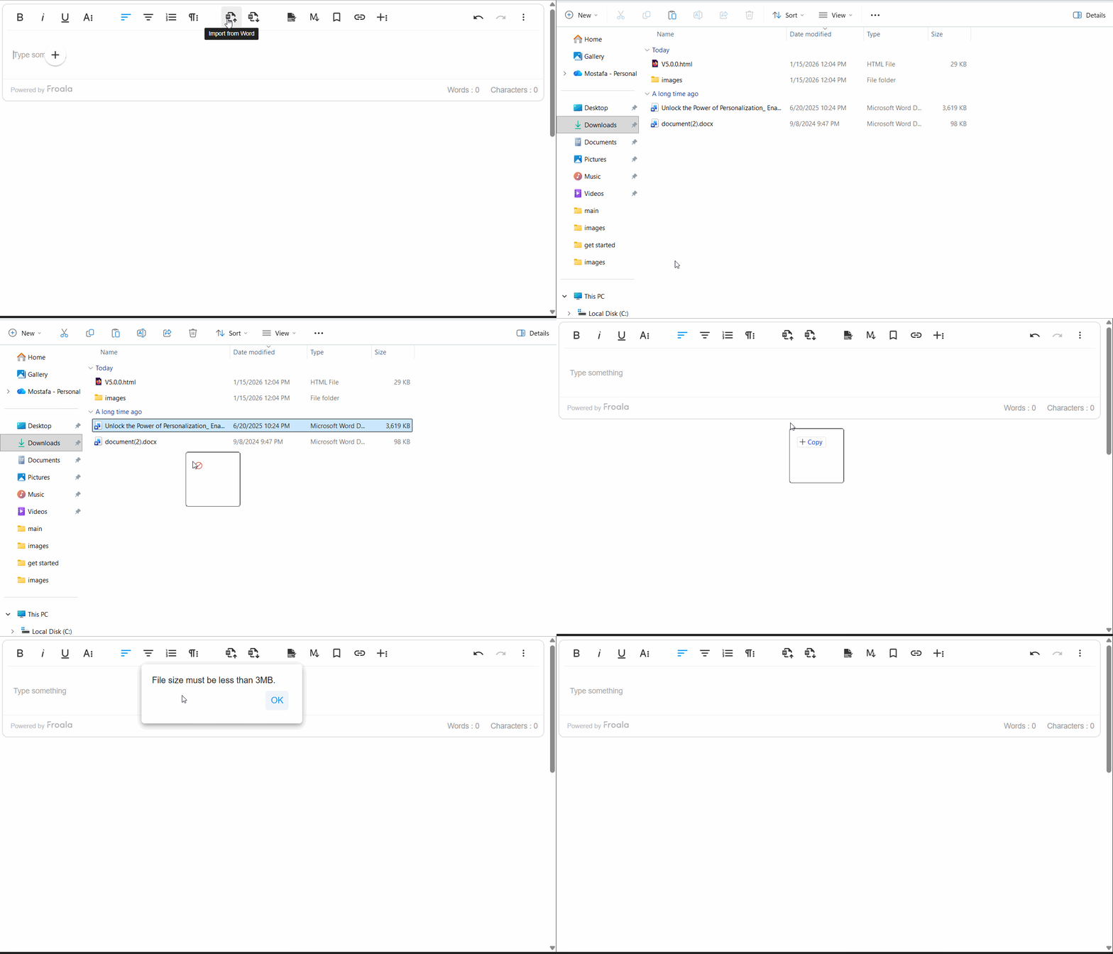
  • The simplest architecture often leads to the most maintainable AI-enhanced editor.

Why Vanilla JS Still Matters

Vanilla JS remains valuable because it prioritizes performance and control. Without the abstraction layers that come with frameworks, developers decide exactly how and when scripts run. This makes applications faster to load and easier to debug.

An image that shows plain JavaScript as the foundation of modern front-end frameworks like React, jQuery, Vue.js, and Angular, as well as backend frameworks like Node.js.

Frameworks bundle extra logic to manage states and components. While this helps large-scale apps, smaller ones like websites and editing tools benefit from staying lean. Every additional library increases bundle size, meaning more kilobytes for users to download, which could translate to slower load times.

Vanilla JS also gives full control over how APIs interact with the DOM. You can manage your AI requests, button clicks, and text insertions directly without adapting to framework-specific actions.

Additionally, vanilla JS doesnโ€™t break when frameworks update. Framework lock-ins often force developers to rewrite integrations after major version changes. By staying independent, your editor turns framework-agnostic, making it future-ready and easy to embed across projects.

Remember when Google rewrote AngularJS and produced Angular (2+) because of the formerโ€™s performance and scalability issues? It changed its primary language from JS to TypeScript (JS but with static typing) and transitioned into component-based architecture. This move, while beneficial in the long run, caused several migration challenges and headaches for AngularJS developers.

Tip: If youโ€™re maintaining a small site or lightweight CMS, a vanilla JS editor can cut load times and reduce maintenance costs significantly. Better yet, the best JavaScript WYSIWYG editor solutions integrate well with plain JS and React, Vue, Angular, and other frameworks.

The Problem with Framework Dependencies

Frameworks simplify complex applications, but they can overcomplicate simpler projects. For example, using a React WYSIWYG editor may require wrapping it in components, managing props, and handling state updates. On the other hand, integrating a WYSIWYG editor in vanilla JS might appear simpler.

If your editor relies on React and the React API changes, your integration could break. The same applies if you use AI SDKs for specific frameworks. Developers could spend more time maintaining compatibility than improving features.

Performance could also suffer, as frameworks load virtual DOM engines and internal state systems that simple text editors donโ€™t need. If you need a WYSIWYG editor for a simple application or site, frameworks like React seem like overkill. With vanilla JS, you can achieve the same AI-enhanced results through simpler means.

Note: The discussion above doesnโ€™t mean or imply that using frameworks is bad. In fact, frameworks are excellent tools for developing full-scale modern web applications. Always assess your project requirements first before committing. You can always switch depending on what you need.

AI Features You Can Implement in Vanilla JS WYSIWYG Editors

Adding AI to a vanilla JS editor doesnโ€™t require a full ecosystem. Most features can connect through REST APIs and editor plugins, returning AI responses in real time.

Smart Text Assistance

In-editor AI can refine user input through grammar checks, rephrasing, or tone adjustments. For instance, integrating OpenAI, DeepSeek, or Claude allows a โ€œRewriteโ€ button to suggest clearer or more natural sentences.

All this could happen through a single fetch() call that sends text and retrieves suggestions. The editor simply replaces the selected text with the AIโ€™s response.

Summarization and Auto-Suggestion

An example that shows a WYSIWYG editor plus AI implementation in vanilla JS.

Text summarization in JavaScript WYSIWYG editors

Writers often need quick summaries or title ideas (writerโ€™s block is real). AI summarization tools can process long content and return concise versions. Similarly, an in-editor AI can scan text and recommend headlines based on keywords and sentiment.

You can achieve this by sending editor content through an API endpoint, then inserting the AI-generated summary back into the editor.

Tip: Only trigger API requests when users explicitly click โ€œSummarize,โ€ or โ€œSuggest Headline,โ€ or other editor buttons for AI functionality. This could help avoid unnecessary API costs.

Visual and Accessibility Improvements

Some advanced editors have AI features that can generate alt text (alternative text that describes images). This improves accessibility for visually impaired readers. Some editors can even generate image captions or analyze and enhance image elements from the editor.

For example, in a vanilla JS setup, you can upload an image and send it to an AI service for analysis. Afterwards, you can then inject the generated caption back into the editor.

Code or Syntax Assistance

For developer-centric WYSIWYG HTML editors, AI can serve as a coding assistant. It can explain code snippets, translate them to other languages, or detect syntax errors.

This feature enhances documentation platforms, coding blogs, or repositories by helping authors write more accurate examples with less effort. For example, GitHub Copilot lets developers create, edit, debug, document, and even test code right from their editor.

How Vanilla JS Makes AI Integration Simpler

Vanilla JS keeps integrating AI straightforwardly. As said earlier, you can use a basic fetch() or XMLHttpRequest call to communicate with any AI API. These methods donโ€™t require additional libraries.

A process flow that shows how AI integration into JS works. The first step is the gathering of user input, followed by fetching and communicating with the AI API. Lastly, the editor updates its contents with the result of the fetch command from earlier.

If your JavaScript WYSIWYG editor allows it, you can also create your own AI plugin. For example,

  1. The editor detects a text selection.
  2. A โ€œSmart Assistโ€ button triggers an asynchronous function.
  3. That function sends the text to an AI API (like OpenAI) and waits for a result.
  4. The API sends back the result, and the script inserts the revised version into the editor.

Managing state with vanilla JS may not appear as natural as with React, but it is usually simple. Event listeners handle user actions, while native DOM updates ensure everything stays fast and responsive, with no hooks or watchers needed.

If you want to learn more about how you can implement AI in vanilla JS setups, read this article about building a โ€œsummarize textโ€ feature with the DeepSeek API. Or, go straight to the coding part and clone this GitHub repo.

Note: You can further extend this setup with promises, async/await logic, and local caching for even smoother performance.

Best Practices When Adding AI to Vanilla JS Editors

AI integration adds power, but it also requires thorough preparation and responsibility. Take note of the quick tips below to help reduce cost and improve performance.

  • Keep your API calls lightweight. Only send data when necessary, like when a user explicitly requests an AI action. Avoid constant background checks, which can raise latency and cost.
  • Always consider privacy and data security. Never send entire drafts to external APIs unless required. Instead, process small text segments or anonymize sensitive information.
  • Cache AI responses where possible. This helps reduce repetitive API calls and speeds up common tasks like text rephrasing or caption generation.
  • Design modular scripts that users can enable or disable easily. This ensures your AI features donโ€™t interfere with the editorโ€™s core performance.
  • Many JavaScript WYSIWYG editors offer plugin APIs. These let you add custom AI buttons whether youโ€™re using vanilla JS or frameworks.

Conclusion

Creating intelligent editing experiences isnโ€™t limited to framework-centric applications. With WYSIWYG editors that support vanilla JS and various frameworks, you can build AI-powered features that stay light and customizable.

By using plain JavaScript and an AI-capable editor, you can reduce complexity, avoid version lock-ins, and speed up development. Paired with modern AI APIs, plain JS remains an adaptable and viable foundation.

When simplicity meets capability, even plain JavaScript becomes a powerful base for intelligent editing.

Mastering Froala Helpers for Device Detection, URL Safety, and More

Froala Helpers

When building advanced experiences with the Froala WYSIWYG Editor, developers often find themselves writing extra JavaScript to handle things like device detection, scroll behavior, or URL validation.

But hereโ€™s the good news โ€” Froala already provides a built-in solution for that: Helpers.

Helpers are small, smart utilities bundled inside Froala that make your code cleaner, faster, and easier to maintain. In this article, weโ€™ll explore some of the most useful helpers โ€” from detecting mobile devices to keeping your URLs safe.


๐Ÿ”‘ Key Takeaways

  • Froala Helpers provide small yet powerful utilities that simplify editor customization.
  • You can detect devices (mobile, iOS, Android, etc.) to deliver tailored UI experiences.
  • Use scroll helpers to keep toolbars or elements aligned as users scroll.
  • The sanitizeURL() helper adds a vital layer of security for link handling.
  • Helpers make your code simpler, faster, and more consistent across platforms.

Whether youโ€™re fine-tuning the editorโ€™s UX or building a custom plugin, helpers let you focus on features โ€” not boilerplate code.

๐ŸŒŸ What Are Froala Helpers?

Froala Helpers are utility functions accessible via editor.helpers. Theyโ€™re designed to simplify common tasks that developers repeatedly need when customizing the editor or building plugins.

For example, you can:

  • Detects whether the user is on iOS or Android.
  • Check if the editor is being used on a touch device.
  • Get the scroll position of the page.
  • Sanitize URLs before inserting them into the editor.

Instead of writing this logic manually, you can use these helpers directly from the Froala instance.

const editor = new FroalaEditor('#editor', {});

console.log(editor.helpers.isMobile()); // true or false

These small methods pack a big productivity punch โ€” they save time, improve reliability, and help you create smarter editor experiences.

โš™๏ธ Why Froala Helpers Matter

When customizing Froala, developers often deal with:

  • Device-based UI adjustments (e.g., hiding toolbars on mobile)
  • Handling touch versus keyboard input
  • Keeping toolbars visible during scrolling
  • Cleaning URLs to prevent unsafe content

Without helpers, these tasks can be repetitive and prone to cross-browser issues. Froala Helpers provide ready-made, tested, and optimized solutions that work consistently across devices and browsers.

Top benefits include:

  • ๐Ÿง  Simplicity: No need to reinvent the wheel.
  • โšก Performance: Built-in and optimized for speed.
  • ๐Ÿงฉ Consistency: Reliable behavior across all browsers.
  • ๐Ÿ›ก๏ธ Security: Safer URL handling and cleaner code.

๐Ÿ“ฑ Device Detection Helpers

Letโ€™s start with the helpers that detect user devices. These are especially useful when building responsive, adaptive experiences in Froala.

1. helpers.isMobile()

Detects if the user is on any mobile device.

Example:

if (editor.helpers.isMobile()) {

ย ย console.log('Mobile layout activated');

}

Use Case: Load a simplified toolbar or disable certain features on smaller screens for a smoother mobile experience.

2. helpers.isAndroid()

Detects Android devices.

Example:

if (editor.helpers.isAndroid()) {

ย ย console.log('Running on Android');

}

Use Case: Handle Android-specific quirks โ€” for example, adjusting cursor handling or input focus behavior in Chrome on Android.

3. helpers.isBlackberry()

Checks if the user is on a Blackberry device.

Example:

if (editor.helpers.isBlackberry()) {

ย ย console.log('Blackberry device detected');

}

Use Case: Though Blackberry devices are rare today, this can still help in enterprise or legacy applications that must support older systems.

4. helpers.isIOS()

Detects whether the editor is running on iPhone or iPad.

Example:

if (editor.helpers.isIOS()) {

ย ย console.log('Running on iOS');

}

Use Case: Adjust touch or clipboard behaviors that behave differently in Safari on iOS.

5. helpers.isMac()

Detects if the system is macOS.

Example:

if (editor.helpers.isMac()) {

ย ย console.log('Mac detected');

}

Use Case: Use platform-specific keyboard shortcuts โ€” for example, using the Command (โŒ˜) key instead of Control.

6. helpers.isTouch()

Checks if the device supports touch input.

Example:

if (editor.helpers.isTouch()) {

ย ย console.log('Touch input detected');

}

Use Case: Switch hover interactions to tap interactions for touch screens.

7. helpers.isWindowsPhone()

Detects Windows Phone browsers.

Example:

if (editor.helpers.isWindowsPhone()) {

ย ย console.log('Windows Phone device detected');

}

Use Case: Support or test compatibility for legacy Windows Phone browsers.

๐Ÿงฉ Pro Tip: Combine these helpers for more granular targeting.

if (editor.helpers.isMobile() && editor.helpers.isIOS()) {

ย ย console.log('Optimize editor for iPhone users');

}

๐Ÿงญ Scrolling Helpers

These helpers come in handy when you need to respond to the editorโ€™s scroll position โ€” for example, repositioning floating toolbars or syncing UI elements as users scroll.

scrolling helpers

8. helpers.scrollTop()

Gets the vertical scroll position.

Example:

const top = editor.helpers.scrollTop();

console.log('Scroll top:', top);

Use Case: Keep floating toolbars in view when the editor or window is scrolled.

9. helpers.scrollLeft()

Gets the horizontal scroll position.

Example:

const left = editor.helpers.scrollLeft();

console.log('Scroll left:', left);

Use Case: Useful for horizontally scrollable tables or editors embedded in side-by-side layouts where toolbar alignment matters.

๐Ÿ”’ URL Sanitization Helper

Security is a big concern in rich text editors โ€” especially when users can insert links. Thatโ€™s where Froalaโ€™s sanitizeURL() helper shines.

10. helpers.sanitizeURL(url)

Cleans a URL to ensure itโ€™s valid and safe before being inserted into the editor.

Example:

const userInputURL = "javascript:alert('xss')";

const safeURL = editor.helpers.sanitizeURL(userInputURL);

console.log(safeURL); // outputs an empty string

Use Case: Prevent users from inserting malicious or invalid links. This adds an extra layer of protection against XSS (Cross-Site Scripting) attacks and ensures that all URLs embedded in your content are safe and well-formed.

๐Ÿงฉ Putting It All Together: Real-World Scenarios

Here are a few ways you can combine helpers for practical results.

๐Ÿง  Example 1: Adaptive Toolbar for Mobile

if (editor.helpers.isMobile() || editor.helpers.isTouch()) {

ย ย editor.opts.toolbarBottom = true;

}

Move the toolbar to the bottom of the editor when users are on touch devices for better usability.

โŒจ๏ธ Example 2: Platform-Specific Shortcuts

if (editor.helpers.isMac()) {

ย ย console.log('Use โŒ˜ + B for bold');

} else {

ย ย console.log('Use Ctrl + B for bold');

}

Adjust keyboard shortcuts dynamically for macOS vs Windows.

๐Ÿ” Example 3: Safe Link Insertion

const url = editor.helpers.sanitizeURL(userInput);

if (url) {

ย ย editor.html.insert(`<a href="${url}">${url}</a>`);

}

Always sanitize URLs before inserting them into content.

๐Ÿš€ Benefits Recap

Hereโ€™s what Froala Helpers bring to your development workflow:

Benefit Description
๐Ÿง  Simpler Code No need to reimplement device or scroll detection logic.
โš™๏ธ Consistency Unified results across browsers and platforms.
๐Ÿ“ฑ Adaptability Create responsive editor experiences that adjust to devices.
๐Ÿ”’ Security Keep your content safe with sanitized URLs.
โšก Efficiency Lightweight, optimized, and built right into Froala.


๐Ÿ Conclusion

Froala Helpers may seem small, but they can make a big impact on your editor customization workflow. Whether youโ€™re optimizing for mobile users, maintaining layout stability while scrolling, or keeping your content secure โ€” these helpers make the process faster, cleaner, and more reliable.

So next time you build a Froala plugin or tweak your editor configuration, remember: ๐Ÿ‘‰ You donโ€™t have to do it alone โ€” let Froala Helpers do the heavy lifting.

โœจ Ready to Build Smarter with Froala?

Experience how Froalaโ€™s clean design, blazing-fast performance, and developer-friendly APIs make rich text editing effortless.

๐Ÿ‘‰ Download the Editor today and start creating beautiful, responsive editing experiences in minutes!

โ“ Frequently Asked Questions (FAQ)

What are Froala Helpers used for?

Froala Helpers are small utility functions that simplify common coding tasks like device detection, scroll handling, and URL sanitization when customizing the Froala Editor.

How do I access helpers in Froala?

All helpers can be accessed through your editor instance:

const editor = new FroalaEditor('#editor');

editor.helpers.isMobile();

Are Froala Helpers available in all versions of the editor?

Yes. Helpers are included in all modern Froala Editor builds and can be used without extra setup or configuration.

Can I combine multiple helpers together?

Absolutely. You can use multiple helpers to create adaptive logic, such as:

if (editor.helpers.isMobile() && editor.helpers.isIOS()) {

ย ย // Apply iPhone-specific UI tweaks

}

Why should I use sanitizeURL()?

sanitizeURL() ensures that any URL added to your editor content is valid and safe. It helps prevent XSS and other malicious code injections.

Are Froala Helpers limited to the editor area?

No. While theyโ€™re designed for editor-related tasks, helpers can be used in broader contexts โ€” for example, to detect device types before initializing Froala or to manage layout responsiveness.

Where can I learn more about Froala Helpers?

You can explore the full list of available helpers and examples in the official Froala Editor Documentation.


Why Unminified Source Code Matters in WYSIWYG Editors

A box that stores some code inside slowly opens, representing unminified source code for development.

When you view a web pageโ€™s source code, it can look either neatly formatted or crammed into one unreadable line. That difference comes down to whether itโ€™s minified or unminified source code. The former removes every unnecessary space, comment, and line break, which is ideal for production because it helps improve performance.

However, that same compactness turns into a problem during development. Developers often need to explore how tools work or adjust their behavior, and reading minified code makes this nearly impossible. By contrast, unminified source code provides clean, readable formatting that encourages experimentation and easier debugging.

This article explores why unminified source code matters, especially in integrating WYSIWYG editors. Additionally, it discusses how unminified code benefits customization, learning, and overall development clarity.

Key Takeaways

  • Unminified source code is readable, editable, and ideal for customization or debugging.
  • It allows developers to understand how tools like WYSIWYG editors work internally.
  • Using unminified code improves collaboration and learning among development teams and even solutions providers.
  • Minified code remains essential for performance in production environments.
  • Balancing both ensures better, safer development without sacrificing website performance.

What Is Unminified Source Code?

2 scrolls (unminified and minified code). The first one is long and readable (unminified), while the second one is short and barely legible (minified).

Every piece of software starts as human-readable code. This is the unminified source code, or the code that developers wrote without putting much effort into formatting or obfuscation. It includes proper indentation, comments, and spacing for better readability.

Once youโ€™re ready to deploy the software, you can then minify or uglify that code. Minification removes all unnecessary characters, such as spaces, line breaks, and comments, while keeping the program functional. This results in a smaller file that loads faster for users but is also nearly impossible for humans to read.

For example, hereโ€™s a script for generating the Fibonacci sequence using recursion:

function fibonacciRecursive(n) {
  if (n <= 1) {
    return n;
  }
  return fibonacciRecursive(n - 1) + fibonacciRecursive(n - 2);
}

// To get the sequence, you can call this in a loop
// Letโ€™s get the first 10 Fibonacci numbers
const n = 10;
const sequence = [];
for (let i = 0; i < n; i++) {
  sequence.push(fibonacciRecursive(i));
}

console.log(sequence);
// Output: [0, 1, 1, 2, 3, 5, 8, 13, 21, 34]

After minifying the code above, youโ€™ll get something like the code below, with spaces and comments removed.

function fibonacciRecursive(n){if(n<=1){return n} return fibonacciRecursive(n-1)+fibonacciRecursive(n-2)}const n=10;const sequence=[];for(let i=0;i<n;i++){sequence.push(fibonacciRecursive(i))}

Note: Minification doesnโ€™t change how a program behaves, but it does optimize the way it loads for users. It just gets rid of all the things that make the code more readable for humans, but it does keep functionality intact.

Why Is Unminified Source Code a Big Deal in WYSIWYG Editors?

WYSIWYG editors often bridge visual creativity and raw code. They help users write blog posts, create web pages, and design emails without solely relying on HTML manually. However, behind this simplicity lie scripts that format text, manage toolbars, and respond to user actions in real time.

Developers need unminified source code to adjust or understand that logic. With it, they turn a closed, opaque, and abstracted system into something adaptable. Letโ€™s explore why having readable code makes such a difference in WYSIWYG development environments.

Higher Degree of Customization

Every editor comes with its default set of tools, like font formatting, paragraph styling, image handling, and so on. But what happens when a company wants something different? For instance, a custom โ€œInsert brand page templateโ€ button or a style preset that matches its brand.

Custom plugins usually handle these features, but when even that isnโ€™t enough to accommodate deeper customization, where do you turn? With a WYSIWYG editor that allows unminified source code integration, developers can scan the structure logically. Additionally, they can pinpoint where exactly the editor defines toolbar elements, plugins, or configurations.

Readable code also reveals how features connect: how a click triggers an event, how styles apply, or how shortcuts work. This deeper visibility encourages developers to experiment and extend the editorโ€™s functionality safely.

Easier Debugging and Error Tracing

A magnifying glass over some code, representing debugging.

When a visual HTML editor stops behaving as expected, tracing the problem can prove frustrating, especially in minified code.

Unminified source code makes debugging more efficient. Developers can search for specific variables, follow function calls, and locate causes of unexpected behavior quickly. Because line numbers and descriptive variable names remain intact, tools like browser consoles and debuggers become much more useful.

In terms of integrating WYSIWYG editors, unminified codes allow developers to collaborate with WYSIWYG editor providers. They can help suggest code improvements, company-specific features that they need, and other insights for future product improvements.

Tip: Always debug using the unminified version unless testing specific production issues. Once you confirm the fix, apply it to the minified build before deployment.

Better Learning and Documentation

Readable source code can also serve as an educational tool. For new developers joining a project, unminified files serve as a living guide to how the editor operates internally.

They can observe the structure of formatting commands, how events flow between modules, and the design of UI components. This helps them learn coding patterns, naming conventions, and modular design principles more effectively than from documentation alone.

Contributors benefit even more. When a project shares its unminified codebase, it invites community collaboration. Aside from proposing improvements as stated earlier, developers can write better documentation or build compatible plugins.

Note: Transparency encourages trust. Tools that provide unminified source code access demonstrate confidence in their architecture and support developer growth.

When to Rely on Unminified Code

Choosing between unminified and minified versions is more about context rather than which is better. Both serve unique purposes within the development cycle. Chances are, youโ€™ll probably use them both in different stages of your application.

Use minified source code when youโ€™re building, debugging, or customizing an application. Itโ€™s particularly valuable when integrating a third-party WYSIWYG editor into a larger system. Some editors that come with unminified code let you understand how features fit into your project and modify them accordingly.

For instance, letโ€™s say youโ€™re developing an internal content management tool. Keeping the unminified version lets your team experiment safely before final deployment. Itโ€™s easier to explore feature dependencies, troubleshoot performance issues, or trace unexpected behaviors in this state.

A gear shift, which represents the toggle from "dev mode" to "production mode." In dev mode, you should use unminified code; on the other hand, in production, try to minify your codes for performance.

Once the system stabilizes and moves to production, you can then minify your code with a bundler or code uglifier. This reduces page load time, conserves bandwidth, and ensures a cleaner, faster experience for end users.

Tip: Treat unminified code as your workshop and minified code as your storefront. Both are necessary, but they serve different visitors. Moreover, youโ€™d want your workshop to have as many tools as possible for a higher degree of freedom. And like minified code, your storefront should look as seamless and as neat as possible for your clients.

Best Practices When Using Unminified Code

Transitioning between readable and compact code is smooth if you maintain structure. Here are some tips to keep both versions manageable.

  • Separate your environments clearly: Keep distinct folders for each version, such as /src for unminified and /dist for minified. This helps avoid confusion during deployment.
  • Use unminified source code only in safe contexts: Avoid deploying readable code to public environments if you can. It could expose proprietary logic or make files heavier to load. Instead, reserve it for development, staging, or internal testing. Of course, obfuscation isnโ€™t a solid security measure, as users can just unminify any minified code. Still, minifying code can significantly improve performance, so why not go for it?
  • Document every change: Whenever you modify unminified files, log any changes as well as the reason for those changes. This ensures that future team members understand your decisions when maintaining the minified version.
  • Automate minification: Tools like Webpack, Rollup, or Gulp can automatically generate minified builds from your readable code. Automation helps prevent accidental inconsistencies and save time during releases.

Note: The goal here isnโ€™t to choose one permanently over the other but to use both strategically. Readability speeds up development, while minification optimizes performance. Together, they form a balanced workflow thatโ€™s both developer-friendly and user-focused.

Conclusion

Unminified source code brings visibility and flexibility to development. It allows developers to study, customize, and debug the inner workings of WYSIWYG editors without wrestling with unreadable lines.

Meanwhile, minified code remains essential for fast-loading production builds. Again, the goal here isnโ€™t to pick one but to use both wisely if you need them.

Balancing readability with performance ensures a development process thatโ€™s both efficient and educational. Some modern solutions, like Froalaโ€™s Architect plan, even include unminified integration options, letting teams enjoy both speed and full control.

Froala Shortcut Secrets That Supercharge Your Productivity

shortcuts secrets

Imagine this: youโ€™re writing, editing, and formatting text โ€” all flowing smoothly โ€” when suddenly you have to grab your mouse just to make text bold or insert a link. That small break? It disrupts your rhythm.

Thatโ€™s why keyboard shortcuts are pure magic. They keep users in their creative flow, transforming ordinary typing into an effortless experience. And for developers working with editors like Froala, understanding how to create and customize shortcuts can take user productivity to the next level.

This article will explore why users love shortcuts, and more importantly, how you can register and customize them in Froala Rich Text Editor to make your users feel truly intuitive and efficient.

Users love shortcuts

Why Users Love Shortcuts

The Psychology of Speed and Flow

Humans crave efficiency. Every time we remove friction between thought and action, our brains reward us with a sense of momentum. Shortcuts do exactly that โ€” they reduce micro-delays. You donโ€™t need to stop typing to click a toolbar icon. Instead, your thoughts move directly into your work.

This state is called โ€œflowโ€ โ€” that sweet spot where focus, creativity, and speed align. Keeping hands on the keyboard helps sustain that state.

Boosting Productivity and Efficiency

A few seconds saved per action might not sound like much. But multiply that by hundreds of formatting tasks a day, and youโ€™ll see why writers, coders, and designers swear by shortcuts.

Think of simple ones like:

  • Ctrl + B for bold
  • Ctrl + Z for undo
  • Ctrl + K for inserting a link

Small actions that keep you moving โ€” no pauses, no friction.

Accessibility and Inclusivity

Shortcuts arenโ€™t just about speed โ€” theyโ€™re also about accessibility. For users with motor limitations or repetitive strain injuries, relying less on mouse interactions makes writing more comfortable.

Well-designed shortcuts make the interface more inclusive, ensuring everyone can use the editor effectively โ€” regardless of how they interact with it.

Customization and User Empowerment

People love tools that adapt to them. Allowing users to customize shortcuts gives them a sense of ownership โ€” theyโ€™re not just using the tool; theyโ€™re shaping it. For developers, this translates into higher satisfaction, engagement, and loyalty.

Froala shortcuts

How Froala Handles Shortcuts by Default

The Froala Rich Text Editor already includes a variety of built-in shortcuts โ€” for bold, italic, underline, undo, redo, and more. For example:

  • Ctrl + B โ†’ Bold
  • Ctrl + I โ†’ Italic
  • Ctrl + U โ†’ Underline
  • Ctrl + Z โ†’ Undo
  • Ctrl + Y โ†’ Redo

These shortcuts are intuitive, consistent across platforms, and designed to match what users expect from other editors like Word or Google Docs.

However, sometimes youโ€™ll want more โ€” a custom command, a unique formatting option, or a plugin action triggered with a keystroke.

Thatโ€™s where custom shortcut registration comes in.

How To Register Custom Shortcuts in Froala

Letโ€™s walk through how you can register your own shortcuts to make your editor truly yours.

Froala provides a powerful method FroalaEditor.RegisterShortcut() that gives you granular control over keyboard interactions. Let’s break down its parameters:

  • key: The unique decimal code identifying the keyboard button
  • cmd: The editor command to trigger (like ‘bold’, ‘italic’)
  • valโ†’ The name of the option to be triggered In case the command has more than one option.
  • letter โ†’ The character shown in tooltip hints.
  • shift โ†’ Boolean to require Shift key combination
  • option โ†’ Boolean to require Alt (โŒฅ (Option) on Mac) key combination

Practical Examples: Mastering Froala Shortcuts

Let’s explore how to create and modify shortcuts with precision.

Example of a basic shortcut: Bold Shortcut

The classic bold shortcut demonstrates the method’s simplicity:

FroalaEditor.RegisterShortcut(

ย ย FroalaEditor.KEYCODE.B,ย  // Decimal code for 'B' key

ย ย 'bold',ย  ย  ย  ย  ย  ย  ย  ย  ย  // Bold command

ย ย null,ย  ย  ย  ย  ย  ย  ย  ย  ย  ย  // No specific option

ย ย 'B', ย  ย  ย  ย  ย  ย  ย  ย  ย  ย  // Tooltip shows 'CTRL + B'

ย ย false, ย  ย  ย  ย  ย  ย  ย  ย  ย  // No Shift key required

ย ย falseย  ย  ย  ย  ย  ย  ย  ย  ย  ย  // No Alt/Option key required

)

This single line configures Ctrl + B (Windows) or Cmd + B (macOS) to instantly bold selected text.

Shortcut Variations

Want a different combination? Simply adjust the parameters:

For example, the following code makes selected text bold using the shortcut Ctrl + Shift + B (Windows) or Cmd + Shift + B (macOS).

FroalaEditor.RegisterShortcut(

ย ย FroalaEditor.KEYCODE.B,ย ย 

ย ย 'bold',ย ย ย ย ย ย ย ย ย ย ย ย ย ย ย ย ย ย 

ย ย null,ย ย ย ย ย ย ย ย ย ย ย ย ย ย ย ย ย ย ย ย 

ย ย 'B',ย ย ย ย ย ย ย ย ย ย ย ย ย ย ย ย ย ย ย ย ย 

ย ย true, ย  ย  ย  ย  ย  ย  ย  ย  ย  // Shift required

ย ย falseย ย ย ย ย ย ย ย ย ย ย ย ย ย ย ย ย ย ย 

)

While the following shortcut registration code modification changes the shortcut toย Ctrl + ALT + B (Windows) or Cmd + Option + B (macOS)

FroalaEditor.RegisterShortcut(

ย ย FroalaEditor.KEYCODE.B,ย ย 

ย ย 'bold',ย ย ย ย ย ย ย ย ย ย ย ย ย ย ย ย ย ย 

ย ย null,ย ย ย ย ย ย ย ย ย ย ย ย ย ย ย ย ย ย ย ย 

ย ย 'B',ย ย ย ย ย ย ย ย ย ย ย ย ย ย ย ย ย ย ย ย ย 

ย ย false,ย  ย  ย  ย  ย  ย  ย  ย  ย  // No Shift required

ย ย true ย  ย  ย  ย  ย  ย  ย  ย  ย  // Alt/Option required

)

If we want to use both Shift and Alt/Option, then you should modify the code to

FroalaEditor.RegisterShortcut(

ย ย FroalaEditor.KEYCODE.B,ย ย 

ย ย 'bold',ย ย ย ย ย ย ย ย ย ย ย ย ย ย ย ย ย ย 

ย ย null,ย ย ย ย ย ย ย ย ย ย ย ย ย ย ย ย ย ย ย ย 

ย ย 'B',ย ย ย ย ย ย ย ย ย ย ย ย ย ย ย ย ย ย ย ย ย 

ย ย true,ย  ย  ย  ย  ย  ย  ย  ย  ย  // Shift required

ย ย true ย  ย  ย  ย  ย  ย  ย  ย  ย  // Alt/Option required

)

This demonstrates how easily you can customize keyboard interactions. This flexibility allows developers to create intuitive, personalized editing experiences that match specific workflow needs. The ability to fine-tune shortcuts means your Froala editor can feel truly tailored, reducing cognitive load and helping users maintain their creative momentum with minimal friction between thought and action.

Shortcuts for Commands with Multiple Actions

Some commands have multiple actions. For instance, the paragraphFormat offer multiple actions such as H1 for turning the text into heading 1 and H2 for turning the text into heading 2 and so on.

To assign a shortcut for the H1 action, you need to pass H1 as the third parameter in the RegisterShortcut method.

  FroalaEditor.RegisterShortcut(
  72,                         // Decimal code for 'H' key
  'paragraphFormat',          // Command
  'H1',                       // Selected Action 
  'H',
  false,
  false
  );

The above code registers Ctrl + H (Windows) or Cmd + H (macOS) to instantly make selected text a heading paragraph.

Similarly, you can create shortcuts for other paragraph formats like H2 or H3 by adjusting the action parameter.

By mapping specific keystrokes to precise formatting actions, you can dramatically reduce the time spent navigating menus and clicking buttons, making the writing process more fluid and intuitive for users across different skill levels and editing preferences.

Disabling Shortcuts

Sometimes, you might want to disable certain default keyboard shortcuts in Froala to prevent conflicts or customize the editing experience. Froala provides a straightforward way to manage this through the shortcutsEnabled configuration option.

How to Disable Specific Shortcuts

You can disable shortcuts by removing their names from the shortcutsEnabled array.

new FroalaEditor('#editor', {

ย ย shortcutsEnabled: ['bold', 'italic'] // Only these shortcuts remain active

});

Completely Disabling Shortcuts

If you want to turn off all default shortcuts:

new FroalaEditor('#editor', {

ย ย shortcutsEnabled: [] // Disables all default shortcuts

});

Why Disable Shortcuts?

Reasons to disable shortcuts might include:

  • Preventing accidental formatting
  • Resolving conflicts with browser or system-wide keyboard commands
  • Creating a more controlled editing environment

By carefully managing shortcuts, you can create a more tailored and user-friendly editing experience.

Shortcut Hints: Guiding Users Intuitively

Shortcut hints

Understanding Shortcut Hints

Shortcut hints are small, informative tooltips that appear when users hover over buttons in the Froala Rich Text Editor. These hints reveal the corresponding keyboard shortcut for each action, providing a quick reference that helps users discover and remember keyboard commands.

The Importance of Shortcut Hints

Shortcut hints serve multiple crucial purposes:

  • Discoverability: They introduce users to available keyboard shortcuts.
  • Learning: Help users quickly memorize keyboard commands
  • Accessibility: Provide clear guidance for users who prefer keyboard navigation.
  • Efficiency: Encourage users to adopt faster editing techniques

Configuring Shortcut Hints

Froala allows you to control shortcut hints through the shortcutsHint configuration option:

new FroalaEditor('#editor', {

ย ย shortcutsHint: trueย  // Enables shortcut hints (default)

});

Hints

To disable shortcut hints completely:

new FroalaEditor('#editor', {

ย ย shortcutsHint: falseย  // Disables all shortcut hints

});

Help Modal: Comprehensive Shortcut Reference

The Help plugin in Froala provides a comprehensive modal that displays all available shortcuts. This modal can be triggered by the help button and offers a complete overview of keyboard shortcuts.

Customizing the Help Modal Content

You can modify the help modal’s content to include custom shortcuts using the helpSets configuration. For example:

const editor = new FroalaEditor('#editor',{
  shortcutsHint: true, //display the shortcut code on hover over the button
}, function(){
  this.opts.helpSets.push({title: "Paragraph Format", commands: [
    {val: "OSkeyH", desc: "Heading 1"},
  ] 
  });
});

This adds a “Paragraph Format” section containing the Heading 1 item and its shortcut, CTRL+H.

Help Modal

Best Practices for Shortcut Hints

  • Keep hints clear and concise.
  • Use standard, intuitive shortcut combinations.
  • Ensure hints are visible but not intrusive.
  • Provide a way for users to view a complete shortcut list.

By thoughtfully implementing shortcut hints, you create a more intuitive, efficient editing experience that empowers users to work faster and more comfortably.

Cross-Platform Considerations

Froala’s shortcut system automatically adapts to different operating systems. The same registration works seamlessly across Windows, macOS, and Linux, handling modifier key differences behind the scenes.

Best Practices for Designing Shortcuts

Handle Shortcut Conflicts

Sometimes, shortcuts can overlap with browser or OS defaults. For instance, Ctrl + S usually saves the page. To avoid confusion:

  • Use combinations less likely to conflict (e.g., Alt + Shift + number keys).
  • Test across Windows, macOS, and Linux, as key modifiers differ (Ctrl vs Cmd).

Keep It Logical and Memorable

If a shortcutโ€™s meaning is obvious, users will remember it.

  • โ€œBโ€ for Bold.
  • โ€œIโ€ for Italic.
  • โ€œLโ€ for Link.

Avoid random or multi-layered key combinations unless absolutely necessary.

Conclusion

Keyboard shortcuts may seem small, but theyโ€™re the silent heroes of productivity. They reduce friction, keep users in flow, and turn routine editing into instinctive action.

For developers, Froalaโ€™s API makes implementing and customizing shortcuts straightforward โ€” giving you the power to create a truly fluid, user-friendly editing experience.

๐Ÿš€ Start Free Trial and explore Froalaโ€™s full set of customization and productivity tools.

๐Ÿ’ก Try it yourself: Experiment with a Froala JSFiddle demo or your local setup.

โœจ Final Thought

In the end, shortcuts arenโ€™t just about key combinations โ€” theyโ€™re about designing efficiency, empowerment, and joy into the user experience. And with Froala, you can deliver exactly that.

Shortcuts means efficiency, empowerment, and joy

Why Your Drag-and-Drop Editor Feels Clunky

A block of content being dragged by a cursor from mud. The mud represents clunky editor UX.

Have you ever had users or even testers tell you that your drag-and-drop editor sometimes feels slow, heavy, or clunky? Such editors are popular tools that make web content creation faster and easier through a visual interface. Without them, people would have a tougher experience using website builders, content management systems (CMS), email builders, and similar platforms.

However, despite its convenience, a drag-and-drop visual HTML editor can sometimes feel more like a burden than a benefit. Complex code, excessive features, or poor optimization often cause it to slow down or feel unresponsive. Instead of empowering users like it should, it may create frustration and interrupt the usersโ€™ creative flow.

In this article, weโ€™ll cover the common reasons a drag-and-drop editor feels clunky. Additionally, youโ€™ll learn about when to worry about clunkiness and when itโ€™s okay to overlook it. Weโ€™ll also discuss some tips that could help you with addressing editor clunkiness.

Key Takeaways

  • Drag-and-drop editors speed up design and content creation, but clunkiness often comes from hasty technical or UX decisions.
  • Knowing when to worry about performance depends on your goals: quick prototypes or full-scale products.
  • You can solve most performance issues with code optimization, modernization, and smarter UX patterns.
  • Analyze your bundles and test your editor across different environments to spot potential problems.
  • Find the right balance between robustness and simplicity. Extra features might mean little if they slow down the userโ€™s workflow.

Should You Worry about Drag-and-Drop Editor Clunkiness?

The short answer here is โ€œit depends,โ€ but in most cases, you should. Not every performance hiccup warrants a high-level alarm. Minor lag, for instance, might not matter when a casual user builds a simple newsletter.

A half-second delay in moving an element could annoy some, but it might not affect the end result too much. But if it starts affecting the entire workflow, clunkiness could cost you.

A timer set to "00:00:01" overlooks a mountain of other timers, which represents how many small, clunky experiences can lead to more serious problems in the long run.

For example, a marketing team building dozens of landing pages will get more poor experiences with a clunky editor. Every small lag, difficulty finding specific buttons, and unresponsiveness add up, creating a mountain of slow processes and reducing efficiency. Worse, users may lose patience and turn to alternatives.

So, what does this tell you? If your drag-and-drop editor is vital for your full application, you should worry about clunkiness and prioritize optimizing it. Otherwise, you can put optimization on hold in favor of other features (but you should get back to it nonetheless).

Furthermore, knowing whether clunkiness is a deal-breaker depends on your goals. If youโ€™re only building a quick prototype, then you donโ€™t need to worry about it. Otherwise, regardless of the editorโ€™s role, you should always strive to improve its performance.

Why Does Your Drag-and-Drop Editor Feel Clunky?

There are many reasons an editor feels slow or unpolished. Some are purely technical, while others come from UX choices that amplify tiny frictions. In this section, youโ€™ll learn some of the usual suspects for this problem.

Too Much Code Running behind the Scenes

When a user drags an element, dozens of scripts can wake up at once. Event listeners, layout calculations, and other mechanisms all run together.

If you rely on multiple libraries, each action might trigger redundant work. This results in higher CPU usage and delayed frame updates.

Note: If you want to try this out, open Chrome DevTools (F12 or right-click, then โ€œInspectโ€). Afterwards, go to the โ€œPerformanceโ€ tab and record a drag interaction. Look for long tasks and repetitive script evaluations. If there are any functions that run many times per interaction, thatโ€™s your smoke signal.

Heavy Use of <iframes> or Layers

The <iframe> element provides isolation and safety. However, isolation could cost you performance, as each <iframe> hosts a separate browsing context.

The browser must paint and combine the context of each <iframe> and the main page independently. When you nest many of these elements, every interaction can force multiple reflows and repaints. As a result, your users might get a laggy or unresponsive experience, especially on low-end devices.

Tip: Letโ€™s say you canโ€™t reduce the number of <iframe> elements and that their content has similar structure and purpose. You can then reuse one instance and swap its content instead of creating and destroying many iframes.

Poor Handling of Responsiveness

Dragging elements on desktop doesnโ€™t guarantee correct layout on mobile. If your editor relies on absolute positioning, elements might snap unexpectedly at different breakpoints. This could cause users to manually adjust layouts per device.

A responsive visual HTML editor design requires adaptive rules. This means fluid grids, percentage widths, and component-first layouts. Editors that treat every element as absolutely positioned can break easily on different screen sizes.

A GIF of a drag-and-drop editor that showcases responsiveness for both the editor and the dropped contents.

Figure 1: An example of a responsive drag-and-drop editor

Tip: If you want to start learning responsive design, MDNโ€™s responsiveness documentation and W3Schoolsโ€™ quick guide might help. You can also opt for third-party responsive design frameworks such as Bootstrap or Tailwind. Finally, you can integrate a drag-and-drop editor thatโ€™s already responsive.

Presence of Legacy Code

Legacy code refers to that which developers wrote for older browsers, frameworks, or libraries. Teams often layer patches on top of it. Each patch, however, could increase complexity and risk of conflicts, causing the dependent application to turn fragile and slow down.

Legacy problems show up as inconsistent behavior between browsers, especially in recent versions. They also limit modern optimizations like passive event listeners or CSS containment.

Think of legacy code as an old house that still serves its main purpose. You shouldnโ€™t demolish it at once; instead, you reinforce and refurbish each room or wing until everything feels sturdy and new. The same thing applies to code.

Overloaded with Features

Having plenty of features is nice for power users who need as many editing and website-building capabilities as they can. But usually, when you add a lot of features to an editor, it could crowd the interface and slow down the platform. This leads to frustration and confusion for users.

Each feature could mean an extra script to load and more background work and events that fire even when the user never touches it. Make sure to minify your bundles as much as you can and remove features or plugins that youโ€™re sure your users wonโ€™t use. Additionally, you can lazy load heavy features by dynamic import, i.e., only when the user needs them, for example:

button.addEventListener('click', async () => {
  const module = await import('./sample-heavy-feature.js');
  module.open();
});

In terms of interface overload, you should categorize your editorโ€™s features according to their purpose. For example, gather all rich text formatting together or combine file upload processes through dropdown elements and separators.

An image that shows ideal toolbar organization for editors. In the image, each paragraph function is consolidated in a "More Paragraph" dropdown button, which reveals a paragraph menu when opened.

Figure 2: An editor that has toolbar organization, putting all paragraph-related features together

If youโ€™re using a third-party drag-and-drop editor, ensure that it has the ability to load and remove features via plugins. This aligns with modular architecture (plugin-based architecture), where different codes are encapsulated in smaller modules that represent a functionality. A plugin-based WYSIWYG editor allows you to load only the features that users need instead of loading everything every time.

Bad Feedback Loops

Letโ€™s say that you already minified your editor scripts, loaded only the necessary plugins, and made everything responsive. If your users or testers still experience slowness, it could stem from poor feedback instead of actual slowness.

If the UI gives no immediate hint, users might think that the app lags. For example, a user drops an element onto the editing space after dragging it from the toolbar or menu. If the editor doesnโ€™t show smooth dragging animations or visual cues (like spinners), the user might hesitate or feel confused.

Here are some quick fixes for improving your editorโ€™s feedback loops:

  • Add snapping markers, loading spinners, and a brief scale or shadow animation on element drop.
  • Use placeholders for slower content.
  • Add a lightweight ghost preview at mouse down. Afterwards, update its position continuously to follow the cursor.

Ignoring Small UX Details

Small UX annoyances can pile up, making the editor feel clumsy overall. For example, a draggable elementโ€™s grab handles might seem too small or hard to find. In this case, users might doubt whether the element is truly draggable or not.

Moreover, some important features might not appear too prominently because theyโ€™re too hidden or their icons are confusing. As a result, users would pause and spend more time hunting for the features they need, scanning every button icon.

Thankfully, design fixes are low effort but high impact:

  • Enlarge drag handles for draggable objects or enclose them in draggable cards. Donโ€™t forget to test these! Making drag handles too big could cause overlapping or the inability to drag adjacent elements.
  • Provide visible drag handles or visuals, tooltip text, and keyboard shortcuts for better accessibility.
  • Use consistent iconography and place common or essential features in more prominent spots.

A GIF that demonstrates a drag-and-drop editor in action. In the GIF, the user clicks and drags both an email signature (logo, name, title, number) and a footer onto the editor.

Figure 3: Seamless drag and drop in action

The GIF above contains a drag-and-drop editor example that demonstrates how it should work in email builders. In the example, users can click and drag an email signature or footer and drop it onto the editing space. To get started with this type of setup, or to see how drag-and-drop editors generally work, visit the demoโ€™s GitHub repository.

Extra Tips to Make Your Drag-and-Drop Editor Less Clunky

Weโ€™ve already discussed some ways to help with clunkiness earlier, but before you go, here are some more practical actions you can take.

Simplify the Codebase

  • Audit bundles with a bundle analyzer like webpack-bundle-analyzer. After an analysis, youโ€™ll find out what your bundle contains, which modules take up the most space, and whether there are any modules that shouldnโ€™t be there.
  • Replace heavy libraries with smaller alternatives if you can.
  • Implement tree-shaking on your bundle to remove any unused code. Some bundlers, like Webpack, automatically use tree-shaking.

Keep Testing

  • Run Google Lighthouse audits and fix long tasks.
  • Test your platform and drag-and-drop editor on low-end mobile devices, older browser versions, and different browsers to help ensure consistency.
  • Benchmark early versions of your editor and compare new builds against the old benchmarks to assess improvements.

Integrate Readily Available Editors

  • If youโ€™re pressed for time, prefer a head start, or want to experiment with drag-and-drop editor features, consider using a readily available editor.
  • Most of these editors have already addressed clunkiness before and continue to improve still.
  • The task of developing and maintaining a polished, complex drag-and-drop functionality will dissipate into simple integration and regular updates.

Conclusion

Drag-and-drop editor clunkiness comes from an accumulation of technical debt, UX friction, and unmeasured features. Thankfully, most problems have concrete fixes. Assess the drag-and-drop feedback loop, remove or lazy load heavy modules, add immediate visual feedback, and tune responsiveness.

A fast visual HTML editor comes from small, consistent improvements. Optimize the render path, clean the codebase, and design for real user flows. When you balance power with simplicity, your editor will feel smoother, more predictable, and very usable.

It might sound like a lot of work. But addressing these clunkiness issues as soon as possible can go a long way towards smoother editing experiences. Or, you can also call it a day and integrate a tried-and-tested drag-and-drop editor. In the end, the choice will depend on your preference, user requirements, and project timeline.

Extending Froala with an APA Website Citation Tool

APA Website Citation Tool

Imagine typing a paragraph, the cursor blinking as you search for the perfect source. You pull up a webpage, draft your sentence, and then hit a wall: you need an APA citation, fast. You donโ€™t want to leave your writing window or disrupt your flow. What if you could summon a perfect APA citation with a single click, right inside your editor?

In this tutorial, youโ€™ll learn how to extend Froala with a lightweight, reusable citation feature. Build a custom toolbar button that opens a popup, collect author/date/title/URL details, and insert a polished APA website citation exactly where youโ€™re writing.

Along the way, youโ€™ll quickly grasp what citations are, why APA matters, and how Froalaโ€™s flexibility makes this tool fit real writing workflows.

By the end, youโ€™ll see that Froala isnโ€™t just a text editorโ€”itโ€™s a powerful tool you can shape to fit specialized workflows, whether youโ€™re supporting academic writing, content publishing, or collaborative editing. Get ready to add a professional-grade citation tool to Froala and give your users a smoother, smarter writing experience.

APA Citation Style

Understanding Citations

A citation gives credit to the source of information you use in your work. It helps readers verify facts, find more information, and ensures you avoid plagiarism. Citations apply whether you quote someone directly or paraphrase their ideas.

By contrast, a quotation is when you copy the exact words from a source. Quotations must always be followed by a citation. In short: quotations are the borrowed words, citations are the credit.

Citations appear in academic papers, blogs, reports, and any content where proper credit matters.

What is APA Citation Style?

The American Psychological Association (APA) style is one of the most widely used citation formats, especially in the social sciences.

A typical APA website citation includes:

  1. Author (person or organization)
  2. Date (year, month, and day if available)
  3. Title of the webpage (italicized)
  4. Website name (if different from the author)
  5. URL

Examples:

  • Individual author: Smith, J. (2023, May 10). How to write a research paper. Writing Guide. https://www.writingguide.org/research-paper
  • Organization author: World Health Organization. (2022, March 14). COVID-19 advice for the public. https://www.who.int/emergencies/diseases/novel-coronavirus-2019/advice-for-public

This structure ensures consistency and clarity for readers.

Why Extend Froala Editor with a Citation Feature?

Froala is more than a text editorโ€”itโ€™s a tool that developers can adapt to almost any content workflow. Writers, students, and professionals often need to insert citations, yet most editors donโ€™t include citation tools by default.

Adding a custom citation button saves time, reduces formatting errors, and improves user experience. It also demonstrates how easily Froala can be tailored for specialized tasks. For example, to work as knowledge publishing or academic writing tool.

Citation Popup

Step-by-Step Guide For Adding A Citation Feature

We will create a custom plugin named โ€œCitationโ€œ. This plugin will register a new toolbar button to open the citation popup. The popup collects the citation details. Youโ€™ll need form fields for author, date, title, website name, and URL.

On submit, format the input as an APA website citation and insert it at the current cursor position.

Creating the Custom Citation Plugin

Define the popup template and the show/hide popup methods.

// Define popup template.
Object.assign(FroalaEditor.POPUP_TEMPLATES, {
  "citationPlugin.popup": "[_BUTTONS_][_CUSTOM_LAYER_][_CBUTTONS_]",
});

// Define popup buttons.
Object.assign(FroalaEditor.DEFAULTS, {
  citationPopupTopButtons: ["popupClose", "|"],
  citationPopupBottomButtons: ["citationSubmit", "|"],
});

// The custom popup is defined inside a plugin (new or existing).
FroalaEditor.PLUGINS.citationPlugin = function (editor) {
  // Create custom popup.
  function initPopup() {
    // Load popup template.
    var template = FroalaEditor.POPUP_TEMPLATES["citationPlugin.popup"];
    if (typeof template == "function") template = template.apply(editor);

    // Popup buttons.
    var citation_popup_top_buttons = "";

    // Create the list of buttons.
    if (editor.opts.citationPopupTopButtons.length > 1) {
      citation_popup_top_buttons += '<div class="fr-buttons">';
      citation_popup_top_buttons += editor.button.buildList(
        editor.opts.citationPopupTopButtons,
      );
      citation_popup_top_buttons += "</div>";
    }

    var citation_popup_bottom_buttons = "";

    // Create the list of buttons.
    if (editor.opts.citationPopupBottomButtons.length > 1) {
      citation_popup_bottom_buttons += '<div class="fr-buttons">';
      citation_popup_bottom_buttons += editor.button.buildList(
        editor.opts.citationPopupBottomButtons,
      );
      citation_popup_bottom_buttons += "</div>";
    }

    var citationPopupTemplate = `
    <div class="fr-citation-popup">
      <div class="fr-citation-input"> <label>Author:</label><input type="text" id="citation-author"></div>
      <div class="fr-citation-input"> <label>Date:</label><input type="text" id="citation-date"></div>
      <div class="fr-citation-input"> <label>Title:</label><input type="text" id="citation-title"></div>
      <div class="fr-citation-input"> <label>Website:</label><input type="text" id="citation-website"></div>
      <div class="fr-citation-input"> <label>URL:</label><input type="text" id="citation-url"></div>
    </div>`;
    // Load popup template.
    var template = {
      buttons: citation_popup_top_buttons,
      custom_layer: citationPopupTemplate,
      cbuttons: citation_popup_bottom_buttons,
    };

    // Create popup.
    var $popup = editor.popups.create("citationPlugin.popup", template);

    return $popup;
  }

  // Show the popup
  function showPopup() {
    // Get the popup object defined above.
    var $popup = editor.popups.get("citationPlugin.popup");

    // If popup doesn't exist then create it.
    // To improve performance it is best to create the popup when it is first needed
    // and not when the editor is initialized.
    if (!$popup) $popup = initPopup();

    // Set the editor toolbar as the popup's container.
    editor.popups.setContainer("citationPlugin.popup", editor.$tb);

    // If the editor is not displayed when a toolbar button is pressed, then set BODY as the popup's container.
    // editor.popups.setContainer('citationPlugin.popup', $('body'));

    // Trigger refresh for the popup.
    // editor.popups.refresh('citationPlugin.popup');

    // This custom popup is opened by pressing a button from the editor's toolbar.
    // Get the button's object in order to place the popup relative to it.
    var $btn = editor.$tb.find('.fr-command[data-cmd="citation"]');

    // Compute the popup's position.
    var left = $btn.offset().left + $btn.outerWidth() / 2;
    var top =
      $btn.offset().top +
      (editor.opts.toolbarBottom ? 10 : $btn.outerHeight() - 10);

    // Show the custom popup.
    // The button's outerHeight is required in case the popup needs to be displayed above it.
    editor.popups.show("citationPlugin.popup", left, top, $btn.outerHeight());
  }

  // Hide the custom popup.
  function hidePopup() {
    editor.popups.hide("citationPlugin.popup");
  }

  // Methods visible outside the plugin.
  return {
    showPopup: showPopup,
    hidePopup: hidePopup,
  };
};

This popup provides a simple input form for the citation.

Note: The code structure is designed to keep the popup creation lazy (only when needed) for performance.

Add a custom button to open the popup

Register a new command named โ€œcitationโ€ and connect it to the plugin. The button lives on the Froala toolbar and triggers the popup when pressed. If the popup is already visible, it hides it.

// Add custom citation button
FroalaEditor.DefineIcon("citation", {
  template: "svgMultiplePath",
  PATHS: `<g id="SVGRepo_bgCarrier" stroke-width="0"></g><g id="SVGRepo_tracerCarrier" stroke-linecap="round" stroke-linejoin="round"></g><g id="SVGRepo_iconCarrier"> <g id="network"></g> <g id="connection"></g> <g id="page"></g> <g id="support"></g> <g id="configuration"></g> <g id="cloud_storage"></g> <g id="password"></g> <g id="search_engine"></g> <g id="history"></g> <g id="SEO"></g> <g id="optimization"></g> <g id="backlink"></g> <g id="performance"></g> <g id="analytics"></g> <g id="security"></g> <g id="dark_web"></g> <g id="video_player"></g> <g id="upload_download"></g> <g id="incognito_tab"></g> <g id="bookmark"> <g> <path d="M88.1,55l7.9-19.6c0.1-0.3,0.1-0.7-0.1-0.9C95.6,34.2,95.3,34,95,34h-7V17c0-2.8-2.2-5-5-5H17c-2.8,0-5,2.2-5,5v17H5 c-0.3,0-0.6,0.2-0.8,0.4c-0.2,0.3-0.2,0.6-0.1,0.9L11.9,55L4.1,74.6c-0.1,0.3-0.1,0.7,0.1,0.9C4.4,75.8,4.7,76,5,76h7v7 c0,2.8,2.2,5,5,5h66c2.8,0,5-2.2,5-5v-7h7c0.3,0,0.6-0.2,0.8-0.4c0.2-0.3,0.2-0.6,0.1-0.9L88.1,55z M17,14h66c1.7,0,3,1.3,3,3v5 H14v-5C14,15.3,15.3,14,17,14z M14,24h72v10H14V24z M86,83c0,1.7-1.3,3-3,3H17c-1.7,0-3-1.3-3-3v-7h72V83z M6.5,74l7.5-18.6 c0.1-0.2,0.1-0.5,0-0.7L6.5,36h87l-7.5,18.6c-0.1,0.2-0.1,0.5,0,0.7L93.5,74H6.5z"></path> <circle cx="80" cy="18" r="2"></circle> <circle cx="74" cy="18" r="2"></circle> <circle cx="68" cy="18" r="2"></circle> <path d="M65.5,50H54.4L51,39.4c-0.1-0.4-0.5-0.7-1-0.7s-0.8,0.3-1,0.7L45.6,50H34.5c-0.4,0-0.8,0.3-1,0.7c-0.1,0.4,0,0.9,0.4,1.1 l9,6.5l-3.4,10.6c-0.1,0.4,0,0.9,0.4,1.1c0.4,0.3,0.8,0.3,1.2,0l9-6.5l9,6.5c0.2,0.1,0.4,0.2,0.6,0.2s0.4-0.1,0.6-0.2 c0.4-0.3,0.5-0.7,0.4-1.1l-3.4-10.6l9-6.5c0.4-0.3,0.5-0.7,0.4-1.1C66.3,50.3,65.9,50,65.5,50z M55.3,57.1 c-0.4,0.3-0.5,0.7-0.4,1.1l2.7,8.3l-7.1-5.1c-0.2-0.1-0.4-0.2-0.6-0.2s-0.4,0.1-0.6,0.2l-7.1,5.1l2.7-8.3c0.1-0.4,0-0.9-0.4-1.1 L37.6,52h8.8c0.4,0,0.8-0.3,1-0.7L50,43l2.7,8.3c0.1,0.4,0.5,0.7,1,0.7h8.8L55.3,57.1z">
</path> </g> </g> </g>`,
  VIEWBOX: "0 0 100 100",
});

FroalaEditor.RegisterCommand("citation", {
  title: "Insert Citation",
  undo: false,
  focus: false,
  popup: true,
  // Buttons which are included in the editor toolbar should have the plugin property set.
  plugin: "citationPlugin",
  callback: function () {
    if (!this.popups.isVisible("citationPlugin.popup")) {
      this.citationPlugin.showPopup();
    } else {
      if (this.$el.find(".fr-marker")) {
        this.events.disableBlur();
        this.selection.restore();
      }
      this.popups.hide("citationPlugin.popup");
    }
  },
});

Here, we define a new icon and tell Froala what to do when the user clicks it.

Add a close button for the popup

Define a close icon (popupClose) and wire it to hide the popup.

This button allows users to close the popup without inserting a citation.

// Define custom popup close button icon and command.
FroalaEditor.DefineIcon("popupClose", { SVG_KEY: "back" });
FroalaEditor.RegisterCommand("popupClose", {
  title: "Close",
  undo: false,
  focus: false,
  callback: function () {
    this.citationPlugin.hidePopup();
  },
});

Handle form submission (APA formatting)

Add a new button (citationSubmit). When clicked, it triggers the following actions:

  • Read the form fields.
  • Build the APA website citation string.
  • Insert the citation into the editor at the cursor position.
  • Close the popup afterward.
// Define custom popup close button icon and command.
FroalaEditor.DefineIcon("citationSubmit", {
  template: "svgMultiplePath",
  PATHS: `<g id="SVGRepo_bgCarrier" stroke-width="0"></g><g id="SVGRepo_tracerCarrier" stroke-linecap="round" stroke-linejoin="round"></g><g id="SVGRepo_iconCarrier"><path d="M905.92 237.76a32 32 0 0 0-52.48 36.48A416 416 0 1 1 96 512a418.56 418.56 0 0 1 297.28-398.72 32 32 0 1 0-18.24-61.44A480 480 0 1 0 992 512a477.12 477.12 0 0 0-86.08-274.24z" fill="#231815"></path><path d="M630.72 113.28A413.76 413.76 0 0 1 768 185.28a32 32 0 0 0 39.68-50.24 476.8 476.8 0 0 0-160-83.2 32 32 0 0 0-18.24 61.44zM489.28 86.72a36.8 36.8 0 0 0 10.56 6.72 30.08 30.08 0 0 0 24.32 0 37.12 37.12 0 0 0 10.56-6.72A32 32 0 0 0 544 64a33.6 33.6 0 0 0-9.28-22.72A32 32 0 0 0 505.6 32a20.8 20.8 0 0 0-5.76 1.92 23.68 23.68 0 0 0-5.76 2.88l-4.8 3.84a32 32 0 0 0-6.72 10.56A32 32 0 0 0 480 64a32 32 0 0 0 2.56 12.16 37.12 37.12 0 0 0 6.72 10.56zM230.08 467.84a36.48 36.48 0 0 0 0 51.84L413.12 704a36.48 36.48 0 0 0 51.84 0l328.96-330.56A36.48 36.48 0 0 0 742.08 320l-303.36 303.36-156.8-155.52a36.8 36.8 0 0 0-51.84 0z" fill="#231815"></path></g>`,
  VIEWBOX: "0 0 1024 1024",
});

FroalaEditor.RegisterCommand("citationSubmit", {
  title: "Close",
  undo: false,
  focus: false,
  callback: function () {
    //Read values from inputs: citation-author, citation-date, citation-title, citation-website, citation-url
    var author = document.getElementById('citation-author').value;
    var date = document.getElementById('citation-date').value;
    var title = document.getElementById('citation-title').value;
    var website = document.getElementById('citation-website').value;
    var url = document.getElementById('citation-url').value;
    
    //Build APA string
    var citation = `<p>${author}. (${date}). <cite>${title}</cite>. ${website}. ${url}</p>`;

    // Insert into Froala editor
    this.html.insert(citation);
    // close the popup 
    this.citationPlugin.hidePopup();
  },
});

Optional: style the inserted citation

You can also wrap citations in a consistent container for styling โ€”for example, wrapping it in a <p class="citation">

.citation {
ย ย font-size: 0.9em;
ย ย color: #555;
}

Style the form (popup)

Add basic layout/styling for the form inside the popup.

Example CSS:

.fr-citation-popup {

ย ย padding: 10px;

}

.fr-citation-popup label{

ย ย width: 75px;

ย ย display: inline-block;

}

.fr-citation-popup input{

ย ย padding: 5px;

ย ย margin-bottom: 5px;

ย ย border-radius: 7px !important;

ย ย border: 1px solid #333 !important;

}

Initialize the editor with the new button

Include the citation button in the Froala toolbar.

const editor = new FroalaEditor("#editor", {

ย ย toolbarButtons: [

ย ย ย ย ["bold", "italic", "underline", "fontSize", "lineHeight"],

ย ย ย ย ["alignLeft", "alignCenter", "alignRight"],

ย ย ย ย ["citation", "textColor", "backgroundColor"],

ย ย ย ย ["insertLink", "html"],

ย ย ],

});

After you follow our step-by-step guide, youโ€™ll end up with:

  • A single, reusable plugin named โ€œCitationโ€
  • A toolbar button labeled Citation
  • A popup form to collect author, date, title, website name, and URL
  • APA-formatted website citations inserted at the cursor position
  • Optional styling hooks to ensure consistent appearance

Enhancements and Tips

  • Validation: Require fields like Author and Title to prevent incomplete citations.
  • Support Multiple Citation Formats: Add options for MLA or Chicago to support more audiences.
  • Links: Make URLs clickable so readers can follow sources directly.
  • Citation Block: Insert citations in a styled container for better readability.

Takeaways

  • You can extend Froala with a lightweight, reusable citation tool that inserts APA website citations directly at the cursor.
  • The approach emphasizes a clean, lazy-loaded popup to minimize performance impact.
  • You can adapt the UI and formatter to support additional citation styles and branding requirements.

Conclusion

We started with the basics of citations and APA style, then walked through creating a custom button, building a popup, handling input, and inserting formatted citations. This small feature demonstrates how powerful and customizable Froala really is.

With just a few lines of JavaScript, you transformed Froala into an academic-friendly writing tool. Now, you can extend this feature furtherโ€”support more citation styles, build citation libraries, or connect to external reference managers.

Froala gives you the building blocks; your creativity defines whatโ€™s possible.

Try adding this citation button to your own Froala editor setup. Explore Froalaโ€™s documentation to see what else you can customize, and consider expanding the feature to support your usersโ€™ unique workflows. With Froala, the editor grows with your needs.

5 Signs You Need AI Functionality in Your HTML Code Writer

An exclamation point along with a symbol for AI, representing the 5 signs you need AI functionality in your WYSIWYG editors.

An HTML code writer is a must for applications that let users create content without touching raw code. With such a tool, marketers can build landing pages, bloggers can draft articles, and educators can create digital learning experiences. The tool empowers many users, but recurring problems remain, such as repetitive formatting, moderation backlogs, and other manual processes.

As developers, the burden of addressing these user pain points falls to us. Thankfully, a modern HTML code writer or WYSIWYG HTML editor can come equipped with artificial intelligence (AI) functionality. This helps remove repetitive tasks, suggest improvements on the go, and allow humans to focus on higher-level work.

But ask yourself, โ€œDo I really need AI in my editor, or is it just the hype talking?โ€ Sometimes, extending the basics is enough, but other times, smart features make all the difference. Knowing the signals should help you decide.

This guide highlights five signs that show when AI can positively transform an HTML code writer. Additionally, it explains how AI tackles common bottlenecks, how to test readiness, and how to adopt it safely and responsibly.

Key Takeaways

  • Repetitive formatting and file processing bottlenecks are strong signs that AI can boost efficiency in your HTML code writer.
  • AI can auto-generate metadata like alt text or image tags, saving manual effort and improving accessibility.
  • Content moderation blockers decrease when AI handles the automatic filtering for inappropriate content.
  • Multilingual support becomes more feasible when AI suggests translations and localized phrasing.
  • User demand for smart features, like summarization and code refactoring, points to the need for AI-driven tools.

5 Signs You Should Add AI to Your HTML Code Writer

Before diving into each signal, letโ€™s establish one thing: AI is not necessarily all about automating every decision and feature. Instead, itโ€™s about reducing repetitive, mechanical work so your team can focus on strategy, creativity, or compliance. If the following scenarios sound familiar, AI will likely make a difference in your applications.

Sign #1: End Users Constantly Repeat the Same Formatting Tasks

When teams repeatedly apply identical layouts, CSS classes, or inline formatting, they might end up wasting time or producing inconsistencies. For example, a marketing team might need to insert the same call to action banner across dozens of pages. Doing this manually, even with copy-paste shortcuts, can lead to errors.

AI can observe the patterns and suggest templates, reusable components, or even nearly complete content. Think of how Googleโ€™s Smart Compose, which uses AI, offers sentence completion based on what youโ€™ve typed before.

An example that shows Google's Smart Compose feature. In the GIF, the user types an email, and Google automatically suggests what to type next, including the phrases "...this week?" and "Please let me know."

Googleโ€™s Smart Compose in Gmail

The same principles apply to HTML editors. Instead of starting with a blank space, the editor could suggest relevant elements based on what youโ€™ve been creating.

Tip: Begin with a โ€œsuggest templateโ€ feature instead of forcing automatic changes. This approach helps build trust and avoids giving users unwanted surprises or irritation. Ask permission from the user before generating content right away.

Sign #2: You Need Better File Metadata Processing but Lack the Resources

Accessibility, SEO, and usability depend on accurate metadata. Alt text helps screen readers describe images for visually impaired users. File tags and captions, on the other hand, make media libraries searchable.

However, writing these manually for every upload is tedious, and skipping them hurts both usability and page ranking.

AI can instantly generate alt text based on image recognition, extract visible text using OCR (optical character recognition), and propose descriptive captions. For instance, uploading a product image of a cat could automatically yield metadata like

  • Alt text: โ€œOrange domestic shorthair cat lying down on a tableโ€
  • Suggested tags: โ€œcats, pets, animalsโ€

A GIF of an HTML code writer with AI and file upload features. Here, the user uploads a picture of a cat, which the AI correctly identifies.

The GIF above demonstrates how an HTML code writer can use AI to recognize images and provide descriptive tags. In this setup, the user uploads an image of an orange cat on a table. Afterwards, the AI features of the file picker generated a few related tags, which included โ€œcat: 95โ€ and โ€œanimal: 95.โ€

This means that the AI is positive that the image contains a cat. The organization can then use this to organize the files based on the generated tags.

Tip: Always present AI-generated metadata as editable suggestions. Human oversight helps ensure accuracy and prevent mistakes (e.g., tagging the orange cat as a โ€œcroissantโ€).

Sign #3: Youโ€™re Relying Solely on Manual Moderation or Safety Checks for Uploads

If your application contains user-generated content, especially media, manual moderation is probably slowing down workflows. Checking each image, video, or snippet of HTML for inappropriate or unsafe material is not scalable. This could lead to delays or, worse, errors in moderating content, potentially harming users or the platform.

AI-powered content safety models can act as a preventive layer. They quickly flag NSFW or risky uploads, block obvious violations, and route borderline cases to human moderators.

A 2025 study by Dr. Neha Khushal Gadhvi et al. states that AI flags unsafe content significantly faster than humans. It recalls how Facebookโ€™s AI was able to flag more than 99% of hate speech before users were able to report it.

Note: In the same study above, the researchers found that AI isnโ€™t completely safe from bias or false results. Thus, when implementing AI in your HTML code writer, take your time in developing or improving your modelโ€™s training data. Additionally, use AI as a filtering layer, not as the final decision-maker, by keeping humans in the loop.

Sign #4: You Serve a Multilingual Audience and Find It Tough to Localize

Expanding to foreign markets usually requires translating UI language and allowing their users to type in their own languages. Hiring professional translators for every update is expensive and slow. Worse, inconsistent translations might hurt credibility and user trust.

Thankfully, you can now have AI-driven translation and localization features inside an HTML code writer. These can suggest translations, adjust phrasing to fit cultural norms, and even handle pluralization rules. For example, you can set your editorโ€™s AI to suggest translating text if a user types in another language.

An image that shows 2 people speaking different languages. There's a robot between them that translates their languages so they can communicate better. This signifies how HTML code writers with AI functionality can incorporate multilingual support easily.

Note: Like with everything AI, AI translation is not foolproof. Always urge users to review what they type before publishing it.

Sign #5: Users Request Smart Features from You

Sometimes, the clearest signal comes directly from your users. If they ask for summarization tools, grammar checks, or smarter formatting, theyโ€™re telling you they want more efficiency.

AI can enable features like

  • Summarizing long text blocks into concise snippets in one button click
  • Automatically generating content like images, table data (like in Canva Sheets), or even videos and audio
  • Checking content grammar and quality and providing improvement tips
  • Suggesting headings and other elements
  • Optimizing and reformatting code

Imagine a knowledge base article written in plain HTML from an old site. AI could generate a clean, up-to-date outline with <h2> and <h3> tags, summarize key sections, and even highlight accessibility issues. This significantly reduces manual editing and improves readability.

How AI Eases Common but Tough HTML Code Writer Problems

Aside from solving isolated issues, adding AI to HTML code writers can also smooth out systemic bottlenecks across multiple areas of content creation or coding.

File and Media Handling

End users juggle resizing images, converting file formats, checking for unsafe content, and scanning for any malware, among other tasks. Doing this manually creates scattered workflows, slows publishing, and increases the risk of mistakes.

An HTML code writer with AI functionality could centralize all these tasks. For example, in one workflow, it could automatically compress a file, convert PNGs into WebP for faster page loads, and flag NSFW material.

Instead of juggling five different tools, users get a streamlined upload process that produces smaller and safer files by default.

Advanced Styling and Templates

Teams without design backgrounds often create mismatched pages. Fonts appear inconsistent, color palettes drift, and layouts ignore brand guidelines. This could result in a site that feels unprofessional and disjointed.

AI can function like brand police. It could analyze the companyโ€™s design system and recommend templates that keep content within those boundaries. For example, when someone creates a new product page, the AI might suggest a pre-styled component that aligns with the companyโ€™s typography and palette.

Instead of design reviews catching inconsistencies at the end, content starts off polished and on-brand. This reduces back-and-forth with designers and helps non-designers produce professional-quality work.

Spelling, Grammar, and Style Checks

A laptop with two words hovering in front of it: "speelingg," which is highlighted in red, and "spelling," which is highlighted in blue and with a check mark. This demonstrates how editors with AI can detect spelling and grammar errors or even style inconsistencies or poor practices.

Maintaining consistent tone and perfect syntax and spelling across pages, languages, and authors is difficult. One contributor writes casually, another writes in formal business language, and yet another introduces grammar mistakes that slip through review.

As briefly stated earlier, an in-editor AI co-writer can function like a real-time writing assistant. It can help flag typos, correct grammar, improve writing, and suggest rewrites that match the organizationโ€™s preferred style. With multilingual support, AI can even maintain consistency when translating across regions.

As a result, content is more consistent and readable. And even if multiple people contribute to the same content, it could seem as though one person wrote it.

Code Review and Refactoring

Over time, websites and web applications accumulate unused or unnecessary code. Multiple editors leave behind redundant <div> wrappers, inline styles, or outdated practices. The result is bloated, inconsistent markup that can potentially hurt performance, accessibility, or maintenance.

An HTML code writer with AI features could act like a live code reviewer. It can improve code by recommending replacing generic <div> tags with semantic ones like <header> or <article>. It could also suggest stripping out duplicate CSS or highlight accessibility issues such as missing alt text.

Instead of gradually drifting toward messy, unmaintainable code, teams can leverage AI to get a cleaner, more semantic, and accessible codebase. This can help improve load times, search rankings, and scalability.

How to Evaluate for AI-Readiness

Before adding AI, test whether your team and workflows are ready. Check to see if you have:
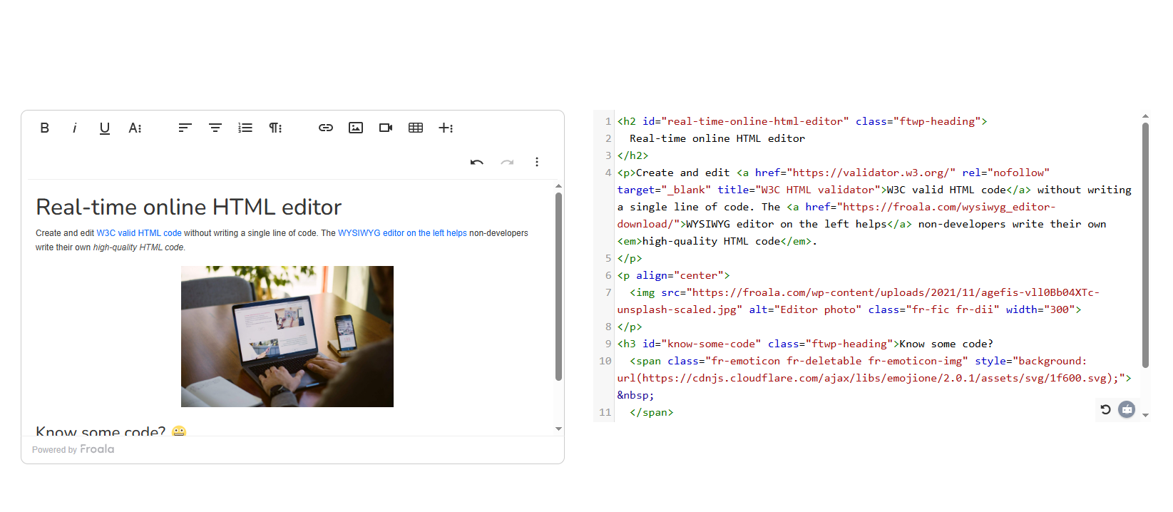
  • A Clear User Problem: Can you pinpoint measurable friction like time lost in manual processes, errors encountered, or repeated support tickets?
  • Sufficient Data: Do you have real or synthetic samples from which AI can learn?
  • Privacy and Compliance Requirements: Will processing content via AI meet data protection laws?
  • Success Metrics: Define measurable goals like acceptance rate of AI suggestions or reduced moderation time. If, in closed test runs, you see users not using the AI at all, think about your requirements again.
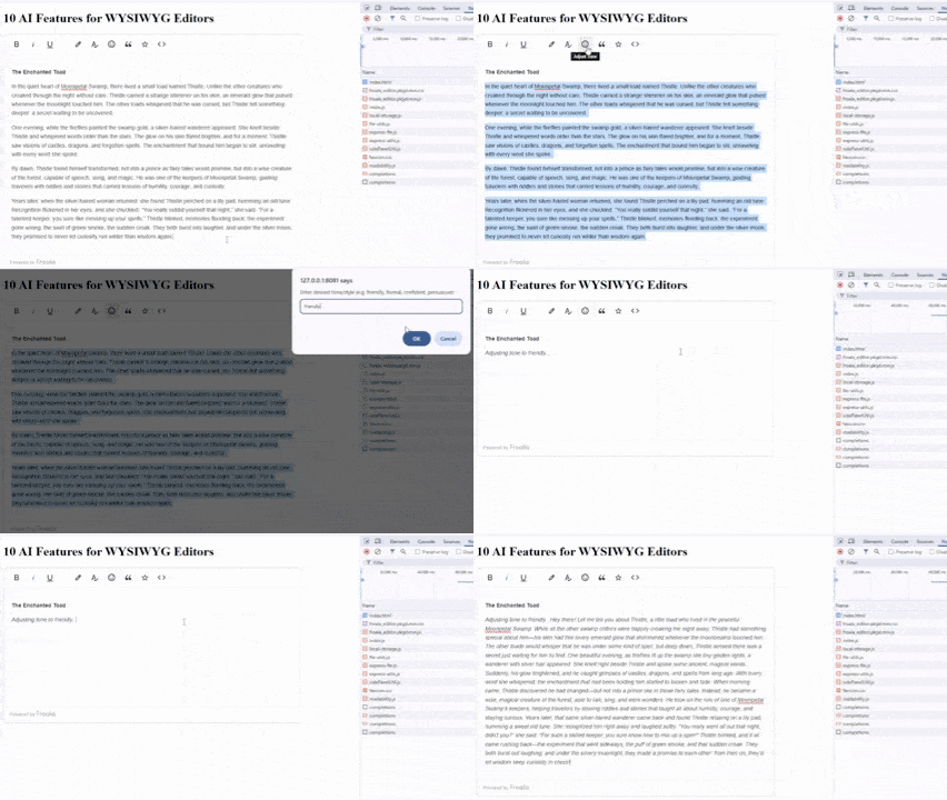
  • A Fallback Plan: Ensure the editor still functions if the integrated AI fails or is unavailable.

Low-Risk Ways to Introduce AI in an HTML Code Writer

Donโ€™t rush when adopting AI. Start small, like:

  • Offering AI suggestions instead of generating automatically and making changes right away, as stated earlier. Let users confirm any changes from the AI before applying them.
  • Keeping humans in the loop for sensitive tasks (e.g., false positives or bias in content moderation, code review).
  • Using feature flags and gradual rollout. Donโ€™t launch every AI functionality at once; instead, enable features in stages or for select user groups. This helps you compare adoption rates, gather feedback, and make adjustments before scaling up.
  • Running A/B tests to track real impact before expanding further.

AI Risks and Red Flags (and How to Mitigate Them)

A digital circuit "storm" that symbolizes AI hallucinations or how AI can go haywire sometimes, even in HTML code writer setups.

AI is powerful, but it can introduce risks. In fact, rushing into it without safeguards can create the opposite of the desired effect, potentially destroying user trust. By anticipating risks, you can build in defenses that keep the technology helpful rather than harmful.

  • Hallucinations: AI sometimes invents details or produces misleading suggestions. Use guardrails and require human review to reduce the chance of bad outputs slipping through.
  • Privacy leaks: If content includes names, addresses, or confidential data (PII), sending it to a third-party API without protection creates compliance problems. Encrypt sensitive data, strip unnecessary personal information, and consider running AI locally when possible.
  • Over-automation: Donโ€™t auto-publish AI content without human confirmation. While this obviously saves time, it can lead to more exhausting work in the future. Keeping humans in control ensures AI remains a powerful support tool, not a counterproductive part of the workflow.
  • Cost creep: Track usage carefully and limit expensive features to where they add value.

By addressing these risks early, teams can have confidence in introducing AI while keeping quality, compliance, and costs under control.

Conclusion

AI goes well with an HTML code writer, providing strategic upgrades when teams face formatting, moderation, or multilingual support bottlenecks. The key is to add it where it solves measurable problems, not where it creates new risks. You should also check first if you really need AI or not.

With platforms like Froala, teams can start with low-risk features such as image tagging suggestions or layout helpers, then grow into moderation or code refactoring as confidence builds. Always keep human oversight, privacy compliance, AI ethics, and cost management in mind.

Sign up

Download the code by signing up for our newsletter

Sign up

Download the code by signing up for our newsletter

Note: By registering, you confirm that you agree to the processing of your personal data by Froala, Inc. - Froala as described in the Privacy Statement. Froala, Inc. - Froala is part of the Idera group and may share your information with its parent company Idera, Inc., and its affiliates. For further details on how your data is used, stored, and shared, please review our Privacy Statement.